Sp-dev-fx-controls-react: New Control: Tag Component
Category
- [x] Enhancement
- [ ] Bug
- [ ] Question
Expected / Desired Behavior
A tag and tags container components.
I'm ready to develop something similar to the Bulma CSS tag style and options if this idea is accepted 🙂.
Thanks!
 AriGunawan
All 8 comments
Thank you for reporting this issue. We will be triaging your incoming issue as soon as possible.
![msftbot[bot] picture](https://avatars.githubusercontent.com/in/26612?v=4&s=40) msftbot[bot]
on 2 Apr 2021
msftbot[bot]
on 2 Apr 2021
What would be the difference from TaxonomyPicker control?
https://pnp.github.io/sp-dev-fx-controls-react/controls/TaxonomyPicker/
or the goal is to display the tags with different colors and and will be integrated with the Microsoft Teams "Tags" options or other dataset? such us TermSet?
 aaclage
on 3 Apr 2021
aaclage
on 3 Apr 2021
The TaxonomyPicker is an input component while this one is a reusable component for displaying data consistently.
Pretty much like the tag element from Bulma (reference)
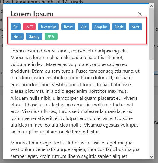
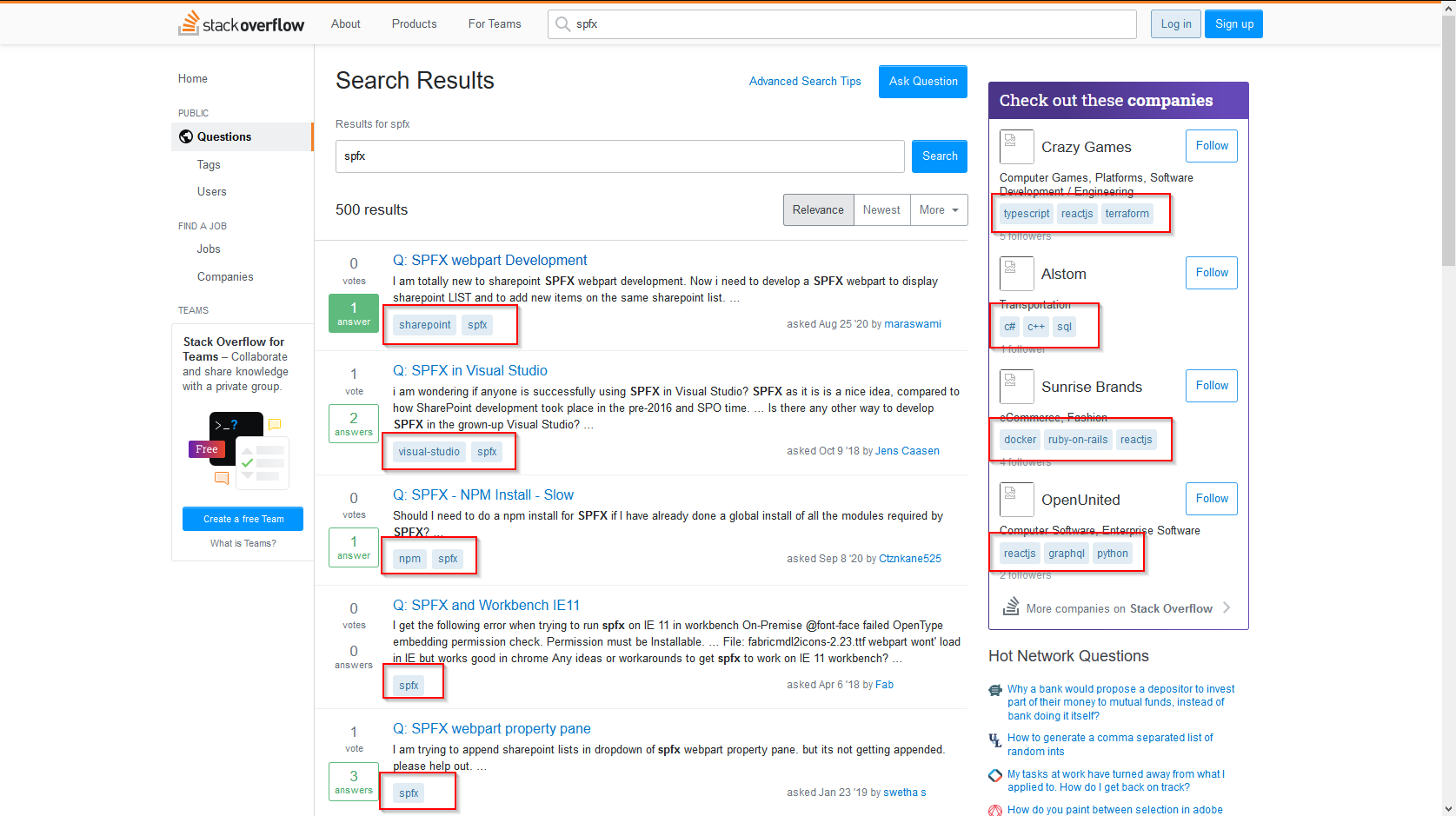
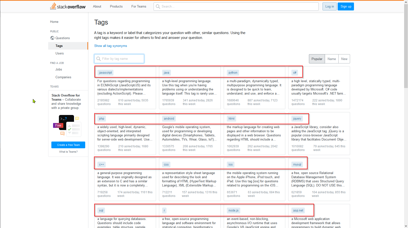
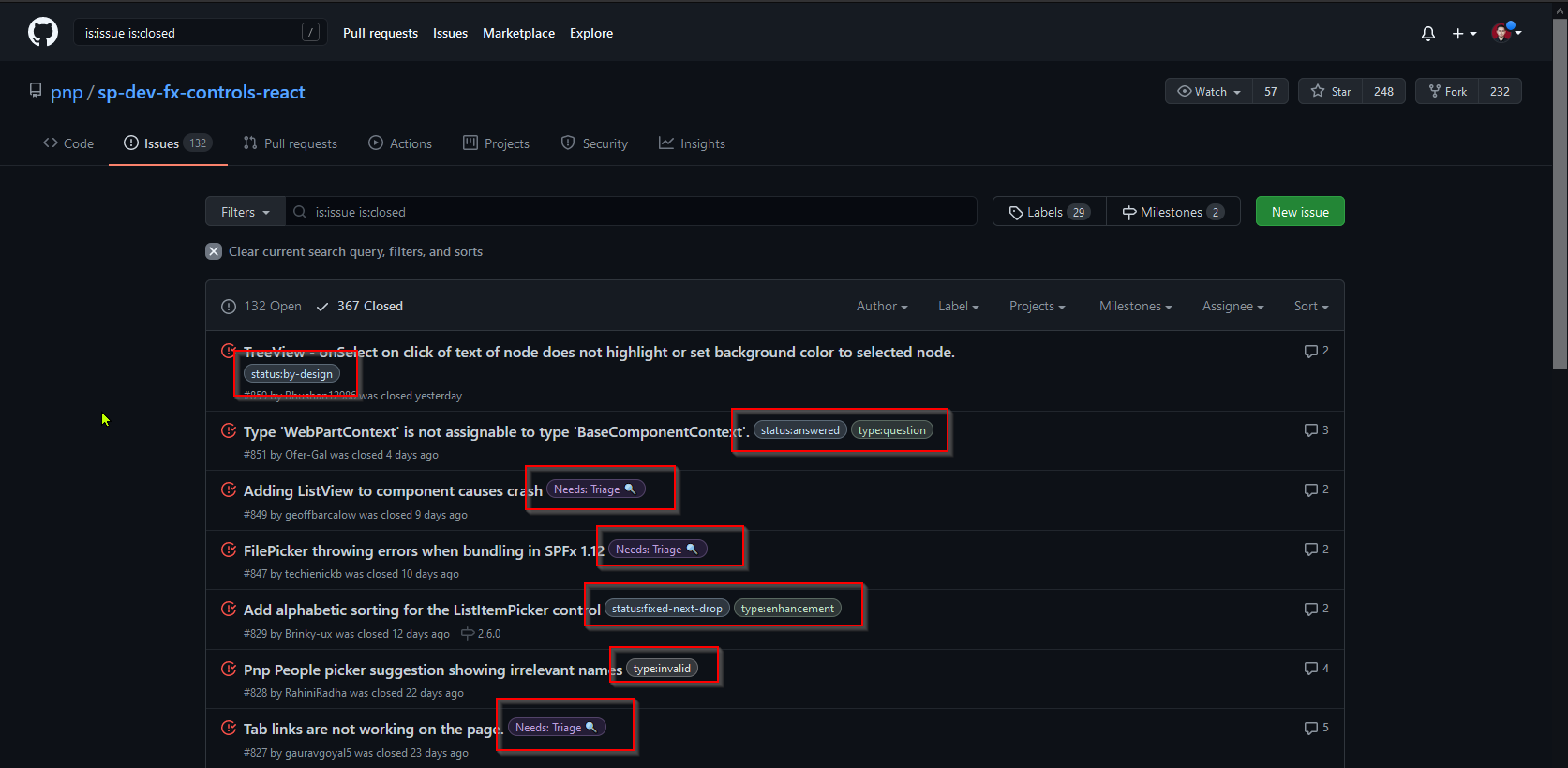
It will provide some options for the colour (danger, info, success, custom, etc), shape (normal, rounded), size (small, normal, large), etc.
Below are some usage examples of the tag component
AriGunawan
on 3 Apr 2021
 kunj-sangani
on 3 Apr 2021
kunj-sangani
on 3 Apr 2021
Got it, i was imagine that but wanted to understand if is only output base on some type of dataset.
All good ideas are appreciated and dont know if there is a team that validates what get's in or out, just need to add value and i can see there value.
You can always create a new branch based on dev and send the PR to the sp-dev-fx-controls-react. I did the same like you, asked before, but in the end you just need to create PR and provide the description and value associated.
aaclage
on 3 Apr 2021
I definitely like the idea
 AJIXuMuK
on 3 Apr 2021
AJIXuMuK
on 3 Apr 2021
Sounds like an interesting addition to me. I used similar components in the past but Fluent UI doesn't seem to have us covered in this case so I went with something custom and simple at the time. If they were available here, I would 100% have used them.
 joelfmrodrigues
on 4 Apr 2021
joelfmrodrigues
on 4 Apr 2021
Hi all,
Some ideas which can be gathered from material ui
Hope this helps
Great! I got some more ideas from that. Thanks!
Got it, i was imagine that but wanted to understand if is only output base on some type of dataset.
All good ideas are appreciated and dont know if there is a team that validates what get's in or out, just need to add value and i can see there value.
You can always create a new branch based on dev and send the PR to the sp-dev-fx-controls-react. I did the same like you, asked before, but in the end you just need to create PR and provide the description and value associated.
I see. I'm just following the guideline to ask first before developing a new component. 😀
Thanks!
I definitely like the idea
Sounds like an interesting addition to me. I used similar components in the past but Fluent UI doesn't seem to have us covered in this case so I went with something custom and simple at the time. If they were available here, I would 100% have used them.
Thanks!
I guess I will start developing this component then create the PR and see whether it's acceptable or not 😄
AriGunawan
on 4 Apr 2021
Related issues
 nbelyh
·
4Comments
nbelyh
·
4Comments
 msgx
·
4Comments
msgx
·
4Comments
 bva999
·
5Comments
bva999
·
5Comments
 pavan2920
·
8Comments
pavan2920
·
8Comments
 enti333
·
4Comments
enti333
·
4Comments
Most helpful comment
Great! I got some more ideas from that. Thanks!
I see. I'm just following the guideline to ask first before developing a new component. 😀
Thanks!
Thanks!
I guess I will start developing this component then create the PR and see whether it's acceptable or not 😄