Sormas-project: Refactoring the headers to help user navigation
Situation Description
Event participants and event actions are two screens linked to an event. Those two screens does not give enough information to identify quickly the concerned event (just the disease, the status, the date of report and the start of the event id in the top right corner).
Feature Description
We would like to have a header on those two pages that gives, at least, the title of the event.
This information would help to identify quickly the concerned event, for example if you use multiple tabs on the browser or if you prints the page or takes screenshots.
This modification should be applied to all screens (not just for events) to keep the UX consistent.
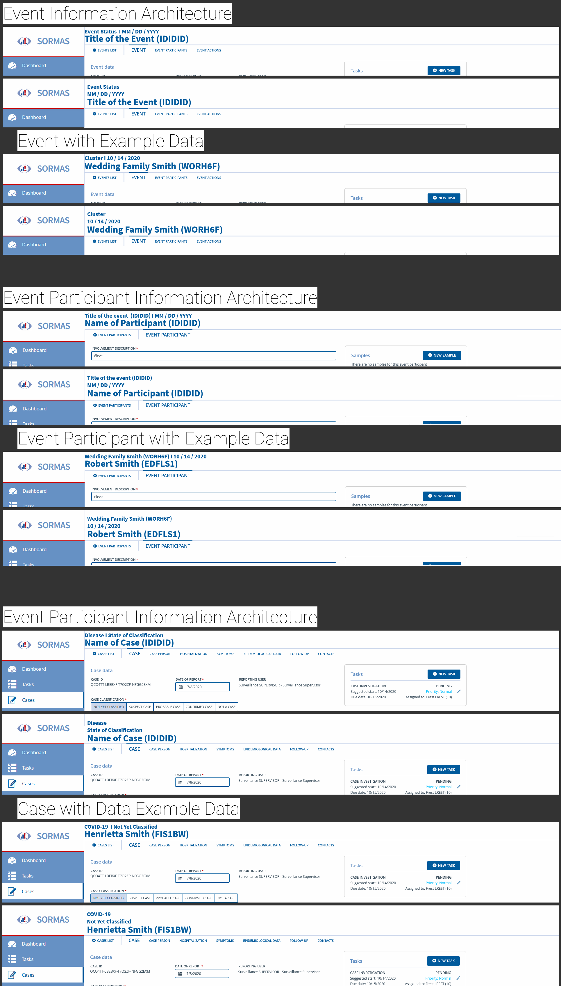
After discussion in the comments and by mail, @carolinverset and @bernardsilenou choose the three row design in the following mockup designed by @hellerdominik :
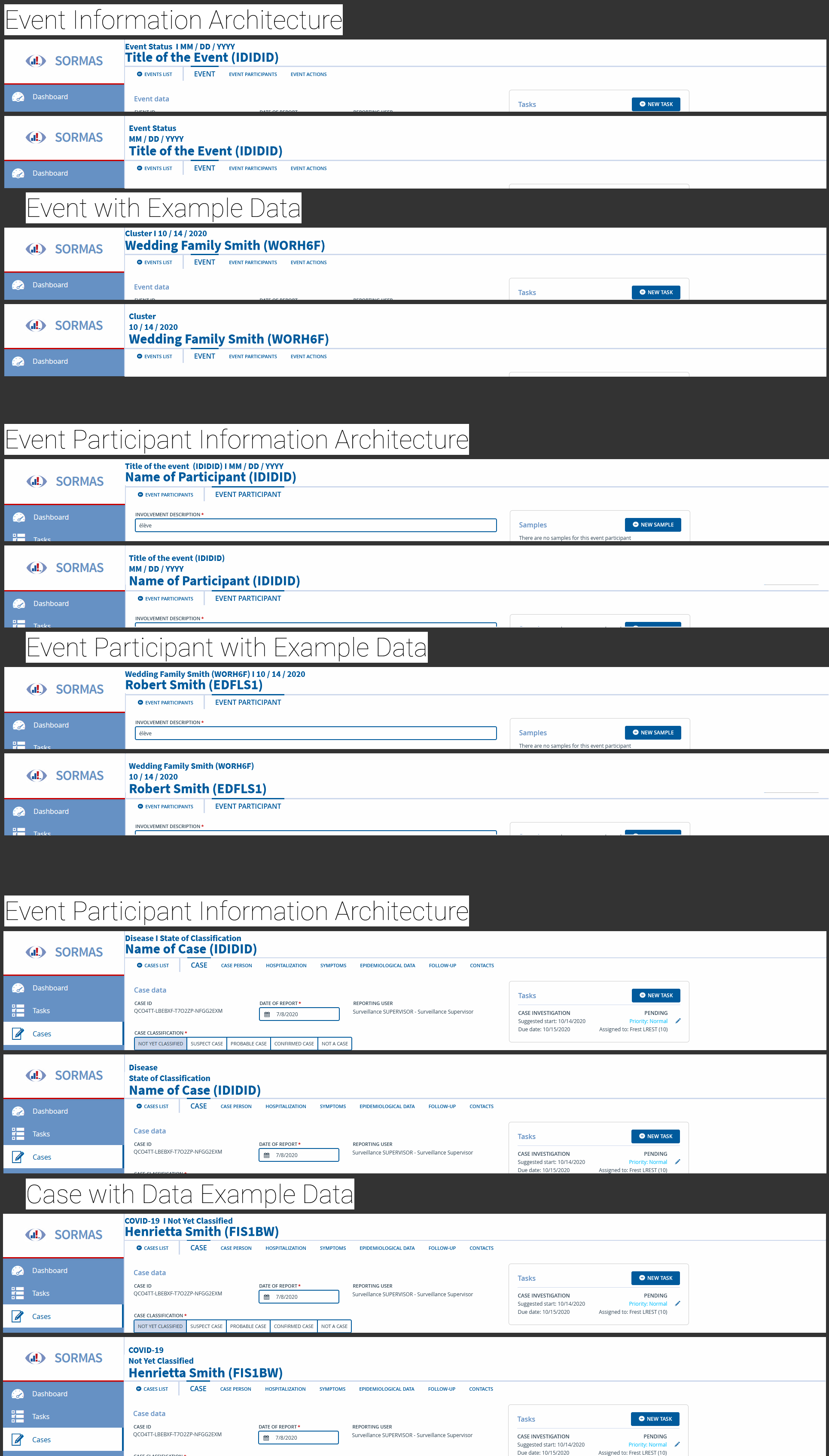
@carolinverset @bernardsilenou
 ftavin
All 26 comments
@ftavin This is a good idea. Please can you have a look at the mockup of the newly event participant form from issue https://github.com/hzi-braunschweig/SORMAS-Project/issues/3003 ? I see this as the solution for the event participant entity, we may just need to do the similar one for the followup form
 bernardsilenou
on 5 Oct 2020
bernardsilenou
on 5 Oct 2020
please can you add a small mockup just to be sure were are thinking about the same thing?
bernardsilenou
on 5 Oct 2020
@bernardsilenou Here are two mockups :
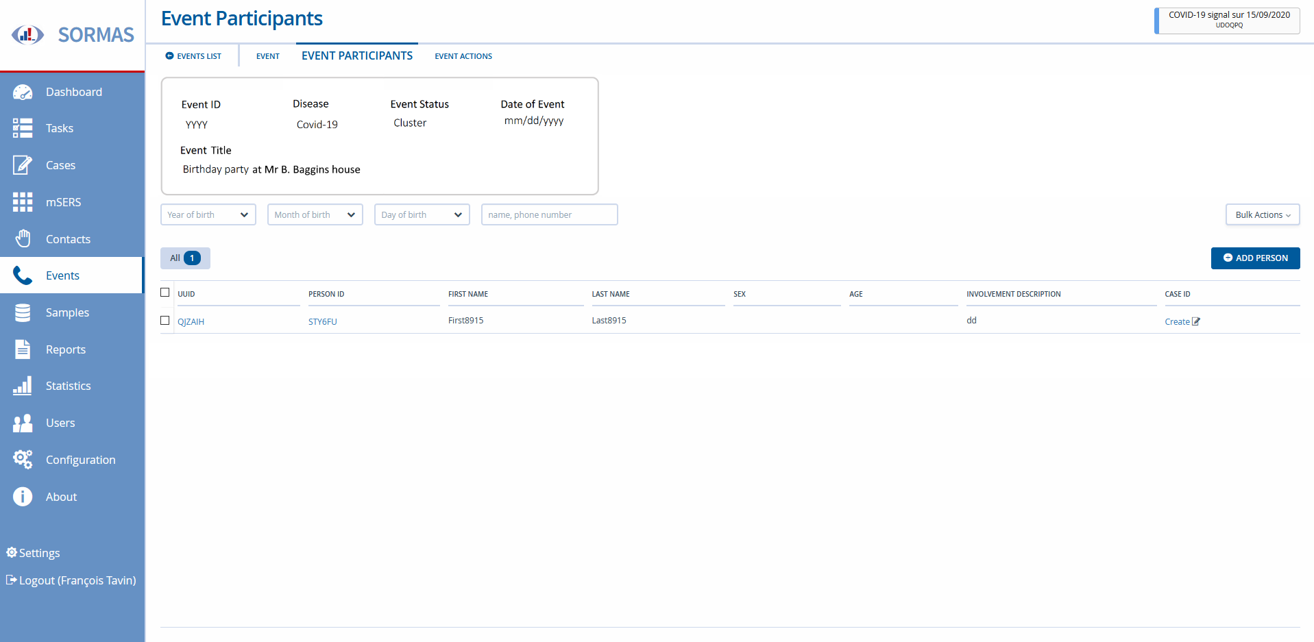
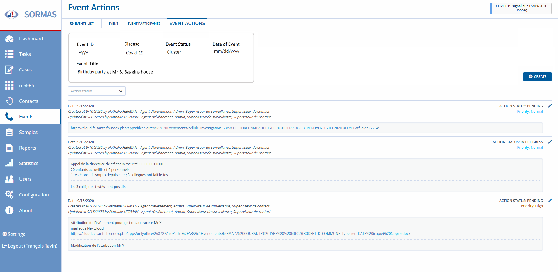
ftavin
on 5 Oct 2020
@ftavin In the figure below, the box at the top right was meant to serve this purpose, linking entities to their principal entity. I can see that only the event title is lacking. Can we not instead add it to the list of variables in the box, and make it nicer? Having both leads to duplicate information.
A similar box exist on the contact directory page, showing information about the source case.
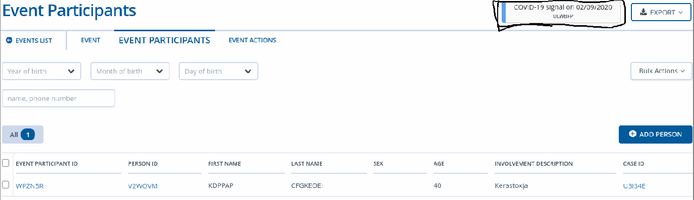
bernardsilenou
on 5 Oct 2020
@bernardsilenou I am ok with your remarks if we make the box nicer : the one on the screenshot is to small to include the title of the event and I believe that it is not user friendly (top right with a large blank on the left does not catch the eye, I made the test with two collegues, it took minutes for them to see that bloc).
I suggest this block should at least stick to the left (just right to "Event Participants") and be more clear (nothing tells us that these are event related informations)
ftavin
on 6 Oct 2020
meeting this morning with @bernardsilenou and @carolinverset :
- we use the blox
- we move the box to the left (just right to the screen title)
- we make the box larger in order to have the title of the event fitting
after this development and confirmation it is ok, an issue will be created to generalize the position of the box to every screen with a box like this one
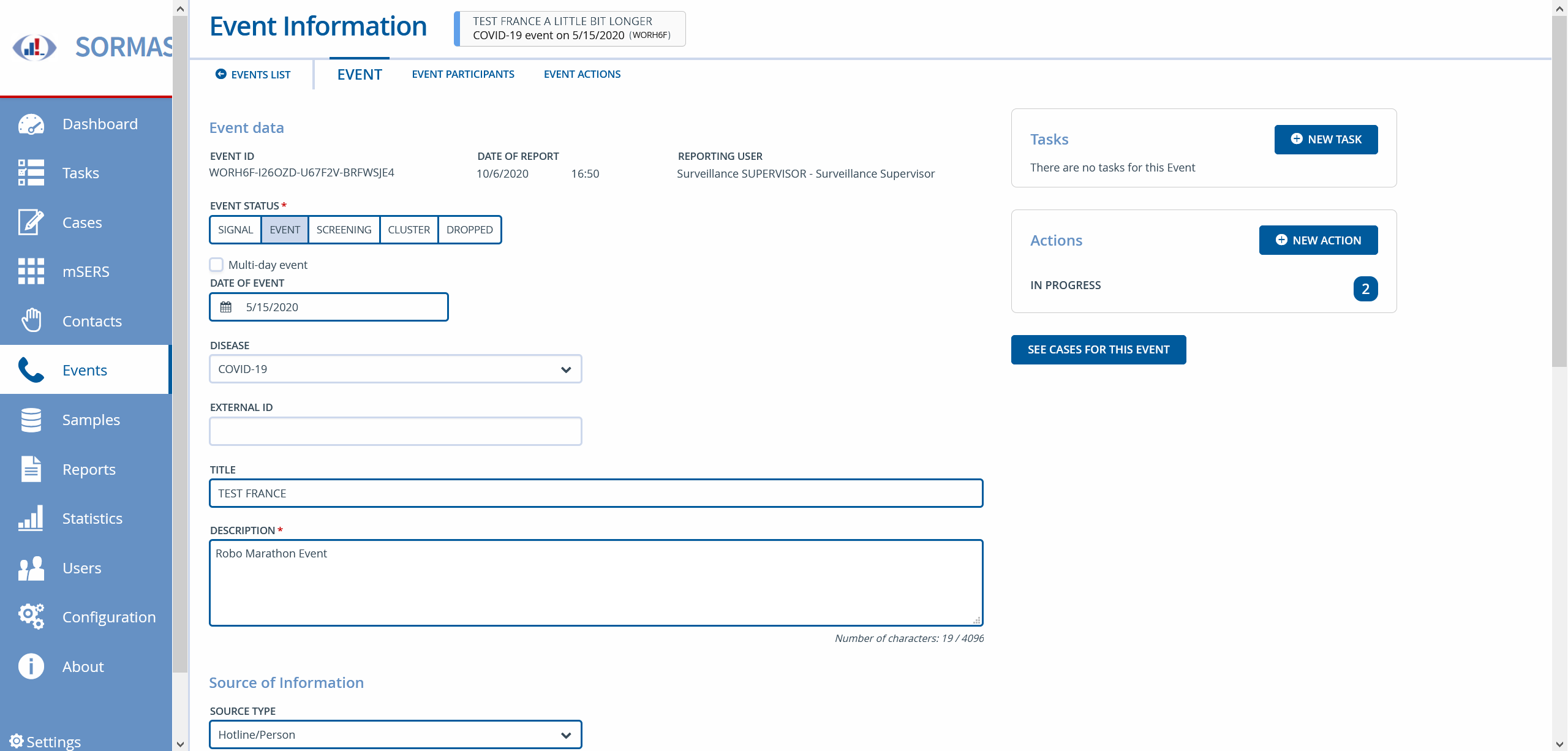
mockup @MateStrysewske :
ftavin
on 7 Oct 2020
@MateStrysewske What do you think about this please?
bernardsilenou
on 8 Oct 2020
@bernardsilenou I really don't like that visually. It looks weird to have this box directly next to the heading and then a huge blank space to the right of it. Also #3096 proposes to completely get rid of the box anyway.
I think we should rather think about something like adding an additional line to the page heading that can be used for further details, e.g. the event title in this case.
 MateStrysewske
on 9 Oct 2020
MateStrysewske
on 9 Oct 2020
@MateStrysewske, your comment makes sense.
@ftavin I have ask @HellerDominik if he can suggest a mockup. Please François, can we wait and see what he will propose before we begin implementation?
bernardsilenou
on 9 Oct 2020
@bernardsilenou ok to wait for the mockup, we hope this could be done within a week to let us the time to implement this for 1.51 !
ftavin
on 9 Oct 2020
Hello everybody,
a nice coincidence that you were addressing this issue around the same time.
My suggestion, to remove the big navigational header and replace it with the actual title of the entry comes a bit from real life patient folders where I would probably search for the patients name in the top left corner. I need to know with one glance who I am dealing with or with which event etc.
In my opinion the navigational element is just not as high in the visual priority as the name of the event, patient or sample.
This is my mockup for the header.

I took all the info from the badge that was on the right and tried to work on a hierarchy. Which is the most important is to be defined by you in the end.
Therefore I did this version with placeholders for 3 informations, the most important ones on the top in the bigger font, another one with the date (or a fourth info) below.

While working on this issue I noticed two other things that I'd like to address.
The first is another redundancy. I think that the arrow below the header and the click to the Event list have the same function.
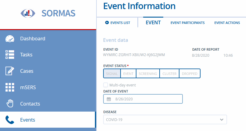
But that's not so important, it just takes noise from the screen if I have fewer options which have the same function.
In what I actually see an improvement would be to stick the header and the navigational elements to the screen and make them not scroll any more.
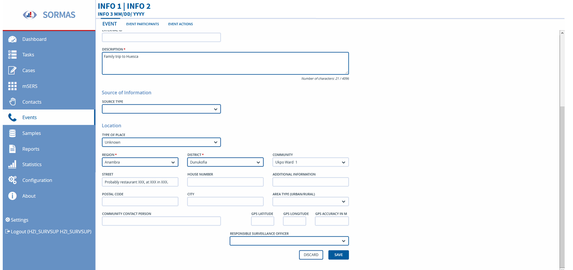
This may work not too well as a mockup therefore I created a little scroll dummy in Axure, which you can find here:
https://nhxmpe.axshare.com
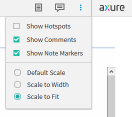
Make sure to set the view in the top right corner to 'Scale to fit' to get the best experience.
Hope this helps. What do you think?
 HellerDominik
on 9 Oct 2020
HellerDominik
on 9 Oct 2020
@HellerDominik Many thanks for this quick and nice design. I think there are 2 needs here:
- How to display information about the record on the form in front of us
- How to display information about the primary entity that this entity is linked to. For example, the parent entity case has children such as contacts, samples, followup, etc. So on the contact from, users should be able to see information about the source case. On the event participant from, we present information about the event, on sample form, show information about case, contact or event participant referenced by the sample, end so on.
I just realized after looking at your mockup that the current event participant form was not rightly design because the top right information box shows the same information as the event participant from (this should have been the information about the event). The person uuid is shown but the event participant uuid is not shown
Form my understanding, I think that your solution is for point 1 and not point 2, is this right?

Please can we (@ftavin , @HellerDominik , @bernardsilenou ) schedule a call on Monday, any time from 16:30 to discuss this issue?
bernardsilenou
on 10 Oct 2020
Yeah, sound's good to me. 16:30 CET?
HellerDominik
on 11 Oct 2020
Thanks, 16:30 is fine by me, lets wait to hear what François says
bernardsilenou
on 11 Oct 2020
@HellerDominik I am writing to confirm our call today at 16:30 - 17:00.
Please can you send my your email through bernard.[email protected]
meeting link: https://conf.dfn.de/webapp/conference/979151124
bernardsilenou
on 12 Oct 2020
@HellerDominik if I understand correctly, you will develop this feature
You will also have to adapt the @media print in css to have this header printed (in the current version, the header is ignored for printing)
ftavin
on 16 Oct 2020
Hey @ftavin
that's not right. I am not a developer. I work in UX and help with prototypes and mockups.
The mockups for these features were the following. In the mail correspondence with Carolin and Bernard they agreed on using a three row design.
HellerDominik
on 16 Oct 2020
Verified issue on SORMAS Version: 1.53.0-SNAPSHOT
 AndyBakcsy-she
on 10 Dec 2020
AndyBakcsy-she
on 10 Dec 2020
This seems to break the Patient Diary integration
In the constructor for de.symeda.sormas.ui.contact.AbstractContactView there is where the btnClimedoAccount button is added to the header, but down bellow the method refreshMenu calls AbstractView.replaceViewHeader which removes everything from the header and only adds back the labels
 vidi42
on 11 Dec 2020
vidi42
on 11 Dec 2020
I have a problem with the execution of this issue (after testing on test-de.sormas.netzlink.com). The implemented change here can not be allowed to be applied to the person form since it ruins the emphasis on differentiating between person and cases/contacts.
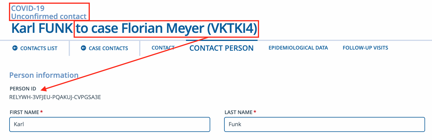
The information given here only applies to the contact itself because the person can have many contacts to any other source case, not to mention all the other possible diseases those source cases can have. We should therefore only show information related to the person itself here. This means that we should either keep it 'Person information' or only reference the name with the shortened person Id here instead of the contact Id.
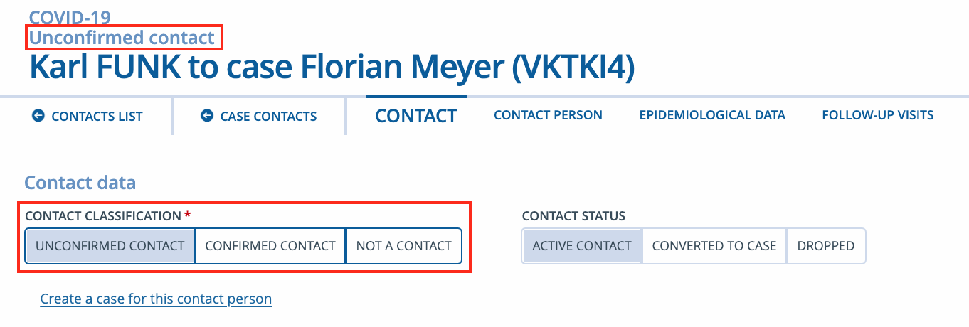
Furthermore, I don't understand the logic behind showing the contact classification in the heading since it is visible right below the heading as well. Showing the contact category here would be much more useful.
According to the concerns mentioned above, the same thing applies to the person form of the case entities. Disease and classification can not be shown here and instead of the case Id it should reference the shortened person Id.
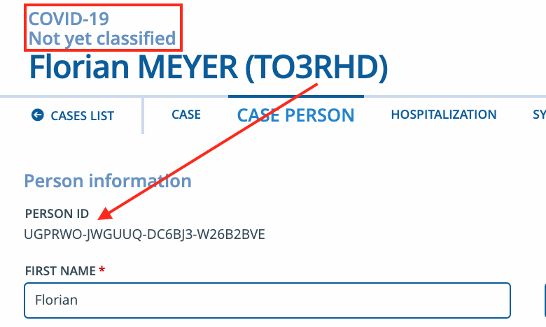
If we could reduce the font size of the name by a bit to be not as distracting would be nice as well.
@bernardsilenou @MateStrysewske
 kwa20
on 12 Dec 2020
kwa20
on 12 Dec 2020
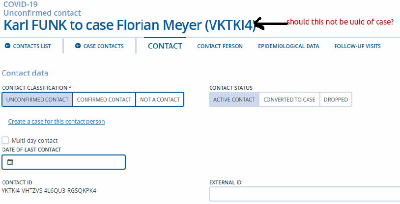
@kwa20 We discussed this issue before implementing it like this. Since this implementation is not obvious from someone who was not invoked like you, I think it is a sigh that we need to have a second look at it.
- In the header panel, the uuid is the uuid of the entity concern, not the uuid of the sub form (eg person) that is displayed below.
his header panel always stay the same not matter the sub form below it. This is one of the main reason whey this change was requested because the old design showed the same information twice: header panel and tab panel below it. - We can refine the second line in the header and show both contact status and category, this is good point.
- Here is a possible arror:
bernardsilenou
on 12 Dec 2020
@kay and I will discuss and add the comment here or create a refinement issue
What I think we need to address in this issue is to correct the uuid of the source case when on the contact tab
bernardsilenou
on 12 Dec 2020
I disagree with @kwa20 here. First of all, this issue doesn't really add anything new, it just moves the information from the top right to the top left to make it a) more visible and b) get rid of the useless headers that we used so far. Secondly, the purpose of this information is that the user knows exactly which entity they are looking at right now, even if they aren't in the "contact information" or "case information" tabs; when inside a case or contact, while you're right that the person form refers to its own entity, we are still displaying everything related to that contact or case, so that's also the information that should always be visible to the user. Showing information about the person itself in the header wouldn't make any sense because you can already see that anyway when you're inside the person form.
I don't really see any reason to change the specifications of this issue besides making the font smaller.
MateStrysewske
on 14 Dec 2020
@bernardsilenou @MateStrysewske Thanks! I understand better now. I was a bit confused about how the entities are referenced for contacts since this issue focused on cases and event participants but the Id is the correct one then because it describes the contact itself and neither the contact person or the case. Putting an Id behind a name might lead users to naturally associate it with that name. I don't have an idea how to simplify it even further but as soon as someone references that Id, the referenced entity should be clear. I guess everything else would be resolved with the planned person directory.
Reducing the font by a bit is indeed all that remains. I might just create another issue for referencing the contact category in the heading. I think that'll be useful.
kwa20
on 14 Dec 2020
- [x] Reduce font size
MateStrysewske
on 15 Dec 2020
Validated the header change on the latest SORMAS Version: 1.53.0-SNAPSHOT
AndyBakcsy-she
on 15 Dec 2020
Related issues
 Candice-Louw
·
7Comments
bernardsilenou
·
5Comments
Candice-Louw
·
7Comments
bernardsilenou
·
5Comments
 AxelNennker
·
4Comments
AxelNennker
·
4Comments
 faatihi
·
8Comments
faatihi
·
8Comments
 Iheanacho2027
·
4Comments
Iheanacho2027
·
4Comments