Sonarr: Episode number column not wide enough for 2 warnings + episode no
Describe the bug
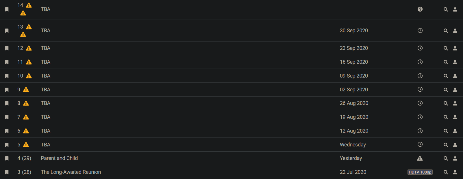
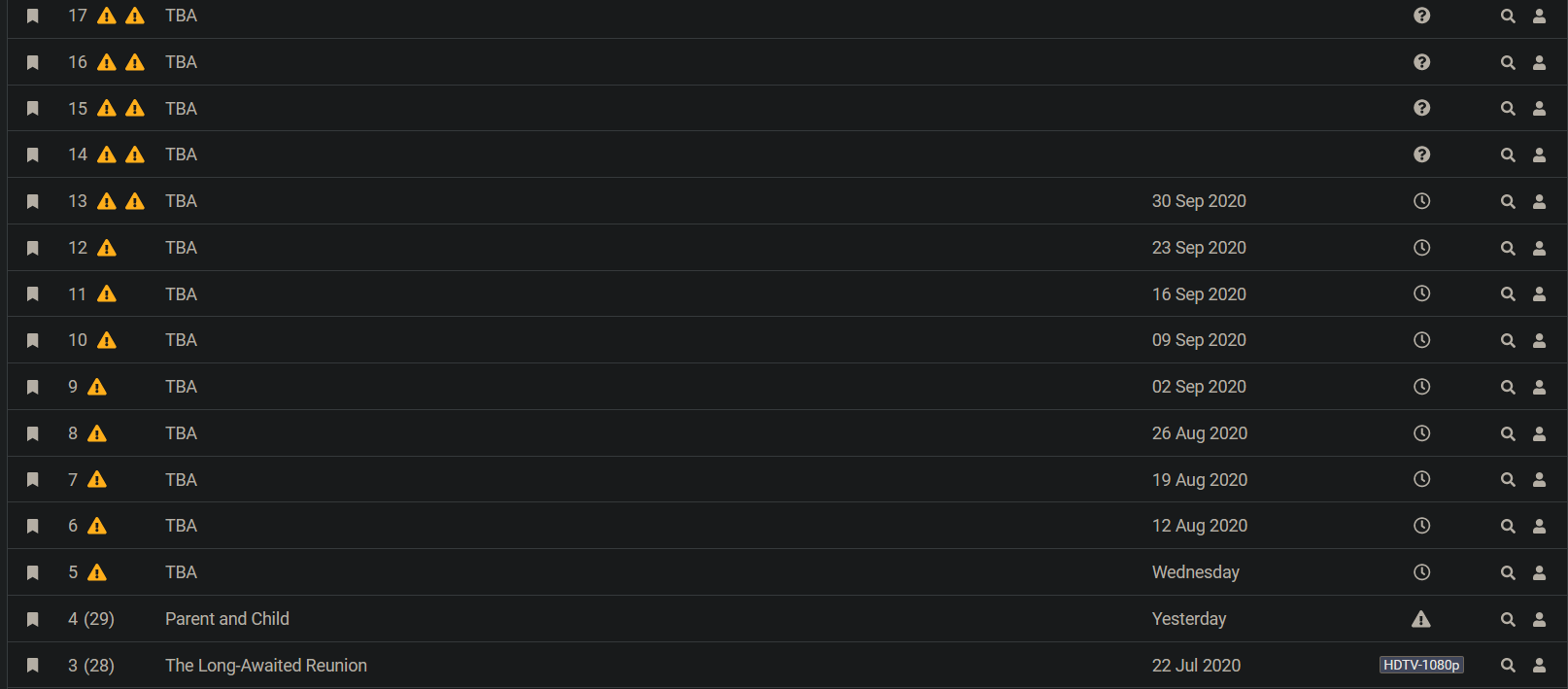
The episode number column in the page of a series is too narrow when there are 2 warnings. It's 65px afaik and increasing it to 80 seems to make it collapse back to the height of 1 row. It does seem a bit too wide now though...
Screenshots
This is as-is.
This is with 80px.
Logs
Not applicable?
System Information
- Sonarr Version: 3.0.3.904
- Operating System: Ubuntu
- .net Framework (Windows) or mono (macOS/Linux) Version: 5.20.1.34
UI Bugs:
- OS: Windows
- Browser: Firefox
- Version: 79.0b9
 danshilm
All 2 comments
better solution would to aggregate all warnings to the one icon's tooltip
 thezoggy
on 2 Aug 2020
thezoggy
on 2 Aug 2020
👍1
Unsure if I should post this here or make another issue.
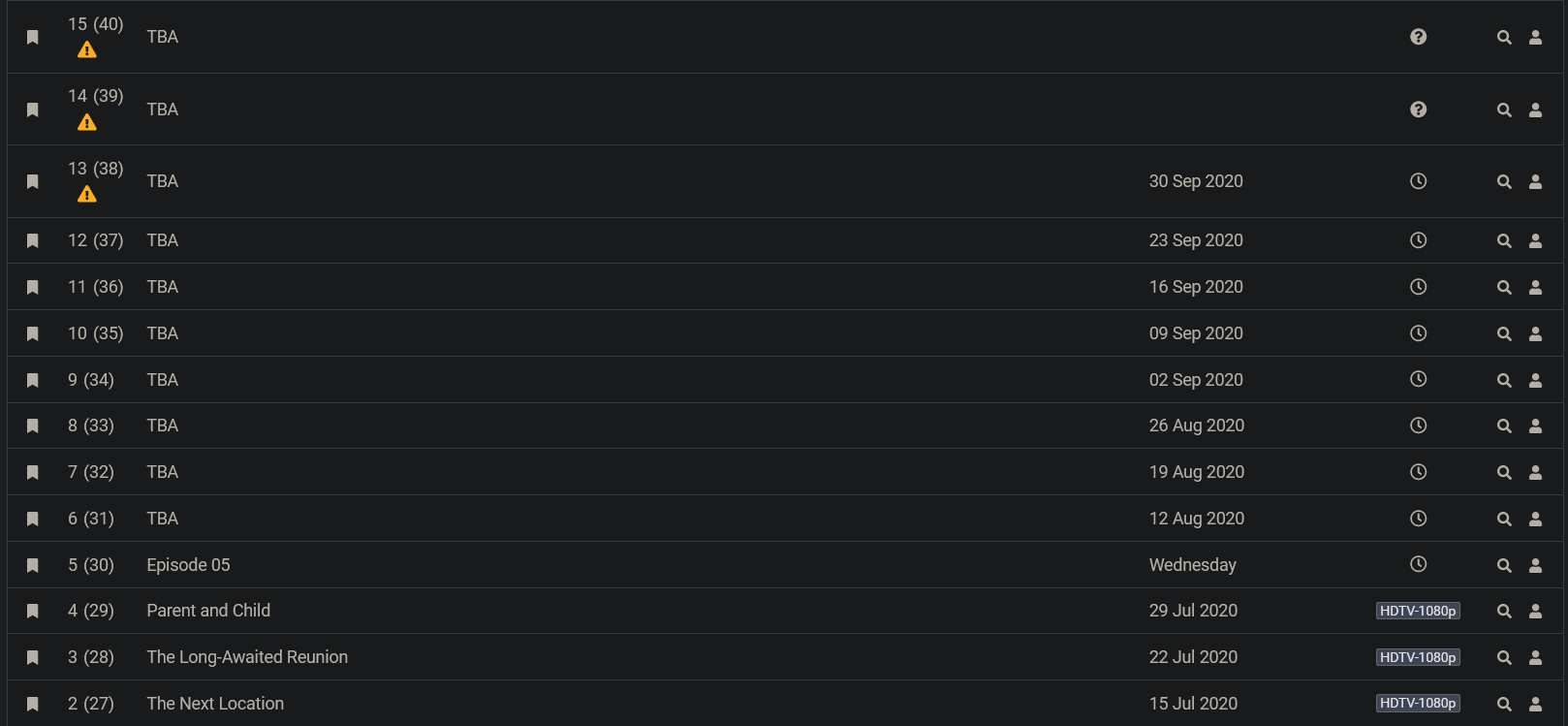
Absolute episode numbers are here now and the column spills over again.
Screenshot:
Thank you for the quick fix in the first place @markus101.
danshilm
on 3 Aug 2020
👍1
Was this page helpful?
0 / 5 - 0 ratings
Related issues
 pimlie
·
4Comments
pimlie
·
4Comments
 satmandu
·
3Comments
satmandu
·
3Comments
 imathew
·
4Comments
imathew
·
4Comments
 skube
·
4Comments
skube
·
4Comments
 markus101
·
4Comments
markus101
·
4Comments