Solvespace: Vector source for UI icons
System information
- SolveSpace version:
3.0 - Operating system: all supported
Expected behavior
Create vector source for UI icons (vector icons set), which could be rendered to raster in any size.
There are two ways:
- Using Inkscape app (rendering could be automatized via Inkscape CLI):
1.1. "Master page" way — all icons should be placed inside single SVG document, where icons are placed as tile/table map:
1.1.1. See Inkscape icons & cursors sets - https://inkscape.org/gallery/=inkscape-gui-icon-set/
1.1.2. See Blender 2.8 icons set - https://devtalk.blender.org/t/new-icons-for-blender-2-8x/4651
1.2. "Layers" way — all icons should be placed inside single SVG, but instead of "Master page" way, each icon is a layer on top of foreground template.
1.3. "1 Icon = 1 SVG" way — each icon should be created as separate SVG file. - Using SolveSpace itself — as SolveSpace itself could render via
solvespace-cli, it would be possible to re-create all icons as SLVS files & render it directly to PNG (even to SVG).
I guess use of Inkscape would be the best (as it de-facto common way to create icons used by many developer),
- Creating a new multicolor icon theme - https://wiki.inkscape.org/wiki/index.php/Creating_a_new_multicolor_icon_theme
- How To Design & Prepare App Icons in Inkscape (video) - https://www.youtube.com/watch?v=r2Kv61cd2P4
BUT SolveSpace could be really used too for this task, thanks to "ambient lighting 1.0" feature already implemented (I itself may try create icons using SolveSpace only).
JFTR, For the feature SolveSpace should support vector icons in SVG format for scalable UI/HiDPI support.
Actual behavior
Actually UI icons are available in PNG (raster) form & has some issues with antialiasing & line styles (width, etc.).
Most of icons created "by hands" manually, and now some of them looks "non-professional"
Need clean up & unify style of dots, lines, color palette (limit it to not more than 4-16 colors), etc.
Additional information
NOTE: Here would be collected links to useful tutorials. More links to be added later!
In the feature, it could all icons could be tweaked in easy way to be ready for Light & Dark (or any other) color theme.
 Symbian9
All 44 comments
This is something I'd like to see in the future as part of a more comprehensive UI change that would include scalable text and resizable SVG toolbar icons. Doing that on all 3 platforms is a lot of work. I don't want to bring up the GUI toolkit discussions again right now either.
Until then maybe a way to create the exisiting icons from SVGs and add a few more than what we have now (and convert them to bitmaps). That would also allow designers to try new icon sets. Even that seems a lot of work. I looked at the "master page" way some time ago and it looked nice, but we'd still need a converter to make bitmaps from them for now.
 phkahler
on 14 Dec 2020
phkahler
on 14 Dec 2020
Until then...
Yeah, for SolveSpace 3.0 release we need just simply recreate actual icons to rerender them in better quality (better anti-aliasing & transparency).
More advanced tweeks & some icons redesign is a task for the next releases ;)
Symbian9
on 14 Dec 2020
Until then...
Yeah, for SolveSpace
3.0release we need just simply recreate actual icons to rerender them in better quality (better anti-aliasing & transparency).
"We need" it!? I don't think so. I like the the sharp/blocky icons with no anti-aliasing.
 ruevs
on 14 Dec 2020
ruevs
on 14 Dec 2020
In fact when the svg main icon was added:
https://github.com/solvespace/solvespace/blob/master/res/freedesktop/solvespace-scalable.svg
it was intentionally created to render pixel accurate to the "blocky" original one.
ruevs
on 14 Dec 2020
"We need" it!? I don't think so. I like the the sharp/blocky icons with no anti-aliasing.
Problem here is that some icons are sharp/blocky, some icons has anti-aliasing & some of icons has anti-aliasing but not fully correct.
There should be no such "mix" in good software.
Symbian9
on 14 Dec 2020
In fact then the svg main icon was added: https://github.com/solvespace/solvespace/blob/master/res/freedesktop/solvespace-scalable.svg
@ruevs, this issue about toolbar icons, NOT about SolveSpace app icon.
See: https://github.com/solvespace/solvespace/tree/master/res/icons
Symbian9
on 14 Dec 2020
I've been experimenting with some different icon styles in my fork. I somewhat agree with @ruevs about liking the pixely non-antialiased icons, and I ended up redrawing the icons with no antialiasing so they're more consistent (plus a few minor changes to make some better fit the style). If someone wants to look at them and offer their opinions, I'd be willing to improve the ones I've redrawn and finish the few I haven't done yet.
 jkrei0
on 20 Dec 2020
jkrei0
on 20 Dec 2020
@jkrei0 I looked through your icons. Personally I like them, but @phkahler ad @jwesthues are the ones who should decide.
A few notes:
lathe.png - the change is not necessary in my opinion
sketch-in-3d.png - I like the original one with the longer vertical line more
step-rotate.png - the dot in the center should be a square - like "sketch-in-plane.png"
symetric.png - the correct file name is symmetric.png.
tangent.png - remove it. tangent-arc.png is the correct file name and you already updated it.
tangent-arc.png - In the original shape the points are more visible.
trim.png - a bit small maybe? But not a problem.
Run the PNGs though an optimizer. yours are 28.9 KB while the original ones are 18.8 KB. For example use https://github.com/apps/imgbot. Do _not_ change any images in the .../test directory.
Here are the toolbars side by side for reference:
| Existing | jkrei0 |
| ------- | ------ |
| 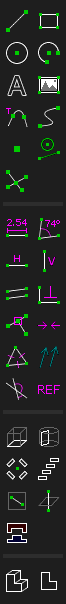 |
|  |
|
ruevs
on 20 Dec 2020
@jkrei0 I like your version. The seem to be higher contrast. Only the second-from-bottom one in the right column is smaller, I don't think smaller is better.
How were these created? My hope to one day use SVG directly, but that will require code changes to render SVG on all platforms. Short of that it would be great if we had SVG icons and a way to generate bitmaps from the SVG before building SolveSpace as-is.
Also, since you're making icons could you make new ones for Revolve and Helix?
phkahler
on 20 Dec 2020
@jkrei0 I like your version. The seem to be higher contrast.
Because they have zero anti-aliasing. This is why I like them as well.
Only the second-from-bottom one in the right column is smaller, I don't think smaller is better.
Indeed ;-)
"sketch-in-3d.png - I like the original one with the longer vertical line more"
ruevs
on 20 Dec 2020
lathe.png- the change is not necessary in my opinion
I changed the angle slightly on the extrude.png, sketch-in-3dand in3d.png to make it look nicer without antialiasing, and to me, my version of lathe.png matches it a bit better. I don't think the change is totally necessary, however.
sketch-in-3d.png- I like the original one with the longer vertical line more
Me too. The whole icon seems a bit small.
step-rotate.png- the dot in the center should be a square - like "sketch-in-plane.png"
Yes. I tried doing that to make the dot sizes more equal since I can't center a 3x3 dot, but it really only makes it worse than simply using a slightly larger dot. (I did this for the circle and arc icons as well, and it fits okay-ish with them but I'll probably end up making those square as well)
The only other icons I'm still unsure about are circle.png and arc.png. I can't quite get the circles to look right. That might be the best I can do in a 24x24 space unless I make them slightly larger, but I don't think making them larger would look good either.
jkrei0
on 20 Dec 2020
@phkahler I used GIMP to create these icons, so it would mean redrawing them again to convert them to SVG. I have a small bit of experience working with SVGs and wouldn't be opposed to creating some SVG icons. If I make SVG icons I'm assuming you'd want them to still be blocky so they don't need antialiasing.
And sure, I can make some helix and revolve icons. I'm not completely sure how those would look though, particularly the helix one.
(edited because I @mentioned the wrong person)
jkrei0
on 20 Dec 2020
@Symbian9I used GIMP to create these icons, so it would mean redrawing them again to convert them to SVG. I have a small bit of experience working with SVGs and wouldn't be opposed to creating some SVG icons.
@jkrei0, I'm author of actual lathe.png (as it persists in SolveSpace master till now!) & used AzPainter app (a lightweight alternative to GIMP) for that 'ugly pixelart'.
I would be happy to work on vector/SVG variant of all those icons (as I'm Inkscape user for years), but can't guaranties that I would complete such a huge task this month (until 2021). Think, I would be able to finish all them until SolveSpace 3.1, or at least for 4.0 release.
BTW, Lets *SolveSpace 3.0 release would include all those non-anti-aliased pixelart icons as a tribute to the outgoing year 2020*! ;)
Symbian9
on 20 Dec 2020
oh crap, just realized I @mentioned you instead of @phkahler. oops!
BTW, Lets SolveSpace 3.0 release would include all those 'ugly' non-anti-aliased pixelart icons as a tribute to the outgoing year 2020! ;)
Personally, I don't think the non-antialiased icons are ugly (I think they look nicer), I just think that the inconsistency between the icons where some are and aren't is ugly.
jkrei0
on 20 Dec 2020
I don't think the non-antialiased icons are ugly
@jkrei0, I just fixed my comment above: "ugly pixelart" is my ![]()
lathe.png icon (actually used in SolveSpace) — your variant of lathe.png looks better than my!
Symbian9
on 20 Dec 2020
@phkahler, I made a quick draft of what I thought the revolve and helix icons might look like, but I'm not completely sure about the helix icon.

revolve.png

helix.png
jkrei0
on 20 Dec 2020
revolve.png
@jkrei0, It would be better show revolve something like ⅔, instead of ⅓.
Symbian9
on 21 Dec 2020
Here is my proposition to final version of step-rotate.png:
- Rotate 45° (lets lines be vertical & horizontal only for better visibility)
- Remove "green dot" (according
step-translate.pngstyle)

As for step-translate.png, let it be @jkrei0's variant (with little smaller rectangles).
Symbian9
on 21 Dec 2020
@jkrei0, It would be better show revolve something like ⅔, instead of ⅓.
Something like this  ? That does look better.
- Rotate 45° (lets lines be vertical & horizontal only for better visibility)
- Remove "green dot" (according step-translate.png style)
I like not having a dot in the center. Rotating it 45° does make it more visible, but I like it better when the rectangles are at an angle (maybe this  ?). I guess I'll see what other people think.
jkrei0
on 21 Dec 2020
I also got a version of the helix icon done that I'm moderately happy with.

helix.png
I got a bit of a start on the text-window icons as well. They're pretty much the same but without antialiasing. Not sure how I feel about these though and I'll probably clean them up so they fit with the pixelart style better.


(If it’s not already obvious, I’ve had a ton more time on my hands lately compared to what I usually have)
jkrei0
on 21 Dec 2020
I like not having a dot in the center. Rotating it 45° does make it more visible, but I like it better when the rectangles are at an angle (maybe this
I also like the rectangles at an angle more.
As for the point - I did not think about centering in the grid - so your rounded one makes perfect sense. Whether it should be there is another question, it is useful as a hint since step rotating does need a center to rotate around, unlike step translating. But on the other hand it is just an "icon" - so idealized by definition :-)
ruevs
on 21 Dec 2020
Rotating it 45° does make it more visible
@jkrei0, Lets see which one step-rotate.png is more visible (has more contrast/clear look)

Something like this
Yeah, it looks better. Small addition - remove hidden bottom edge:

This is mostly look like ¾, but not ⅔.
Also, here is alternative ⅔ cutout icon for revolve.png (with hidden edge)
 (I guess, this is the best one)
Symbian9
on 21 Dec 2020
Easily solved by making the lines 2 pixels.

And with a 4x4 point in the center

I like this last one the most.
ruevs
on 21 Dec 2020
Also, here is alternative ⅔ cutout icon for
revolve.png(with hidden edge)
(I guess, this is the best one)
I like this one the most.
ruevs
on 21 Dec 2020
Easily solved by making the lines 2 pixels.
I like it & Vote for this version of step-rotate.png (just without "green dot"! lets keep it as simple as possible)
Symbian9
on 21 Dec 2020
@jkrei0, Few more ideas:
- fully remove hidden edges from
extrude.png,lathe.png,revolve.png&helix.png - make
lathe.pngandrevolve.pngmore visually different - make "solid edges" more thicker

Symbian9
on 21 Dec 2020
To me lathe looks rather weird without the hidden arc, because then the "sketch" (the white rectangle) "hangs" in the air. But if lathe has hidden features then the others should have them as well for consistency. Overall I prefer the hidden lines as they are currently.
ruevs
on 21 Dec 2020
without the hidden arc
@ruevs, Ups, this was a my mistake.
Here is what it should be:

Alternatively, show only hidden edges of base sketch for lathe.png

Symbian9
on 21 Dec 2020
Ahh that's better. The second one is perhaps nicer.
Let other people chime in.
ruevs
on 21 Dec 2020
Alternatively, show only hidden edge of base sketch for
lathe.png
I like the one with the stippled lines.
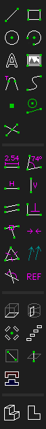
Here are the toolbars side-by-side again with the modifications I've made.
| Master | @jkrei0 |
|---------|----------|
|  |
| 
| | 
 |
|
jkrei0
on 21 Dec 2020
Here are the toolbars side-by-side again with the modifications I've made.
All seems fine, but looking on full toolbar your variant of step-rotate.png looks too much contrast.
I suggest to choose my previous variant described in https://github.com/solvespace/solvespace/issues/857#issuecomment-748863140
Also propose move "View Toolbar" from "Property Browser" directly in main window as on-top horizontal toolbar (additionally move in3d.png and ontoworkplane.png from "Toolbar" on the right side of "View Toolbar"):

Symbian9
on 21 Dec 2020
I do like the idea of moving the view buttons to that toolbar. It seems like they fit better there.
I'm not sure about moving the toolbar to the top of the window, I kind of like it in the property browser. Maybe adding a second row of icons to the property browser? That's not really my decision to make though, and I don't have too much for or against either layout.
I also did a bit more work on the icons for the property browser.
 (my icons)
 (current icons)
I know the first icon there is the wrong color. That's my bad. here's the one with the right color 
(and I also fixed some shading on this icon  )
)
jkrei0
on 21 Dec 2020
All seems fine, but looking on full toolbar your variant of
step-rotate.pnglooks too much contrast.
In the full toolbar, it is. I was hoping to be able to have the angled step-rotate.png image. Though without it being double-thick it doesn't have enough contrast, and when it is double thick it's too much. I guess I'll settle for yours where the lines are straight horizontal and vertical.
jkrei0
on 21 Dec 2020
I also did a bit more work on the icons for the property browser.
And here is "View Toolbar" with @jkrei0's icons + just little redesigned in3d.png & ontoworkplane.png

@jkrei0, I'm not sure was it a good idea to recolor workplane edges on ![]()
workplane.png to white — think this icon need some redesign, but workplane edges should not be shown as white anyway (as on all other icons we use white for sketch lines or solid edges).
(and I also fixed some shading on this icon
UPD: I just added few more fixes to your shaded.png & faces.png.
UPD2: Also here little fixed workplane.png icons (to be in style of "normals") + reorganized order on main "Toolbar" to be more compact & more logical:

Symbian9
on 21 Dec 2020
@jkrei0, I'm not sure was it a good idea to recolor workplace edges on
workplane.pngto white
Yeah, I see that.
I thought I corrected that in my edit and made it grey. Your version with the same color as the normals is much better. I think your versions of in3d.png & ontoworkplane.png need a bit of work, but I like the change overall.
jkrei0
on 21 Dec 2020
I also did a bit more work on the icons for the property browser.
I like yours better. There is one thing though, and I say this as a persons with a mild red-green deficiency. The red in the first icon and some of the others is very hard for me to see. Bringing it up in brightness is helpful, but also mixing in a small amount of either green or blue will help. You don't need to make it look bright orange or anything, just brighten it for those who don't perceive the pure red as easily.
Same was done with blue and yellow text a while back.
Oh, and I prefer the 45 degree anlged boxes for the rotate icon. And I'll take whatever I can get for Revolve an Helix.
Thank you!
phkahler
on 22 Dec 2020
Oh, and I prefer the 45 degree anlged boxes for the rotate icon
By the 45-degree one, I assume you mean this 
(as opposed to the one with lighter less visible lines)
Someone else should probably find a shade of red that works better. I'm terrible at picking colors for things.
jkrei0
on 22 Dec 2020
This just came across hacker news:
https://www.pushing-pixels.org/2011/11/04/about-those-vector-icons.html
phkahler
on 24 Dec 2020
This just came across Hacker News:
- https://www.pushing-pixels.org/2011/11/04/about-those-vector-icons.html
> So no, SVG is definitely not the answer. At least not today.
@phkahler, As article written in 2011, it is outdated in 2020.
In last 5 years mostly all modern software (such as Blender, GIMP, QCAD, LibreCAD, FreeCAD, Inkscape, Scribus, etc.) already switched own GUI toolbars to use scalable/vector icons in SVG format.
Full HN thread:
- https://news.ycombinator.com/item?id=25517084
- comment about Haiku OS vector icons - https://news.ycombinator.com/item?id=25517084#25524366
Symbian9
on 24 Dec 2020
Full HN thread:
* https://news.ycombinator.com/item?id=25517084

  * comment about Haiku OS vector icons - https://news.ycombinator.com/item?id=25517084#25524366
Well, I read the whole 2011 article carefully, and the whole thread at HN and I am even more convinced than before that I do not want vector icons.
ruevs
on 25 Dec 2020
Well, I read the whole 2011 article carefully, and the whole thread at HN... I do not want vector icons.
@ruevs, And now try reread actual issue thread title carefully:
Vector source for UI icons
In the first comment I just proposed create vector source for UI icons, and then render it to raster for SolveSpace 3.0 (instead of create each "pixelart" by hands):
P.S. Adding vector icons is a task for SolveSpace 4.0.
Symbian9
on 25 Dec 2020
Someone else should probably find a shade of red that works better. I'm terrible at picking colors for things.
@jkrei0 I'd say no alpha and go with RGB = 220, 32, 32 or even brighter on the red component. 240 is better IMHO but I don't want to make it ugly for normal people either.
phkahler
on 9 Jan 2021
The bottom left icon for "Nearest Isometric View" does not show an isometric view. Just sayin' since we've gone into detailed discussion about various specific icons ;-)
Edit: Just noticed there are some alternates being tried in the above discussion.
phkahler
on 10 Jan 2021
The bottom left icon for "Nearest Isometric View" does not show an isometric view
Edit: Just noticed there are some alternates being tried in the above discussion.
Yep. And I already proposed to fix this by redesign in3d.png & ontoworkplane.png icons:
FTR, Actual in3d.png looks like a "Cabinet" projection (instead of "Isometric"):
 Symbian9
on 11 Jan 2021
Symbian9
on 11 Jan 2021
Related issues
 brothermechanic
·
9Comments
brothermechanic
·
9Comments
 Harvie
·
6Comments
Harvie
·
6Comments
 Timmmm
·
7Comments
Timmmm
·
7Comments
 probonopd
·
5Comments
probonopd
·
5Comments
 michthom
·
9Comments
michthom
·
9Comments
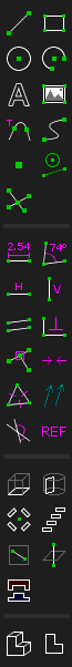
Most helpful comment
I like the one with the stippled lines.
Here are the toolbars side-by-side again with the modifications I've made.
| Master | @jkrei0 | |
| 

 |
|
|---------|----------|
|
| |