Skin.arctic.horizon: [Request] Clearlogo on Fullscreen Widget
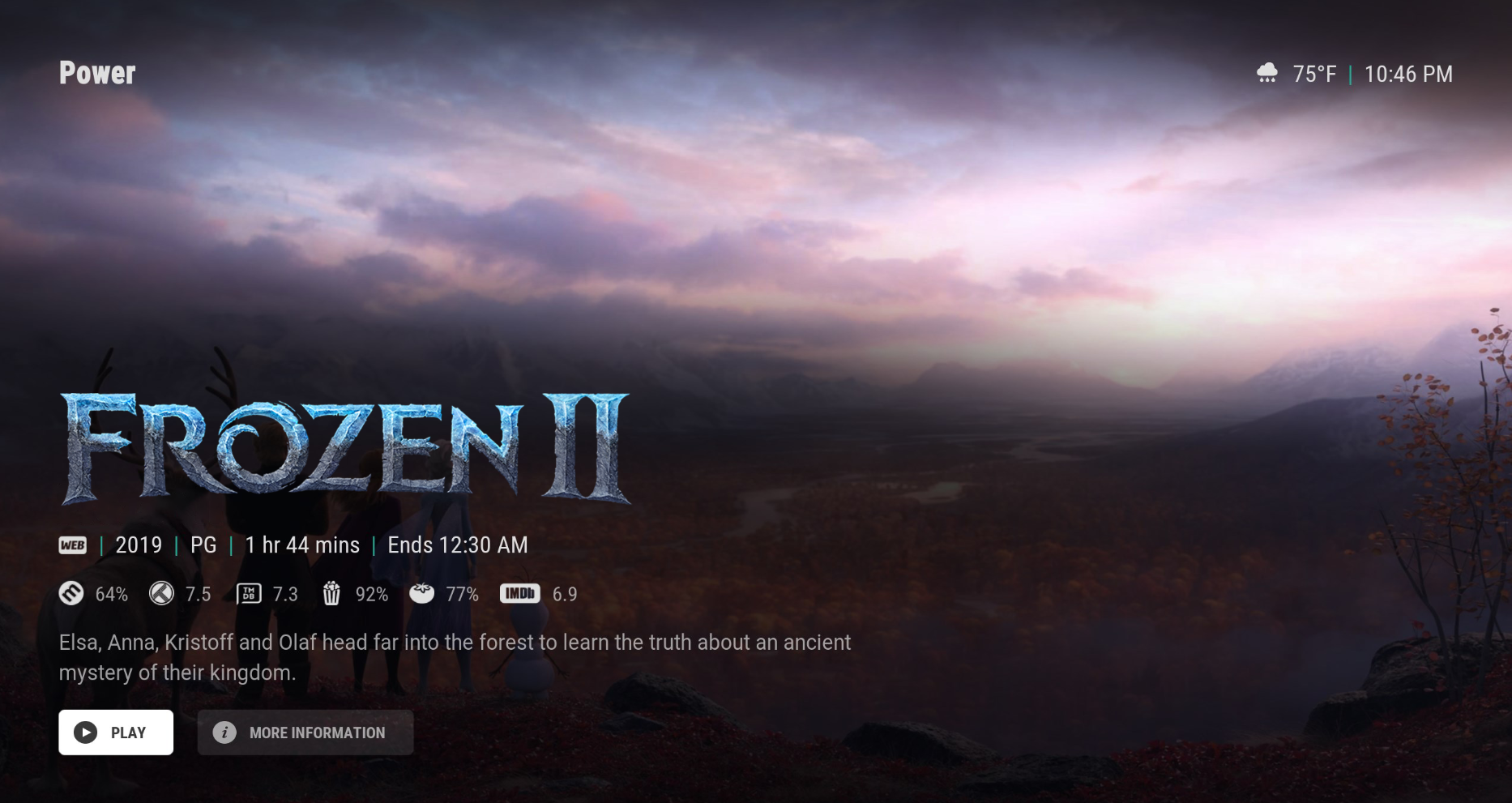
First of all, I could've sworn that either the Showcase Hub or the screensaver used to show clearlogo in this position... but It would be really sweet if we could get clearlogo in the bottom right of these "fullscreen"-styled widget scenarios. I made a quick mockup, as an example, but it's certainly possible my measurements aren't quite right :sweat_smile:

 drinfernoo
All 12 comments
I think it would be cool if it would Replace the text if available , and fall back to text if not
 SerpentDrago
on 2 Sep 2020
SerpentDrago
on 2 Sep 2020
like this , or even larger
SerpentDrago
on 2 Sep 2020
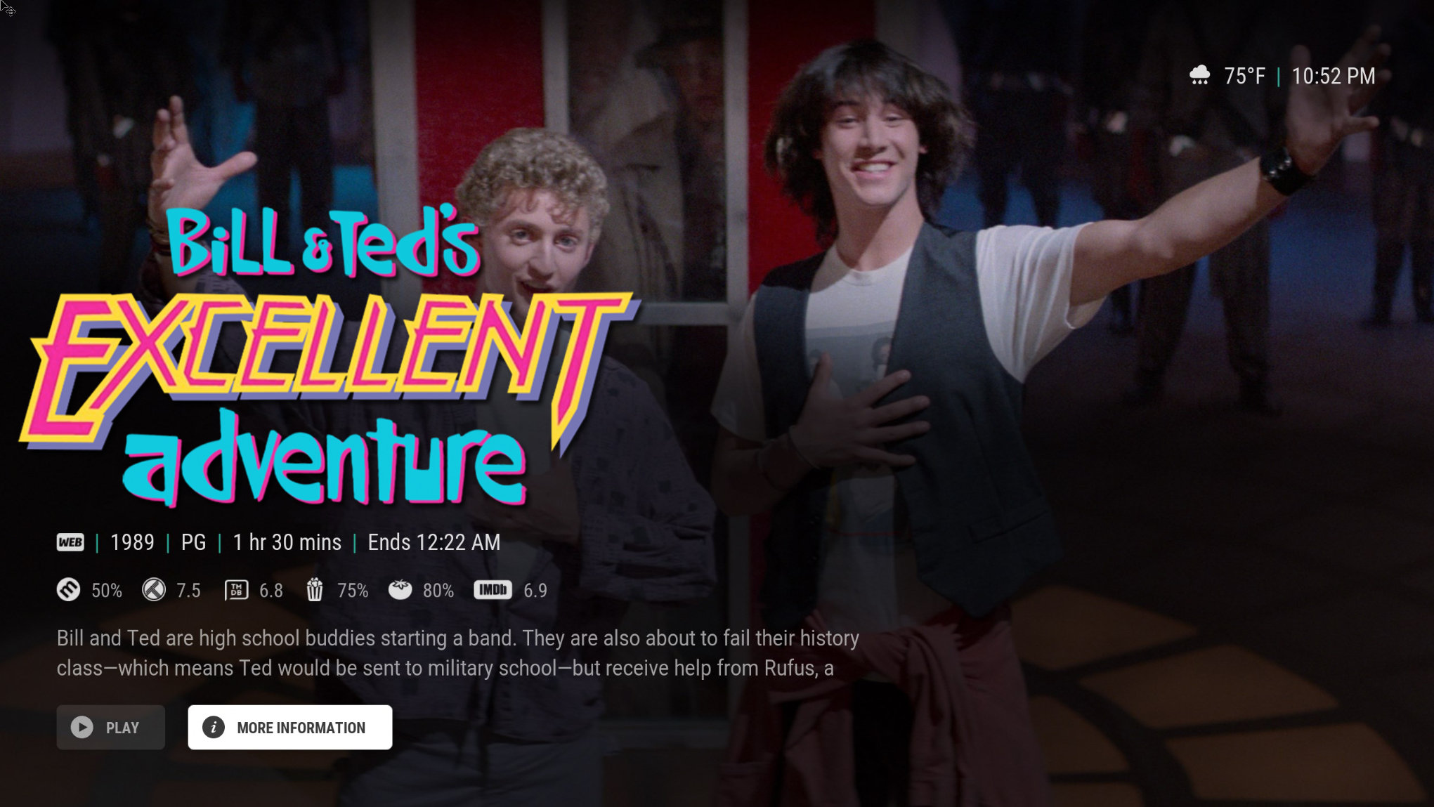
Honestly while we are at it , offer option to remove the top left "section" label , where it would have said power for me
SerpentDrago
on 2 Sep 2020
@SerpentDrago That one is coming: https://github.com/jurialmunkey/skin.arctic.horizon/issues/243
But I think the main reason he's always stayed away from having such a prominent clearlogo is due to what are often drastic differences in sizing and relative position, as well as availability.
I do agree it looks nice, but also feel clearlogo along the right side of the screen "lines up" better visually with clearart in the skin.
drinfernoo
on 2 Sep 2020
Yeh i can understand the reason not to . i'd just like the option even if its not always perfect depending on the logo. Honestly 99 times out of 100 it works and looks perfect in auramods spotlight . I think the "fall back title text" could be a bit larger to no matter what he decides
great to hear about the header text !
SerpentDrago
on 2 Sep 2020
@SerpentDrago - Pretty much exactly what drinfernoo said. The main reason I've shied away from using clearlogos as title is because they don't have strong alignment edge (unlike clearart which aligns bottom right) and will often have blank/dead transparent space with a centered logo. The top rated Jurassic Park logo particularly annoys me, particularly since there is another version which uses the space much better.
Right or center positioning for clearlogo works because exact alignment isn't as important since there isn't text underneath (an uneven margin makes your eyes work much harder to parse text quickly on screen).
Also, making the clearlogo that large is a problem because it won't align correctly with the top edge when you scroll to the next widget. Having clearlogo there means forgoing either ratings, plot or buttons -- all of which I imagine are probably more highly preferred: ratings/plot because that widget is typically about discovery of something to watch; buttons because people with six button remotes don't have a way to access info without context menu and there's no <oncontext> tag that will allow me to pass the context action through to the background list.
@drinfernoo - to answer your question, yes fullscreen widget definitely had clearlogo as seen in this screenshot - just need to figure a few things out in terms of getting it to work properly for both menu types. Problem essentially boils down to figuring out a way to hide it when second widget is focused for horizontal menu. The vert menu is fine because it will hide whenever fullscreen widget isn't focused since it needs to hide for the slide over animation. However, since horizontal doesn't slide, the clearlogo needs to be visible anytime fullscreen widget is onscreen but needs to hide when second widget is focused because of the clearart. Problem is that getting details about a different widget in a skinshortcut template is difficult.
 jurialmunkey
on 2 Sep 2020
jurialmunkey
on 2 Sep 2020
Fixed in latest.
jurialmunkey
on 2 Sep 2020
@jurialmunkey I understand your reasons . It is jarring when the logo doesn't really align or if there is a lack of a logo.
Just fyi if you never seen Auramod's showcase .
Also if you could look at that for another few things i wanted to run past you . While i have you here . watch the video above to see examples .
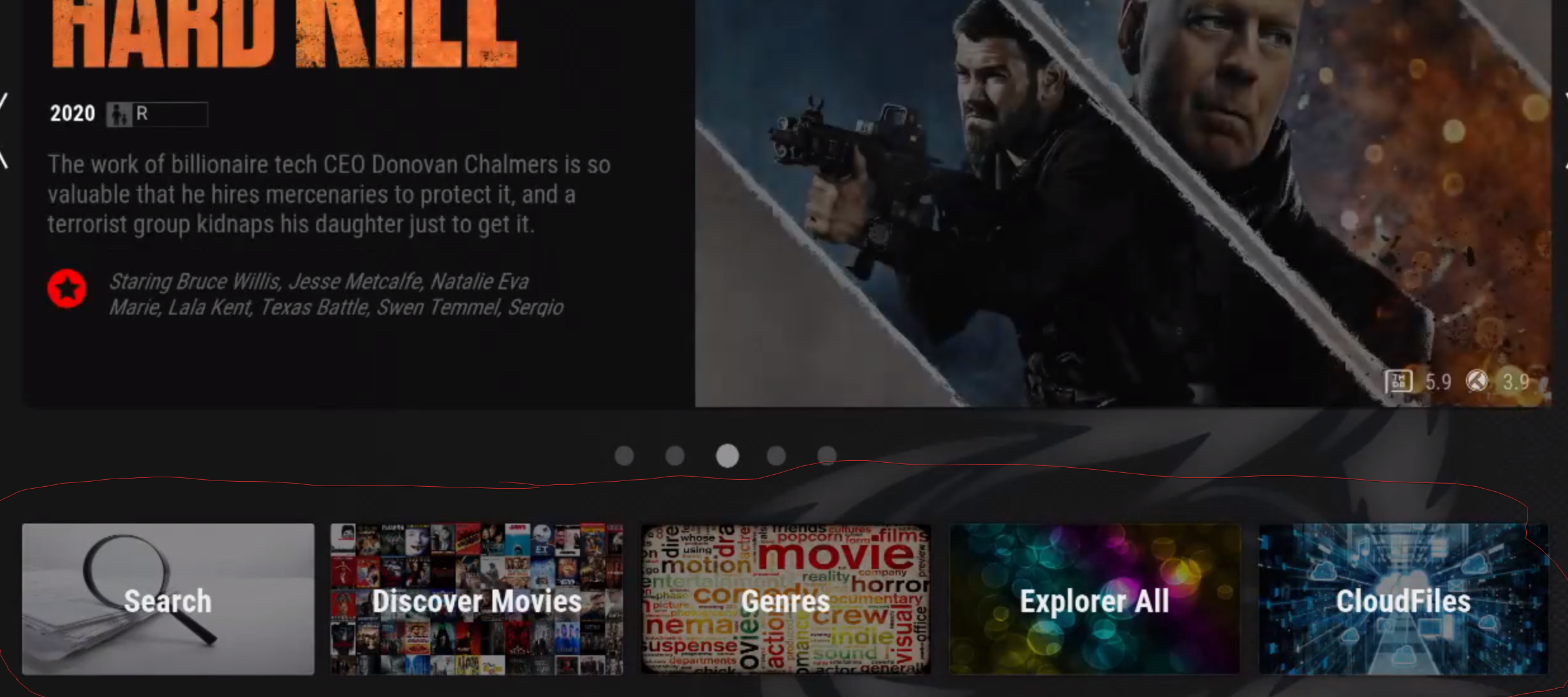
- The Category widgets / submenu underneath the showcase . Is there any way you can add the ability to set background in AH kinda like they are in auramod , Where they take up the entire "button" . Basically in auramod you can set background on the category widgets , Then you set the icon to "none" icon , and it will then center the Widget name . I think it could look fantastic in AH . with Ah's nice smooth fonts and borders . I'd kill to have this ability without having to fork it myself .
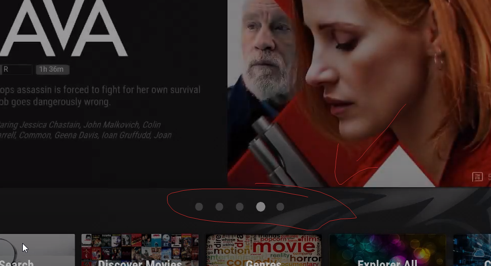
- Some kinda of indicator on which Full screen widget your on (like if there is 5 /10 total items in the Full Screen widget , what # your currently on . Really not a big deal at all but just wondered if you liked this design idea .
- Alignment of Category widgets / submenu under the showcase in auramod FIT in a single page , that way you see the big showcase widget and the cat widgets without scrolling . Wonder if the same could kinda be done in AH with Submenus and the full screen widget .
as you can see i'm basically trying to replicate the look i have in auramod slightly in AH , I love what you have done in AH and how smooth it is and your choice of fonts . General design is amazing . and auramod is for SURE clunky in comparison . but i'm having issues switching just yet . After AH development has calmed down a bit i may just fork and do some mods .
Anyways , Thanks for all you do , just ignore my suggestions if they dont' fit with your vision , Working with sky and helping with auramod I FULLY understand not wanting to add even more options and alignment stuff to a skin , as it can get very much a pain in the * to work with , when there is to many settings .
Have a great day !
SerpentDrago
on 3 Sep 2020
@SerpentDrago
Submenu Backgrounds (1)
I had actually been playing around with a similar idea quite a while ago where I wanted to include backgrounds not just for submenu items but also for library nodes - I never got around to fully implementing it because I ran into the issue of what to do with custom nodes/playlists etc. Plus it was a lot of work sourcing suitable and nice looking background artwork that also had an appropriate license. I wish I saved some screenshots because it looked quite good.
Opened an issue here: https://github.com/jurialmunkey/skin.arctic.horizon/issues/270
Item Indicator (2)
Yep good idea, I'll look at adding something to indicate the item position for background widget. The main issue is that because the item limit can be variable, then something like dots are not really feasible and I'd rather not have yet another piece of text floating somewhere on screen. I'll see what I can come up with.
Opened an issue here: https://github.com/jurialmunkey/skin.arctic.horizon/issues/271
Widget Alignment (3)
Honestly alignment is already a pain as it is -- other than the fact that Kodi doesn't really give any control over positioning in grouplists and so requires a series of hacks to force the positioning I want, the big issue is that skinshortcut templates don't really have a way for each widget to get info about other widgets in the group
e.g. It's pretty much impossible to tell what the widget above/below will be and then include the correct top/height positioning in the template on that basis. Instead I have to resort to less than satisfactory hacks/tricks that involve reactionary visibility conditions. That's really limiting in terms of variations as each potential configuration then requires a bunch of hidden controls which become visible according to configuration rather than only including what is needed (and more controls means worse performance and more chance of bugs/unexpected behaviour).
I think the solution here is probably more likely having a similar type of "lovefilm / large landscape showcase" widget as shown in the video of auramod where the height makes it fit properly on-screen with the submenu. I'll have a think about this and see what I come up with
jurialmunkey
on 3 Sep 2020
Also on the topic of clearlogo as title replacement, here are a few examples of why it doesn't work. These are very popular shows using the default highest rated artwork - so it's not like I went to trouble to find bad examples.
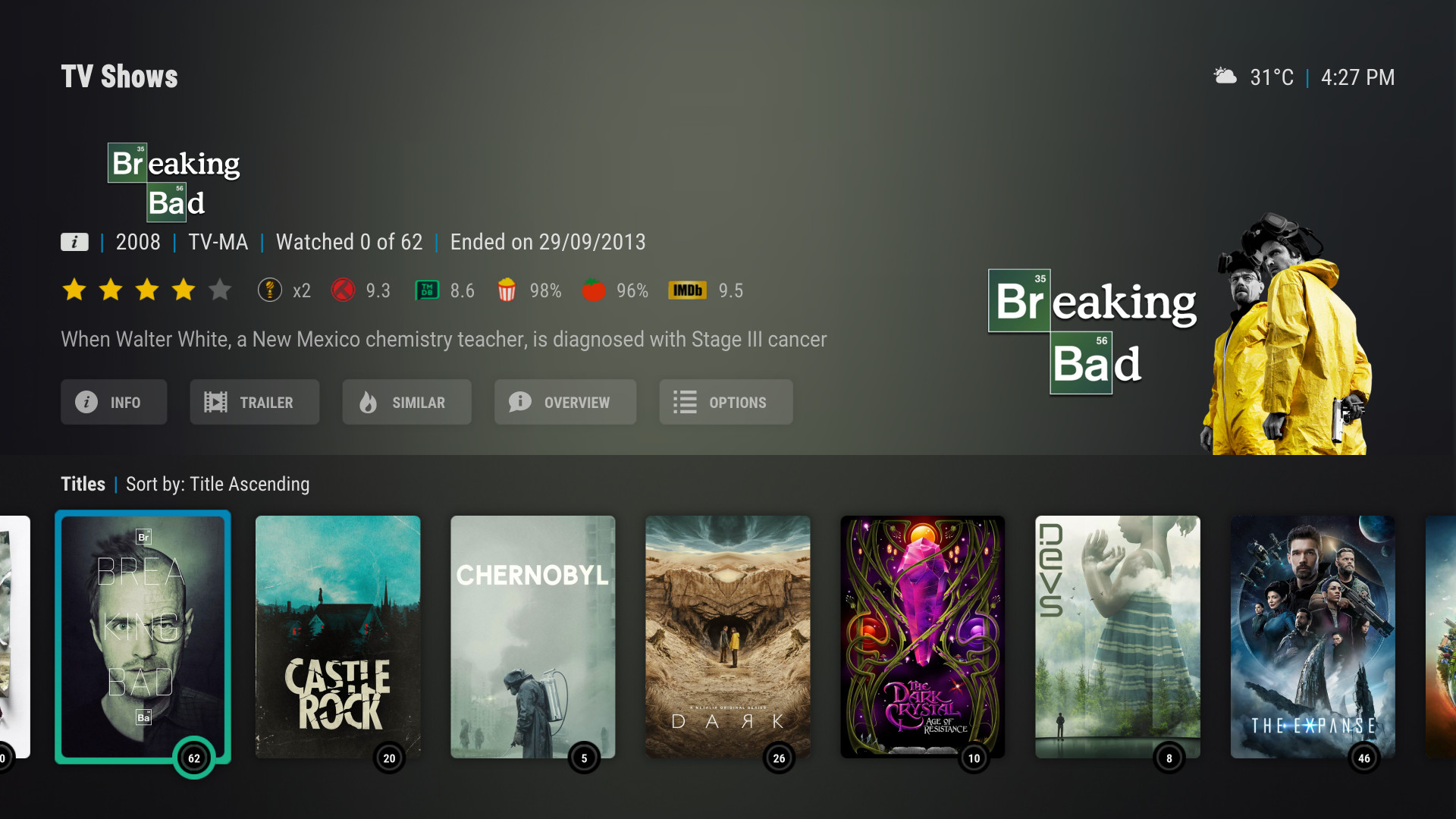
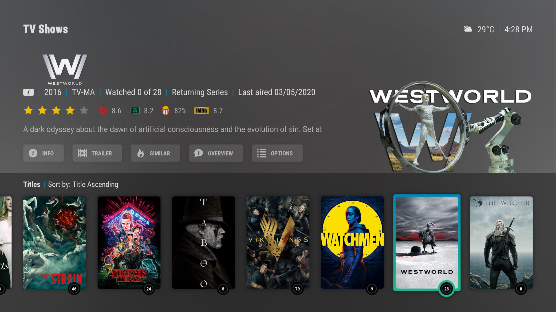
Even with logos that are more suitable, there's often vertical spacing issues due to dead space:

Of course, with the correct cropping the logos can look amazing. Yet even with careful selection of the logos I'm using, I still needed to download and crop all of these manually to get them to align nicely.


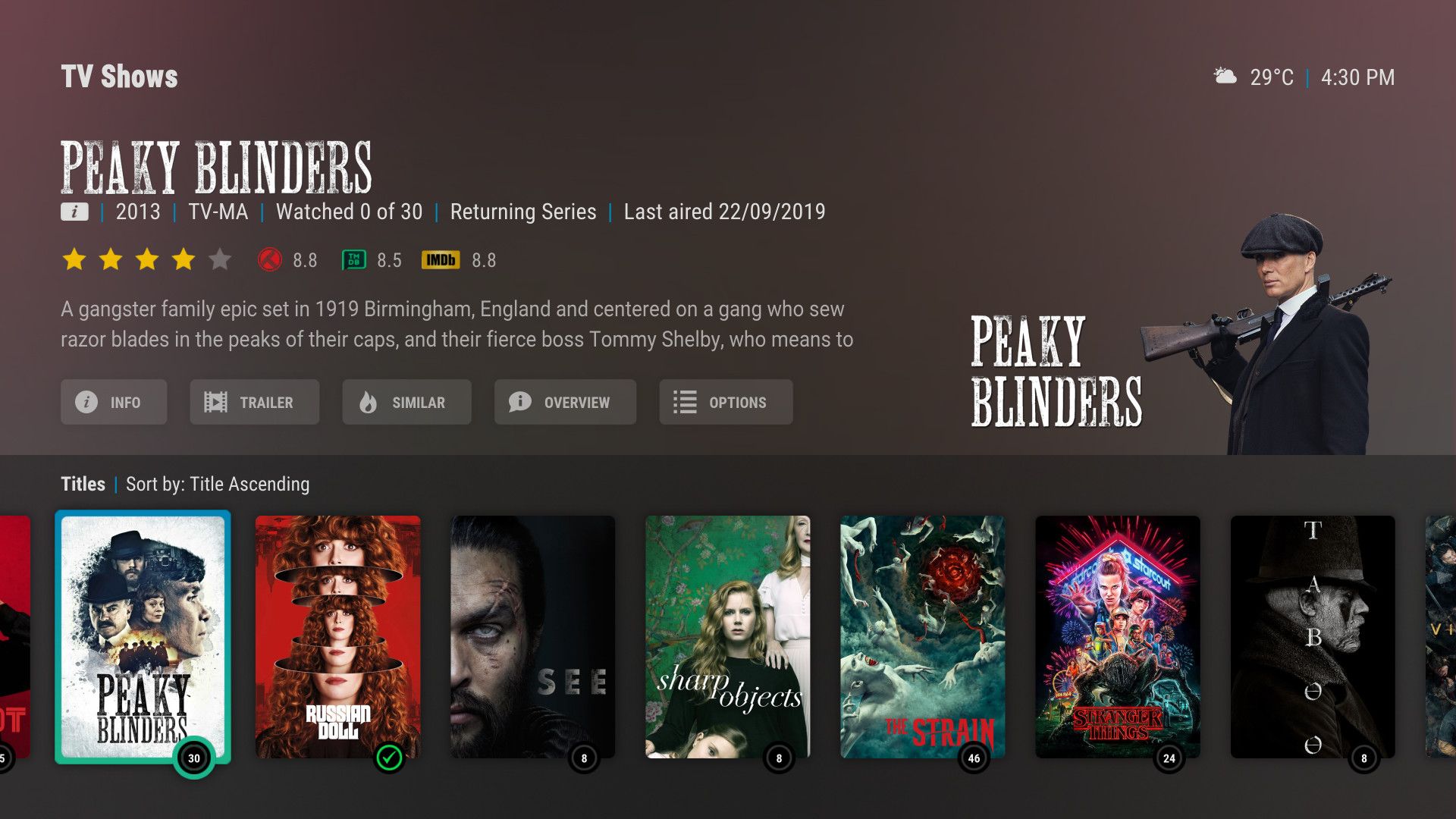
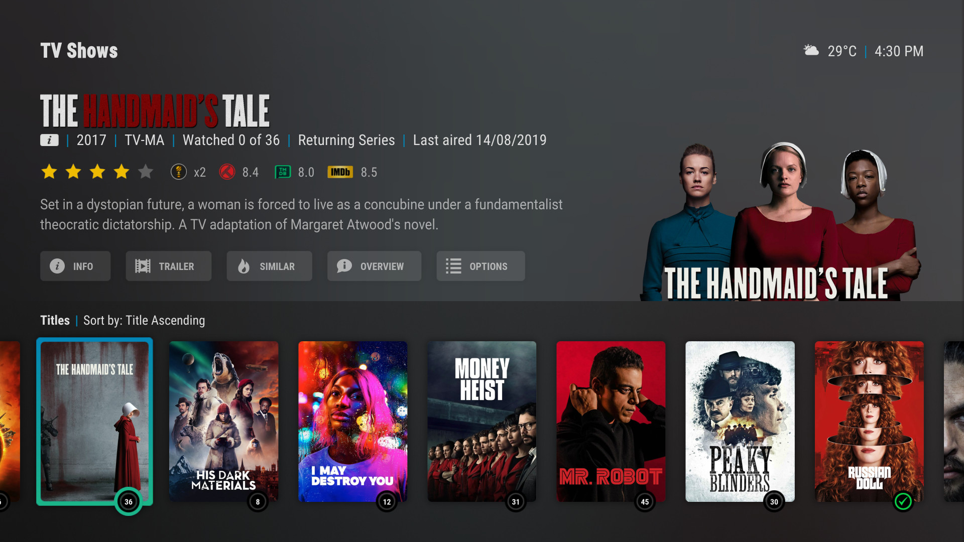
jurialmunkey
on 3 Sep 2020
I think the solution here is probably more likely having a similar type of "lovefilm / large landscape showcase" widget as shown in the video of auramod where the height makes it fit properly on-screen with the submenu. I'll have a think about this and see what I come up with
Yes , i like that !
SerpentDrago
on 3 Sep 2020
Thanks for the response's
SerpentDrago
on 3 Sep 2020
Related issues
 sammy2142
·
6Comments
sammy2142
·
6Comments
 juanma-cvega
·
6Comments
juanma-cvega
·
6Comments
 Blurayx
·
4Comments
Blurayx
·
4Comments
Blurayx
·
4Comments
Blurayx
·
4Comments
 Jackp7173
·
3Comments
Jackp7173
·
3Comments
Most helpful comment
Also on the topic of clearlogo as title replacement, here are a few examples of why it doesn't work. These are very popular shows using the default highest rated artwork - so it's not like I went to trouble to find bad examples.
Even with logos that are more suitable, there's often vertical spacing issues due to dead space:

Of course, with the correct cropping the logos can look amazing. Yet even with careful selection of the logos I'm using, I still needed to download and crop all of these manually to get them to align nicely.