Skin.arctic.horizon: [Question]
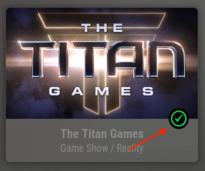
is there an option to change the color of the watched icon?
Thanks
 Blurayx
All 8 comments
The actual png texture is green so changing the colour needs a new texture to be made. Not difficult, but not as simple as just changing the colour definition in the colour scheme.
Why? What colour would you expect it to be? I can make it customisable easy enough, just wondering what the expected usage is so I can determine what the best way to implement it would be.
 jurialmunkey
on 17 Aug 2020
jurialmunkey
on 17 Aug 2020
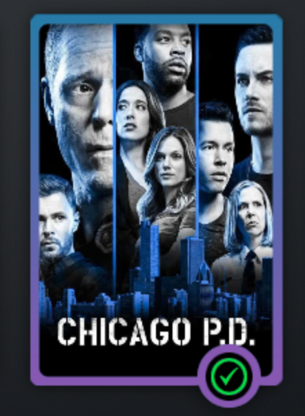
personally I prefer blue or any other subtle colour, Green stands out like a sore thumb with my AH colour scheme.
It would be great if you could make it customisable 😀
As you can see green is not cohesive with my colour scheme.
Thanks
Blurayx
on 17 Aug 2020
Another color in the picker wouldn't be bad 😉
 drinfernoo
on 17 Aug 2020
drinfernoo
on 17 Aug 2020
Ah just remembered why I hardcoded the colour into the texture itself -- colordiffuse variables only respond to the focused item. Basically means if I make it customisable, all indicators will change colour depending on the status of the focused item, which is definitely not wanted!
I can make the colour customisable by including a few different texture options to toggle between but unfortunately not a selectable colour via the colour picker (there's a way to do it but the performance impact won't be worth it - whereas just switching out the texture basically costs nothing).
jurialmunkey
on 19 Aug 2020
@jurialmunkey Could script.skinvariables possibly be leveraged to do it?
I don't know that it does color/image processing now, but I wrote some very simple image overlay logic with PIL in AutoWidget recently that smells to me like it might be relevant 😉
drinfernoo
on 19 Aug 2020
@jurialmunkey Could script.skinvariables possibly be leveraged to do it?
I don't know that it does color/image processing now, but I wrote some very simple image overlay logic with PIL in AutoWidget recently that smells to me like it might be relevant 😉
Unfortunately not. It's something that is baked into how itemlayout in a container works.
If you do colordiffuse="$VAR[MyColorVar]" all the ListItem references in the variable conditions will relate to the focused item not that specific item in the layout. It's the same reason why the colorpicker needs to have an actual physical texture for each possible colour because it can't just use something like colordiffuse="$INFO[ListItem.Property(color)]" in the itemlayout.
Take the following variable:
<variable name="MyColorVar">
     <value condition="String.IsEqual(ListItem.Overlay,OverlayWatched.png)">ff00ff00</value>
     <value>ffffffff</value>
</variable>
Say Item1 is watched and has focus. Item2 is unwatched and unfocused.
In the itemlayout for item2
<label>$VAR[MyColorVar]</label> will output <label>ffffffff</label>
HOWEVER
colordiffuse="$VAR[MyColorVar]" will output colordiffuse="ff00ff00"
I'm pretty sure it's done this way for performance reasons - it's the same reason why referencing external containers or window properties from inside itemlayout will give unexpected results.
Even if we used script.skinvariables to generate a variable per listitem, it's not possible to reference those variables. You can't do something like colordiffuse="$VAR[MyColorVar_$INFO[ListItem.CurrentItem]] because currentitem will refer to the focused item when used in the colordiffuse tag. And anyway, you can't use $VAR/$INFO as part of var/info names because includes build on window load before $VAR/$INFO evaluate.
The only way to do it is to have separate controls for each type of indicator that each have their own colordiffuse definition. That's a performance hit compared to using only one control which switches the texture based on a variable.
jurialmunkey
on 19 Aug 2020
Okay I've played around with a few things. I think if I limit it so you can only edit checkmark colour, and that colour is also tied to the progress indicator colour then it's not too bad because it only results in one extra control with only a few extra visibility conditions (so minimal performance impact).
Means you can't edit new star colour or any of the other indicators. Also means that progress indicator circle will be same colour as checkmark colour. And only the new circle style indicator colour can be edited (can't edit "classic" corner style).
Skin Settings > Items and Views > Watched Indicators > Watched progress colour
jurialmunkey
on 19 Aug 2020
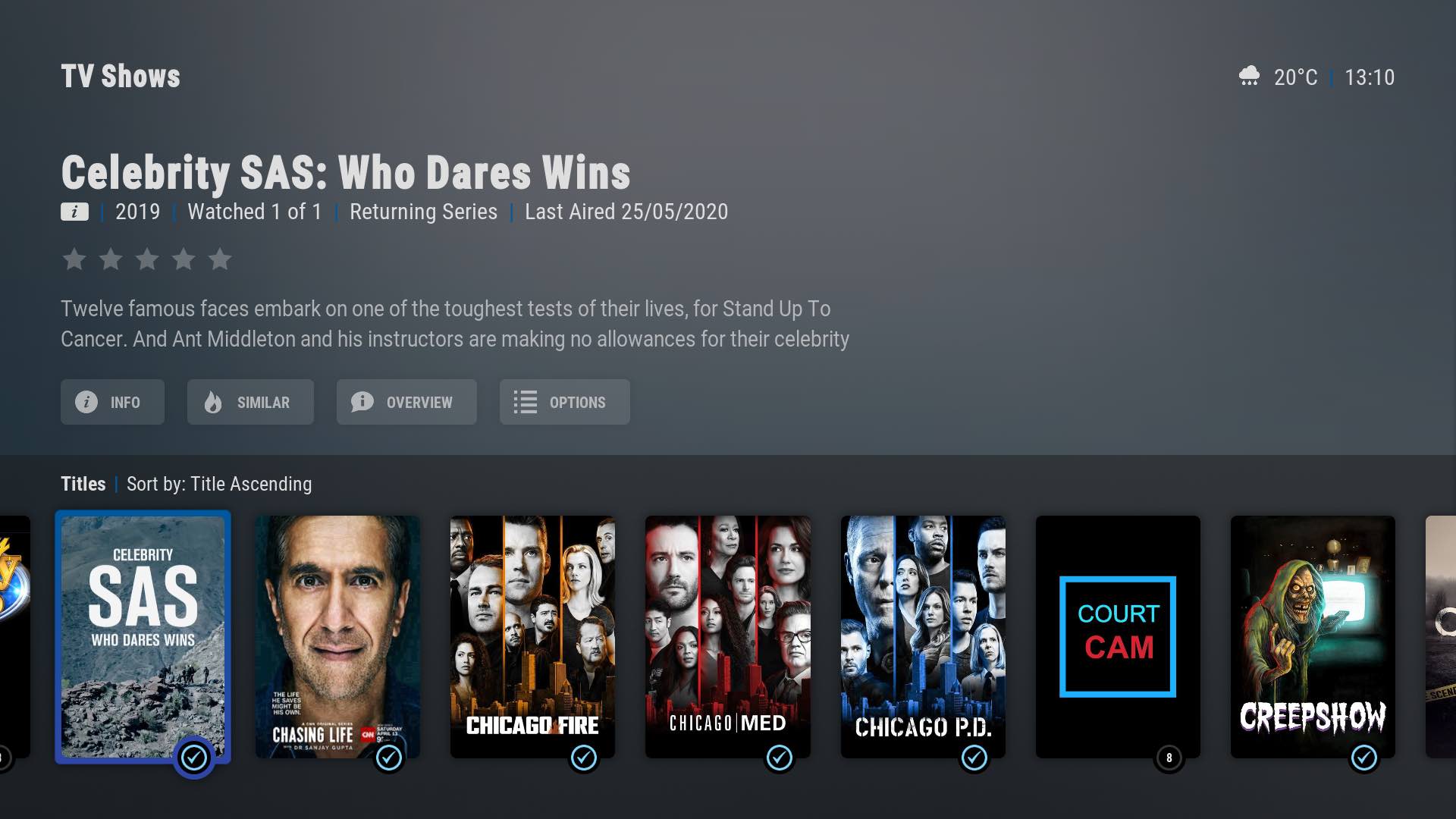
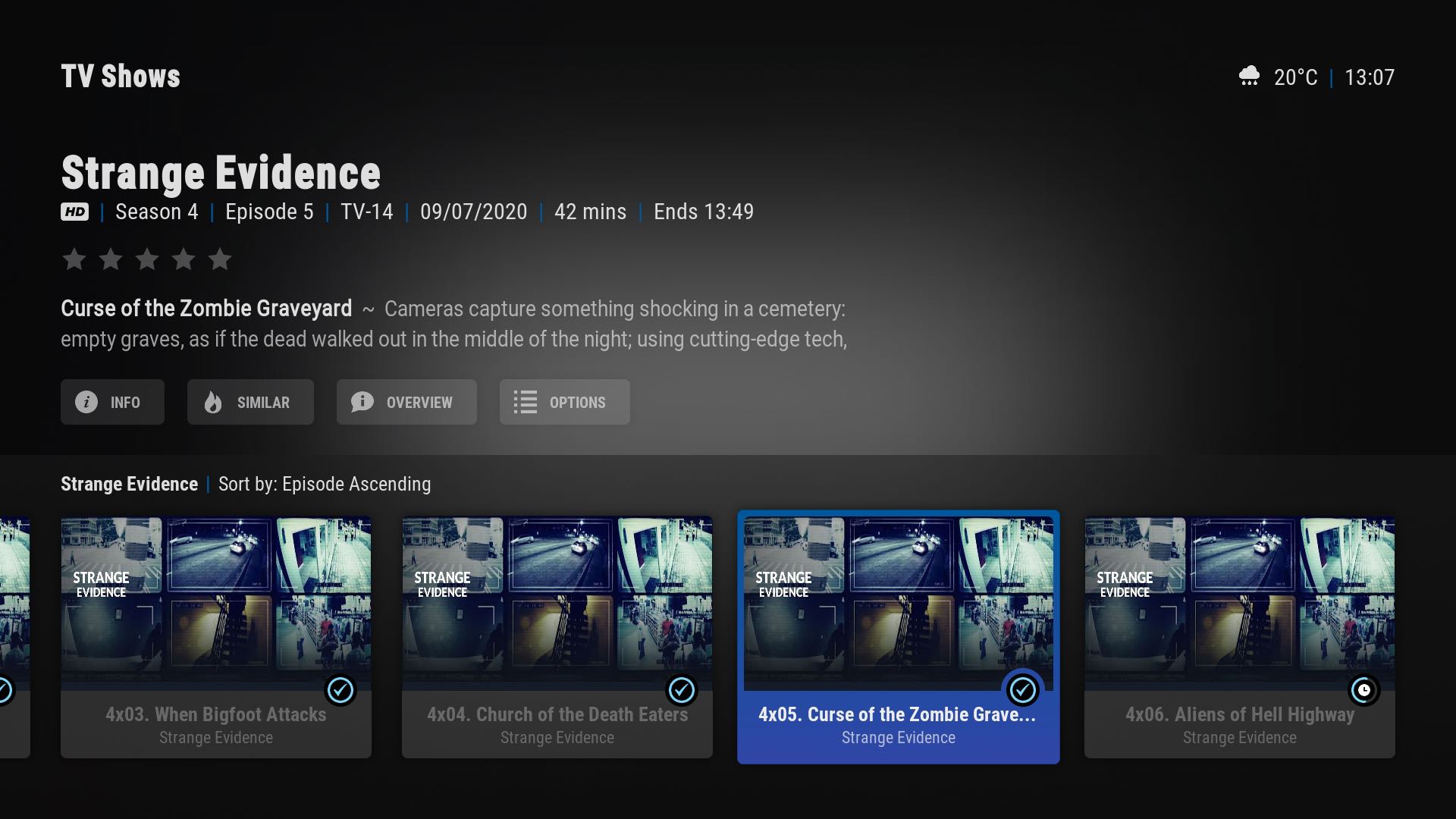
This is amazing. Thank you so much for adding this feature without compromising performance 😀
I really like how my setup is so cohesive.

Blurayx
on 19 Aug 2020
Related issues
jurialmunkey
·
6Comments
Blurayx
·
5Comments
Blurayx
·
5Comments
jurialmunkey
·
3Comments
 onlytanmoy
·
3Comments
onlytanmoy
·
3Comments
Most helpful comment
Okay I've played around with a few things. I think if I limit it so you can only edit checkmark colour, and that colour is also tied to the progress indicator colour then it's not too bad because it only results in one extra control with only a few extra visibility conditions (so minimal performance impact).
Means you can't edit new star colour or any of the other indicators. Also means that progress indicator circle will be same colour as checkmark colour. And only the new circle style indicator colour can be edited (can't edit "classic" corner style).
Skin Settings > Items and Views > Watched Indicators > Watched progress colour