Site-kit-wp: Implement `UserDimensionsPieChart` component for new All Traffic widget
After scaffolding the UserDimensionsPieChart component in #2392, it should now actually be implemented.
_Do not alter or remove anything below. The following sections will be managed by moderators only._
Acceptance criteria
- The pie chart for the new All Traffic widget should be fully implemented and should encompass the UI around the pie chart in the bottom right corner of the widget (see Figma file), including the legend below.
- The chart should use real report data and display a tooltip when one hovers over a slice.
- The chart should be redrawn with new data when another dimension tab is selected.
- If there are more than 5 different dimension values in the resulting report, the chart should include in the piechart only the 4 accounting for the largest amount, and all other values should be aggregated in a single "Others" slice.
Implementation Brief
- Implement the
UserDimensionsPieChartcomponent for the new All Traffic widget following these instructions:
- It should use
<GoogleChart/>component to display the chart and should encompass the UI around the pie chart in the bottom right corner of the widget (see Figma file), including the legend below. - The component should select the current dimension from the
core/formsstore viagetValue( FORM_ALL_TRAFFIC_WIDGET, 'dimensionName' ). If not set, the default should bega:channelGrouping. - The piechart should display data from an Analytics report for the metric
ga:usersand the dimensiondimensionName(see above), dates based on the current date range, and optionally the current entity URL, if there is one. - If there are more than 5 different dimension values in the resulting report, only the 4 accounting for the largest amount should be included in the piechart, and all other values should be aggregated in a single "Others" slice.
- Hovering over a pie slice should show a tooltip exposing the name, percentage value, absolute value, and percentage change over previous period, like it is in the Figma file. The exception to this is the "Others" slice:
- When hovering over any "Others" slice, an alternative tooltip should be shown which only shows "Others" as name, the percentage value, absolute value, and a notice to "See the detailed breakdown in Analytics". The link for now should just point to the Analytics FE via
getServiceReportURL( 'trafficsources-overview' )(#2428 will improve this).
- When hovering over any "Others" slice, an alternative tooltip should be shown which only shows "Others" as name, the percentage value, absolute value, and a notice to "See the detailed breakdown in Analytics". The link for now should just point to the Analytics FE via
- It should use
- The existing Storybook story for
DashboardAllTrafficWidgetV2should have its setup updated, to populate the registry with corresponding test report data, so that the UI rendered byUserDimensionsPieChartis visible there.
Test Coverage
- Not needed.
Visual Regression Changes
- The chart component should appear on the right side of the new All Traffic widget.
QA Brief
- Set up the plugin on your local machine;
- Go to the dashboard page;
- Make sure you see the new All Traffic widget;
- Make sure the new All Traffic widget displays a chart with a legend beneath it on the right side;
- Make sure when you switch dimensions, the chart is redrawn with new data;
- Make sure when you hover over a slice you see a tooltip with appropriate information.
Changelog entry
- Implement
UserDimensionsPieChartcomponent for new Analytics All Traffic widget.
 felixarntz
All 17 comments
@felixarntz this is ready for IBR. Once again, moved implementation details from AC to IB section and updated AC to describe the expected outcome of this ticket. Let me know if it's okay for you.
 eugene-manuilov
on 2 Dec 2020
eugene-manuilov
on 2 Dec 2020
@eugene-manuilov I think overall this looks good, however I'd prefer if we kept ACs untouched or only changed them after discussing the changes. For example, not everything you moved to the IB isn't also valuable for the ACs (for example the handling of more than 5 elements for the piechart). For ACs that include implementation details, it's okay in the IB to list those parts only briefly with "see the ACs for details", while expanding on the parts that the ACs does not cover as much. Let's do that for the future.
IB ✅
felixarntz
on 3 Dec 2020
... however I'd prefer if we kept ACs untouched or only changed them after discussing the changes ...
:+1:
For example, not everything you moved to the IB isn't also valuable for the ACs (for example the handling of more than 5 elements for the piechart).
Ah.. yes, you are right, I have added it back to the AC.
eugene-manuilov
on 3 Dec 2020
@marrrmarrr @felixarntz while working on this ticket I found that the tooltip designed in the Figma file is quite confusing because it is not clear to which number the change belongs. Here is the screenshot from the Figma file:
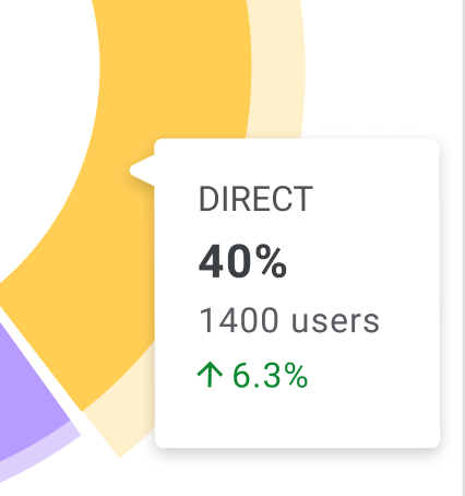
It shows 6.3% growth, but it's not clear what exactly has grown: the percent number or the absolute number of users? If it is the percent growth, then is it growth from 37.74% to 40% (by 6.3%) or absolute number growth from 33.7% to 40% (on 6.3%)?
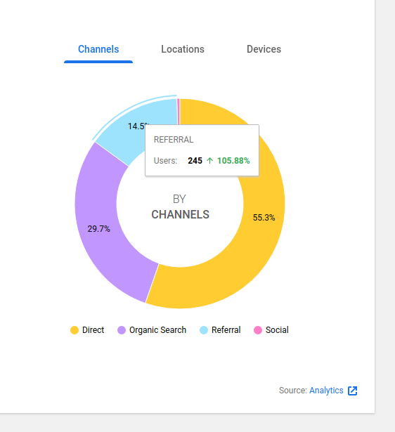
So, I have decided to simplify it a little bit and removed the percent numbers from tooltips since they are already available on the pie slices. The following is what I have come up with. If it doesn't work for you, please, let me know how you want it to display:
eugene-manuilov
on 21 Dec 2020
@marrrmarrr @felixarntz also one more thing that I have found is that there is no way to change the background color for the legend item of the selected slice and make the highlight line of the selected slice thicker. I have looked through the documentation of the Google Charts library and haven't found anything that can help to achieve it. Can we leave the current styles or should we do something else?

eugene-manuilov
on 21 Dec 2020
@eugene-manuilov I've discussed this with @marrrmarrr. Some replies:
- For the tooltip, your proposed content _almost_ looks good. However, let's bring back the percentage so that it is included in the tooltip as well, but more separate from the other two numbers: Let's put the overall percentage right next to the channel name, e.g. like "REFERRAL: 40%".
- Question about the tooltip: The original design has a small arrow pointer from the tooltip rectangle. Is it possible to achieve that with the charts library or not?
- Regarding the alternative pie chart highlighting style, we can go with that given the charts library limitation.
- Regarding the lack of highlighting the currently active legend, this is something we should double-check. The requirement here is that it should be possible to select a pie slice by clicking on the legend for it - is that currently the case or not? And then, if the pie slice is selected, its legend should be highlighted. If the charts library doesn't allow for the exact style we have, that should be fine, but we need to be able to click a legend and then have it highlighted _somehow_. Can you check again if the charts library has _some_ kind of alternative for that?
felixarntz
on 23 Dec 2020
1 . For the tooltip, your proposed content almost looks good. However, let's bring back the percentage so that it is included in the tooltip as well, but more separate from the other two numbers: Let's put the overall percentage right next to the channel name, e.g. like "REFERRAL: 40%".
3 . Regarding the alternative pie chart highlighting style, we can go with that given the charts library limitation.
:+1:
2 . Question about the tooltip: The original design has a small arrow pointer from the tooltip rectangle. Is it possible to achieve that with the charts library or not?
Unfortunately, I think we can't do it with the current functionality of the google charts library.
4 . Regarding the lack of highlighting the currently active legend, this is something we should double-check. The requirement here is that it should be possible to select a pie slice by clicking on the legend for it - is that currently the case or not? And then, if the pie slice is selected, its legend should be highlighted. If the charts library doesn't allow for the exact style we have, that should be fine, but we need to be able to click a legend and then have it highlighted somehow. Can you check again if the charts library has some kind of alternative for that?
Yes, it works as required but it doesn't let us use the exact style for the selected legend item. When I click on a legend item, the appropriate pie slice is highlighted.
eugene-manuilov
on 23 Dec 2020
QA Update: Fail ❌
@eugene-manuilov just a few observations.
- When you only have one dimension in any of the tabs, i.e. channels, the styling is slightly off. Screenshot
- When you switch date periods should the chart be redrawn with new data? I'm not seeing any changes between 28 days and 90 days, although, it could be the data since it's a low traffic site.
- This could be because I am using a local site but I am seeing a JS Error in the console, details below. Please could you confirm?
browser.js:38 Uncaught (in promise) Invariant Violation: userInputState is required.
    at invariant (http://localhost:10004/wp-content/plugins/google-site-kit/dist/assets/js/googlesitekit-vendor.009c5e4699d86cc49812.js:87981:15)
    at Object.receiveUserInputState (http://localhost:10004/wp-content/plugins/google-site-kit/dist/assets/js/googlesitekit-datastore-user.90198150d6ee78df96e6.js:2277:53)
    at getUserInputState$ (http://localhost:10004/wp-content/plugins/google-site-kit/dist/assets/js/googlesitekit-datastore-user.90198150d6ee78df96e6.js:2490:28)
    at tryCatch (http://localhost:10004/wp-content/plugins/google-site-kit/dist/assets/js/googlesitekit-vendor.009c5e4699d86cc49812.js:205950:40)
    at Generator.invoke [as _invoke] (http://localhost:10004/wp-content/plugins/google-site-kit/dist/assets/js/googlesitekit-vendor.009c5e4699d86cc49812.js:206179:22)
    at Generator.prototype.<computed> [as next] (http://localhost:10004/wp-content/plugins/google-site-kit/dist/assets/js/googlesitekit-vendor.009c5e4699d86cc49812.js:206002:21)
    at http://localhost:10004/wp-content/plugins/google-site-kit/dist/assets/js/googlesitekit-vendor.009c5e4699d86cc49812.js:207243:55
    at http://localhost:10004/wp-content/plugins/google-site-kit/dist/assets/js/googlesitekit-vendor.009c5e4699d86cc49812.js:59442:9
    at http://localhost:10004/wp-content/plugins/google-site-kit/dist/assets/js/googlesitekit-vendor.009c5e4699d86cc49812.js:207258:18
    at Array.some (<anonymous>)
Verified:
- When on the dashboard, the new All Traffic widget appears.
- The new All Traffic widget displays a chart with a legend beneath it on the right side Screenshot
- When you switch dimensions, the chart is redrawn with new data
- When you hover over a slice you see a tooltip with appropriate information. Screenshot
 wpdarren
on 6 Jan 2021
wpdarren
on 6 Jan 2021
Thanks, @wpdarren!
- When you only have one dimension in any of the tabs, i.e. channels, the styling is slightly off. Screenshot
Yep, I'll create a new PR for it. I have to hide the single slice text because we can't control where it appears.
- When you switch date periods should the chart be redrawn with new data? I'm not seeing any changes between 28 days and 90 days, although, it could be the data since it's a low traffic site.
Yes, it should change. Just try it on a site with more data.
- This could be because I am using a local site but I am seeing a JS Error in the console, details below. Please could you confirm?
This doesn't seem to be related to the current ticket because it is user input settings related stuff. You can probably open a follow-up ticket for it.
eugene-manuilov
on 6 Jan 2021
QA Update: Fail ❌
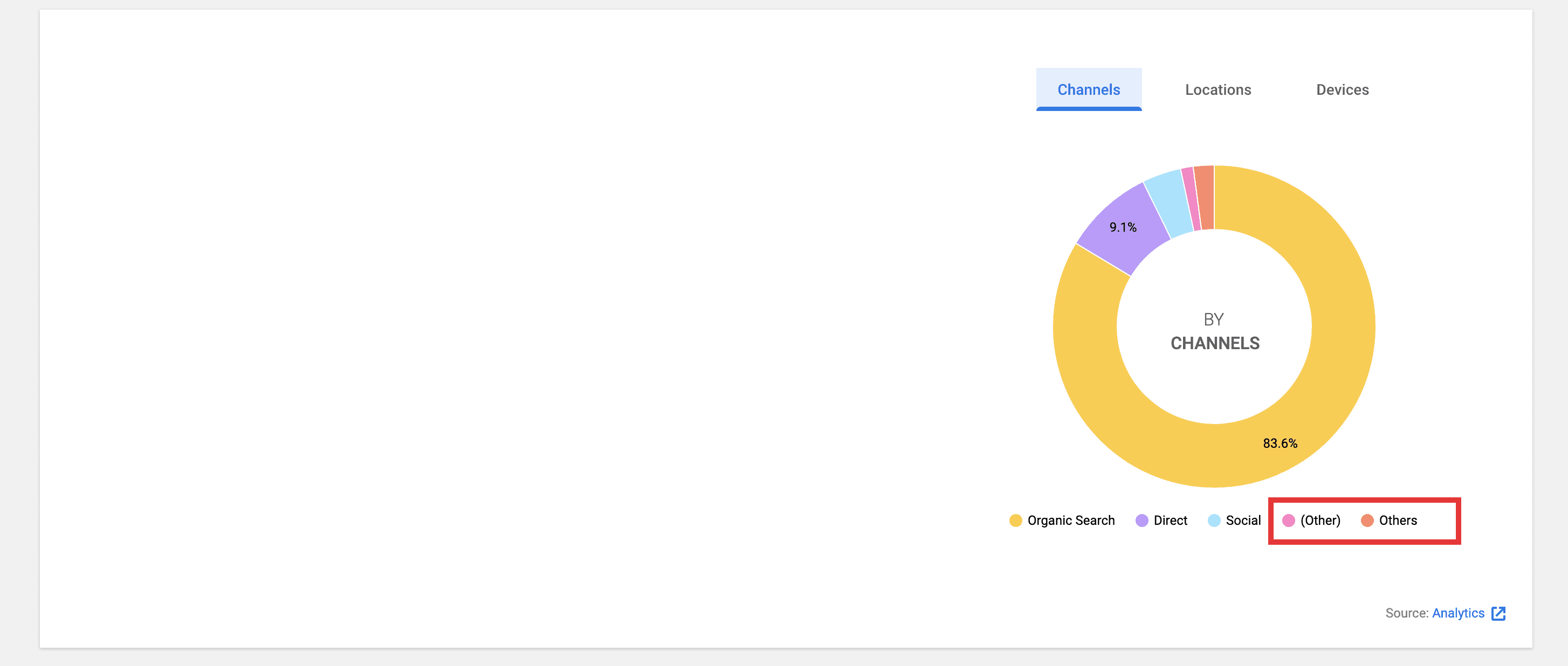
@eugene-manuilov I have a few more observations on a site that has more traffic.
- On the Channels tab, there is a slice for
(other)andothersis this expected?
- When you hover over the tooltip, it flashes fast and is difficult to read (and annoying) See screencast below.
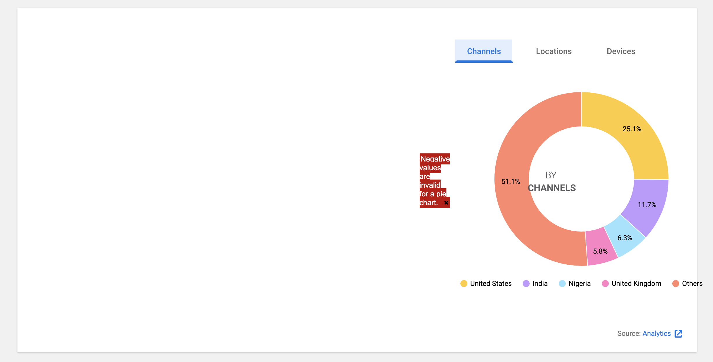
- On the Channels tab, when you select 7 days, a message appears
Negative values are invalid for a pie chart.
wpdarren
on 7 Jan 2021
- On the Channels tab, there is a slice for (other) and others is this expected?
Hm... it's definitely not expected. @felixarntz what do you think if I turn off "Others" for the channel dimension if it already has (Other)?
- When you hover over the tooltip, it flashes fast and is difficult to read (and annoying) See screencast below.
Unfortunately, we can't control it.
- On the Channels tab, when you select 7 days, a message appears Negative values are invalid for a pie chart.
Hm... good catch... I'll work on it.
eugene-manuilov
on 7 Jan 2021
@wpdarren can you add me to your GA account so I can see the negative value issue on my end as well?
eugene-manuilov
on 7 Jan 2021
@eugene-manuilov Regarding the "(other)", I agree that's confusing, but it's expected right now because the way that the API segments that is likely different from our approach for "Others" (which is to simply cut off entries other than the first five). We cannot omit "Others" because to us "(other)" is a dimension like any other, and it looks like the Google API response also has entries after that, which wouldn't be reflected if we just stripped our "Others".
Let's think about this separately and not worry about it as part of the initial implementation.
felixarntz
on 7 Jan 2021
@wpdarren see Felix's reply above ^. Could you please create a follow-up ticket for it? The remaining part is the negative values issue which I can't reproduce atm on my local :thinking:
eugene-manuilov
on 7 Jan 2021
QA Update: Fail ❌
@eugene-manuilov
The legend underneath the pie charge for Devices is all in lowercase, whereas the other tabs are in title case.
So that it is consistent could we change this?
FYI: I will create a ticket for the (other)/others issue as highlighted above. Have made a note to do this ASAP. All of the other issues on this ticket have been fixed.
wpdarren
on 11 Jan 2021
@wpdarren this is what Google returns to us. We can't modify labels there.
eugene-manuilov
on 11 Jan 2021
@eugene-manuilov in that case, this ticket passes! Thank you for your patience.
QA Update: Pass ✅
Verified:
- When on the dashboard, the new All Traffic widget appears.
- The new All Traffic widget displays a chart with a legend beneath it on the right side Screenshot
- When you switch dimensions, the chart is redrawn with new data
- When you hover over a slice you see a tooltip with appropriate information. Screenshot
wpdarren
on 11 Jan 2021
Related issues
 quangbahoa
·
5Comments
quangbahoa
·
5Comments
 quindo
·
5Comments
felixarntz
·
4Comments
felixarntz
·
4Comments
quindo
·
5Comments
felixarntz
·
4Comments
felixarntz
·
4Comments
 jamesozzie
·
3Comments
jamesozzie
·
3Comments
Most helpful comment
@eugene-manuilov Regarding the "(other)", I agree that's confusing, but it's expected right now because the way that the API segments that is likely different from our approach for "Others" (which is to simply cut off entries other than the first five). We cannot omit "Others" because to us "(other)" is a dimension like any other, and it looks like the Google API response also has entries after that, which wouldn't be reflected if we just stripped our "Others".
Let's think about this separately and not worry about it as part of the initial implementation.