Site-kit-wp: Refactor svgs to use React components via svg import
Feature Description
Currently our build process transforms our svgs into a sprite which is then used by a SvgIcon component to render them. This is problematic to moving our asset pipeline over to be fully-managed by Webpack (#1326), and svg rendered in this way lacks benefits such as CSS styling.
_Do not alter or remove anything below. The following sections will be managed by moderators only._
Acceptance criteria
- Webpack should be configured to use
@svgr/webpackfor loading svgs - All svg rendered within React apps should use a
ReactComponentfrom the imported svg file itself
- The
SvgIconcomponent should be removed - All svg sprite-related dependencies and build steps should be removed
- Current React svg components should be moved to svg files and replaced with the import
Implementation Brief
- Install
@svgr/webpackas a dev dependency. - Update webpack config to use
@svgr/webpackloader for*.svgfiles. - Remove
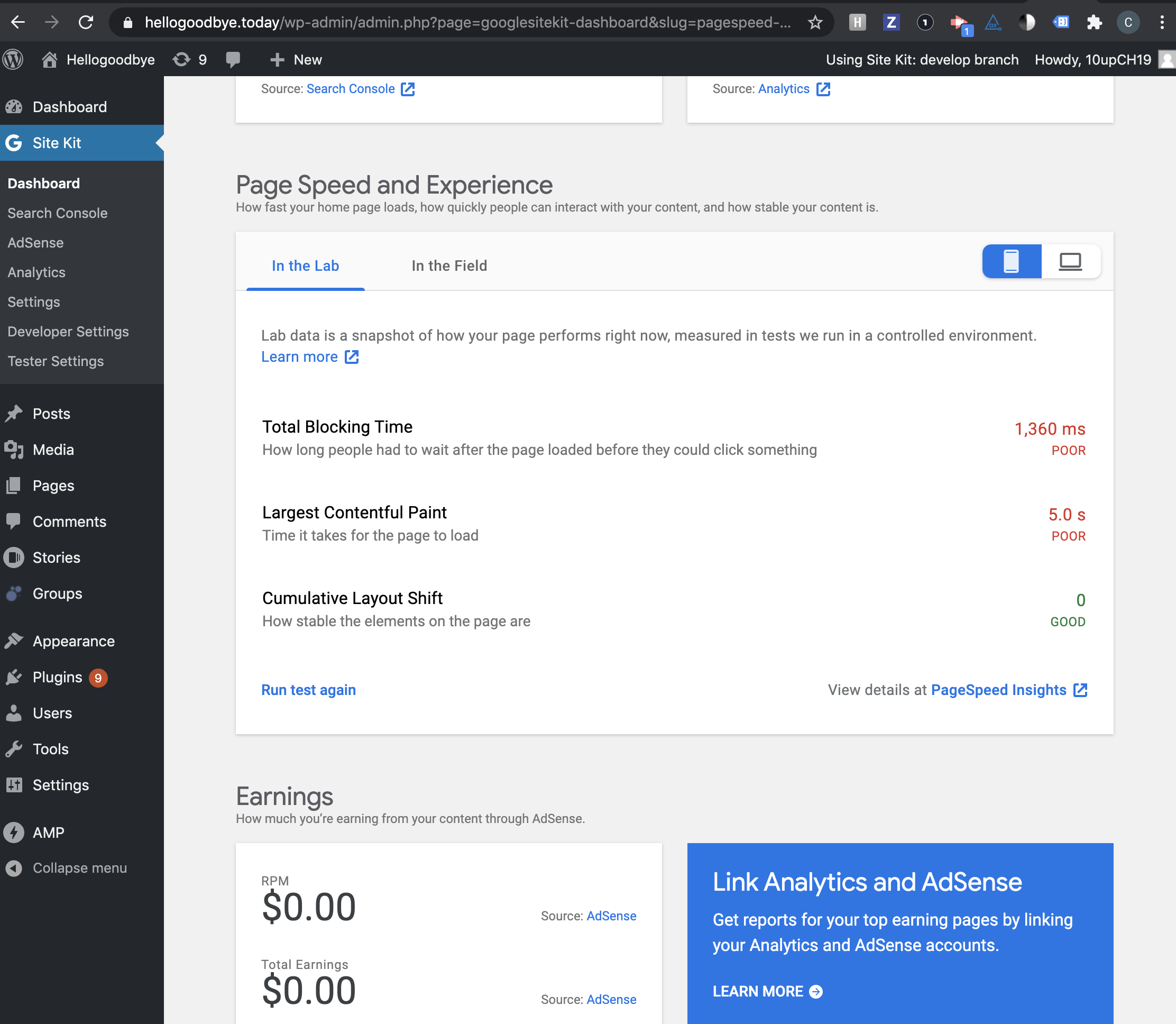
Assets::svg_spritemethod. - Update PageSpeed Insights module icon:
- replace image icon with its svg version.
- use CSS to create disable state for the icon.
- Refactor
PageHeadercomponent:
- Rework it to be functional component.
- Update
iconproperty to bePropTypes.node. - Update icon rendering logic to render an icon passed via property directly instead of using
SvgIconcomponent. - Replace conditional part with
${ props.children }. - Remove
iconWidth,iconHeightandiconIDprops. - Update
AdSenseDashboardWidget,AnalyticsDashboardWidgetandGoogleSitekitSearchConsoleDashboardWidgetcomponents to pass correct icon component toPageHeader. - Remove
googlesitekit.showDateRangeSelector-${ iconID }filter and extract conditional part for date range into a new componentPageHeaderDateRange. - Update
AnalyticsDashboardWidgetandGoogleSitekitSearchConsoleDashboardWidgetcomponents to pass an istance ofPageHeaderDateRangecomponent as a child forPageHeadercomponent. - Remove
googlesitekit.showDateRangeSelector-${ slug }filters fromanalytics/index.legacy.jsandsearch-console/index.legacy.jsfiles.
- Update
DashboardSplashMaincomponent to use icons forsplashModulesitems loaded straight from svg files. - Refactor
DashboardSplashModulecomponent:
- Make it to be functional component.
- Update
iconproperty to bePropTypes.node. - Update icon rendering to render the icon directly instead of passing it to either
SvgIconcomponent orimgtag.
- Update
moduleIconfunction to import svg icons for all modules, select an appropriate icon based on module slug and return it. Passwidth,heightanduseClassasclassNamearguments to the rendered icon component. Rework all occurrences of this function to account for the new behavior. - Update
Notificationcomponent to usemoduleIconto get a module icon component. - Replace all occurences of
SvgIconwith direct usage of svg files. Don't forget to update storybook stories too. - Remove
SvgIconcomponent. - Remove
assets/images/icon-pagespeed.pngfile.
QA Brief
- Changes to SVGs are universal, do a general smoke check that SVGs still behave as before (visual regression tests verify that they look the same already)
- Verify date range functionality within page header still behaves as expected
- AdSense Dashboard via
AdSenseDashboardWidget.js - Analytics Dashboard via
AnalyticsDashboardWidget.js - Search Console Dashboard via
GoogleSiteKitSearchConsoleDashboardWidget.js
- AdSense Dashboard via
Changelog entry
- Use direct SVG imports instead of an SVG sprite which can cause accessibility and testing issues.
 aaemnnosttv
All 16 comments
@aaemnnosttv we would also need to get rid of Assets::svg_sprite method since it's no longer needed too. Plus, I think we need clearly define which tool we need to use for svg imports.
 eugene-manuilov
on 5 Aug 2020
eugene-manuilov
on 5 Aug 2020
Agreed regarding specifying the tool. I've traditionally used the simple svg-url-loader, which is useful if we want to use SVGs in our SCSS. But it's definitely more work to use in React.
I'd recommend we use https://www.npmjs.com/package/react-svg-loader, to make it really easy to add SVGs. It allows us to import SVGs directly like so:
import MyLogo from '../images/myLogo.svg';

<div>
  {/* Outputs an SVG! */}
  <MyLogo />
</div>
If we need support for SVGs in SCSS we can use svg-url-loader for our SCSS files as well, but I don't even know if we need that right now.
 tofumatt
on 5 Aug 2020
tofumatt
on 5 Aug 2020
Actually, chatted with @aaemnnosttv and @svgr/webpack looks good and is what's used by create-react-app, so let's go with that. I trust what the makers of CRA picked 😄
tofumatt
on 5 Aug 2020
@eugene-manuilov removing Assets::svg_sprite makes sense but that's a bit of an implementation detail so let's add that to the IB. The specific loader/tool is also a bit of a detail but I added that to the AC too. Ready for IB!
aaemnnosttv
on 5 Aug 2020
IB looks good, although there are a few things that would be good to add
- We should mention that the PageSpeed Insights module icon will be replaced with an svg (currently only module that uses an image) and there are a few places where this exception is hardcoded e.g. https://github.com/google/site-kit-wp/blob/b61caae583d46caf64b89959077ffeb38bedea1e/assets/js/util/index.js#L591-L595
- As in the above example, places where we use multiple versions of an icon for a disabled state should be consolidated to use the same (full-color) icon and use CSS to style the disabled state (this was already done in one place a while ago so ideally we can share the CSS needed there)
If a dynamic
idproperty is used, import all possible svg files for that component and add a switch to pick an appropriate svg image for providedid.
In some cases, such as PageHeader where the component is rendered with a hardcoded iconID, we should be able to pass the icon through as a component/node prop instead of a string ID.
https://github.com/google/site-kit-wp/blob/b61caae583d46caf64b89959077ffeb38bedea1e/assets/js/modules/adsense/components/dashboard/AdSenseDashboardWidget.js#L160-L161
If that covers all the cases, we should update it to only accept the icon that way rather than adding a lookup-table/switch into that component.
This is just an example, but if we can move the icon ownership to a consuming component and leverage a prop for the icon itself that would be a bit cleaner I think.
One other thing about this component specifically, is that the iconID shouldn't be used as a module slug https://github.com/google/site-kit-wp/blob/6bcbb90f0db8962124fe08f0163ca5c856a08ff8/assets/js/components/page-header.js#L57
As for module icons specifically, I think it would be a good idea to add a dedicated component to each module, for its own icon so that these are always available in the same place for each module.
e.g. assets/js/modules/{module}/components/index.js
export { ReactComponent as ModuleIcon } from '../../../assets/svg/module.svg';
and in SetupMain.js for example we could use it like so
import { ModuleIcon } from '../'
All
SvgIcon uses (not as many as I thought)
25 results - 16 files

assets/js/components/logo.js:
  32:           <SvgIcon
  38:           <SvgIcon

assets/js/components/page-header.js:
  68:                               <SvgIcon id={ iconID } height={ iconHeight } width={ iconWidth } className="googlesitekit-page-header__icon" />

assets/js/components/dashboard-splash/dashboard-splash-module.js:
  46:                   ) : <SvgIcon id={ icon } width="33" height="33" /> }

assets/js/components/dashboard-splash/dashboard-splash-outro.js:
  53:                               <SvgIcon id="logo-g" height="33" width="29" />

assets/js/components/notifications/notification.js:
  260:      const logoSVG = module ? <SvgIcon id={ module } height="19" width="19" /> : <SvgIcon id={ 'logo-g' } height="34" width="32" />;

assets/js/components/settings/settings-module.js:
  383:                                              <SvgIcon
  411:                                                  <SvgIcon

assets/js/components/settings/settings-overlay.js:
  47:                       <SvgIcon id="lock" width="22" height="30" />

assets/js/components/setup-wizard/wizard-progress-step.js:
  59:               statusIcon = <SvgIcon id="exclamation" height="12" width="2" />;
  62:               statusIcon = <SvgIcon id="exclamation" height="12" width="2" />;
  65:               statusIcon = <SvgIcon id="check" height="12" width="16" />;

assets/js/modules/adsense/components/common/AdBlockerWarning.js:
  62:           <SvgIcon id="error" height="20" width="23" /> { message }

assets/js/modules/adsense/components/dashboard/AdSenseDashboardOutro.js:
  45:                               <SvgIcon id="adsense" height="36" width="42" />
  46:                               <SvgIcon id="plus" height="13" width="13" />
  47:                               <SvgIcon id="analytics" height="36" width="34" />

assets/js/modules/adsense/components/setup/SetupMain.js:
  349:                  <SvgIcon id="adsense" width="33" height="33" />

assets/js/modules/analytics/components/setup/SetupMain.js:
  97:               <SvgIcon id="analytics" width="33" height="33" />

assets/js/modules/optimize/components/setup/SetupMain.js:
  61:               <SvgIcon id="optimize" width="33" height="33" />

assets/js/modules/tagmanager/components/setup/SetupMain.js:
  82:               <SvgIcon id="tagmanager" width="33" height="33" />

assets/js/util/index.js:
  589:  let iconComponent = <SvgIcon id={ module } width={ width } height={ height } className={ useClass } />;
  592:      iconComponent = <SvgIcon id={ `${ module }-disabled` } width={ width } height={ height } className={ useClass } />;

stories/wp-dashboard.stories.js:
  58:                               <SvgIcon id="logo-g" height="19" width="19" />
  59:                               <SvgIcon id="logo-sitekit" height="17" width="78" />
TLDR; you don't need to add all of this detail, but just summarizing the important points (mostly the bullet points above) and this should be good to go 😄
aaemnnosttv
on 7 Aug 2020
@aaemnnosttv IB is updated with additional details.
eugene-manuilov
on 8 Aug 2020
IB is looking good @eugene-manuilov 👍 A few points to clarify and then this should be good to go
- Regarding
moduleIcon- I think we can refactor this out as it was mostly needed for handling the disabled variants and the special case for PSI which used an image instead. Now that each module will only have a single svg icon, a central map of[ moduleSlug ]: IconComponentas an export would probably be all that's needed here (perhaps fromassets/js/modules/index.jsor a sibling module), and the rest of the arguments would become props. Since the 3 instances of this function use different arguments (props), I think it makes sense to do away with this abstraction and just apply them directly to the component for the module instead. For the disabled icons - these aren't even in the repo anymore, and the only place these are even used is on the module connection screen via Settings which is already using the normal icon + css for the variant so there should be nothing extra needed for that. - The
assets/images/icon-pagespeed.pngshould no longer be needed and can be deleted as it will be using the new svg. - It looks like there's only 2 instances of
SvgIconto update in storybook, these shouldn't be a problem though.
aaemnnosttv
on 17 Aug 2020
- Regarding moduleIcon - I think we can refactor this out as it was mostly needed for handling the disabled variants and the special case for PSI which used an image instead. Now that each module will only have a single svg icon, a central map of [ moduleSlug ]: IconComponent as an export would probably be all that's needed here (perhaps from assets/js/modules/index.js or a sibling module), and the rest of the arguments would become props. Since the 3 instances of this function use different arguments (props), I think it makes sense to do away with this abstraction and just apply them directly to the component for the module instead. For the disabled icons - these aren't even in the repo anymore, and the only place these are even used is on the module connection screen via Settings which is already using the normal icon + css for the variant so there should be nothing extra needed for that.
Updated instructions for the moduleIcon function and decided not to go away with this abstraction because suggested approach is pretty much the same abstraction that require more efforts and things to change without valuable benefits.
If we really wanted to solve this, we would need to define module icons as part of module info data that we store in the modules datastore and use icons from that datastore instead of loading it using moduleIcon function or anything similar. But this is out of the scope for this ticket.
- The assets/images/icon-pagespeed.png should no longer be needed and can be deleted as it will be using the new svg.
- It looks like there's only 2 instances of SvgIcon to update in storybook, these shouldn't be a problem though.
Added.
eugene-manuilov
on 17 Aug 2020
@eugene-manuilov
If we really wanted to solve this, we would need to define module icons as part of module info data that we store in the modules datastore and use icons from that datastore instead of loading it using moduleIcon function or anything similar. But this is out of the scope for this ticket.
We can't store a component in the datastore, but I agree that there should be a better API for obtaining the component for a specific module. We can keep it for now, but let's define a new issue to address this properly.
Bypass
width,heightanduseClassasclassNamearguments to the rendered icon component.
Probably just typo, but I think you mean to pass those arguments as props to the icon component, rather than bypass them?
aaemnnosttv
on 17 Aug 2020
Probably just typo, but I think you mean to pass those arguments as props to the icon component, rather than bypass them?
Yes, updated.
eugene-manuilov
on 17 Aug 2020
We can't store a component in the datastore, but I agree that there should be a better API for obtaining the component for a specific module. We can keep it for now, but let's define a new issue to address this properly.
It requires more thoughts, will add it later.
eugene-manuilov
on 17 Aug 2020
IB ✅
aaemnnosttv
on 17 Aug 2020
@felixarntz @marrrmarrr there's a question for you here regarding a 5px change to the PSI icon.
The TL;DR is that previously PSI was the only module to use an image instead of an svg so we're looking to resolve any inconsistencies with other icons now that it will have an svg like others. The icon was rendered 5px wider than others, likely to compensate for its shorter content. I think we should update it to use the same dimensions as other module icons rather than preserving a module-specific exception for its icon, but wanted to check with you both first.
aaemnnosttv
on 7 Oct 2020
Tested
Installed, activated and setup latest develop SK.
Activated and installed all modules, ran a series of regression tests around module functionality focusing on Adsense, Analytics and Search Console.
Passed QA ✅
 cole10up
on 16 Oct 2020
cole10up
on 16 Oct 2020
⚠️ @cole10up I just noticed that the icons in the PSI module are missing the foreground color on the icons
Sending this back to execution for a follow up.
aaemnnosttv
on 16 Oct 2020
Retested with the latest SK
Checked both widget and non widget
Confirmed functionality of the buttons.
Passed QA ✅
cole10up
on 21 Oct 2020
Related issues
aaemnnosttv
·
5Comments
 Loganson
·
5Comments
Loganson
·
5Comments
 felixarntz
·
4Comments
felixarntz
·
4Comments
 theeducatedbarfly
·
4Comments
aaemnnosttv
·
4Comments
theeducatedbarfly
·
4Comments
aaemnnosttv
·
4Comments