Site-kit-wp: Remove G Site Kit icons on dashboard metabox and screen option
Bug Description
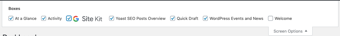
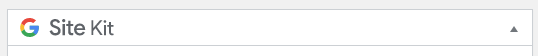
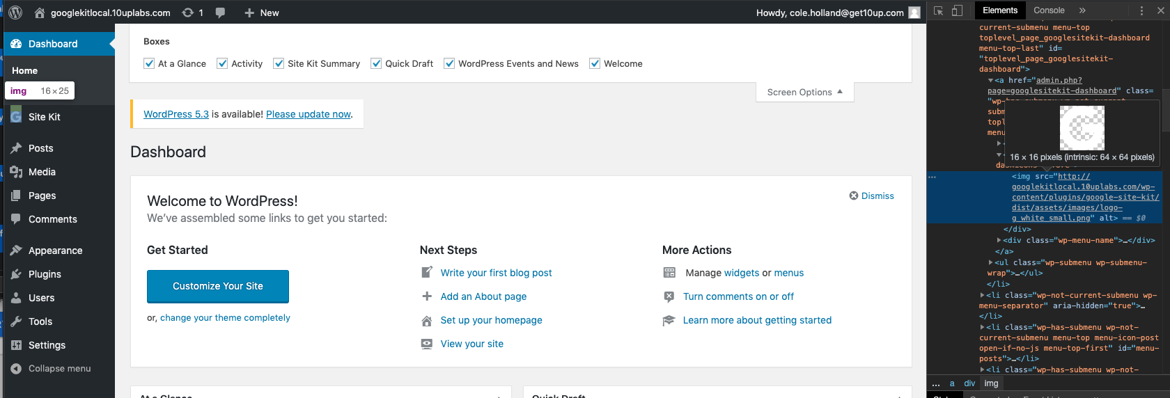
The G Site Kit icon is rendered on the dashboard metabox and screen option which does not adhere to WordPress Standards. Instead, only "Site Kit" or "Site Kit by Google" text should be rendered.
Steps to reproduce
- Go to 'Dashboard'
- Click on 'Screen option'
Screenshots
_Do not alter or remove anything below. The following sections will be managed by moderators only._
Acceptance criteria
- For the screen option, display plain text: "Site Kit Summary" instead of the current image.
- For the dashboard metabox, display plain text: "Site Kit Summary" instead of the current image.
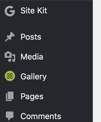
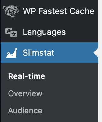
- For the lefthand nav menu, decrease icon width to 16px
Implementation Brief
- Change https://github.com/google/site-kit-wp/blob/6cc90cccb72fea847915012ca9a223c6088990f6/includes/Core/Admin/Dashboard.php#L118 to remove the text SVG and use text instead (it should read "Site Kit Summary"
- Adjust size of icon in https://github.com/google/site-kit-wp/blob/6cc90cccb72fea847915012ca9a223c6088990f6/includes/Core/Admin/Screen.php#L132 to be 16px high/wide
Changelog entry
- Update usage of G icon in admin menu, dashboard widget and screen options to align better with WordPress admin UI.
 ThierryA
All 14 comments
perfect :) thanx! and in addition I would really recommend to reduce the 'G' logo in the sidebar to keep the line spacing provided by wordpress as other respected plugin authors do.
 TomMuc1
on 19 Nov 2019
TomMuc1
on 19 Nov 2019
perfect :) thanx! and in addition I would really recommend to reduce the 'G' logo in the sidebar to keep the line spacing provided by wordpress as other respected plugin authors do.
Yep, will be reduced to 16px
ThierryA
on 19 Nov 2019
IB ✅
 felixarntz
on 19 Nov 2019
felixarntz
on 19 Nov 2019
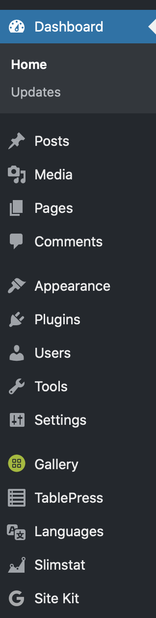
This is verified. The G is now 16 x 16 on the left nav. Also confirmed the copy states 'Site Kit Summary' as well as removing the G logo from Screen options
Passed QA ✅
 cole10up
on 20 Nov 2019
cole10up
on 20 Nov 2019
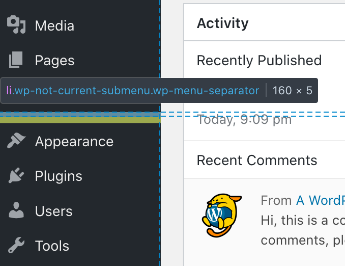
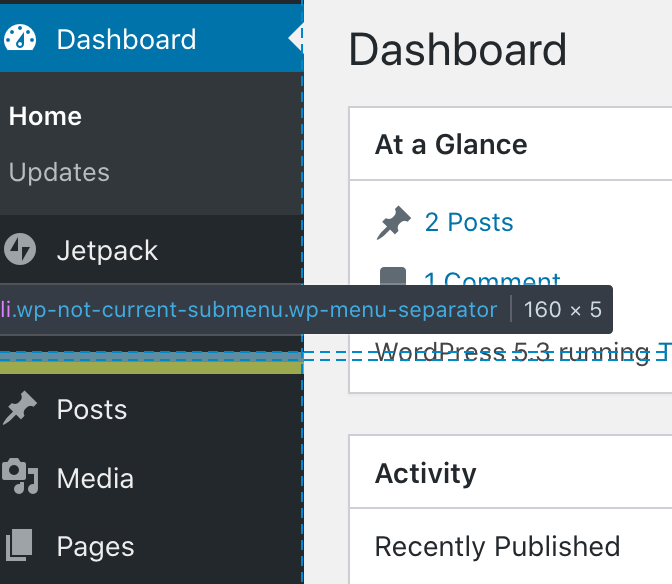
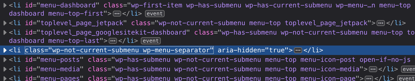
yes. but you can still clearly see that there is a bug with an additional blank line under the 'g' in the page bar. the distance from 'sitekit' to 'posts' is much too big.
TomMuc1
on 20 Nov 2019
Do you mind if I create a separate bug for this spacing?
cole10up
on 20 Nov 2019
feel free if you're paid on a per bug basis :)
TomMuc1
on 20 Nov 2019
Ahah! What an incentive that would be! "Broken in Netscape Navigator 6" ;)
I'll get this bug in and reference it in this ticket for you.
cole10up
on 20 Nov 2019
That spacing is not a bug; it's an intentional menu separator in the WordPress Admin. There is one used to separate out site-wide sections like the WP Dashboard, Site Kit, and Jetpack and content-type sections like Posts, Media, Pages, and Comments. There's another after the content-type sections for things like Appearance and Settings. Those have always been there and aren't the result of our icon:
 tofumatt
on 20 Nov 2019
tofumatt
on 20 Nov 2019
Thanks for checking on that!
cole10up
on 20 Nov 2019
ok. but then 'site kit' should definetly not show up under 'site-wide'. even if google thinks 'be loud - be on top' ...
TomMuc1
on 20 Nov 2019
ok. but then 'site kit' should definetly not show up under 'site-wide'. even if google thinks 'be loud - be on top' ...
Thanks for sharing your opinion @TomMuc1 . We have a user-first approach, in fact that is what matters the most to us. Looking at the various sections in the admin bar, the "site-wise" section is typically used for Hubs, Dashboards etc. Site Kit totally falls under this category given that it provides site-wise insights and dashboards. From a user perspective, it wouldn't make sense to have it in the post types list, settings or else section.
With that said, menu ordering preferences is very personal and thankfully, anyone is free to either re-order it via the code or use a free plugin allowing to customize admin menu order according to each and everyone preferences 😉
ThierryA
on 21 Nov 2019
is it a 'user first approach' or a 'google first approach'? if you look at the two oversized colorful icons that you have thankfully removed, you'll think of the second rather than the first. many other statistics plugins have decided to use the lower part of the sidebar - but of course there are others who said 'main thing high up'. what is - rightly - today the biggest criticism of google worldwide is its encroachment in many ways. but surely that's a question you have to decide for yourself ...
cheers
tom
TomMuc1
on 21 Nov 2019
the logo fits now. thanx!
TomMuc1
on 22 Nov 2019
Related issues
 Loganson
·
5Comments
felixarntz
·
4Comments
Loganson
·
5Comments
felixarntz
·
4Comments
 aaemnnosttv
·
3Comments
felixarntz
·
4Comments
aaemnnosttv
·
3Comments
felixarntz
·
4Comments
 quindo
·
5Comments
quindo
·
5Comments
Most helpful comment
Thanks for sharing your opinion @TomMuc1 . We have a user-first approach, in fact that is what matters the most to us. Looking at the various sections in the admin bar, the "site-wise" section is typically used for Hubs, Dashboards etc. Site Kit totally falls under this category given that it provides site-wise insights and dashboards. From a user perspective, it wouldn't make sense to have it in the post types list, settings or else section.
With that said, menu ordering preferences is very personal and thankfully, anyone is free to either re-order it via the code or use a free plugin allowing to customize admin menu order according to each and everyone preferences 😉