Simplewall: Show executable in blue and/or add its icon in notifications
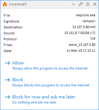
I find that I'm really having to actively search for the name of the executable in the new notification popups. The previous layout was more compact (now there's a lot of white space and the actual information is all the way to the far right of the screen) and the name of the executable isn't colored anymore, as was the case in the old layout. Especially the latter makes it difficult to focus right away on the most important information in the dialog. Would you consider making it a link to the containing folder, so that it turns up blue and underlined again?
Following the motto "a picture says [/is worth] more than a thousand words", it might also be a good idea to include the icon of the executable in the dialog.
 ltGuillaume
All 3 comments
Meanwhile a few minor corrections, not worth opening a different issue since a screenshot is here already :)
- _Always block_ obviously,
instead of _Always blocks_ - It is correct to say "allow to" but "block to" is like LOL :) The correct way of saying is "to block from", and in this case it also follows by an -ing form. So it should be
_Always block this program from accessing the internet_
 pwn0r
on 12 Mar 2019
pwn0r
on 12 Mar 2019
@pwn0r
my engrish is very poor, thank you!
 henrypp
on 14 Mar 2019
henrypp
on 14 Mar 2019
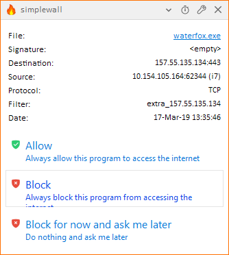
The buttons do not allow for two lines to show properly. This is a problem for English and I'm guessing lots of other languages, too.
ltGuillaume
on 17 Mar 2019
Related issues
ltGuillaume
·
3Comments
 Chaython
·
4Comments
Chaython
·
4Comments
 c-rilaun
·
3Comments
c-rilaun
·
3Comments
 gameb0y
·
3Comments
gameb0y
·
3Comments
 shiftyshady
·
4Comments
shiftyshady
·
4Comments