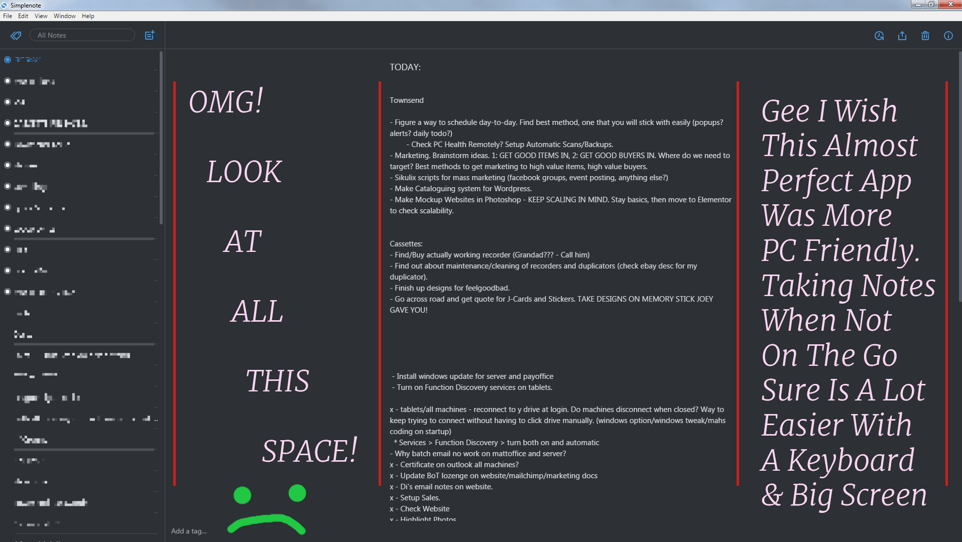
Simplenote-electron: White space beside left margin when window is maximised
When the window is maximised in the Windows app it pushes the left margin for a note to the middle of the screen.
Steps to reproduce
- Open a note in the Windows app.
- Maximise the window.
What I expected
I expected the contents of the note to be aligned on the left.
What happened instead
The left margin was in the middle of the screen.
OS version
Windows 10
Screenshot / Video

Reported in #2750989-t
 rachelsquirrel
All 16 comments
This is actually a design implementation, in order to make text of notes more readable. It looks weird with that text though because there's no long lines that wrap in that note.
 roundhill
on 26 Aug 2016
roundhill
on 26 Aug 2016
Hello!
If this is design implementation, please add some options for user that not need this behavior to have possibility to work on full page width.
Thank you in advance!
 Gen4040
on 12 Sep 2016
Gen4040
on 12 Sep 2016
Seconded, the margins on the windows app are crazy wide. This is not the case in either the webapp or the mac app, which look great.
 hedgefield
on 9 Jan 2017
hedgefield
on 9 Jan 2017
One of my notes is a reading list with lots of URLs. It is really hard to follow with some long URLs here and there.
 salehe
on 23 Jan 2017
salehe
on 23 Jan 2017
I agree with having shorter lines for readability (except in the case of long urls).
What if just the left margin was removed as requested here? It would leave lots of white space on the right, but I think it wouldn't look as bad.
 supernovia
on 24 Mar 2017
supernovia
on 24 Mar 2017
The margins are intentional, and make reading the notes easier. It's not wasted space. In most cases, seeing more text on the screen at once is not better.
Some ideas to address this:
- Multi-column at large widths
- Just a bit wider at large widths (1920px+)
- Include at option to set the max width maybe with 2 options? (
fullandautomatic)
 davewhitley
on 3 Apr 2017
davewhitley
on 3 Apr 2017
This also came up in 818198-z.
 SiobhyB
on 29 Nov 2017
SiobhyB
on 29 Nov 2017
I've got a screenshot of the issue. Reported in 983926-zen
rachelsquirrel
on 7 Mar 2018
Just a bit wider at large widths (1920px+)
I'm thinking I'll try this out with a PR. It's the easiest of your options :)
roundhill
on 7 Mar 2018
Maybe we should let a user set the width on his own? For example, we could add the scrollbar to change working area width.
 natanielcz
on 7 Mar 2018
natanielcz
on 7 Mar 2018
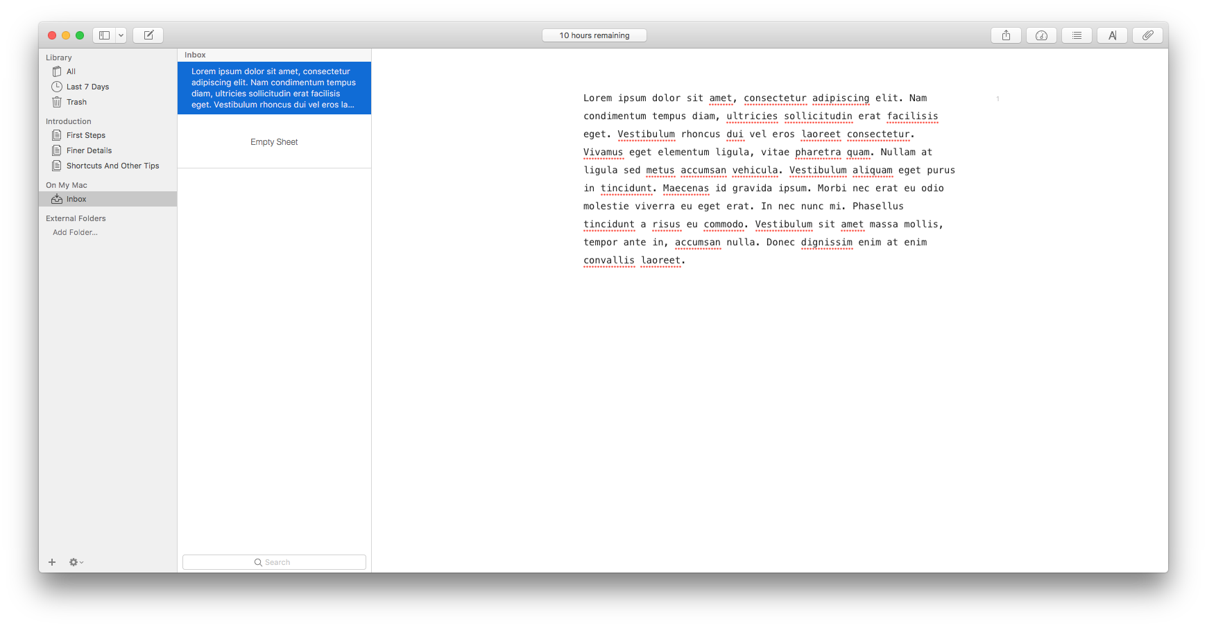
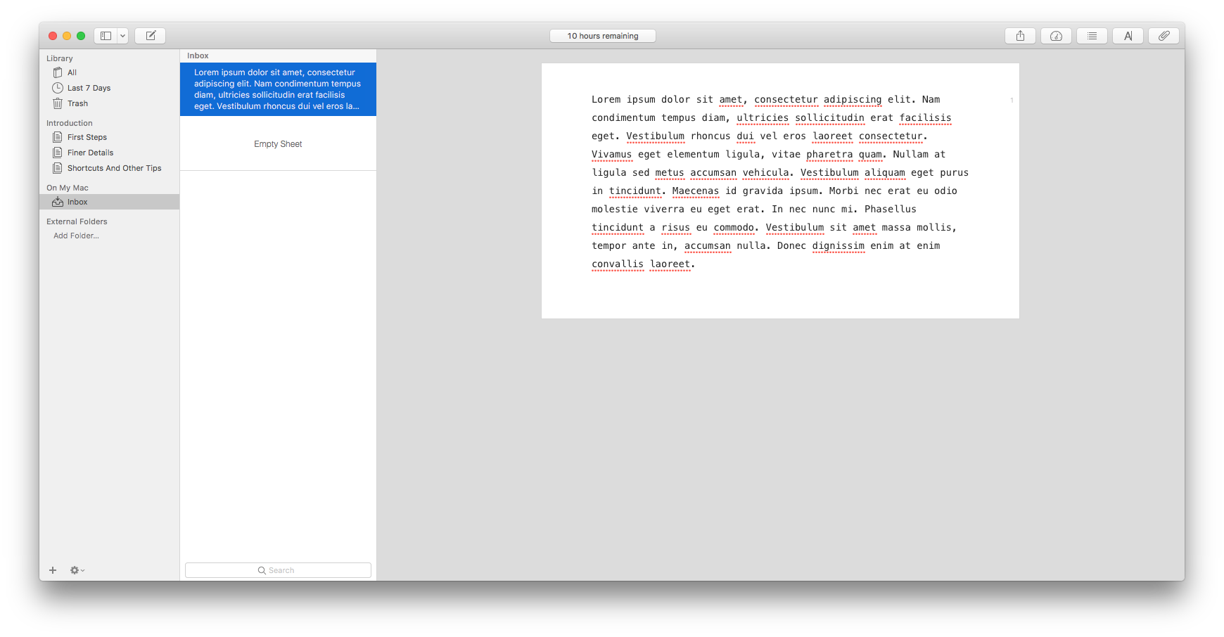
Here's an attempt with a break at 1366px, it changes the max width to 1280px:
roundhill
on 7 Mar 2018
Personally, I don't like it. It's really inconvenient for me to read so long lines.
natanielcz
on 7 Mar 2018
A user mentions this as an issue in 1292890-zen. I'm letting them know it's by design.
I think the margin is good for legibility (although a preference option would be great, too). Is there a way to tweak this design so that the margins are better communicated as a purposeful design?
 jessestu
on 25 Jul 2018
jessestu
on 25 Jul 2018
User's reply to Jesse's message 1292890-zen:
totally can understand folks not wanting to have lines of unlimited
length, but I would argue that's a totally different issue than having
the left side margin vary like that. In other words, keep the left side
margin fixed (and close to the list of note names in Windows) but go
ahead and wrap things where you all deem best on the right hand side.
 sashastone
on 25 Jul 2018
sashastone
on 25 Jul 2018
I think the margin is good for legibility (although a preference option would be great, too). Is there a way to tweak this design so that the margins are better communicated as a purposeful design?
I think we should add a light background color in the margins so that it looks intentional. I think Ulysses does this via a "page mode", but the default I think is just white space. Do ppl think it's an issue on Ulysses?
We can also use better width breakpoints.
As far as the option goes, I'm in favor of this:
Include at option to set the max width maybe with 2 options? (full and automatic)
davewhitley
on 2 Aug 2018
A Line Length setting has been introduced in #815, and will be released soon 🙂
 mirka
on 22 Sep 2018
mirka
on 22 Sep 2018
Related issues
 swalladge
·
3Comments
swalladge
·
3Comments
 kaepuo
·
5Comments
kaepuo
·
5Comments
 rbreaves
·
3Comments
rbreaves
·
3Comments
 Sushubh
·
4Comments
Sushubh
·
4Comments
 rachelmcr
·
3Comments
rachelmcr
·
3Comments
Most helpful comment
Seconded, the margins on the windows app are crazy wide. This is not the case in either the webapp or the mac app, which look great.