Silverstripe-framework: Better describe the 'keep me signed in' option
Overview
We've seen a good amount of user feedback report a lack of trust in using the 'keep me signed in' feature on the login screen. While some users will avoid this option for increased security, it can also be really helpful in streamlining a common action - if you have other controls in place, like a personal device in a secure location like a workplace office.
To support users in making a decision to use this feature it be helpful to add more information about this feature on the login screen
Suggestions:
- Include how long a user will be signed in for if the option is selected
- Review the wording entirely for usefulness
- Include some form of guidance like: link for more information, tooltips, help labels, etc
Acceptance Criteria
- [x] A CMS user understands, to the full extent, what will happen if the 'keep me signed in' option is selected
- [x] The configured time period is included in the label, e.g '... for x days'
- [x] Any wording changes consider how this screen might relate to having the multi-factor authentication module installed, as selecting this option would also skip the MFA login screen on subsequent visits
- [x] Additional guidance is added to the 'login-forms' module template to support the user in making a safe decision (i.e. tooltip and 'help' link)
- [x] The checkbox wording is changed in both framework's security.ss template and the special 'login-forms' module - changes to other themes are not required
- [x] Remove redundant 'title' attribute from the existing checkbox
- [x] User and Developer documentation is updated to reflect the change
- [x] Mergeup from 4.1 (mistakenly targeted early branch) .. 4.3 & 4
PR's
- [x] https://github.com/silverstripe/silverstripe-login-forms/pull/86
- [x] https://github.com/silverstripe/silverstripe-login-forms/pull/89
- [x] https://github.com/silverstripe/silverstripe-framework/pull/9900
Other PRs (probably don't need to merge)
 brynwhyman
All 16 comments
Some broad ideas about what different options we might have visually.
https://projects.invisionapp.com/share/WG10HY0X46S8#/screens/447507104_Login_Forms_-_Keep_Me_Signed_In
 clarkepaul
on 15 Mar 2021
clarkepaul
on 15 Mar 2021
Note that the checkbox currently has a title with some details on it:
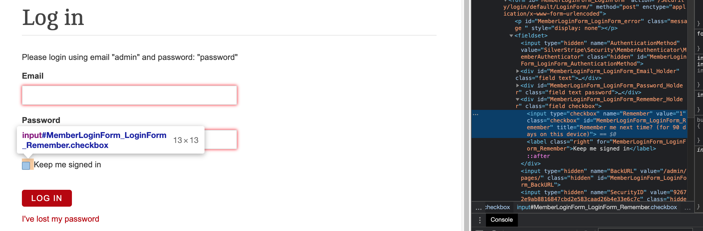 - this should be removed/updated as part of this issue.
 bergice
on 15 Mar 2021
bergice
on 15 Mar 2021
From our original survey feedback, there was a sure sign that the "Keep me signed in" feature wasn't clear enough about what it does. It's hard to ascertain whether that was because of the wording "Keep me signed in" itself, we know for sure there is a lack of supporting information and access to guidance. We collectively think adding "for x days" will go a long to making this feature make more sense, so that's a no brainer.
Unfortunately providing more information within the likes of a tooltip or popover might be a no-go even when it's non-react (basic bootstrap or custom code) if we are considering this to fallback to sites without login-forms. Would be good to get a little more clarification on this @bergice.
Providing a link to user help is on the path to being more helpful but I doubt users would use it or relate that to the use of the "Keep me signed in" feature.
Because we have differing views on what the text should be I could knock up another small survey to understand a bit more about the wording we use. My hunch is that it's all much of a muchness although feedback from one user when given the mockup was that "Keep me signed in" and "Remember me" made the most sense to them.
@brynwhyman @bergice whats your thoughts on another survey just for the wording of "Keep me signed in" and a preference as to where the links are to access guidence?
clarkepaul
on 31 Mar 2021
https://invis.io/BN10MV40YMZT#/448746237_Login_Forms_-_Keep_Me_Signed_In_V2
This is my preferred approach with a popover and a separate link to generic login user help. I think this will provide the best overall experience, so it more comes down to feasibility. With the wording, I'm open to changes and I will get a few peoples opinions today.
clarkepaul
on 31 Mar 2021
whats your thoughts on another survey
I don’t see any harm in sending that survey… Could just send it internally and close it at the end of today? I’d suggest the following changes though:
- Zooming in more on the image (it's hard to read the "for 30 days" part)
- Tweak the intro text to something like:
_People have the option to skip the following login screen (for their current device) to avoid what could be a repetitive action if you are accessing the CMS often. While using this option streamlines the process, it is reducing the level of security so people need to be aware of the impacts._
_People should only use this feature if they trust the device they are using. They will remain authenticated for 30 days and the functionality applies to the login screen and MFA (if they use it)._
brynwhyman
on 1 Apr 2021
@bergice said there could also be changes to the Wātea, Starter, and Simple themes.
I'd say those themes should just replicate the changes made for login-forms, what do you think @clarkepaul ?
If so, we can either amend the following AC to reflect updating these themes as well, or create a follow up issue to address those changes
" - [ ] This change is effected in both the standard login form template and the special 'login-forms' module"
I agree they should look the same, but there will be small changes as they have different layouts/styling and icons as well.
The checkbox is part of the form, but the help icon/link is rendered as part of the template next to the header.
bergice
on 1 Apr 2021
So, clarifying what it sounds like still needs to happen:
- Get consensus on checkbox label wording - pending survey results.
- @bergice to outline whether the hover text in @clarkepaul favoured designs is possible, or how much effort would be involved.
As an aside, I'm updating the ACs with reference to the Wātea, Starter, and Simple themes. Aside from confirming they reference the new checkbox label, they don't need further work (like adding help labels). With the login-forms module installed, it will override these theme login templates, and login-forms was made the default for new sites from CMS 4.6+.
brynwhyman
on 1 Apr 2021
So, clarifying what it sounds like still needs to happen:
- Get consensus on checkbox label wording - pending survey results.
- @bergice to outline whether the hover text in @clarkepaul favoured designs is possible, or how much effort would be involved.
As an aside, I'm updating the ACs with reference to the Wātea, Starter, and Simple themes. Aside from confirming they reference the new checkbox label, they don't need further work (like adding help labels). With the login-forms module installed, it will override these theme login templates, and login-forms was made the default for new sites from CMS 4.6+.
The bootstrap tooltips could potentially work if we override the templates.
I was gonna add the help link / button to the other themes, but if you don't want me to that's fine as well.
bergice
on 1 Apr 2021
To further clarify a point made in standup this morning, the following ACs need only to apply to the login-forms template:
- [ ] Additional information is included where relevant, i.e tooltip
I've updated that AC to the following to be more clear:
[ ] ~Additional information is included where relevant, i.e tooltip~
[ ] Additional guidance is added to the login template to support the user in making a safe decision (i.e. tooltip and 'help' link)
brynwhyman
on 6 Apr 2021
@clarkepaul regarding the new designs at https://projects.invisionapp.com/share/BN10MV40YMZT#/screens/448746237_Login_Forms_-_Keep_Me_Signed_In_V2 :
- The bootstrap tooltips only work in admin, and I'm not too keen on adding this to the front-end.
- The new question mark tooltip icon is essentially a new component. Is this something we are going to be using elsewhere as well? I'd probably prefer having it as a React component instead and adding it to the pattern library, but it seems out of scope of this issue. This also makes it tricky as the whole form is rendered using form fields, and it would have to look different on different themes as well, plus the font icons may be different too.
My suggestions:
- Maybe it is easier to just fix the normal tooltip that was there to begin with?
- I've already added the
Need Help?link, so it should be fine to keep it. But keep in mind that we're only looking at adding it to thelogin-formsmodule at this stage.
bergice
on 7 Apr 2021
The question mark is just an icon in the pattern library currently but you probably can't access that in login forms (correct me if my assumption is wrong) so would need that icon in the login forms module? The popover is already a component in the React library but you might not be able to access that so I thought you'd be replicating it as we do replicating the look of form fields.
The old tooltip is not really a tooltip (was a title), its not intuitive to have a question mark icon to trigger it as the delay is too long. Keen to chat in person if possible @bergice .
clarkepaul
on 7 Apr 2021
Had a chat to @clarkepaul, we'll mock up a new tooltip quickly with css/js then I'll probably just override the checkbox template on login-forms to render the question-mark icon and tooltip.
bergice
on 7 Apr 2021
Mockup https://codepen.io/clarkepaul/pen/OJWjYRL I expect you'd write the JS as you see fit. Op seems a bit buggy with focus and JS competing with each other @bergice
clarkepaul
on 7 Apr 2021
For the AC User and Developer documentation is updated to reflect the change - we'll handle userhelp via https://github.com/silverstripe/silverstripe-session-manager/issues/15
Dev docs were updated as part of https://github.com/silverstripe/silverstripe-framework/issues/9884
 emteknetnz
on 13 Apr 2021
emteknetnz
on 13 Apr 2021
PRs have been merged and merged up
emteknetnz
on 14 Apr 2021
Related issues
 dhensby
·
6Comments
dhensby
·
6Comments
 ScopeyNZ
·
5Comments
ScopeyNZ
·
5Comments
 micmania1
·
6Comments
micmania1
·
6Comments
 sminnee
·
6Comments
sminnee
·
6Comments
 dnsl48
·
6Comments
dnsl48
·
6Comments