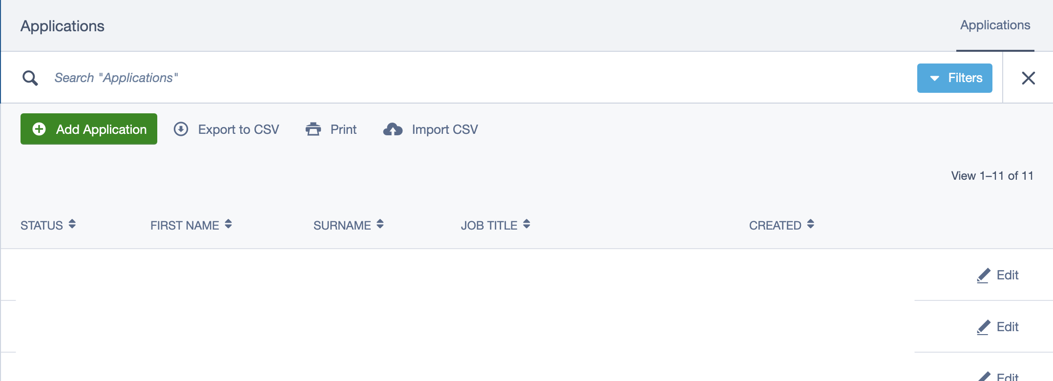
Silverstripe-framework: New GridFieldFilterHeader UX
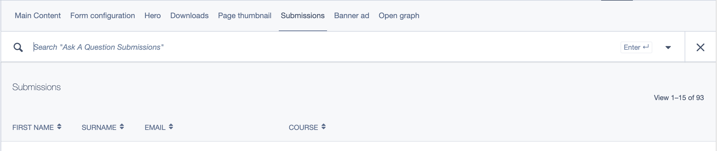
- There’s no way to change which field the main search input filters on - it seems to default to the first searchable field. That’s a safe enough default, but ideally you’d be able to configure this to filter against multiple fields (e.g. in my case, it could match against _any_ field)
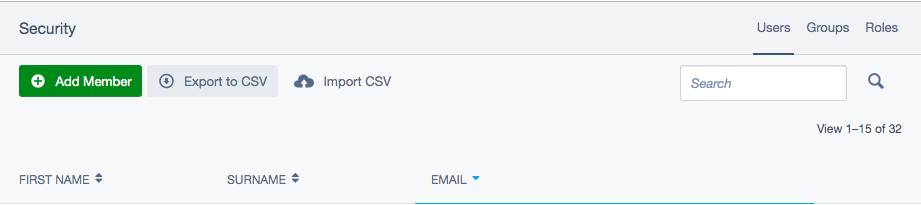
- The placeholder text says “Search \
- It’s not obvious that more search options are available. I think it just needs to stand out more, maybe make it a button in a different colour and add “More filters” text or something?
 kinglozzer
All 11 comments
/cc @silverstripeux
I'd say 1 is probably a bug, or at least a feature regression (which I think counts as a bug).
The other two are UX concerns.
Do you agree? Maybe we should split the first problem into a separate issue and triage as a bug?
 ScopeyNZ
on 9 Jul 2019
ScopeyNZ
on 9 Jul 2019
- I'm not aware if the functionality was different compared with the older search but @maxime-rainville should do.
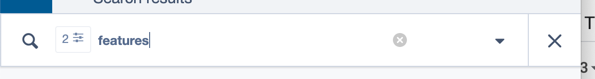
- Yup fair comment, we could change the placeholder text to be the single column it searches from if it is only the single column. e.g. _Search from First name_
- This is a hard one because the search field has so much going on and at small sizes or on smaller panels there isn't the space for all of the actions to have labels, so we tried to keep the same UI for all situations. Even if the user is using a desktop we don't actually know how much space the search has to show the full label. We battled with this problem when we designed it, in SS3 it did have "More filters" or something similar which took a lot of space from the search field. Perhaps replace the arrow with "Filters..." ?
 clarkepaul
on 12 Jul 2019
clarkepaul
on 12 Jul 2019
I'm not aware if the functionality was different compared with the older search but @maxime-rainville should do.
Not 100% sure as I haven’t checked, but I think the older functionality only had separate inputs for each field... so I guess it didn’t need the ability to choose a “primary” column?
Yup fair comment, we could change the placeholder text to be the single column it searches from if it is only the single column. e.g. _Search from First name_
I think that’d help. The ideal solution would be for it to search all text-based columns with an OR, then the popup form searches individual columns with an AND... but that’s _a lot_ more work than changing some placeholder text 😉
This is a hard one because the search field has so much going on and at small sizes or on smaller panels there isn't the space for all of the actions to have labels, so we tried to keep the same UI for all situations. Even if the user is using a desktop we don't actually know how much space the search has to show the full label. We battled with this problem when we designed it, in SS3 it did have "More filters" or something similar which took a lot of space from the search field. Perhaps replace the arrow with "Filters..." ?
I think making it a button would help - it both makes it stand out more, and offers a hint at what it does. I came back to this today because I had to explain this to a client on the phone, who struggled to find the arrow even while I was talking them through it!
Here it is just with some text added...
Or my personal preference (remember it is hidden completely until you click the search icon 😅)
kinglozzer
on 1 Aug 2019
The pre ss4.3 search didn't have a combined search field. All the filters were tied to a specific field.
But I agree we need to provide a better way of defining the fields that should be included in the main search. In a perfect world, you would be able to use silverstripe-fulltextsearch in GridFields so we can provide the same level of search in the backend as we do in the front end.
 maxime-rainville
on 1 Aug 2019
maxime-rainville
on 1 Aug 2019
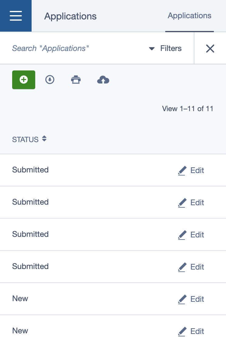
@kinglozzer Just be mindful of how it looks when populated with filters... looks a little broken actually :(

clarkepaul
on 1 Aug 2019
Can we instead of having this in the header search, split out the search component to its own item and use this filter header as something which lives inside the gridfield, like it used to?
I think we're confusing contexts here, and also causing way too many interactions by having it hidden away like this.
We could put the filter back in somehow like this:
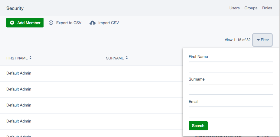
Filters applied could be added to the results something like this:
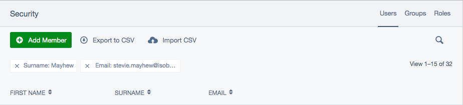
Search as a dedicated component:
 stevie-mayhew
on 2 Aug 2019
stevie-mayhew
on 2 Aug 2019
I like the ideas but in reality, I don't think we'd get the time to redo this with so many changes all at once. We do have plans to update the grid field to react at some stage so potentially could be incorporated in that work?
The goal with the search work was to create a single experience (reduce variations) for all search's but it just doesn't work as well for grid fields with the current UI.
My preference is when the search icon is in the table header (as it used to be) rather than the actions toolbar. I like the idea of bringing out the tags. Not sure about separating search and filters as you can get in some weird states between the two them, I remember experimenting with this a while back and wasn't satisfied with the experience.
clarkepaul
on 2 Aug 2019
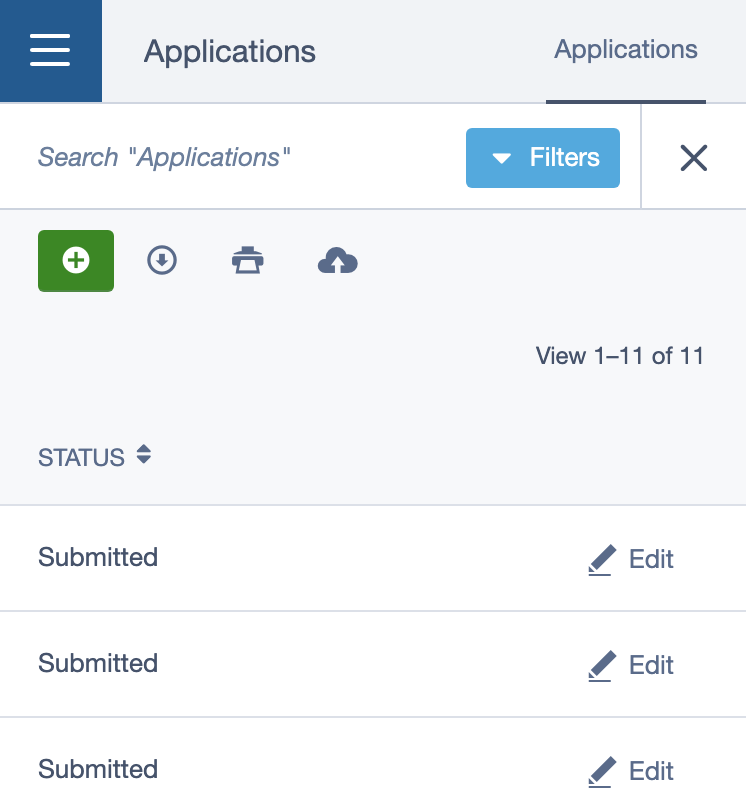
@clarkepaul Would you (or anyone else @silverstripe-ux) object to one of my suggestions for making the “Filters” button more visible as something of a stop-gap? That’s my main concern at the moment - clients keep reporting to me that the search doesn’t work when they’re just not spotting the little arrow
kinglozzer
on 2 Aug 2019
Yup, I'd be happy with the text version of it with some minor pattern changes:
- move the little drop icon to the right side of the _Filter_ label
- _Filter_ label can be hidden on mobile with just the dropdown arrow showing (hopefully the pattern would be more familiar with the more power-user type person)
The reason I'd prefer to hold back on the dropdown looking like a button is that I think it would get confused with an actual "Search" button—it looks like the primary action when I don't think it should. Buttons also take up more space horizontally and space is precious. We also need to make space for the [enter] help text which is pictured in the very first screenshot.
cc @maxime-rainville @newleeland add thoughts if you have any :)
clarkepaul
on 5 Aug 2019
I made a feature request post in the forum for macOS Finder style filters. I'd love to see something like that so that users can:
- Apply more than one filter per field
- Define the type of filter, not just the value (restricted to filters that make sense for the data type of the chosen field)
- Use AND / OR to build complex filters
Example use cases:
- Find Members edited between 2018-02-01 and 2018-04-02
- Find Members whose email starts with "j" and ends with "gmail.com"
- Find Members whose first name is "Joe" or "John"
- Find Members where all of the above are true
 jonom
on 26 Sep 2019
jonom
on 26 Sep 2019
And if you could bookmark/save these search parameters some how then all the better 😄
jonom
on 26 Sep 2019
Related issues
jonom
·
5Comments
kinglozzer
·
6Comments
 sminnee
·
6Comments
kinglozzer
·
4Comments
sminnee
·
6Comments
kinglozzer
·
4Comments
 chillu
·
5Comments
chillu
·
5Comments
Most helpful comment
@clarkepaul Would you (or anyone else @silverstripe-ux) object to one of my suggestions for making the “Filters” button more visible as something of a stop-gap? That’s my main concern at the moment - clients keep reporting to me that the search doesn’t work when they’re just not spotting the little arrow