Silverstripe-framework: Replace CMS tabs with dropdown toggle on pages that have long tabs
Acceptance criteria
- CMS pages with many content sub-tabs are rendered in a more usable fashion
- A dropdown in place of some or all of the tabs
- Follow WCAG 2.0
Doesn't have to auto-switch to accordion on mobile devices if that's too hard.
Continued from #1863 // @clarkepaul
My initial sketch -  .
.
Paul, thoughts on final design. Getting rid of all tabs and having a single dropdown select might seem a little extreme but would make everyones lives easier.

 wilr
wilr
All 37 comments
I like the approach wilr has come up with in the first image above but wouldn't there be too many things to consider to work out where to make the break for the drop-down? also as you resize the browser we would need adjust the amount of items presented accordingly.
In the designs above the breadcrumb is as short as it will ever be and we need to be considerate of that. Instead of working out widths of the tabs and how many there are, I think that if there isn't enough space for all the tabs and breadcrumbs then present the tabs as a single drop-down (like in the second image above) purely to limit edge cases, but as @wilr said above it is a little extreme though.
Does somebody have an idea of how many tabs would be extreme? (just to give me an idea).
I'd be willing to add the drop-down designs if it gets as far as being implemented, I'd prefer to stick to the lighter colors used in the interface for any dropdown panel.
 clarkepaul
on 14 May 2013
clarkepaul
on 14 May 2013
The issue with too many tabs mostly comes in the second level. Here's an example from a project I've inherited. Yes, could be consolidated, but that's besides the point. I didn't have to search that hard to find an example discussed as "extreme" here.

And that doesn't even need to be developer neglect when designing tabs, all you need is a bunch of relations with long names, which will be scaffolded into tabs by SilverStripe automatically (which can be adjusted of course).
The problem I have with having a single tab with dropdowns by default is that it dramatically - and in most cases needlessly - reduces the visibility of these other items. The illustrated example with "Show Content, hide Settings" is not representative here, since "Settings" is not commonly clicked on by authors. The tabs in my example though are all treated equally in terms of usage.
Just to reiterate my point from the original ticket: Any solution we come up with will need to be keyboard accessible and thoroughly tested across use cases and supported browsers. It also needs to be fast, since these calculations happen on resize which is already too slow :)
 chillu
on 14 May 2013
chillu
on 14 May 2013
A few more options up for discussion. Perhaps this should be taken up in Google groups first?

clarkepaul
on 15 May 2013
I'm having a similar issue to the one @willr originally brought up but in a ModelAdmin section. I guess you could say it's a bit of an edge case, but not hard to come across given that the tab names are generated from the class names of each model:

A discussion about the ModelAdmin issue came up before in the Google group: https://groups.google.com/forum/?fromgroups#!topic/silverstripe-dev/c-W-ZxDlDuA.
 kinglozzer
on 21 May 2013
kinglozzer
on 21 May 2013
Here's another issue I've noticed with long titles

 tractorcow
on 22 May 2013
tractorcow
on 22 May 2013
@clarkepaul Did you want to keep this ticket open or should we leave it?
wilr
on 2 Jun 2015
I would leave it open - there is still an issue that needs to be resolved. I'll push for it to get looked at internally but in the meantime someone else might want to pick it up. Putting the breadcrumb issue to the side I think removing the tab look by doing something like my example C we can greatly increase the available space.
clarkepaul
on 3 Jun 2015
UX in 3.3 has changed a lot. @clarkepaul one year later, do we still need this ticket?
tractorcow
on 21 Jan 2016
@clarkepaul and I want to try addressing this is 4.0
tractorcow
on 21 Jan 2016
Ingo's noted that a dropdown will be much better for accessibility.
 sminnee
on 7 Mar 2017
sminnee
on 7 Mar 2017
Tabs in SS4 are a bit more lightweight (no borders, less padding), which means we can fit a few more characters in a given horizontal space.

We don't have long tabs in core, so this is mostly an issue for custom projects. It's partially related to making the CMS work on smaller screen dimensions, but we already have a workable solution for this: It simply breaks tabs into a new line. I'm sorry, but this isn't a priority for beta1 - tentatively marking as a 4.0 issue.
chillu
on 8 May 2017
@chillu Has tabs been reworked to bootstrap from jQuery UI yet? Last I checked it wasn't but if it does, might be easier to complete this task - http://www.bootply.com/xvAx7qs67v
wilr
on 8 May 2017
Yeah I think doing this on bootstrap CSS is a precondition. We're still using jQuery UI tabs in Entwine, but react-bootstrap tabs in React. See https://github.com/silverstripe/silverstripe-framework/issues/5612.
We likely can't use react-bootstrap for Entwine-based sections. While we can add React-based inner views (e.g. a form field) into an Entwine-based container with some hacks, the other way around (React-based containers with Entwine-based fields) sounds like a world of pain. So we'd need to use the standard Bootstrap JavaScript here, and create an Entwine wrapper around it.
I'm not sure how much value there is replacing jQuery UI with Bootstrap JavaScript in Entwine-based views which is also different from what we use in React-based views. I'd suggest we only implement auto-collapse tabs in React-based views, and focus our efforts on converting Entwine to React views instead.
chillu
on 8 May 2017
Would be good to get this prioritised into one of the Beta's @chillu
clarkepaul
on 8 May 2017
Doesn't break an API so downgrading to change/minor.
sminnee
on 28 Jun 2017
I'm moving this out of the beta2 milestone, since I think we have a viable solution at the moment (flowing tabs). Same as for other UI improvements which are geared towards smaller screen sizes: Let's first prove that there's interest in using the CMS in those screen sizes before over-investing into features geared towards that use case. I know there's a "chicken and egg" factor, but the lack of dropdown tabs doesn't stop anybody from doing their work on smaller screens.
chillu
on 5 Jul 2017
Do we know anyone who hasn't tried to use the CMS on their phone? I have - it's not a primary device, but when you're out and about and need to do something in a rush, using a phone is possible and works and I'd be surprised if many people haven't at least tried to use the CMS on their phone.
 dhensby
on 5 Jul 2017
dhensby
on 5 Jul 2017
Yep, and all those people who tried it will be able to achieve their goal already, tabs are clickable and not obscured (see earlier screenshots on this thread). On mobile, it'd sure be nice to have dropdown tabs because of space issues. On tablet and larger screens, it's not essential. And after all, if you have more than a tablet screen width worth of tabs, that's a UX problem in itself - you should consolidate your tabs and avoid confusing authors.
This is a valid issue, but it's not as important to fix as e.g. getting the GridField versioned UX right - hence moving out of 4.0 milestone. Contributions welcome as usual heh.
chillu
on 6 Jul 2017
I agree with @chillu. Its important to recognise these tabs as more navigation links with differences in importance, rather than "tabs" which similar importance (when used correctly: https://www.nngroup.com/articles/tabs-used-right/). Having the that in mind, the order of the "tabs" becomes important, when we have a lot of tabs visible it takes more cognitive load to find the more important ones. A solution would be what @wilr originally mentioned, with the more important "tabs" visible and the less important/used "tabs" hidden in a dropdown or a "..." button.
 newleeland
on 10 Jul 2017
newleeland
on 10 Jul 2017
Latest designs here: https://projects.invisionapp.com/boards/2RX68PKZVXDH/~~
Option to use the meatballs icon or a "more" label
 jamessilverstripe
on 29 Aug 2017
jamessilverstripe
on 29 Aug 2017
Moved designs to the CMS style guide under Nav-Tabs https://projects.invisionapp.com/dsm/silver-stripe/silver-stripe
clarkepaul
on 27 Mar 2018
This has popped up again in the context of the global archive view: https://github.com/silverstripe/silverstripe-framework/issues/6202#issuecomment-397922216
chillu
on 18 Jun 2018
A working example of inspiration with Bootstrap https://www.bootply.com/voCGmhNjq6~~
Better example: https://www.eyecon.ro/bootstrap-tabdrop/
clarkepaul
on 16 Aug 2019
What happens to the way it displays that list if you select link14 from that list?
 robbieaverill
on 16 Aug 2019
robbieaverill
on 16 Aug 2019
So in that example, the display of the visible tabs doesn't change but the item in the dropnav shows as being selected. This isn't going to be a perfect solution, moving the order of the presented tabs wouldn't be a good idea either. Scrollable tabs would be the other option.
clarkepaul
on 19 Aug 2019
If there's an item in the dropdown which is selected, how do you indicate that when the dropdown isn't open?
robbieaverill
on 19 Aug 2019
@robbieaverill you could just highlight the pill and the item within the dropdown or put the tab in the breadcrumbs? A simple highlight is probably good enough.
wilr
on 19 Aug 2019
I've updated the designs which can still be found in the CMS style guide.
You'll notice a few changes such as active states which have been changed to be more inline with our current tab pattern. Let me know if you have anymore thoughts towards the designs 🙂
 sachajudd
on 4 Sep 2019
sachajudd
on 4 Sep 2019
Most tabs in the CMS aren't based on React, and given how baked into the Entwine/PJAX logic they are, this isn't easy to achieve. If it looks like the solution to this is not something "future proof" (React), but rather some kind of Bootstrap JS library or custom Entwine hackery, can we please hold off on implementing this "future legacy"? We'll have to rewrite it in React once tabsets are presented like that. I'd rather hold off on non-critical enhancements like this than doing them twice :D
Case in point: That library Paul found was published in 2013, is a ZIP download, and has no issue tracker. We already have enough complexity in our CMS frontend layer without adding more non-React libraries./cc @brynwhyman @clarkepaul
chillu
on 4 Sep 2019
The library was to show an example of how the experience can look, I wouldn't want to dictate how we should implement it. I'd still like to hear from the team on how much effort and where it could be applied (New React vs existing enhancement) and decide from there.
Some instances of the tabs are unusable (especially in smaller screens e.g. Advanced Workflow) which to me makes it pretty high impact to the end-user. I don't want to put this to the side if its a couple of days effort.
clarkepaul
on 5 Sep 2019
I scanned through the discussion very, very quickly so I don't know all the details. It seems to me that this issue is under some planning and might be solved someday? Anyway, my real point to actually write a comment was just to provide an up-to-date screenshot about how SilverStripe 4.5.1 performs today regarding this issue, as the screenshots at the start of this issue are from the SS3.x era.
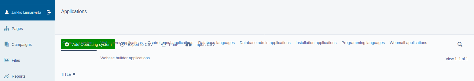
See, my multiple long-name tabs pop out from their place. The empty space under the "Applications" heading is the place where the tabs should be. Now the tabs go on top of the green "Add new DataObject class name" button and other buttons next to it. The "Add new" button becomes unclickable because of this.
So now I'll just postpone and wait as this problem is clearly already under consideration. Thanks! :)
Edit 2020-03-16: Just for the record, the above screenshot is from Firefox version 74.0 (64 bit Ubuntu)
 Taitava
on 13 Mar 2020
Taitava
on 13 Mar 2020
Thanks for sharing that screenshot @Taitava. To @clarkepaul's point, I'd also be interested in understanding how much effort would be involved in solving this from a React perspective, v.s a more stop-gap solution, given that it's been a requirement of some sort since 2013! I'll see if I can get this past a development team for comment in the next month or so.
 brynwhyman
on 16 Mar 2020
brynwhyman
on 16 Mar 2020
I think this can be a two step process and the first bit might be to just fix the styling so it doesn't break horribly.
The second bit then could be to replace the tablist with a dropdown on smaller screens.
 michalkleiner
on 16 Mar 2020
michalkleiner
on 16 Mar 2020
There's already a separate issue for the tab overlays on https://github.com/silverstripe/silverstripe-cms/issues/2405
chillu
on 11 May 2020
@chillu Good! According to the comments, it seems to be fixed now :).
Taitava
on 12 May 2020
Just posting a couple React approaches. Either is better than the current functionality.
Scrolling Tabs React component from Material-UI
Dropdown React Tabs
clarkepaul
on 25 Jun 2020
@clarkepaul I'd prefer the dropdown. It allows to see all tabs at once with one click.
Taitava
on 28 Jun 2020
Related issues
 dnsl48
·
6Comments
dnsl48
·
6Comments
 maxime-rainville
·
3Comments
sminnee
·
6Comments
maxime-rainville
·
3Comments
sminnee
·
6Comments
 ScopeyNZ
·
5Comments
ScopeyNZ
·
5Comments
 micmania1
·
6Comments
micmania1
·
6Comments
Most helpful comment
I think this can be a two step process and the first bit might be to just fix the styling so it doesn't break horribly.
The second bit then could be to replace the tablist with a dropdown on smaller screens.