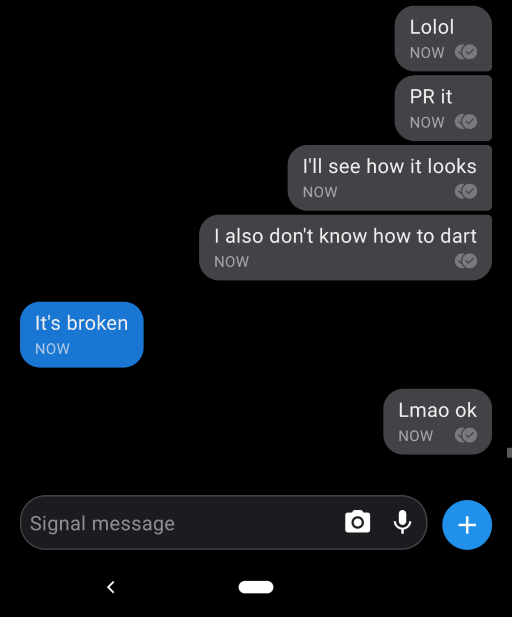
Signal-android: [UX bug] Message timestamps are too capital and too large
- [ x ] I have searched open and closed issues for duplicates
- [ x ] I am submitting a bug report for existing functionality that does not work as intended
- [ x ] I have read https://github.com/signalapp/Signal-Android/wiki/Submitting-useful-bug-reports
- [ x ] This isn't a feature request or a discussion topic
Bug description
The timestamps on the new UI are way too big. They're very similar in size to the actual message font and are very distracting. Also, it seems like it's yelling at me -_-.
Steps to reproduce
- Be on 4.24.1
- Send messages
Actual result: Timestamps are huge and capitalized, drawing user's attention.
Expected result: Don't be so eye catching with the timestamps, they're meta data.
Screenshots

Device info
Device: Google Pixel 2 XL
Android version: 9 (build number: PPP4.180612.004)
Signal version: 4.24.1
All 2 comments
THEY ARE REALLY ANNOYING
I'm going to close this because this isn't technically a bug (they look as intended), but I will communicate this feedback to the team. FWIW I believe the size of the timestamp is the smallest font size you can use if you want to remain accessible, but we'll see if there's a way to make them less distracting. Thank you for the feedback!
If you're interested in continuing the discussion, feel free to make a post on the forum, or chime in via a post we setup to collect design feedback. Thanks!