Shoelace: Consider using :not(:defined) { display: none; }
Describe the bug
Components leak unstyled internals while their definitions are loading.
To Reproduce
Steps to reproduce the behavior:
- Go to https://shoelace.glitch.me/r/1/2.0.0-beta./40.html
- Hard Reload repeatedly
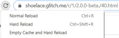
- Throttle network if needed

- See behavior before all definitions load and after
| before ❌ | after ✔️ |
| - | - |
| 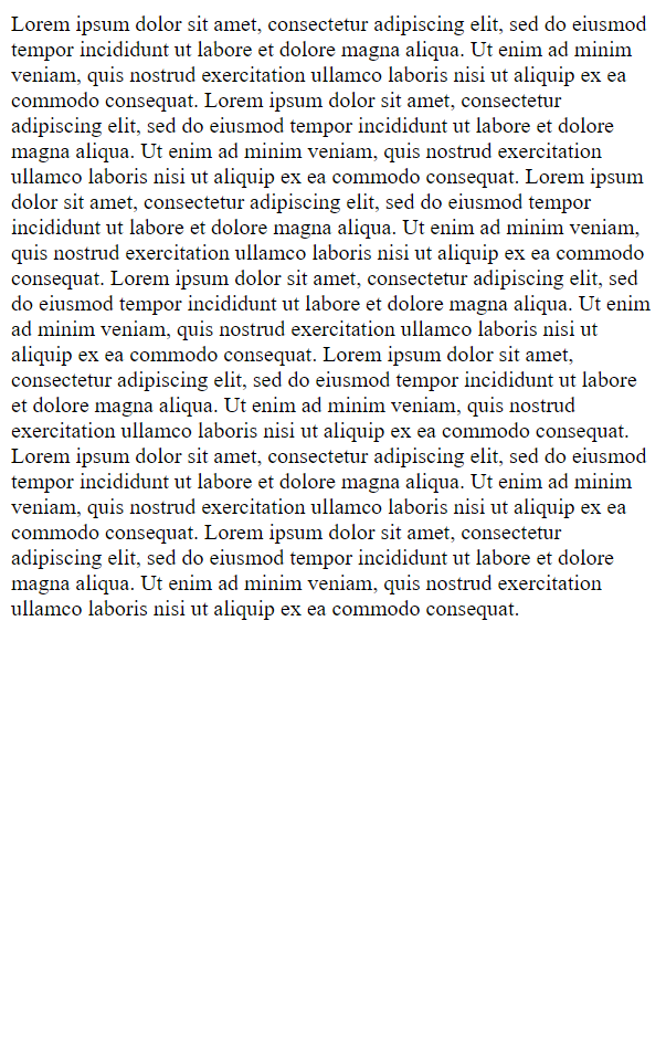 |
|  |
|
Expected behavior
Things look clean at all times as can be seen in the below screenshots. (See Additional Context section below for the recommended improvement.)
| before ✔️ | after ✔️ |
| - | - |
|  | |
| |
Desktop (please complete the following information):
- OS: Windows 10
20H219042.985 - Browser: Chrome
- Version:
90.0.4430.212
Additional context
- Compare https://shoelace.glitch.me/r/1/2.0.0-beta./40.css.html which contains:
CSS :not(:defined) { display: none; } - Hard Reload repeatedly
- Integrate a (project-scoped) version of the above to the project if/as desired or document the unscoped one for your users.
For now, scoping could be achieved with:
CSS
sl-component-1:not(:defined),
sl-component-2:not(:defined) { display: none; }
and soon more concisely (https://caniuse.com/?search=:is) with:
CSS
:is(sl-component-1,sl-component-2):not(:defined) { display: none; }
https://caniuse.com/?search=:defined
https://developer.mozilla.org/en-US/docs/Web/CSS/:defined
People that disable JavaScript in their browsers should be handled by site owners with <noscript> which can also be used by you to restore the current behavior for such subset of users.
          <style>:not(:defined) { display:    none; }</style>
<noscript><style>:not(:defined) { display: initial; }</style></noscript>
<!-- rest of the page follows -->
 cetinsert
All 4 comments
From your example:
<style>:not(:defined) { display: none; }</style>
I tried this previously with a generic selector, but it caused problems (I believe with Angular) and, in hindsight, seems like an overreach. It was quickly reverted in 3c4ec12b18fe82cfef3218d48874adc850bd5dda.
There's a base stylesheet, but I've been trying to eliminate light DOM styles from it so it only includes design tokens. I don't think I want to scope this to specific components anyways. I feel that this should be a more generic solution, or be left to the user to determine how they want to handle it.
I've stumbled upon a number of other approaches, most notably these two:
<style>
  /* Appear when available */
  :not(:defined) {
    visibility: hidden;
  }

  /* Fade in when available */
  :not(:defined) {
    opacity: 0;
    transition: .25s opacity;
  }

  :defined {
    opacity: 1;
  }
</style>
There's also a JavaScript method you can use to ensure components are available. You can use this to show a preloader, for example.
customElements.whenDefined('sl-alert').then(() => {
  // alert is ready
});
Because the generic CSS solution affects more than just Shoelace components, and because there are a number of ways to do this, I think it's probably best to leave it to the user and provide documentation to demonstrate how users can handle these scenarios.
On a related note, it might make sense to include the generic :not(:defined) solution in the upcoming (and optional) typography/core stylesheet.
 claviska
on 28 May 2021
claviska
on 28 May 2021
Those are great examples @claviska — and I'd definitely prefer visibility: hidden over display: none because the latter tends to cause a lot more layout shifting.
 jaredcwhite
on 29 May 2021
jaredcwhite
on 29 May 2021
Also fading in elements can be really nice in general — I recently changed my Shoelace + Hotwire Turbo app so page changes smoothly fade in most components instead of instant UI updates and it makes the app feel way slicker.
jaredcwhite
on 29 May 2021
Closing this as a wontfix so users can choose to solve this however they prefer.
claviska
on 5 Jun 2021
Related issues
 kevinlandsberg
·
4Comments
kevinlandsberg
·
4Comments
 NullVoxPopuli
·
6Comments
jaredcwhite
·
6Comments
NullVoxPopuli
·
6Comments
jaredcwhite
·
6Comments
 kevnk
·
6Comments
kevnk
·
6Comments
 SheepFromHeaven
·
7Comments
SheepFromHeaven
·
7Comments
Most helpful comment
From your example:
I tried this previously with a generic selector, but it caused problems (I believe with Angular) and, in hindsight, seems like an overreach. It was quickly reverted in 3c4ec12b18fe82cfef3218d48874adc850bd5dda.
There's a base stylesheet, but I've been trying to eliminate light DOM styles from it so it only includes design tokens. I don't think I want to scope this to specific components anyways. I feel that this should be a more generic solution, or be left to the user to determine how they want to handle it.
I've stumbled upon a number of other approaches, most notably these two:
There's also a JavaScript method you can use to ensure components are available. You can use this to show a preloader, for example.
Because the generic CSS solution affects more than just Shoelace components, and because there are a number of ways to do this, I think it's probably best to leave it to the user and provide documentation to demonstrate how users can handle these scenarios.
On a related note, it might make sense to include the generic
:not(:defined)solution in the upcoming (and optional) typography/core stylesheet.