Shields: Improve text appearance in Firefox on Windows
Are you experiencing an issue with...
- [x] [shields.io](https://shields.io/#/)
:beetle: Description
There is room to improve the badge kerning / keming.
Between "o" and "w".

As well as "z" and "e".

:link: Link to the badge
This is an issue with the text on any badge with the aforementioned character combinations. (Possibly others that I have not noticed)
e.g. "Powershell", "bower"
Note that the issue does not appear on the for-the-badge style.
 MacroPower
All 21 comments
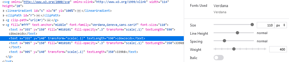
Hmmm, that does not look like Verdana. What OS are you on? Can you check if removing DejaVu Sans from the font-family list in the svg fixes it?
 paulmelnikow
on 23 Mar 2020
paulmelnikow
on 23 Mar 2020
Hmmm, that does not look like Verdana. What OS are you on?
Windows 10
Can you check if removing DejaVu Sans from the font-family list in the svg fixes it?
Removing that font did seem to fix it for me:

MacroPower
on 24 Mar 2020
Mostly talking to the maintainers here: I've never really understood why DejaVu Sans was there, especially first in the list.
paulmelnikow
on 24 Mar 2020
I checked on MacOS today and it seems like it renders fine there.
MacroPower
on 24 Mar 2020
I'd suggest we remove DejaVu Sans from the templates after #4756 is merged.
paulmelnikow
on 6 Apr 2020
I opened #4979 to fix this. @MacroPower could you check in that PR's review app to see if it looks better now?
paulmelnikow
on 29 Apr 2020
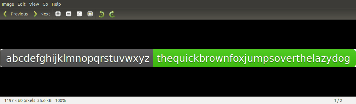
With Verdana it looks better, but potentially it could still show up somewhere else.
With textLength:

Without
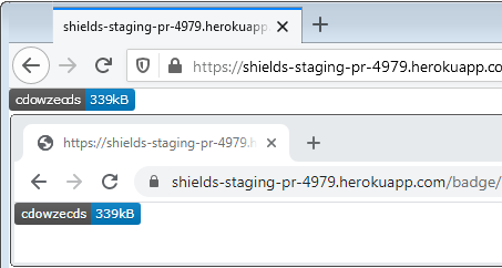
In first case letters "c" and "d" are sticking together.
 FTOH
on 30 Apr 2020
FTOH
on 30 Apr 2020
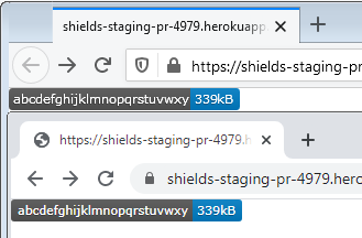
That's odd, I'm seeing the same thing on Windows @FTOH

Still much better than the original. But "cd" is in this label twice and the kerning is a lot different in each instance.
Per usual MacOS renders this without any issues as far as I could see.
MacroPower
on 30 Apr 2020
Thanks for checking this out.
@FTOH is first screenshots taken from https://shields-staging-pr-4979.herokuapp.com/ and the second one is an svg you modified? Can you post the badge link, and also show a corresponding screenshot from master?
For what it's worth, there are surprisingly few kerning pairs in Verdana, at least in my copy. IIRC none of the alpha letter pairs have one. Solving this is less about kerning per se, than about computing a text width on the server which matches the text width in the front end. If we do change how the width is computed, some of that will have to be done in anafanafo which builds the width lookup tables.
That's odd, I'm seeing the same thing on Windows @FTOH
@MacroPower Not sure I understand what you mean. Could you elaborate?
paulmelnikow
on 30 Apr 2020
@paulmelnikow Guess I was just expressing that it seems unusual that two different instances of that "cd" pair are rendered differently in the same label.
MacroPower
on 30 Apr 2020
@paulmelnikow Guess I was just expressing that it seems unusual that two different instances of that "cd" pair are rendered differently in the same label.
Yea, that's odd. I wonder if it's aligning letters to pixels?
paulmelnikow
on 30 Apr 2020
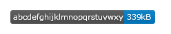
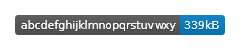
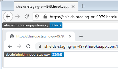
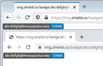
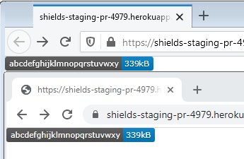
@paulmelnikow This is the link for the first screenshot.
https://shields-staging-pr-4979.herokuapp.com/badge/abcdefghijklmnopqrstuvwxy-339kB-blue
For the second one, I deleted textLength property in devtools.
and also show a corresponding screenshot from master?
img.shields.io? If yes
P.S. I am on Windows 7
FTOH
on 1 May 2020
It's strange, in this particular instance (abcdefghijkl...) the new one isn't looking better.
Can you confirm that it's rendering using Verdana and not one of the other fallback fonts? It looks like it is Verdana but I can't be sure.
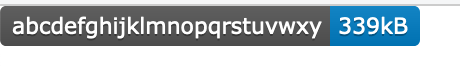
Here what https://shields-staging-pr-4979.herokuapp.com/badge/abcdefghijklmnopqrstuvwxy-339kB-blue looks like on Mac OS:
paulmelnikow
on 1 May 2020
Just as a data point, I use linux and have DejaVu Sans installed. This is what the 2 badges look like on my machine:
img.shields.io:

shields-staging-pr-4979

They're are very slightly different, but not by much its more noticeable if you flick between the two..
I honestly couldn't tell you if one or the other is "better"
 chris48s
on 1 May 2020
chris48s
on 1 May 2020
Ooh, interesting, it is surprisingly close! Maybe we should leave DejaVu Sans in as a fallback, but swap it to the end of the priority list instead of the beginning.
Still not really sure how to make this look good on Windows…
paulmelnikow
on 1 May 2020
Can you confirm that it's rendering using Verdana and not one of the other fallback fonts? It looks like it is Verdana but I can't be sure.
Yes on Chrome and Firefox

I am opened badge on Chrome and it looks perfect. So it is Firefox specific problem..
FTOH
on 2 May 2020
Could it be an issue with font size?
paulmelnikow
on 2 May 2020
I tried this script in console, the badge looks the same.
$('text').parentNode.setAttribute('font-size', 11)
$$('text').forEach(el => {
  el.removeAttribute('transform')
  'x,y,textLength'.split(',').forEach(attr => {
    el.setAttribute(attr, el.getAttribute(attr) / 10)
  })
})
Only the complete removal of the property "textLength" solves the problem, but breaks the paddings.
FTOH
on 2 May 2020
Can you tell that the effective font size and letter spacing is consistent with other browsers that don't have the problem? I really appreciate your help getting to the bottom of this!
paulmelnikow
on 2 May 2020
$0.getComputedTextLength() for Chrome returns 1549.0771484375, for Firefox: 1600
This is what they look like without the textLength attribute:
Verdana:
DejaVu Sans
FTOH
on 3 May 2020
I found a CSS property that fixes the error
text-rendering: geometricprecision;
FTOH
on 3 May 2020
Related issues
 salaros
·
3Comments
salaros
·
3Comments
 chadwhitacre
·
4Comments
paulmelnikow
·
3Comments
chadwhitacre
·
4Comments
paulmelnikow
·
3Comments
 korenyoni
·
3Comments
korenyoni
·
3Comments
 lukeeey
·
3Comments
lukeeey
·
3Comments
Most helpful comment
I found a CSS property that fixes the error

text-rendering: geometricprecision;