Sharex: Monochromatic Tray Icon to fit Windows 10 style
It would be cool, thanks.
 roughnecks
All 17 comments
You can easily use GIMP, PhotoShop, or an online converter to convert it as .ico for use in Windows
To use, just change the icon of the start menu shortcut (right-click -> open file location -> right-click -> properties -> change icon). You might need to restart ShareX or unpin and repin to taskbar for the changes to take effect
 sylveon
on 20 Aug 2017
sylveon
on 20 Aug 2017
Thanks, but I'm using the Store App, is this the same?
I've searched for "ShareX.exe" and found it in "C:\Program Files\WindowsApps\19568ShareX.ShareX_11.9.1.0_x64__egrzcvs15399j" but it's not a shortcut and I cannot change icon.
roughnecks
on 20 Aug 2017
You cannot change icons on the Store build.
sylveon
on 20 Aug 2017
You cannot change icons on the Store build.
Yeah, pretty much why I'm asking for a feature to be added.
roughnecks
on 20 Aug 2017
That would require two completely different packages, you cannot change it at runtime either.
sylveon
on 20 Aug 2017
We change the icon all the time
how do you think the upload progress indicator works?
 Scrxtchy
on 20 Aug 2017
Scrxtchy
on 20 Aug 2017
He wants to change the icon in the taskbar and the tray, not only the tray.
It is not doable to change the taskbar icon at runtime on a desktop bridge app because it is hardcoded in the package.
sylveon
on 20 Aug 2017
if you want to edit the taskbar tray, you need to edit the icons in
C:\Program Files\WindowsApps\19568ShareX.ShareX_11.9.1.0_x64__egrzcvs15399j\Assets\
The easy part is getting them
the harder part is putting new ones over the top
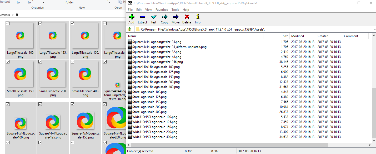
I can tell you if you delete these files, sharex UWP will run without icons, but won't crash
eg. soundcloud
Scrxtchy
on 20 Aug 2017
He wants to change the icon in the taskbar and the tray, not only the tray.
Where did I write that?
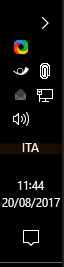
I only want the TRAY icon to be monochromatic.
Icons in the taskbar are all colored, no need to change those.
roughnecks
on 20 Aug 2017
Icons in the taskbar are all colored, no need to change those.
Pretty much what I thought
Scrxtchy
on 20 Aug 2017
White icon not looks good as 16x16 because then difficult to differentiate its parts.
 Jaex
on 20 Aug 2017
Jaex
on 20 Aug 2017
Like this a little bit
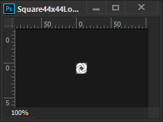
Just used a mask with a bush negative, so it's a little blurry.
Pencil tool would have given sharp edges
Scrxtchy
on 20 Aug 2017
I could always install the Desktop App, but automatic updates managed by Windows Store are much better.
In the meanwhile, if @Jaex doesn't feel like doing this change, I'll just keep ShareX hidden in the tray.
Thank you all.
roughnecks
on 21 Aug 2017
This is the example for 16x16 icon, which not looks very good:

Separation lines barely visible.
Jaex
on 9 Feb 2019
I tried to make separation of parts more visible:

Jaex
on 9 Feb 2019
Added it to here:
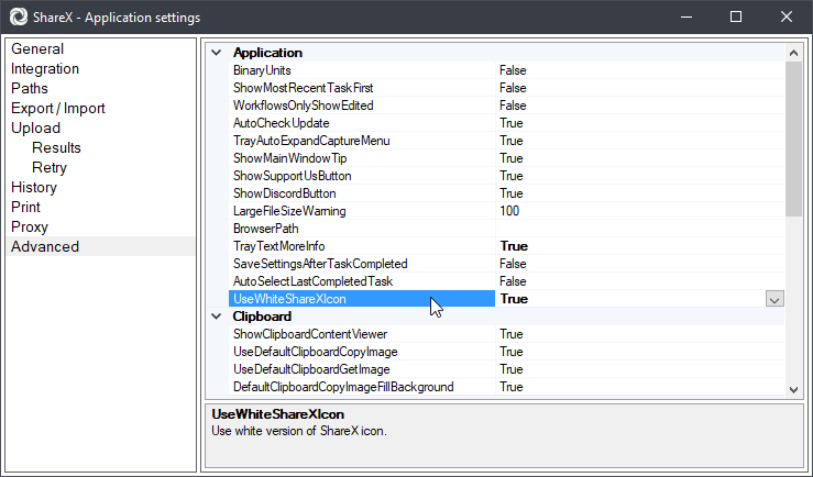
Jaex
on 10 Feb 2019
@Jaex Could you make it so the white version still occupies the same amount of space in the 256x256 icon? The white one is 20px taller/wider, so it looks a little bit unsightly in the taskbar due to its size.
I don't think it's too hard to see the separation in this white icon at a small size, but if feedback thinks it should be more distinct, then perhaps the lines could be made darker or thicker similar to how Slack handles it. After all, the separation in the original logo isn't distinct; it's only separated by having different colours. Still thicker than the lines in the coloured ShareX icon, Windows Defender icon, Slack icon, Git Bash icon, and Google Chrome icon when using small taskbar buttons!
 ErikHumphrey
on 27 Jun 2019
ErikHumphrey
on 27 Jun 2019
Related issues
 ned-martin
·
112Comments
ned-martin
·
112Comments
 makingbillions
·
28Comments
makingbillions
·
28Comments
 carasius
·
19Comments
carasius
·
19Comments
 tx-trainwreck
·
46Comments
tx-trainwreck
·
46Comments
 DBJDBJ
·
25Comments
DBJDBJ
·
25Comments
Most helpful comment
Added it to here: