Shadowsocks-android: Logo Proposal
Hey, I saw your project and I appreciated it. I can support your project with making a logo design. I saw that you already have a logo design but I think that it is not unique. So similar with logo design of Telegram. What do you think about that? If you interested I can show my portfolio. I am waiting your feedback, have a nice day! :)
Best regards
Baran Pirinçal
 baranpirincal
All 7 comments
I believe shadowsocks project started to use this logo before Telegram. Maybe the best way is help them to redesign their logo. 😄
Anyway, you can submit any proposal here.
 madeye
on 23 May 2018
madeye
on 23 May 2018
@madeye I am so sorry for that. People can also think wrong like me because Telegram is a very well-known application. However, thank you for your understanding. I will submit my proposal as soon as possible...
Have a nice day!
baranpirincal
on 23 May 2018
Thanks for your help. It'd be great if you can follow material design
guidelines and create an adaptive icon.
 Mygod
on 23 May 2018
Mygod
on 23 May 2018
@Mygod Do you have any other request or idea about design on your mind? Feel free to share with me.
baranpirincal
on 23 May 2018
FYI if it's not mind-blowingly good we will probably not use it.
Mygod
on 23 May 2018
Closing due to inactivity.
Mygod
on 1 Jun 2018
Sorry for resurrecting this issue, but I think tackling it can improve user-experience users for both Shadowsocks and Telegram.
The similarity between two logos becomes problematic in notification bar and lock screen. Here is my notification bar showing two logos as reference (Dec 2020):
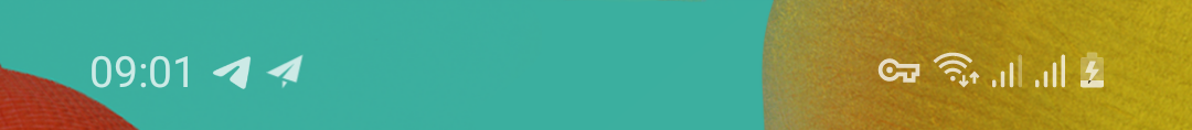
As Telegram is a messaging app, the users are accustomed to associating its icon with a new message. The similarity can irritate users, since they confuse Shadowsocks logo (which is always shown) with Telegram.
What that makes it worse is that there is a significant overlap between the users of two apps, because Telegram has been blocked in a couple of countries and Shadowsocks, well, can help to circumvent it.
Now these are the solutions that comes to my mind:
1) Leaving the logo as is. The users might sooner or later figure out to differ two logos without any effort. Humans are good at learning to recognize patterns subconsciously nevertheless.
2) Assuming the first solution doesn't work, a workaround is to turn off notifications for Shadowsocks. This hides the logo from notification bar and lock screen albeit this is not ideal.
3) Asking the guys over Telegram to change their logo. I don't think they would it and the issue will remain.
4) Making a minimalistic change to the current logo that contrast it enough with Telegram logo (e.g. flipping the logo horizontally).
5) Using a totally different logo. This can resolve the issue, but it needs a considerable amount effort. It can also negatively impact the branding of Shadowsocks as people have always known it with "paper plane" logo.
Personally, I don't like solution (3) and (5). I like (4) but the minimalist change can be debated.
What's your thoughts on this?
 nickaein
on 13 Dec 2020
nickaein
on 13 Dec 2020
Related issues
 KlansyMsniv
·
3Comments
KlansyMsniv
·
3Comments
 Rabbit1623
·
5Comments
Rabbit1623
·
5Comments
 iKirby
·
4Comments
iKirby
·
4Comments
 theScrabi
·
5Comments
theScrabi
·
5Comments
 wenewzhang
·
4Comments
wenewzhang
·
4Comments
Most helpful comment
Thanks for your help. It'd be great if you can follow material design
guidelines and create an adaptive icon.