Seurat: group coloring switches sides in VlnPlot with split.by
Hello,
I am running the dev version. Below is my command to make a Violin plot split by a grouping variable:
VlnPlot(object = obj, features = "gene1", split.by = "group", assay="RNA", pt.size=0.5)
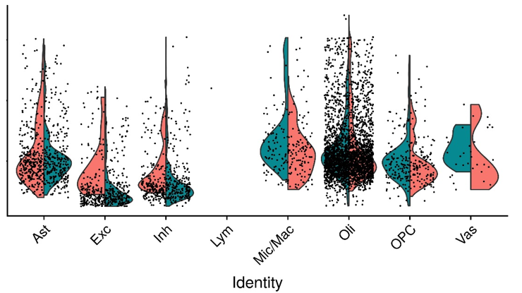
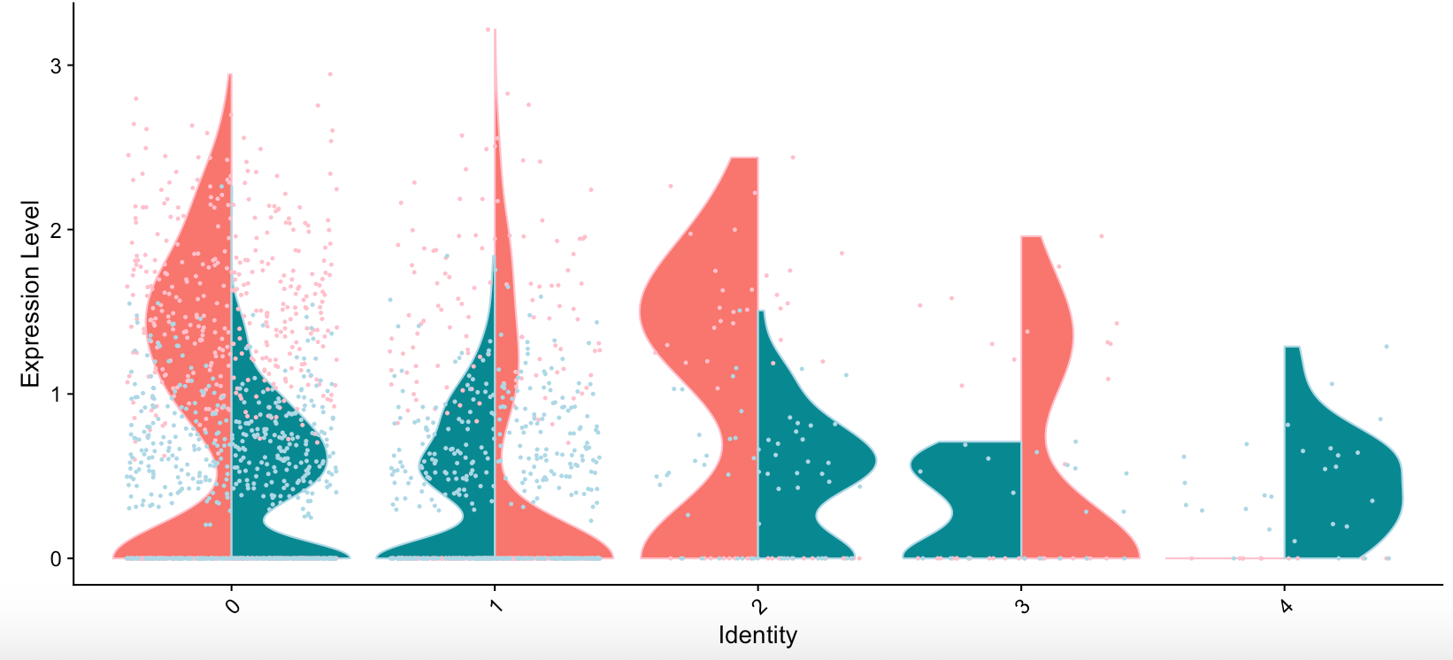
Strangely, group1(red) is initially plotted on the left side but switched to the right side in the same graph. An example is attached. Thank you.
 Ryan-Zhu
All 7 comments
Hi,
This is strange. Does the switching persist if you remove the empty identity ("Lym")?
 andrewwbutler
on 23 Aug 2019
andrewwbutler
on 23 Aug 2019
Hi Andrew,
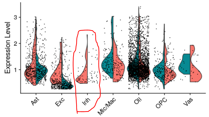
I removed "Lym" identity and the VlnPlot worked properly now. Note the "Lym" identity is not totally empty--there's one cell in one of the two groups. To further test this, I removed all cells in group2 (green) of "Inh", and it caused color switching again. Moreover, cells belonging to goup1 of "Inh", which should have been plotted on the left side only, are now distributed across the entire "Inh" column, which can be misleading. I'd appreciate your help to fix the bug. Thank you.
Ryan-Zhu
on 23 Aug 2019
Moreover, cells belonging to goup1 of "Inh", which should have been plotted on the left side only, are now distributed across the entire "Inh" column, which can be misleading.
I think this is a general "bug". I also noticed that, when you use split.by, the violins are split, but the points are still allover. This can be especially misleading, when you don't have enough cells in the cluster expressing the respective gene.
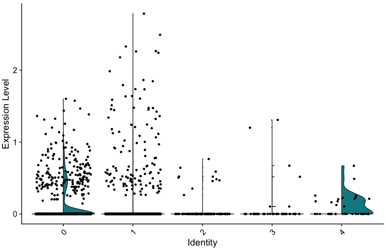
I used the following code to show that the points are allover:
VlnPlot(seurat.object, features = genes[2], split.by = "condition")+aes(color=seurat.object$condition)
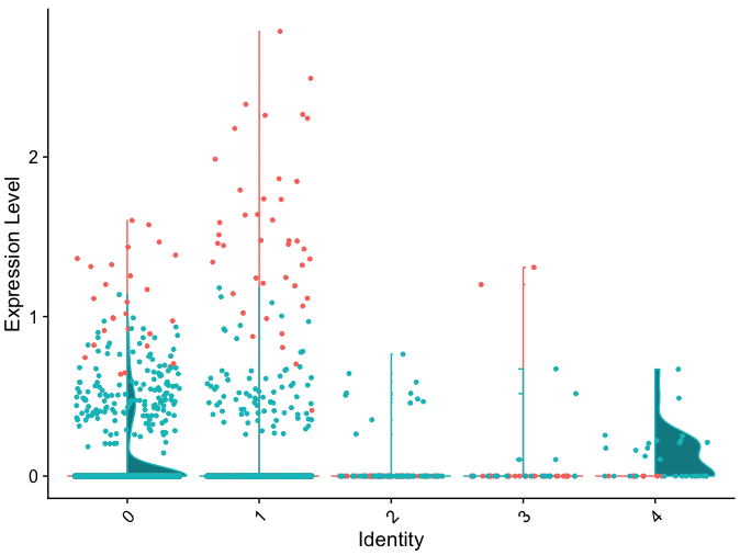
If the dots are all black, in condition 2 in this plot, you would expext that more ore less the same amount of cells is expressing this gene, at more or less the same level. But when coloring the dots, it becomes clear that these are actually expressed at very different levels in the two conditions.
Is there a possibility to plot the dots of each condition only to the side of that condition when using the split.by argument?
 ahoffrichter
on 19 Nov 2019
ahoffrichter
on 19 Nov 2019
I just realized that with the above mentioned code
VlnPlot(seurat.object, features = genes[2], split.by = "condition")+aes(color=seurat.object$condition)
the coloring again switches sides in each group.
ahoffrichter
on 6 Dec 2019
Thanks for reporting this, it will be fixed in the next release.
 timoast
on 3 Apr 2020
timoast
on 3 Apr 2020
This is now fixed on the develop branch
timoast
on 10 Apr 2020
This still seems not fixed. I am opening a new issue.
 saeedfc
on 14 May 2020
saeedfc
on 14 May 2020
Related issues
 tmccra2
·
3Comments
tmccra2
·
3Comments
 GHAStVHenry
·
3Comments
GHAStVHenry
·
3Comments
 kysbbubbu
·
3Comments
kysbbubbu
·
3Comments
 sarahwajid
·
3Comments
sarahwajid
·
3Comments
 RuiyangLiu94
·
3Comments
RuiyangLiu94
·
3Comments
Most helpful comment
I think this is a general "bug". I also noticed that, when you use
split.by, the violins are split, but the points are still allover. This can be especially misleading, when you don't have enough cells in the cluster expressing the respective gene.I used the following code to show that the points are allover:
VlnPlot(seurat.object, features = genes[2], split.by = "condition")+aes(color=seurat.object$condition)If the dots are all black, in condition 2 in this plot, you would expext that more ore less the same amount of cells is expressing this gene, at more or less the same level. But when coloring the dots, it becomes clear that these are actually expressed at very different levels in the two conditions.
Is there a possibility to plot the dots of each condition only to the side of that condition when using the
split.byargument?