Server: Selecting of items has a different look depending on the kind of item
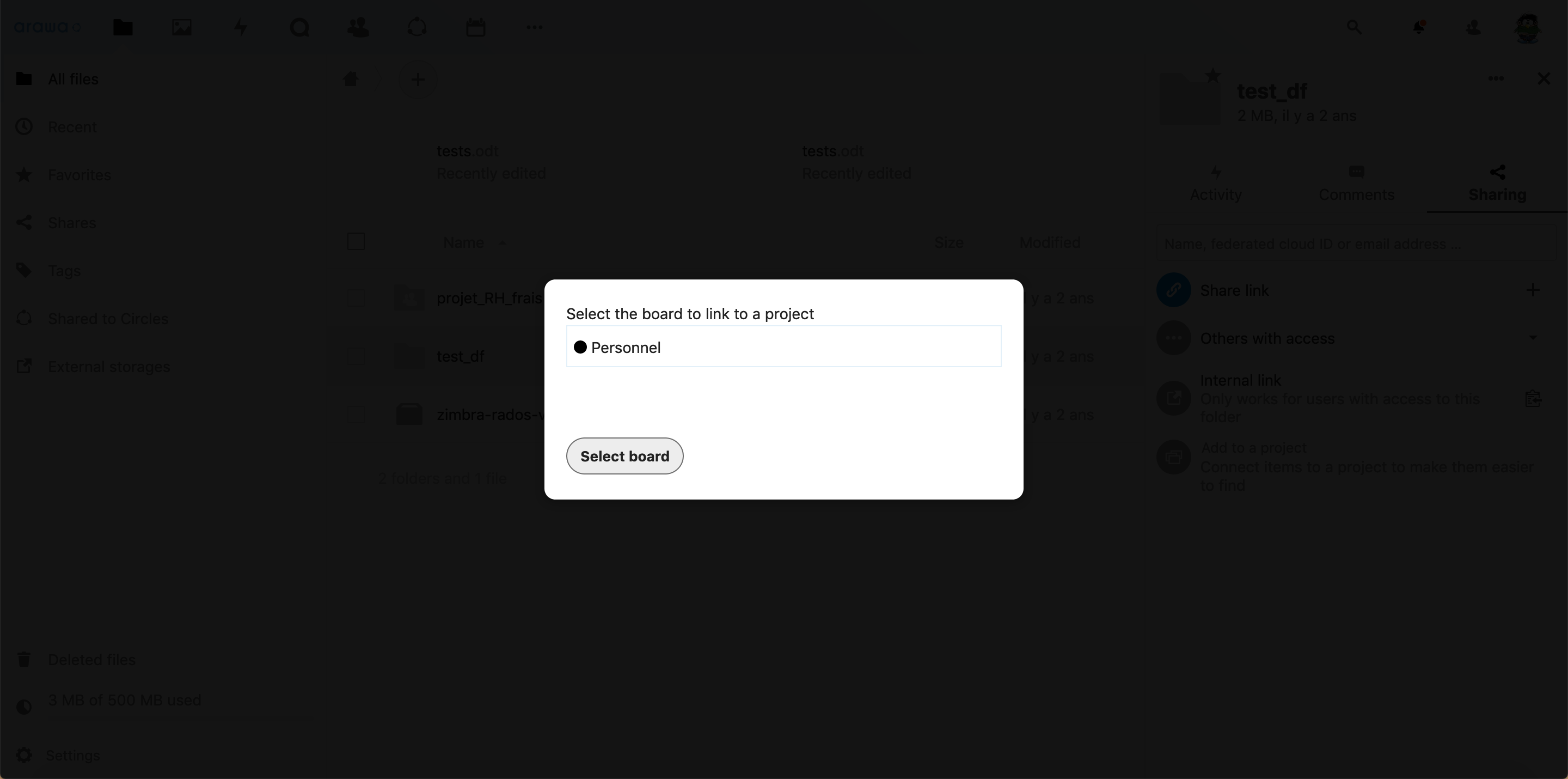
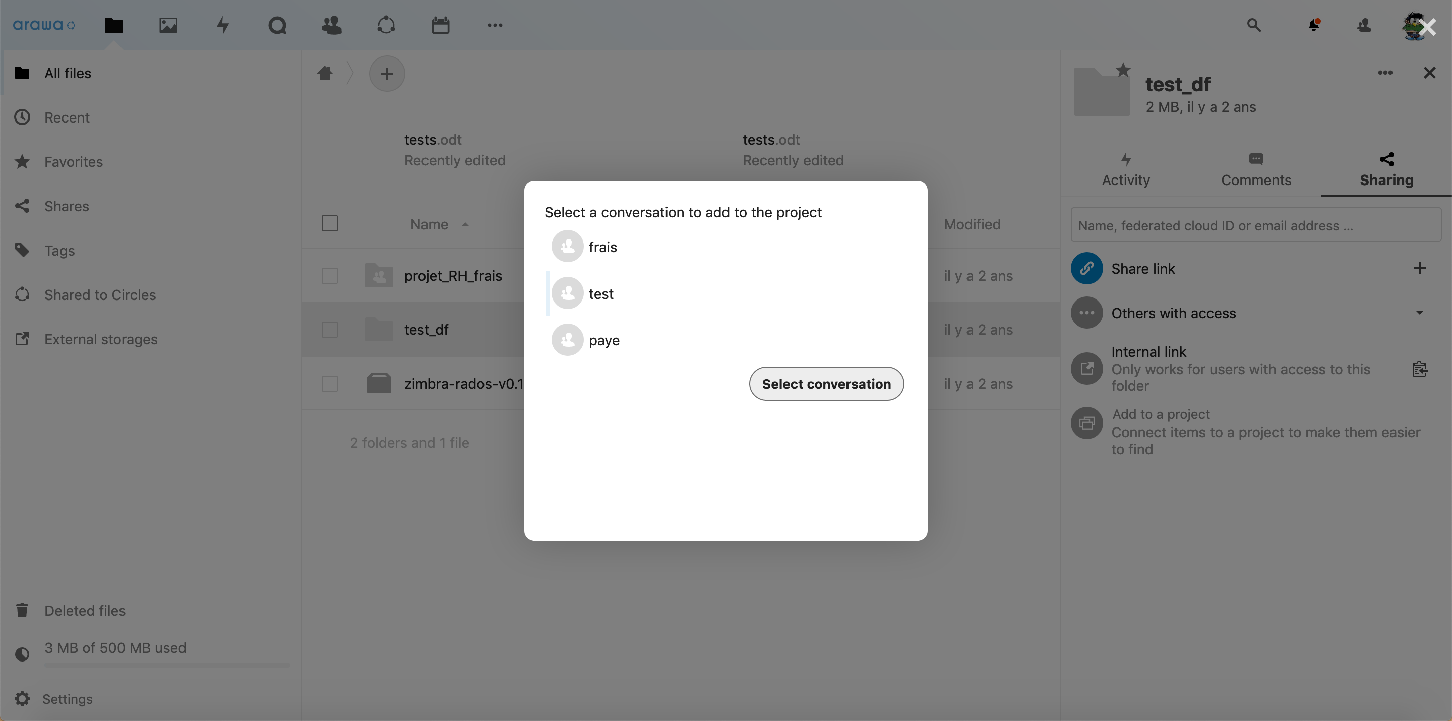
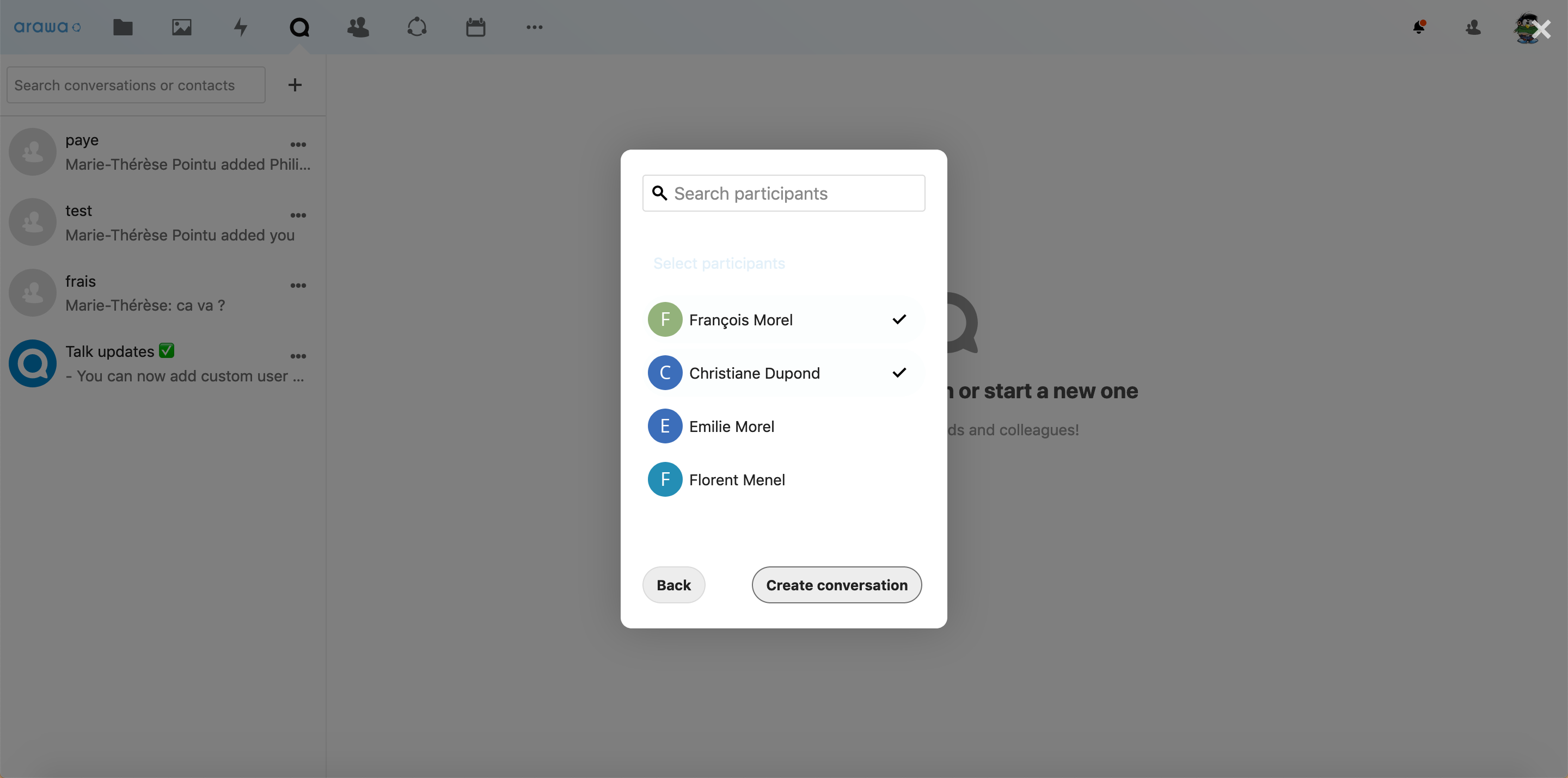
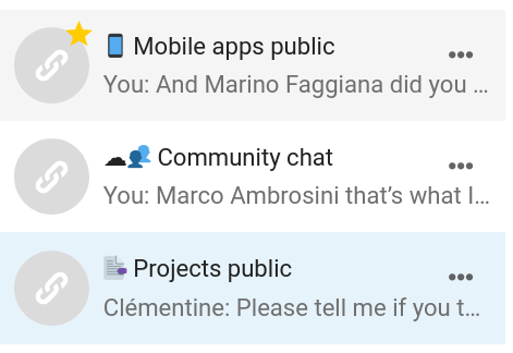
When adding a file to a project and linking it to an item (board, file or conversation) the selection indicators are different for each type of items.
File > share > Add to a project > Link to a board : light blue frame
Link to a file : grey background

Link to a conversation : light blue line on the left side
The last one is not necessarily linked to the Projects feature but the selection indicator when choosing participants to create a conversation is also different : check marks
The selection indicators are very different from each other and I believe the design would be better if those indicators were cohesive. I also think the indicator for a conversation is not really visible, the most effective indicator seems to be the one for the files.
 Clementine46
All 3 comments
Really great analysis @Clementine46!
I also think the indicator for a conversation is not really visible, the most effective indicator seems to be the one for the files.
The indicator in conversations depends on the theming color, which seems to be quite light on your instance. However, there we normally automatically fall back to a grey with enough contrast, which should happen in this case too – cc @ma12-co
@Clementine46 we also have the 2 feedback states for hover/focus (light grey) and active/selected (light primary/theming color), as you can also see in the Talk navigation.
We could use either the light grey or the light primary color for this selection design as well – which do you think would be better? (Also e.g. when you select items in the file list with multiselect.)
 jancborchardt
on 8 Apr 2020
jancborchardt
on 8 Apr 2020
Cool that you brought this up @Clementine46 :)
Yep, we should add a fallback there @jancborchardt, but as a general pattern for multi-selections I would mimic what we do for the navigation:
- var(--color-hover) when hovering elements;
- var(--color-primary-light) for selected elements;
 ma12-co
on 9 Apr 2020
ma12-co
on 9 Apr 2020
I agree with @ma12-co, the theming color should be used for the selection design. Since this color is already used for selected elements, it will be more consistent that way :)
Clementine46
on 9 Apr 2020
Related issues
 rullzer
·
3Comments
rullzer
·
3Comments
 ghost
·
3Comments
ghost
·
3Comments
 williambargent
·
3Comments
williambargent
·
3Comments
 mfechner
·
3Comments
jancborchardt
·
3Comments
mfechner
·
3Comments
jancborchardt
·
3Comments