Server: User management view: Rethink quota
Is your feature request related to a problem? Please describe.
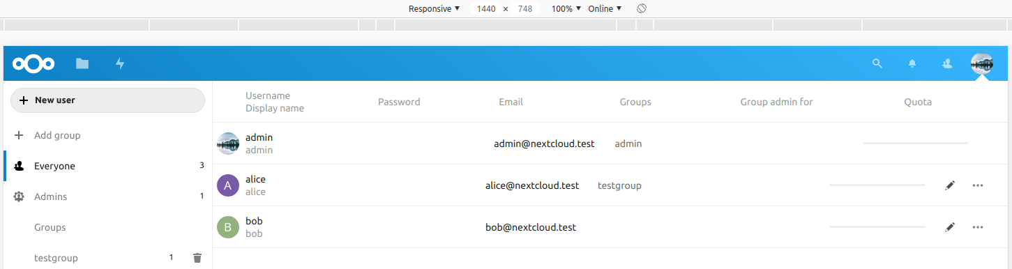
I like the new user management view :+1: but I'm unhappy with the quota bar. Please switch from a designer to a user manager perspective for a moment. I'm not able to see what quota is assigned for a user or how many storage is used.
- To see the storage in use (to concrete value): hover over the bar.
- To see the assigned quota: enter the edit mode.
Describe the solution you'd like
Remove the progress bar. Show the important information: x MB of y MB used. The progress bar is fine for the user view but not user management view.
Describe alternatives you've considered
There is no alternative to consider.
cc @nextcloud/designers
 kesselb
All 6 comments
@jancborchardt
 skjnldsv
on 22 Dec 2019
skjnldsv
on 22 Dec 2019
What was wrong with the way we had it before, text and visualization combined?
We should have it like this again and we get the best of both worlds. The correct information, and a quick identification of who is close to being over quota.
And yes, the text could be:
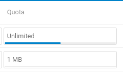
- Unlimited (10 GB used)
- 5 GB (2 GB used)
 jancborchardt
on 30 Dec 2019
jancborchardt
on 30 Dec 2019
I remember discussing to show the used space as tooltip but not removing the general space. So maybe we removed it accidentally.
So @jancborchardt @kesselb, you propose to show both (general space and used space) inside the field and not as a tooltip?
 GretaD
on 6 Jan 2020
GretaD
on 6 Jan 2020
I Remove the progress bar. Show the important information: x MB of y MB used. The progress bar is fine for the user view but not user management view.
That's my proposal. I don't see any need for a quota bar at this place. Probably from a designer perspective this quota bar makes sense. But it's hiding important information.
kesselb
on 6 Jan 2020
Yes, my proposal is as per my last comment in https://github.com/nextcloud/server/issues/18540#issuecomment-569630626 :)
And that does include the bar, which is not just decoration but great for quick identification on who is close to hitting limits – and as we had before.
jancborchardt
on 8 Jan 2020
For the user management view it's decoration. To see if someone is close to hitting the limits is not the point. The point is how many quota is assigned and how much used. Everyone can do the math ;) I'm fine with using a decent color to indicate if someone is hitting the quota (e.g yellow < 90%, red < 95%).
I know you have a lot of expertise in this area. My concern is to not hide important information behind some visual elements. Making it harder than necessary to get information.
But I'm also fine with restoring the previous state: bar with text. That will work for most people yet there is no real use for bar ;)
kesselb
on 8 Jan 2020
Related issues
 j-ed
·
3Comments
j-ed
·
3Comments
 brylie
·
3Comments
brylie
·
3Comments
 blackcrack
·
3Comments
jancborchardt
·
3Comments
blackcrack
·
3Comments
jancborchardt
·
3Comments
 ThomasLeister
·
3Comments
ThomasLeister
·
3Comments
Most helpful comment
What was wrong with the way we had it before, text and visualization combined?

We should have it like this again and we get the best of both worlds. The correct information, and a quick identification of who is close to being over quota.
And yes, the text could be: