Server: New Folder input box in move dialog not clickable
12946
Steps to reproduce
- Select one or multiple files
- Click on Actions (top of the page)
- Click on Move or Copy
- navigate to a few subfolders
or:
- Click on the three dots on the right side of a file or folder
- Click on Move or Copy
- navigate to a few subfolders
Expected behaviour
- I want to create a subfolder by clicking on the + button.
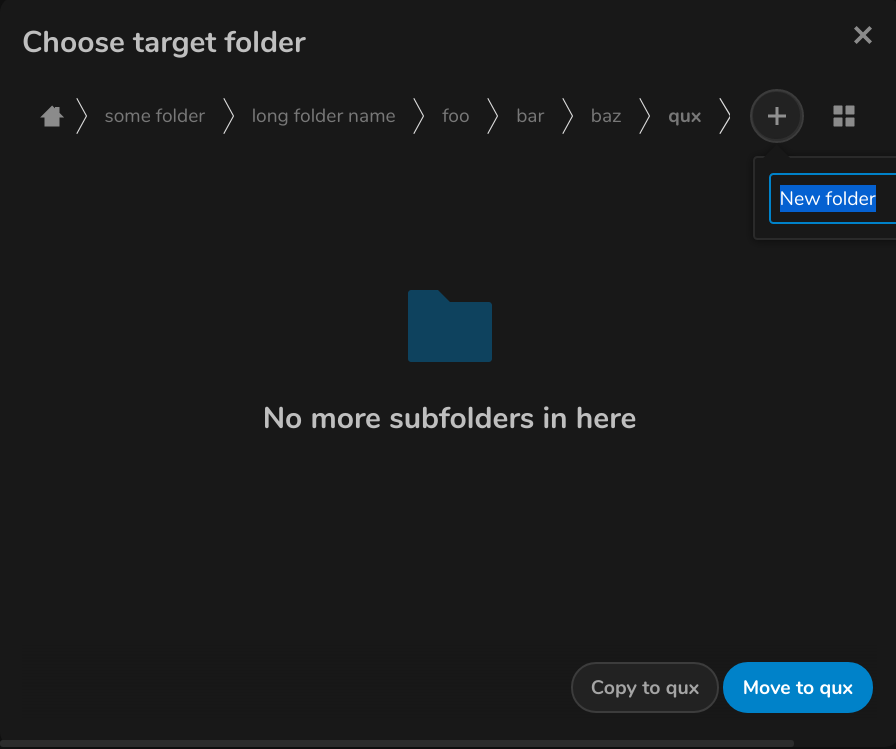
- A small input box appears.
- I type the name of the new folder in the input box
- I click on the arrow button and the folder gets created
Actual behaviour
I experienced a unconvenient behavior. The arrow button is outside the dialog / is not visible.

I think the best way to explain why this is a problem (i think) is a video:
https://youtu.be/zQlEq3VLNxY
or if you dont like google: https://nextcloud.fractava.com/index.php/s/github-issue
(is video explanation ok in a github issue ?)
Server configuration (probaly not very important)
Operating system:
Unraid
Web server:
nginx
Database:
mysql
PHP version:
7
Nextcloud version: (see Nextcloud admin page)
16.0.4
Updated from an older Nextcloud/ownCloud or fresh install:
Updated
Where did you install Nextcloud from:
Docker (linuxserver/nextcloud)
Are you using external storage, if yes which one: local/smb/sftp/...
no
Are you using encryption: yes/no
no
Are you using an external user-backend, if yes which one: LDAP/ActiveDirectory/Webdav/...
no
Dark Mode
yes
Different behavior without Dark Mode
no
Client configuration
Browser:
doesnt work on:
-brave (video) (0.66.99 != newest version)
-vivaldi (2.6.1566.44-1 != newest version)
-firefox (newest version)
does work on:
-chromium (newest version) -> different behavior -> + button is on the left side -> enough space
-chrome (newest version) -> different behavior -> + button is on the left side -> enough space
-vivaldi (newest version) -> different behavior -> + button is on the left side -> enough space
-brave (newest version) -> different behavior -> + button is on the left side -> enough space
-> On Chromium based browsers it does only work in the newest version
-> It doesnt seem to work in any firefox version
Operating system:
Kubuntu
Screen Resolution
3840x2160px

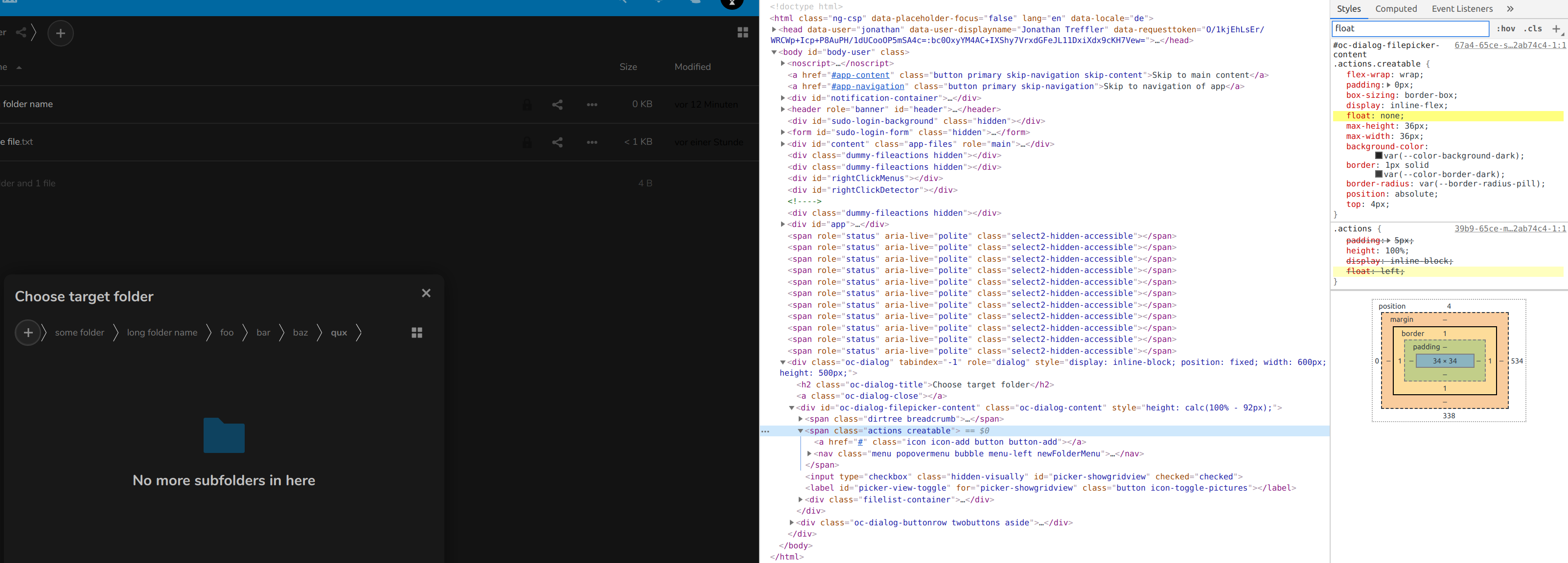
As you can see there is a float (left) applied to the + button but it gets overwritten in some browsers.

In chrome it gets overwritten but it works
Disclaimer:
I know this is a tiny bug and its maybe just a browser "problem" , but still it bugs me.
If it would work in the newest firefox version i opened have posted this issue.
Maybe everything works fine on another screen resolution or different operating system.
All 7 comments
I am not able to test it on a different os because i dont use windows / mac at all
CC @nextcloud/designers
@skjnldsv @juliushaertl this dropdown should be centered by default, right? This could already fix it?
@jancborchardt we could center it, but then on mobile, on root, the menu would shift on the left when no navigation :)
(ps: the vue component include an auto alignment in case it's out of bounds, but we're not there yet for the breadcrumbs)
but then on mobile, on root, the menu would shift on the left when no navigation :)
What do you mean by that? When you are in root there’s still the home icon, just like there’s the "Grid/list view" icon on the right.
But yeah anyway – this would be fixed by having it centered by default and then do the auto-alignment once it’s there, as @skjnldsv said. :)
What do you mean by that? When you are in root there’s still the home icon, just like there’s the "Grid/list view" icon on the right.
Ah yes right!
On nc 16-17, the popup is centered btw. :)
On nc 16-17, the popup is centered
I think this issue can now be closed 🙂