Server: Differentiate group avatars from user avatars
Is your feature request related to a problem? Please describe.
For an enhanced UI/UX through better differentiation of groups and users in lists, the group avatars should be marked somehow.
Describe the solution you'd like
There are many design options to realize this. e.g.:
- The group avatar could be "tagged" by the small symbol used by contacts app.
- The group avatar could be "tagged" by a small symbol resembling a "G"
- Instead of a circle it could be more edged
- A border in a specific colour could surround the circle
- Some kind of group symbol could prepend the group name
- ...
 bpcurse
All 6 comments
cc @nextcloud/designers
 MorrisJobke
on 25 Mar 2019
MorrisJobke
on 25 Mar 2019
What about an Option to set circle/system Group - avatars by uploading them just as you can do for users. An additional step could be selecting circle/system group Avatars from a generic source (like Font Awesome) for creating easy group avatars 🤔
 MariusBluem
on 25 Mar 2019
MariusBluem
on 25 Mar 2019
Absolutely agree with the base problem: The suggestion dropdown is confusing as to what is a user, an email contact, or a group:
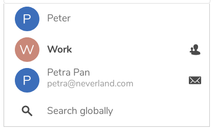
That’s because they all use the color algorithm and the first letter placeholder. Also, they have an indicator on the right which is not really visible as it’s off to the side.
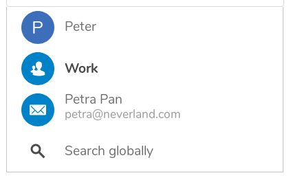
How about this proposal of simplifying:
- Groups get the primary blue background and the contacts icon for the circle
- Email contacts not yet sure
- if there’s no avatar, then primary blue background with email icon works well too
- if there _is_ an avatar, show that one and maybe the email icon overlayed on the bottom right, so that it’s also left of the second row which shows the email?
What do you think @nextcloud/designers?
 jancborchardt
on 18 Apr 2019
jancborchardt
on 18 Apr 2019
How about this proposal of simplifying:
I like that proposal 👍
MorrisJobke
on 18 Apr 2019
@jancborchardt Looks good, smooth and simple.
What about extending this to users from federated instances?

"icon-link" could be used in this case
bpcurse
on 23 Apr 2019
@bpcurse as users from federated instances are Nextcloud users too, we don’t need to differentiate them from the local ones in icon. The icon will be either their avatar, or the avatar placeholder. From the second line you can see that they are federated, as that should show the federated cloud ID like
Virginia Robinson
@[email protected]
jancborchardt
on 23 Apr 2019
Related issues
 williambargent
·
3Comments
williambargent
·
3Comments
 mfechner
·
3Comments
mfechner
·
3Comments
 juliushaertl
·
3Comments
MorrisJobke
·
3Comments
juliushaertl
·
3Comments
MorrisJobke
·
3Comments
 rullzer
·
3Comments
rullzer
·
3Comments
Most helpful comment
Absolutely agree with the base problem: The suggestion dropdown is confusing as to what is a user, an email contact, or a group:
That’s because they all use the color algorithm and the first letter placeholder. Also, they have an indicator on the right which is not really visible as it’s off to the side.
How about this proposal of simplifying:
What do you think @nextcloud/designers?