Server: Responsiveness of design on large screens (like 4k displays)
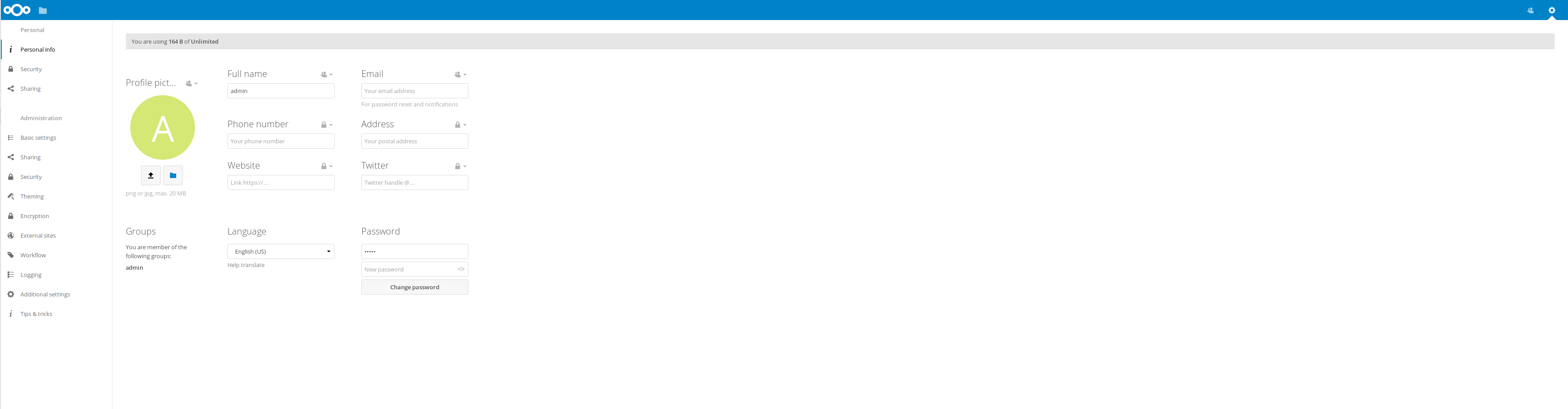
I have a 4k monitor and still the word "Profile picture" is truncated? The text is not even available as title...
Can we improve this somehow?
cc @nextcloud/designers
 nickvergessen
All 9 comments
Adding this to the list! 😂
 skjnldsv
on 16 Nov 2017
skjnldsv
on 16 Nov 2017
@nickvergessen do you have two monitors side by side, or is the bottom truncated? Could you post a screenshot of the whole screen?
@skjnldsv @nextcloud/designers we need to talk about responsiveness also for huge displays. Like flexible units, automatic zooming, etc.
 jancborchardt
on 16 Nov 2017
jancborchardt
on 16 Nov 2017
do you have two monitors side by side, or is the bottom truncated? Could you post a screenshot of the whole screen?
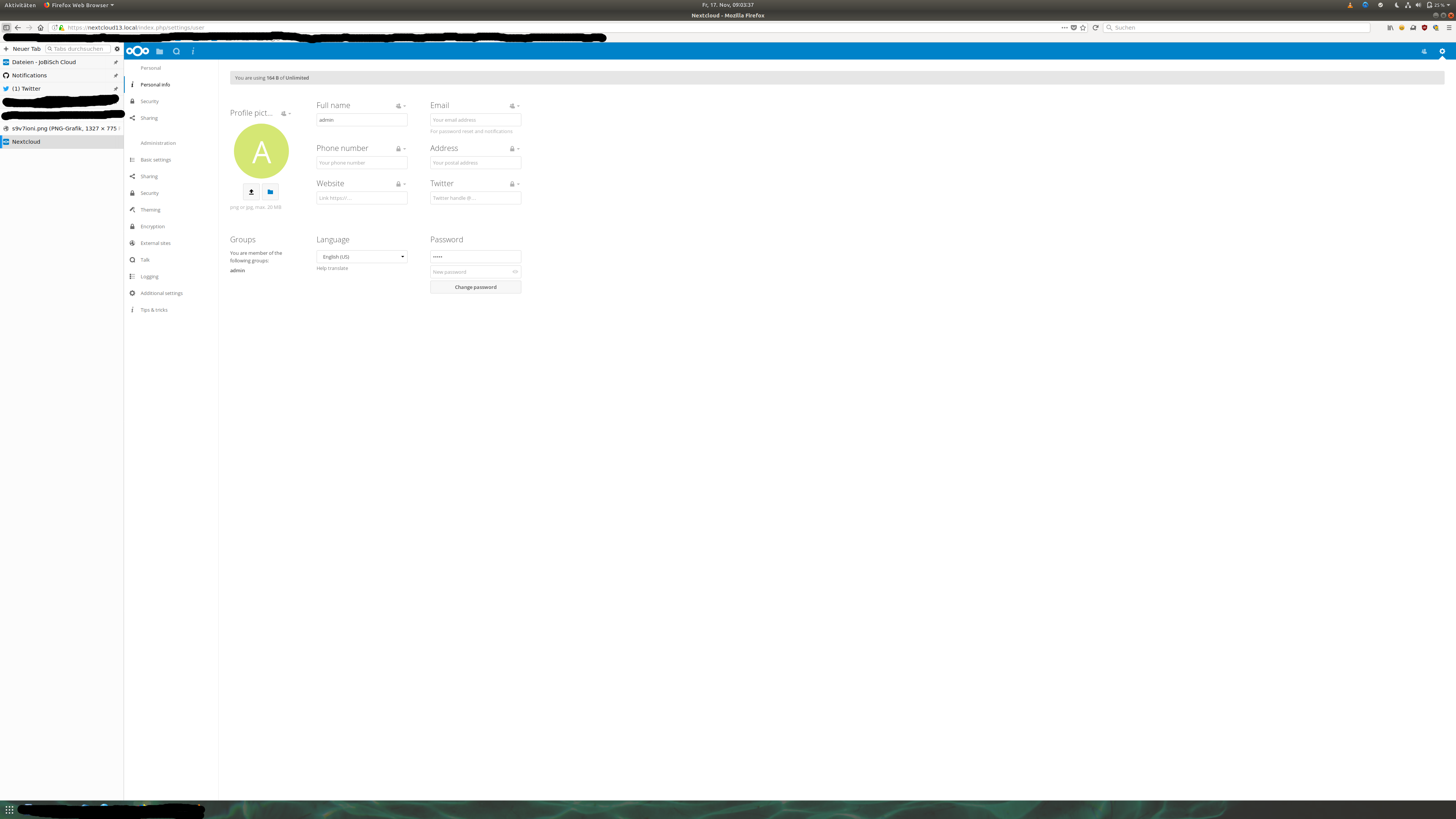
I cut it off, can post a full screen tomorrow
nickvergessen
on 16 Nov 2017
@jancborchardt I will work on responsiveness when I''ll start removing the absolute mess (pun intended) of the css content! :p
skjnldsv
on 17 Nov 2017
But some issues must be decided first. Some items still must have fixed max-width otherwise it will look stupid
 pixelipo
on 17 Nov 2017
pixelipo
on 17 Nov 2017
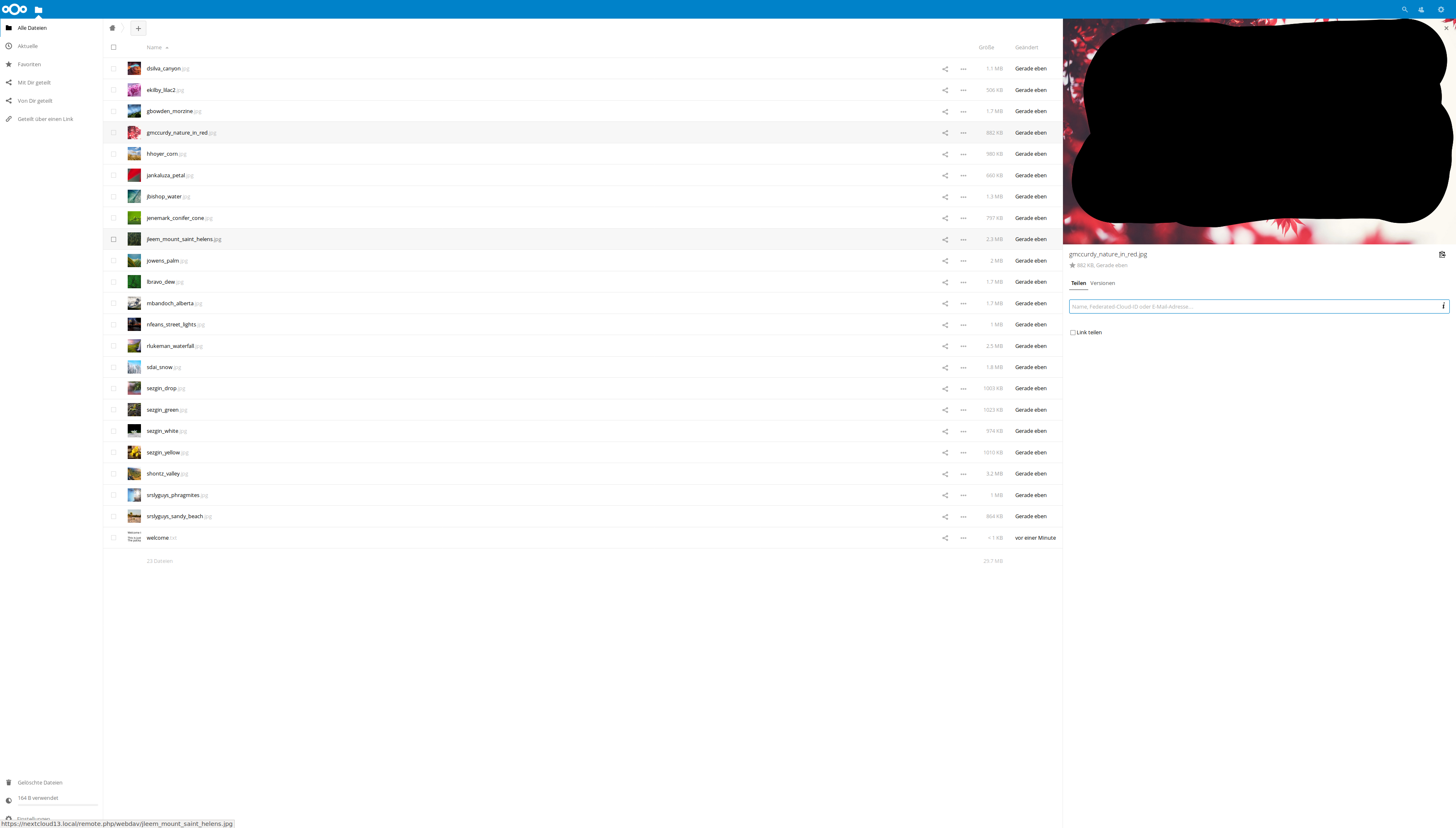
Here is a full screen just for jan:
 nickvergessen
on 17 Nov 2017
nickvergessen
on 17 Nov 2017
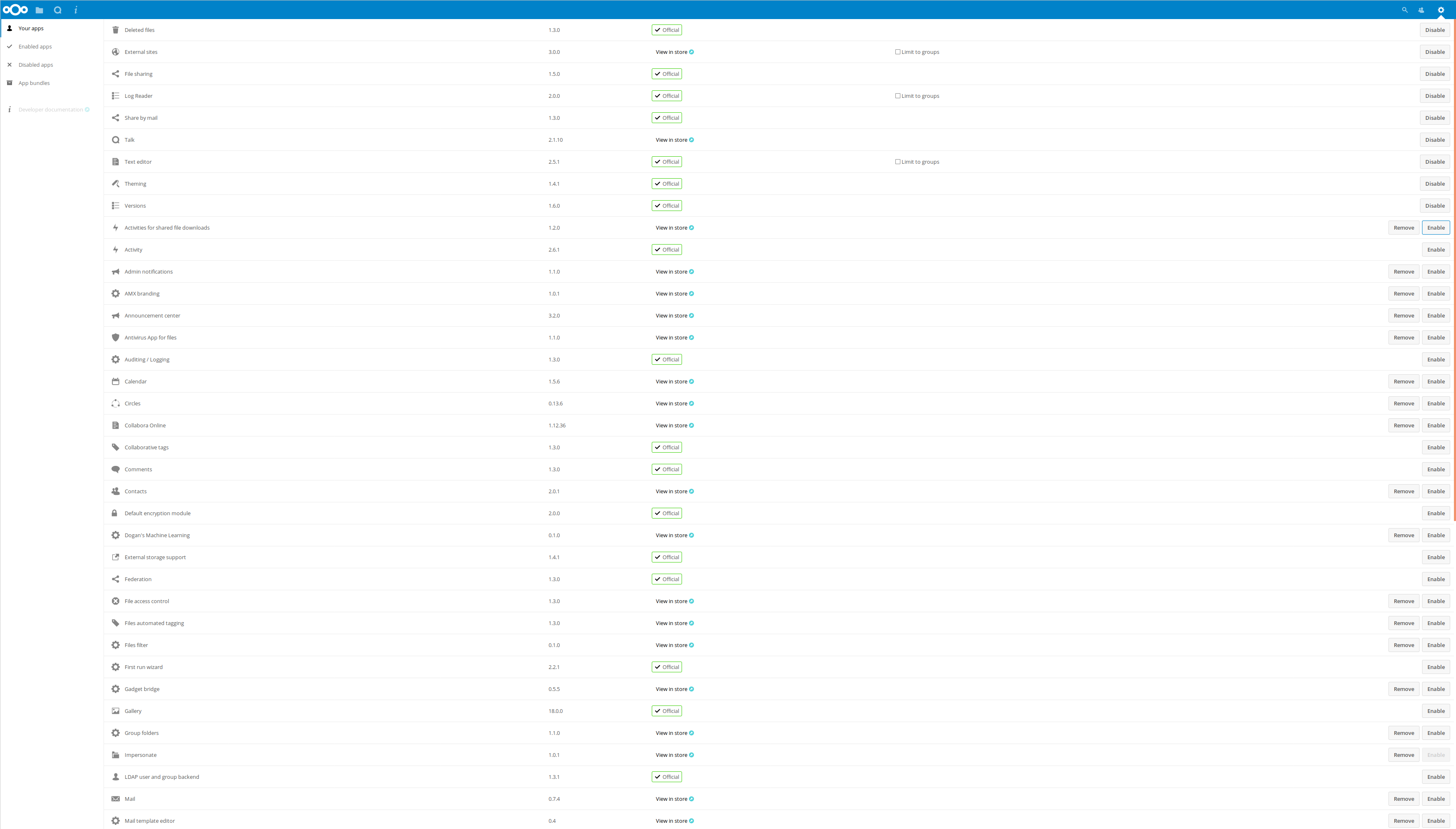
Also I just notices: App management has no row hover effect, so it's hard to make the link between enable/disable button and the app name
 nickvergessen
on 17 Nov 2017
nickvergessen
on 17 Nov 2017
Ok, so we definitely should use flexible units so on a 4k monitor stuff should not be so small. @nickvergessen cause it is quite small, right? I assume the monitor is smth between 24"–30"?
@nickvergessen can you open a separate issue about the hover in user mgmt?
jancborchardt
on 17 Nov 2017
The screen is 27" it's a bit small, but not really harder to read compared with pages like twitter, fb, gh,... they are all pretty much the same.
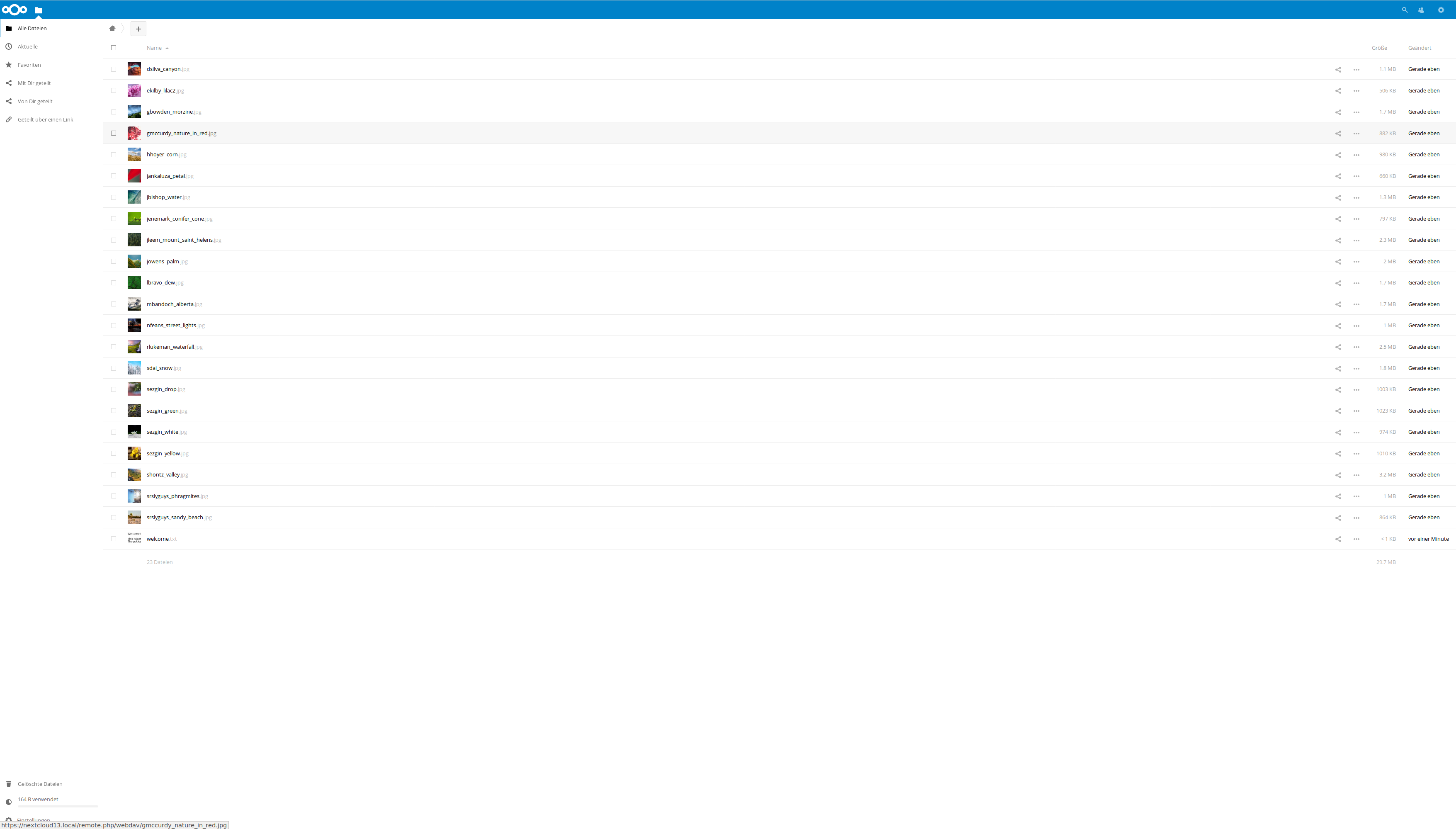
File list without sidebar
File list with sidebar
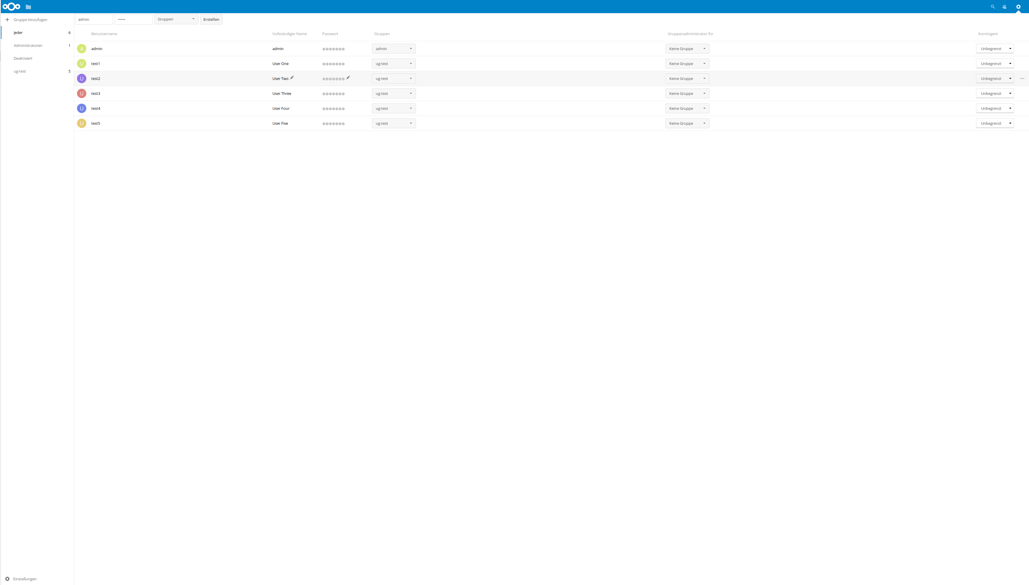
User management
 nickvergessen
on 17 Nov 2017
nickvergessen
on 17 Nov 2017
Related issues
 MorrisJobke
·
3Comments
MorrisJobke
·
3Comments
 georgehrke
·
3Comments
georgehrke
·
3Comments
 ChristophWurst
·
3Comments
ChristophWurst
·
3Comments
 j-ed
·
3Comments
j-ed
·
3Comments
 brylie
·
3Comments
brylie
·
3Comments