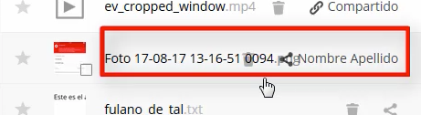
Server: Share info is overlapping filename when sidebar is opened
- having a received share (the name of the owner is shown in the file list)
- open the sidebar for this file
- actual: sometimes the filename is overlapped by the share info
- expected: filename should get cropped and an ellipsis should be added

cc @nextcloud/designers Do you have an idea how to implement this?
 MorrisJobke
All 11 comments
Switch to a full flex table? :D
 skjnldsv
on 14 Sep 2017
skjnldsv
on 14 Sep 2017
Switch to a full flex table? :D
Best would be a short term solution for stable12 as well and a proper solution like the flex table. :/
MorrisJobke
on 14 Sep 2017
I can't reproduce, the name is correctly ellipsed on my install.
skjnldsv
on 14 Sep 2017
I can't reproduce, the name is correctly ellipsed on my install.
When opening the sidebar or when shrinking the window?
MorrisJobke
on 14 Sep 2017
Hum, if I shrink the window, I lose all of the buttons actually.
skjnldsv
on 14 Sep 2017
We should definitely rework on this from scratch.
To sketch everything and decide what we want to hide/show on smaller screens.
skjnldsv
on 14 Sep 2017
I also can't reproduce this. But also what's the delete icon directly there in the row? Maybe it has to do with some customization?
 jancborchardt
on 14 Sep 2017
jancborchardt
on 14 Sep 2017
Ah ok, can see now. Seems we need to adjust the thresholds again. Will then also ellipsize the sharer name so it works with that.
jancborchardt
on 14 Sep 2017
What do we want here then! :)
Do we want to see the full part of the table? like the size ... and so one? Or are we ok hiding it by the sidebar on narrow screens?
skjnldsv
on 14 Sep 2017
@skjnldsv exactly: First, the modified & size info hides, then the sharer name too. All of this hides at once at the moment.
I’m looking into ellipsizing the sharer name currently.
jancborchardt
on 14 Sep 2017
Fix is at https://github.com/nextcloud/server/pull/6506 :)
jancborchardt
on 14 Sep 2017
Related issues
 mama21mama
·
3Comments
mama21mama
·
3Comments
 ThomasLeister
·
3Comments
ThomasLeister
·
3Comments
 j-ed
·
3Comments
j-ed
·
3Comments
 georgehrke
·
3Comments
georgehrke
·
3Comments
 MariusBluem
·
3Comments
MariusBluem
·
3Comments