Server: Navigation entries hard to see on normal monitors
Testing master right now.
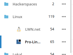
Just a quick photo how the news app looks on a normal 22" 1980p monitor

Can you see which entry is active? I find it very hard since the 2px? blue border seems to merge with the display border.
@jancborchardt
 BernhardPosselt
All 5 comments
cc @nextcloud/designers
 LukasReschke
on 1 May 2017
LukasReschke
on 1 May 2017
I would say the main issue here is that there’s a lot of stuff going on and it’s all battling against each other. How about:
- Only highlighting the _one_ row which is active, not the full containing folder
- Removing the gradient effect for folders, the indent is really enough.
- I assume the orange entry is highlighted because of an error? That could be more elegantly done via an icon like in Contacts: https://github.com/nextcloud/contacts/pull/85 (the screenshots seem to be broken, but it’s an icon-error on the right of the row. No additional color.)
 jancborchardt
on 2 May 2017
jancborchardt
on 2 May 2017
Agree on everything. However even with everything addressed the active entry highlight merges with the display border. There should be something that separates the blue bar from the border (like a white bar, comparable to white subtitles with black border for movies) or an additional visual hint that this entry is active (e.g.: use a bullet point, extend color further with a gradient, also place it on the right side, underline, etc etc etc).
I don't have a preferred way of solving it, it's just that the current approach is not enough for me to quickly find the highlighted entry. And I'm neither visually impaired nor do I need glasses (according to my doctor :))
BernhardPosselt
on 2 May 2017
@juliushaertl do you think we should go back to highlighting the full row? cc @nextcloud/designers
jancborchardt
on 19 Mar 2018
@jancborchardt I think we should actually just increase the width of the activity indicator. For nested lists, we need to make sure that only the active submenu entry has the active indicator:
 juliushaertl
on 19 Mar 2018
juliushaertl
on 19 Mar 2018
Related issues
 j-ed
·
3Comments
j-ed
·
3Comments
 mfechner
·
3Comments
mfechner
·
3Comments
 georgehrke
·
3Comments
jancborchardt
·
3Comments
georgehrke
·
3Comments
jancborchardt
·
3Comments
 e-alfred
·
3Comments
e-alfred
·
3Comments
Most helpful comment
I would say the main issue here is that there’s a lot of stuff going on and it’s all battling against each other. How about: