Server: Add labels to the header app navigation icons
As discussed on various places, but latest in @Espina2's dashboard redesign inspiration #4273, the current iteration of the app navigation lacks labels and therefore is classic mystery meat.
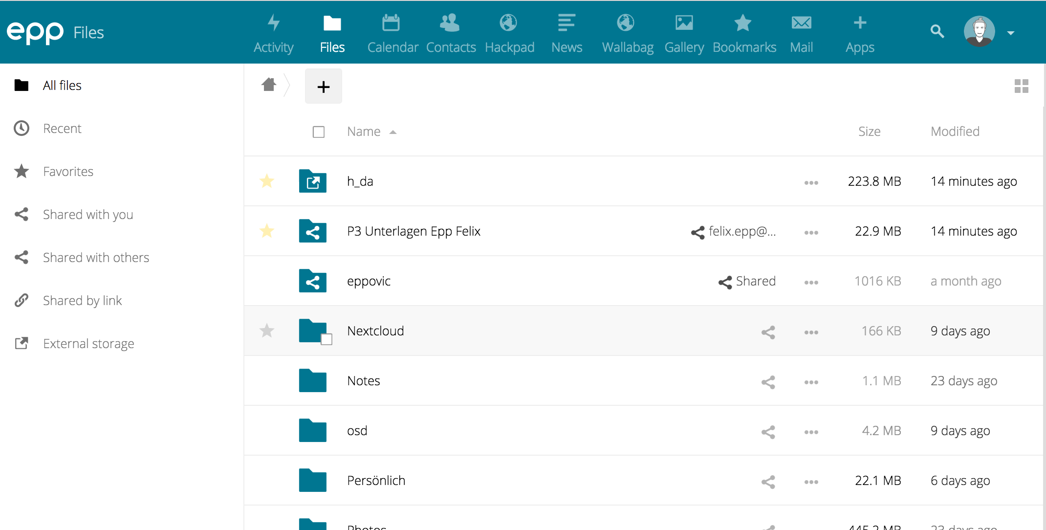
So, far we have two proposals:
- @Espina2 proposed more horizontal space per app to fit the label:

- @jancborchardt suggested labels under the icons. I created an ugly mock a few month with the same idea:

What you clearly can see in both examples: the header would need to become higher, which is ok with me, because I feel the whole design could use some spacing. But also the space per app has to be way bigger, even with the labels under the icons, because the names can be arbitrary, especially in other languages.
I guess for a better discussion we would need a proper proposal...
But I wanted to put the discussion over here.
@nextcloud/designers
 eppfel
All 7 comments
@eppfel You have only four options, label on top, label on down or label on side or what we have now, no label.
I still prefer my version, and have arrow to show more, because on mobile you can make the same, but instead of the arrow you just slide on the menu.
But feel free to put more thinking in this, I have 99% sure that are not any solution without changing the layout.
 Espina2
on 3 May 2017
Espina2
on 3 May 2017
What we could do is by default have it like we do now without label. On hovering/focusing the header bar however the labels of _every_ app is shown, essentially animating to what @eppfel posted above. That way we have a balance between both worlds: We get the non-distracting design when using an app, but avoid the mystery meat when focused on the navigation.
What do you think @nextcloud/designers @karlitschek?
 jancborchardt
on 3 Jul 2017
jancborchardt
on 3 Jul 2017
Sorry. I can't imagine at the moment how this looks and feels. The screenshot of @eppfel looks still too crowded. I really think we should leave some whitespace. We should try to simplify our UI with more free space to guide the eyes of the users to the important elements. Instead of filling everything up.
 karlitschek
on 3 Jul 2017
karlitschek
on 3 Jul 2017
I'm generally not a fan of labelling everything. Icon should be meaningful, otherwise it's a design failure.
Perhaps solution could be to give a welcome screen that would show a grid of enabled apps with name, icon and description so that new user could get familiar with them.
We could also show a notification to a user when new app has been installed (by admin) since last login.
 pixelipo
on 3 Jul 2017
pixelipo
on 3 Jul 2017
hello,
how to make icon like this? in my nextcloud 12
 alahwany
on 6 Nov 2017
alahwany
on 6 Nov 2017
This came up again in a different issue and I made a slightly adjusted mockup based on yours: https://github.com/nextcloud/server/issues/10952#issuecomment-426790178
(Basically the same, but it only shows the labels on hover. Labels of _all_ of the apps on hovering anywhere in the header.) Let’s continue in the other issue cause it has newer info with more recent version. Will close this. :)
jancborchardt
on 30 Oct 2018
Pull request at https://github.com/nextcloud/server/pull/12153 – please review! :)
jancborchardt
on 30 Oct 2018
Related issues
 ChristophWurst
·
3Comments
ChristophWurst
·
3Comments
 blackcrack
·
3Comments
blackcrack
·
3Comments
 dl5rcw
·
3Comments
dl5rcw
·
3Comments
 MorrisJobke
·
3Comments
MorrisJobke
·
3Comments
 mama21mama
·
3Comments
mama21mama
·
3Comments
Most helpful comment
Sorry. I can't imagine at the moment how this looks and feels. The screenshot of @eppfel looks still too crowded. I really think we should leave some whitespace. We should try to simplify our UI with more free space to guide the eyes of the users to the important elements. Instead of filling everything up.