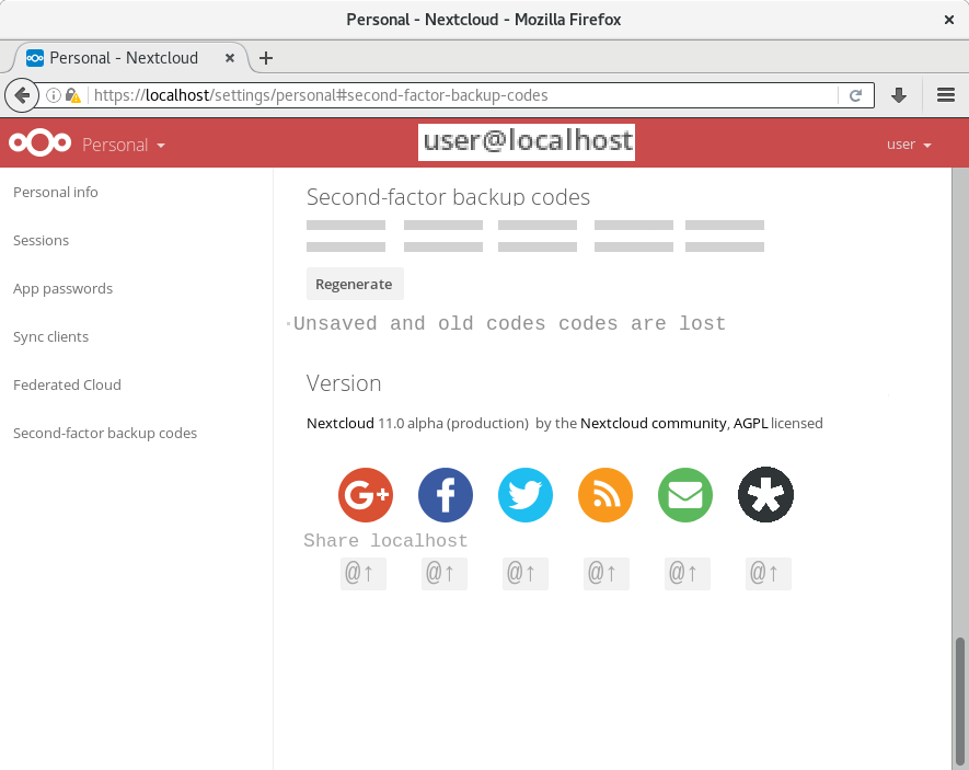
We recently added a new setting to the personal settings page – the ability to generate backup codes, which can be used in case users lose access to their second factor. At the moment, the user interface doesn't look that nice:


@nextcloud/designers any idea how we could make a prettier user interface out of that? Would be great if someone could create a mockup :art: :rocket:
ref https://github.com/nextcloud/server/pull/1171
 ChristophWurst
All 9 comments
- A bit of space between the explanation and the codes.
- Show only 5 codes in one row instead of 10.
And for all other 2FA's:
- Put all 2FA stuff into one single menu instead of giving every plugin (and now the codes) an own space on the personal-page.
 MariusBluem
on 7 Sep 2016
MariusBluem
on 7 Sep 2016
Put all 2FA stuff into one single menu instead of giving every plugin (and now the codes) an own space on the personal-page.
If that were possible, I'd dot it :wink:
ChristophWurst
on 7 Sep 2016
If that were possible, I'd dot it 😉
Isnt this also possible on admin-page with the encryption stuff. "No Encryption plugin loaded". We could do the same for 2FA - we load all plugins into a single column. 😉
MariusBluem
on 7 Sep 2016
Isnt this also possible on admin-page
Yes, it is. But AFAIK _only_ on the admin page and not for personal settings. cc @blizzz
ChristophWurst
on 7 Sep 2016
Isnt this also possible on admin-page
Yes, it is. But AFAIK _only_ on the admin page and not for personal settings. cc @blizzz
Yupp. The intention is to integration personal and admin settings to have just one "settings". We're not there yet and personal settings were not touched.
 blizzz
on 7 Sep 2016
blizzz
on 7 Sep 2016
Yupp. The intention is to integration personal and admin settings to have just one "settings". We're not there yet and personal settings were not touched.
I have some aspects speaking against that - but this is not the right place to discuss 😁
MariusBluem
on 7 Sep 2016
 comradekingu
on 24 Sep 2017
comradekingu
on 24 Sep 2017
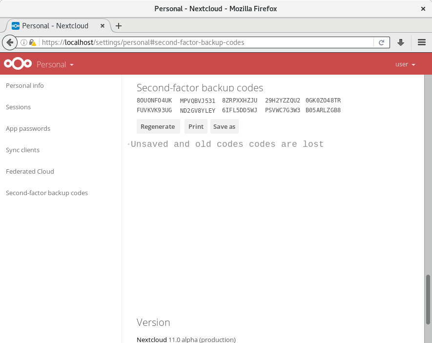
@comradekingu looks good, only the "Old codes are lost …" text is a bit big and out of place. Should use a normal p.
Feel free to open a pull request.
 jancborchardt
on 25 Sep 2017
jancborchardt
on 25 Sep 2017
Basically done by #11409 and other recent enhancements.
ChristophWurst
on 3 Oct 2018
Related issues
 brylie
·
3Comments
ChristophWurst
·
3Comments
brylie
·
3Comments
ChristophWurst
·
3Comments
 rullzer
·
3Comments
rullzer
·
3Comments
 e-alfred
·
3Comments
e-alfred
·
3Comments
 georgehrke
·
3Comments
georgehrke
·
3Comments