The GitHub autogenerated one is among the lamest I've seen.

 dtolnay
All 13 comments
Maybe something like the poster combo?
 oli-obk
on 4 Aug 2016
oli-obk
on 4 Aug 2016
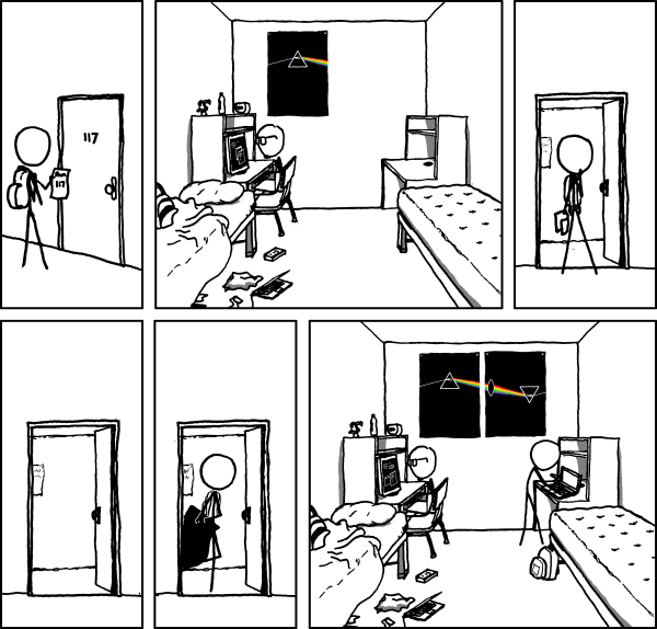
@dtolnay: wow, that's hillarious.
@oli-obk: I like the direction! I wonder what we could to do make it not look like the Pink Floyd poster. I thought about gravitational lensing but that's probably too far out there. Something from this app might work.
Another option might be some play on aqua regia, based off of Bohr dissolving some gold Nobel Prizes to hide them from Nazis, and then reconstituted them after the war.
 erickt
on 8 Aug 2016
erickt
on 8 Aug 2016
that's a pretty cool app
oli-obk
on 8 Aug 2016
 killercup
on 20 Apr 2017
killercup
on 20 Apr 2017

I made an icon, just a sketch right now, but the idea is there. What do you guys think?
 Paluth
on 20 Apr 2017
Paluth
on 20 Apr 2017
@Paluth That's not how sprockets work! :)
EDIT: Oh wait those actually are gears... to which I say heresy. :P
 bstrie
on 20 Apr 2017
bstrie
on 20 Apr 2017
we can churn the gears a little with each major release! :)
Paluth
on 21 Apr 2017

Was trying to do a dissolving effect, but couldn't get it to look right 🙁 oh well!
 Diggsey
on 21 Apr 2017
Diggsey
on 21 Apr 2017
What about a picture of the rust gear printed on a piece of paper?
 clarfonthey
on 21 Apr 2017
clarfonthey
on 21 Apr 2017

Started off trying to turn the rust gear into a sun... kinda ended up with a yin/yang thing at some point... eh :/
 fourthetrees
on 21 Apr 2017
fourthetrees
on 21 Apr 2017
I appreciate that the cogwheel is a recognizable element of Rust's logo, but I find it to be a rather hackneyed symbol in OSS. It would be nice to try something different, e.g. a cheap geometric bauble:

 tapeinosyne
on 21 Apr 2017
tapeinosyne
on 21 Apr 2017
@tapeinosyne I agree with you and I love your design. Would you or anyone else be willing to put some more time into this? I think we can make something work.
Things I like:
- Subtle emphasis on the two halves of the word ser and de. Different colors for ser vs de or anything similarly in-your-face would be too much. What you have is brilliant.
- Square is great for the icon of the github org.
Things that would really sell it:
- A variation / minimalization that works in 44x44 pixels - the size of the icon left of this comment.
- Some idea of how this would fit into the context of a readme or website - whether in square form or a banner-shaped variation. Designing a website is a whole separate thing but if we have a logo it might as well be usable on the current one.
dtolnay
on 21 Apr 2017
I'd be happy to hear from others in this thread and refine the design. A benefit of these baubles is that they can be crammed through cookie-cutter steps to extrude variations; it's easy to iterate on them.
So, here are the basic elements of this particular bauble:
- a technical font in a single color,
- one solid color or mostly homogeneous pattern,
- one simple pattern that works nicely with the other,
- use of vertical alignment to visually separate the prefix “ser” from the suffix “de”.
It only takes a few minutes to sketch an alternative design based on these steps. I used Input Serif Compressed in medium weight, a palette based on the Solarized color scheme, and a simple pattern of pips. Now, tasked with adapting the bauble to a different form factor, I can renounce any sophistication and nevertheless obtain tolerable results:

It is similarly easy to experiment with different patterns:

Less so with minimization, which can seldom be achieved without some tedious pixel-wrangling. (At least, not with Affinity Designer; it could be that Illustrator offers better rasterization.)

If we were to identify a variation we liked well enough, it wouldn't take long to finalize a design (ensure alignment, adjust spacing, and so on). Meanwhile, we can experiment without much effort.
tapeinosyne
on 23 Apr 2017
Related issues
dtolnay
·
3Comments
 mwu-tow
·
3Comments
dtolnay
·
3Comments
mwu-tow
·
3Comments
dtolnay
·
3Comments
 pwoolcoc
·
3Comments
dtolnay
·
3Comments
pwoolcoc
·
3Comments
dtolnay
·
3Comments
Most helpful comment
@dtolnay: wow, that's hillarious.
@oli-obk: I like the direction! I wonder what we could to do make it not look like the Pink Floyd poster. I thought about gravitational lensing but that's probably too far out there. Something from this app might work.
Another option might be some play on aqua regia, based off of Bohr dissolving some gold Nobel Prizes to hide them from Nazis, and then reconstituted them after the war.