Semantic-ui: [Form] Add Input Help Text
Has anyone implemented subtext or sub-label like input help using Semantic classes? See my attached prototype.

I'd like to have some text left aligned closely under the input at a 50% opacity / or grey color. I know I can roll my own. But I'd much rather use semantic styles.
 geemang2000
All 27 comments
Looks like
This is my subtext etc etc''' might work.
geemang2000
on 9 Feb 2015
Also, it'd be great if the "error" style would work with the Input Help Text. E.g. if a containing field has error, the Help Text would have support the error style. This would be great as I'd dynamically replace the Help Text with the validation error text.

geemang2000
on 9 Feb 2015
Duplicate of #299
 jlukic
on 11 Feb 2015
jlukic
on 11 Feb 2015
It'd be great if the help subtext works uniformly with all input types. E.g. Checkbox, Dropdown as well.
geemang2000
on 13 Feb 2015
Yes, please! :+1:
 Starefossen
on 19 Oct 2015
Starefossen
on 19 Oct 2015
This would be really nice! Haven't had many issues switching over from Bootstrap, but this is one nice feature which Semantic-UI is missing.
 john-osullivan
on 4 Dec 2015
john-osullivan
on 4 Dec 2015
Is there any current work around? I'm switching from Bootstrap 3 to Semantic and need this feature.
 ChristopherRabotin
on 9 Feb 2016
ChristopherRabotin
on 9 Feb 2016
I am also interested to see if anyone has found a workaround. My ten-minute google search didn't yield any fruits.
 kellobri
on 11 Jul 2016
kellobri
on 11 Jul 2016
+1
 xxRockOnxx
on 27 Aug 2016
xxRockOnxx
on 27 Aug 2016
So? Is like a joke - don't have this feature.
 love-intent
on 30 Dec 2016
love-intent
on 30 Dec 2016
+1 (migrating from Bootstrap 3)
 maisoui
on 19 Jan 2017
maisoui
on 19 Jan 2017
+1
 renatoaraujo
on 11 Mar 2017
renatoaraujo
on 11 Mar 2017
A workaround for anyone who needs it in the future:
<div class="field error">
<label for="example">Example Field:</label>
<input type="text" id="example">
<small class="helper">Some message.</small>
</div>
.field.error small.helper {
    color: #9F3A38 !important;
}

renatoaraujo
on 11 Mar 2017
Do we have to make a workgroud for this feature? No plan to add it?
 CrisLi
on 27 Apr 2017
CrisLi
on 27 Apr 2017
Is works with label
love-intent
on 27 Apr 2017
@ideal-life-generator Label has nothing to do with Form Field. We have to set Label pointing color to red and add error class to the Field.
CrisLi
on 27 Apr 2017
Currently I need this feature for my project, it would be very helpful. Will you implement it?
 aleksandrabe
on 7 Dec 2017
aleksandrabe
on 7 Dec 2017
I'm getting the feeling that Semantic-UI's core maintainer doesn't have enough time to keep it moving, but also has strong feelings about the library's direction/purpose and doesn't want to give up control.
john-osullivan
on 13 Dec 2017
This issue has been automatically marked as stale because it has not had recent activity. It will be closed in 30 days if no further activity occurs. Thank you for your contributions.
![stale[bot] picture](https://avatars.githubusercontent.com/in/1724?v=4&s=40) stale[bot]
on 13 Mar 2018
stale[bot]
on 13 Mar 2018
Any updates?
 rocketspacer
on 24 Mar 2018
rocketspacer
on 24 Mar 2018
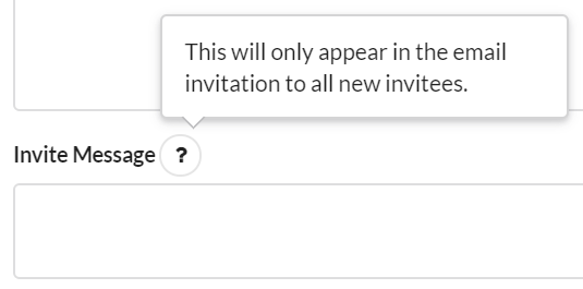
@rocketspacer I'm using Semantic-UI within semantic-ui-react, and I made a couple of components to let me work around. Circular help icons look like something that should be moused over for help info, so just use them as the trigger on a hoverable popup.
class HelpIcon extends Component{

    shouldComponentUpdate(nextProps){ return this.props.helpText !== nextProps.helpText; }

    render(){
        return (
            <Popup content={this.props.helpText}
                hoverable
                trigger={<Icon name='help' circular />} />
        )
    }
}
Then I wrapped the Semantic components with my own that took an optional helpText prop; if helpText was provided, then the field's label gets a help icon.
Maybe I'm spoiled because of how much Semantic made easy, but these workarounds were a real hassle.
john-osullivan
on 19 Apr 2018
@john-osullivan Can you give an example of your wrapper component? I'm looking to do something similar and that sounds really helpful.
 mattfelten
on 16 Aug 2018
mattfelten
on 16 Aug 2018
Sure, @mattfelten , here's how I set up a TextInput which appeared on a page that had multiple forms, so each input also needed to include the form it was on:
class TextField extends Component{
    constructor(props){
        super(props);
    }

    shouldComponentUpdate(nextProps){
        return this.props.value !== nextProps.value;
    }

    render(){
        let fieldName = this.props.formId ? this.props.formId+'/'+this.props.fieldName : this.props.fieldName;
        let helpText = this.props.helpText ? (
            <HelpIcon helpText={this.props.helpText} />
        ) : null;
        return (
            <FormField inline={nulled(this.props.inline)}
                       width={nulled(this.props.width)}
                       key={nulled(this.props.key)}>
                <label htmlFor={fieldName}>
                    {this.props.displayName}
                    {' '}
                    { helpText }
                </label>
                <Input type='text'
                       fluid={nulled(this.props.fluid)}
                       name={fieldName}
                       value={this.props.value}
                       onChange={this.props.onChange}
                       disabled={nulled(this.props.isDisabled)} />
            </FormField>
        )
    }
}
nulled just returns null if the value is false or undefined, as there were some props which treated any value at all as activating it. This component is basically just a wrapper, but it reduced a decent amount of boilerplate in my higher-level forms.
john-osullivan
on 17 Aug 2018
I had a similar issue and what I decided to do instead was just add a className to a Form.Group element designated to be the 'subtext' or 'input help text' and added a css override to offset the 'subtext' to align right under the input Form.Group.
<Form.Group widths={2}>
  <Form.Input label='Name' placeholder='Bob' required />
  <Form.Input label='Location' placeholder='Utopia' />
</Form.Group>
<Form.Group className='subtext' widths={2}>
  <Form.Field content={<small>A name.</small>} />
  <Form.Field content={<small>A location.</small>} />
</Form.Group>
/*
 * Semantic UI Override
 */
.ui.form .fields.subtext {
  margin-top: -1em;
}
Not sure if some people prefer this way vs more complicated coding so I thought I'd put this out there.
 watashiarc
on 4 Jan 2019
watashiarc
on 4 Jan 2019
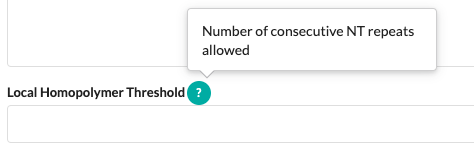
import { Label, Popup } from 'semantic-ui-react'

const HelpLabel = ({ label, help }) => (
  <>
    <label style={{ display: 'inline' }}>{label}</label>
    <Popup
      content={help}
      trigger={(
        <Label color="teal" circular>
          ?
        </Label>
      )}
    />
  </>
)
usage:
        <Form.Field>
          <HelpLabel
            help="Number of consecutive NT repeats allowed"
            label="Local Homopolymer Threshold"
          />
          <Input
            type="number"
            fluid
            placeholder=""
          />
        </Form.Field>
 gravitypersists
on 28 Aug 2019
gravitypersists
on 28 Aug 2019
This is really missing imo!
 boxed
on 6 Feb 2020
boxed
on 6 Feb 2020
+1
 adrianbeloqui
on 14 Feb 2020
adrianbeloqui
on 14 Feb 2020
Related issues
 guilhermeblanco
·
3Comments
guilhermeblanco
·
3Comments
 rdzidziguri
·
3Comments
rdzidziguri
·
3Comments
 ghost
·
3Comments
ghost
·
3Comments
 mixerp
·
3Comments
mixerp
·
3Comments
 miguelmota
·
3Comments
miguelmota
·
3Comments
Most helpful comment
A workaround for anyone who needs it in the future: