@Carreau generated an original idea and put a gist up here: https://nbviewer.jupyter.org/gist/Carreau/7ad674d27698ad11bd4a4398b14481bf
I adapted the code so more of it would be parametrized: https://gist.github.com/mwaskom/7eb7d01d9aa25ea83894293027d12a8c
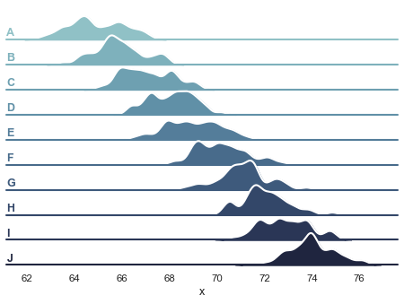
Currently working on something that looks roughly like this:

 mwaskom
All 9 comments
@Carreau suggests: 'To break from classic, I would change one of those to "histogram".'
which yields something like this:

mwaskom
on 3 Sep 2020
For some reason this change all of a sudden makes it look like a basketball to me
mwaskom
on 3 Sep 2020
Cool thing! reminds me of
 MaozGelbart
on 3 Sep 2020
MaozGelbart
on 3 Sep 2020
Yeah it's kind of funny, I originally reacted negatively to @Carreau's suggestion because it reminded me of a ridgeline plot, which I think work better as graphic design than as as data visualization in most cases. But I guess that's what we want here!
mwaskom
on 3 Sep 2020
I definitely wanted to have something that had a hint of ridge plot, but far enough that it is not too obvious for lay person.
I think it is important to convey that seaborn has a statistical connection and why I went for pure gaussian instead of arbitrary distribution that might really look like a wave.
I used the double ring to be able to place the logo both on light and dark background – which I think is important
and I believe the color scheme should likely be less muted if we compare to some other logos from the pydata ecosystem.
The circle-log make me also thing about drawing in in sand, like a zen garden logo. I think we might be able to move away from that an break apart the surrounding circle, or the opposite way we can make the logo more complex and make the surrounding circle a porthole.
There should also likely be a version of the logo where the name seaborn is spelled out; why not SEABORN with the O being the logo.
In the twitter thread you mentioned the dask logo here is the corresponding issue.
You may want to talk amore about what you are looking for in a logo;
And what you really want usually is a logo spec; with the exact values of the colors and various parameters; also likely a color palette that goes with it, and a font. You do not want to avoid having one prototype logo, or you risk ending up with something like the Prototype kilogram, or the jupyter logo where none of the main curves in the crescent are actually circular – which sucks.
 Carreau
on 3 Sep 2020
Carreau
on 3 Sep 2020
OK modulo some tweaking I feel like I've spent the right amount of time on this and have a design I'm pretty happy with. I'm certain a professional designer could do a better job. But I'm also certain a professional developer would have done a better job with the library, too, so I think everything is in alignment :)
The basic logo badge looks like this:

and a word mark logo (e.g. for the website navbar) will look like this:

There's also a tall version of the wordmark logo:

But the alignment with the "bo" and the main badge is vexing me.
One nice thing about this approach is that using cubehelix to generate the colors means the coloring process is generative. Here are some variants:

These are kind of fun. The purple ones break the sea metaphor and remind me of city in the foothills of some mountain range. The green ones look like rolling hills. I don't know if this will really be useful, but cool to have.
Regarding the saturation, I think that "desaturated colors" is a fairly important part of seaborn's visual aesthetic, so I think that fits, even if the logo won't pop as much on a slide next to the pandas and dask ones.
I'm not certain that it looks best with the ring. Putting a the logo on a white circle allows it to work on a dark background without the ring:

But I think on balance the ring helps connect the logo to the text when present. (I did make a version with the logo as the "o" in "seaborn", but I don't love it:

mwaskom
on 4 Sep 2020
Those looks great, I think the default color works the best. The only thing that I find inconsistent the the linewidth on histogram looks smaller than the one on the first gaussian, and I think it is also smaller on the second gaussian but it's more difficult to see with the scatter.
I agree that the O as the Logo does not looks as good as I thought.
I guess with now just need to implement this:
import sns
sns.logo()
I'm not certain that it looks best with the ring.
You know the saying:
"Cause if you like it, then you shoulda put a ring on it" – Beyoncé
:-P
Carreau
on 4 Sep 2020
@Carreau how would you prefer to be acknowledged for conceiving the design and implementation? Link to github profile?
mwaskom
on 4 Sep 2020
@Carreau how would you prefer to be acknowledged for conceiving the design and implementation? Link to github profile?
Sure, that's fine. It was also a 10 minutes hack, you did more work than I on the final design.
Carreau
on 4 Sep 2020
Related issues
 amelio-vazquez-reina
·
3Comments
amelio-vazquez-reina
·
3Comments
 alexpetralia
·
3Comments
alexpetralia
·
3Comments
 btyukodi
·
3Comments
btyukodi
·
3Comments
 JanHomann
·
3Comments
JanHomann
·
3Comments
 phantom0301
·
3Comments
phantom0301
·
3Comments
Most helpful comment
OK modulo some tweaking I feel like I've spent the right amount of time on this and have a design I'm pretty happy with. I'm certain a professional designer could do a better job. But I'm also certain a professional developer would have done a better job with the library, too, so I think everything is in alignment :)
The basic logo badge looks like this:
and a word mark logo (e.g. for the website navbar) will look like this:
There's also a tall version of the wordmark logo:
But the alignment with the "bo" and the main badge is vexing me.
One nice thing about this approach is that using cubehelix to generate the colors means the coloring process is generative. Here are some variants:
These are kind of fun. The purple ones break the sea metaphor and remind me of city in the foothills of some mountain range. The green ones look like rolling hills. I don't know if this will really be useful, but cool to have.
Regarding the saturation, I think that "desaturated colors" is a fairly important part of seaborn's visual aesthetic, so I think that fits, even if the logo won't pop as much on a slide next to the pandas and dask ones.
I'm not certain that it looks best with the ring. Putting a the logo on a white circle allows it to work on a dark background without the ring:
But I think on balance the ring helps connect the logo to the text when present. (I did make a version with the logo as the "o" in "seaborn", but I don't love it: