Seaborn: FacetGrid legend missing colors in key
Code Sample, a copy-pastable example if possible
import pandas as pd
import matplotlib.pyplot as plt
import matplotlib.patches as patches
import seaborn as sns
sns.set_style('whitegrid')
test = sns.load_dataset("tips")
g = sns.FacetGrid(test,
col="sex",
hue="smoker",
size=4, aspect=1)
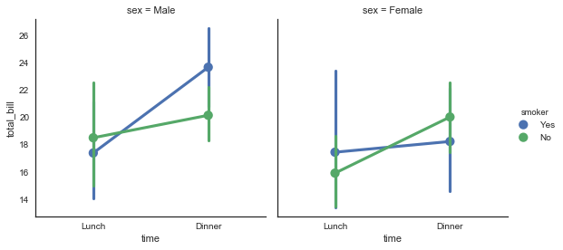
g = (g.map(sns.pointplot, "time", "total_bill").add_legend())
Problem description
For some reason I cannot get the colors from the plot to appear in the key:

Here is my setup:
INSTALLED VERSIONS
commit: None
python: 3.5.2.final.0
python-bits: 64
OS: Darwin
OS-release: 15.0.0
machine: x86_64
processor: i386
byteorder: little
LC_ALL: None
LANG: en_US.UTF-8
LOCALE: en_US.UTF-8
pandas: 0.19.0
seaborn: 0.7.1
matplotlib: 2.0.0
jupyter: 1.0.0
jupyter_client: 4.4.0
jupyter_console: 5.0.0
jupyter_core: 4.2.0
I was on a much earlier version of Matplotlib (1.5.1), and tried upgrading to 2.0 but that did not fix the issue.
 msure
msure
All 15 comments
Use factorplot.
 mwaskom
on 3 May 2017
mwaskom
on 3 May 2017
Is there a solution for this? Can factorplot be used with a custom map function like in FacetGrid?.
I have a custom histogram function for plotting on each facet. It plots the data fine but I have the same issue with the legend missing the colors.
 pbashivan
on 17 May 2017
pbashivan
on 17 May 2017
I have same problem of missing colors in legend when using pairgrid plot in Jupyter notebook inline.
 ManavalanG
on 10 Jul 2017
ManavalanG
on 10 Jul 2017
Use plt.legend(). I had a similar case and it solved it
 jkarakas
on 26 Jul 2017
jkarakas
on 26 Jul 2017
@jkarakas could you elaborate? I'm having a similar problem and would like to see your solution.
 kning
on 10 Aug 2017
kning
on 10 Aug 2017
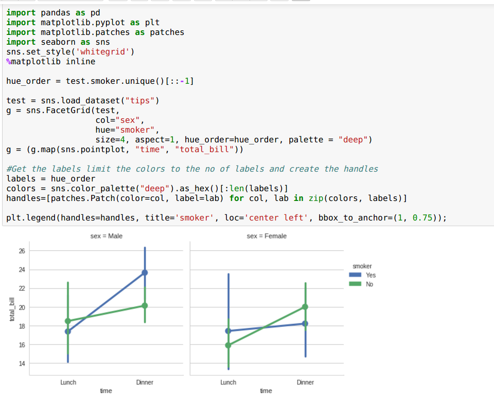
@kning It is very explicit but it works.There is obviously something wrong with getting the patches from the FacetGrid object.
jkarakas
on 12 Aug 2017
As I've said previously: use factorplot.
mwaskom
on 13 Aug 2017
OK well what if I want to use swarmplot?
 xguse
on 25 May 2018
xguse
on 25 May 2018
That works really good. thumbs up, jkarakas. However, I have 20 hue - datasets in my plot, but legend will show me only the first 6, because color palette has only length 6. How can I recycle the colors?
 Rockbaron
on 29 May 2018
Rockbaron
on 29 May 2018
Folks I was terse in my response because there are numerous examples of this in the docs but you're really overthinking things with these hacks:
sns.factorplot(x="time", y="total_bill", hue="smoker", col="sex",
               size=4, aspect=1, hue_order=["Yes", "No"],
               data=tips)
mwaskom
on 29 May 2018
@mwaskom, thank you for the answer. You have been of course correct about factorplot.
@Rockbaron you can expand your palette if you want to recycle deep like this: sns.set_palette(sns.color_palette("deep", 20)).
There are a lot of options and examples on working with color palettes at the seaborn documentation
jkarakas
on 29 May 2018
I had the issue of missing only one of the colors in the legend when using PairGrid with pointplot. Making sure I put NaN first in my df solved this, as: df.sort_values(<column to sort>, na_position="first"). I don't know what is going on under the hood but a possible explanation is that matplotlib/seaborn takes the last row of each hue in the pandas dataframe and uses this as label. If this is a row with NaN the color will disappear in the legend.
 ksahlin
on 16 Oct 2018
ksahlin
on 16 Oct 2018
Extending the answer of @jkarakas , you can pass a dictionary to the add_legend function of the FacetGrid object like so: g.add_legend(legend_data= {lab: hand for lab, hand in zip(labels, handles)})
then you won't need to call plt.legend
 N0rbi
on 15 Sep 2019
N0rbi
on 15 Sep 2019
Extending the answer of @jkarakas , you can pass a dictionary to the add_legend function of the FacetGrid object like so:
g.add_legend(legend_data= {lab: hand for lab, hand in zip(labels, handles)})
then you won't need to callplt.legend
Thanks for your response @N0rbi
 ThisIsVenkatesh
on 30 Dec 2019
ThisIsVenkatesh
on 30 Dec 2019
What about using distplot? In the catplot documentation looks like that is not supported.
 vpapaioannou
on 21 May 2020
vpapaioannou
on 21 May 2020
Related issues
 phantom0301
·
3Comments
phantom0301
·
3Comments
 TDaltonC
·
3Comments
TDaltonC
·
3Comments
 amelio-vazquez-reina
·
4Comments
amelio-vazquez-reina
·
4Comments
 stonebig
·
4Comments
stonebig
·
4Comments
 vinay-jayaram
·
3Comments
vinay-jayaram
·
3Comments
Most helpful comment
@kning It is very explicit but it works.There is obviously something wrong with getting the patches from the FacetGrid object.
