Scratchaddons: Improvements on the update notification modal
There is this new thing where there will be a notification modal/banner that shows every update. The modal is shown below.
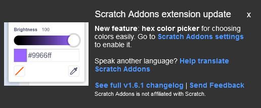
Unfortunately, I have comments with the design and the system, and I feel that this is done hastily, I think this can be improved for the sake of the users.
Firstly, I wanted to introduce the prototype that I made to help me explaining the points that I am going to talk soon.
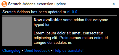
https://codepen.io/Hans5958/pen/oNzpxNy
You may see that this resembles the design of Windows window design. Thought this design can improved, that's not the point I want to discuss mainly, but I have also made multiple examples with different color schemes, shown below.
On the top portion of this modal, there is the title bar. It contains the title of the modal and the close button, like the one's that we have. I also added the logo as a decoration, but that can be removed if you really don't want to copy the Windows design.
Below the title bar is the where the content is. I divided it into three parts: the intro, the highlights, and the footer. Here's the explanation of those three parts.
- The intro contains, well, the introduction/summary of the modal. It just says that it is updated into this certain version. Pretty weird why this didn't included, and the version number is just included below, as a part of a link. This also works as the only content if there are no highlights. The reason of why this is a point will be explained below.
- The highlights contains the feature/addon that wanted to be highlighted. It contains the image part and the text part, but can be adjusted for various updates. The elements are aligned center so that the text is aligned in the center when the content is short, which examples will be provided below. The image can also be excluded, just in case there are none.
- The footer contains relevant links (and texts maybe) for the notification. It only contains links with short phrases, because I think it is unnecessary to make it long. I didn't include the disclaimer because, well, do we really need to warn them like hundreds of times because they might didn't understand about the implications?
Now that I have explained the structure of my idea of the modal, I will continue giving suggestions for the mechanism and some other aspects of it.
The notification should be shown for every single update, including patch versions.
I have no idea why we don't tell the users about the patch updates. What if there is a significant and popular bug that we fixed in a patch version, and we didn't tell them? That would be sad.
What about the highlights? We can just hide the image if it is only text, or even remove it completely and just show the intro and the footer. I have also put this into consideration on the design, which is shown on the example below.The modal should be made on a HTML file, and then injected safely.
I don't think there will be security implications since the contents are static and can't be modified by external users, unless there is a crazy dev that would want to implement a backdoor, which I think it won't happen in near future due to the review process of this org.The highlights should be contained in an accessible format, not hardcoded.
What I mean is that the highlights should be contained in an HTML file, a JSON data, or a YAML data, instead of it being hardcoded. This would make it easier to change for every update, and I don't think it will be hurt to add another file on our extension/repository. This also makes it easier to add/remove aspects on the highlights, instead of writing HTML or JS code.
By the way, I understand that there is a PR underway (or might be already merged) that changed the CSS code so it is styled better. This is not quite relevant within my points explained here and hence is not discussed on this issue.
Also, there is a typo. There is no period at the end of the "Help translate Scratch Addons" sentence. Please fix.
Finally, since it is end of the year, happy new year, whenever and wherever you guys are.
Examples
Here are some of the examples that I made with my prototype.
Color scheme examples
| Color scheme | Image |
| -- | -- |
| White title bar, black content |
| All black | 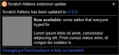
| All white | 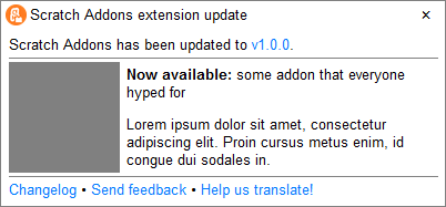
| Scratch Addons dark mode | 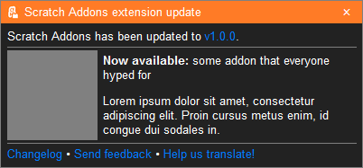
| Scratch Addons light mode | 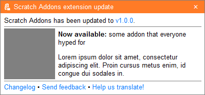
Close button examples
| Design | Images |
| -- | -- |
| Block design | 

| Round design | 

Case examples
| Case | Image |
| -- | -- |
| No image | 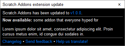
| Short highlight text | 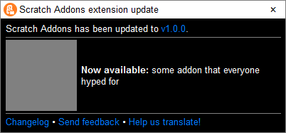
| No image and short highlight text (i.e. bugfix) | 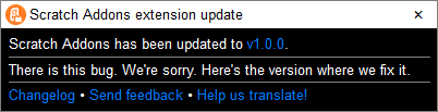
| No highlights | 
| No footer | 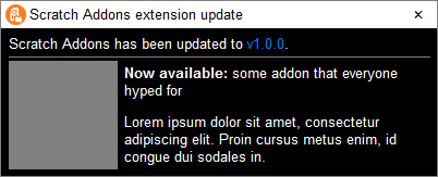
| Intro only | 
 Hans5958
All 13 comments
This is not the current design, see #1125.
 mxmou
on 31 Dec 2020
mxmou
on 31 Dec 2020
This is not the current design, see #1125.
I have addressed this on this part.
By the way, I understand that there is a PR underway (or might be already merged) that changed the CSS code so it is styled better. This is not quite relevant within my points explained here and hence is not discussed on this issue.
Hans5958
on 31 Dec 2020
Please don't, we are not a phishing website
 Touchcreator
on 31 Dec 2020
Touchcreator
on 31 Dec 2020
I'm not sure how this could be a phishing attempt. There is no way this is it because there is no box to fill. If your point is that the window could fool anyone that this is from an Windows app (like you, somehow), then please look at other color schemes that I made. I also believe that this design could be improved, so I am open to any ideas.
Also, note that the modal design is not the main point. The structure and the system is the one.
Hans5958
on 31 Dec 2020
I'm not sure how this could be a phishing attempt. There is no way this is it because there is no box to fill. If your point is that the window could fool anyone that this is from an Windows app (like you, somehow), then please look at other color schemes that I made. I also believe that this design could be improved, so I am open to any ideas.
Also, note that the modal design is not the main point. The structure and the system is the one.
No, it looks too much like a windows popup
Touchcreator
on 31 Dec 2020
No, it looks too much like a windows popup
You probably don't read my comment fully.
If you think so that we can change it. It's just the prototype, and I'm not talking the design, remember!
Hans5958
on 31 Dec 2020
No, it looks too much like a windows popup
You probably don't read my comment fully.
If you think so that we can change it. It's just the prototype, and I'm not talking the design, remember!
ok
Touchcreator
on 31 Dec 2020
Can I try designing one?
 Explosion-Scratch
on 31 Dec 2020
Explosion-Scratch
on 31 Dec 2020
@Hans5958 What do you think of this: https://nt2ws.csb.app/
Explosion-Scratch
on 31 Dec 2020
The highlights should be contained in an accessible format, not hardcoded.
What I mean is that the highlights should be contained in an HTML file, a JSON data, or a YAML data, instead of it being hardcoded. This would make it easier to change for every update, and I don't think it will be hurt to add another file on our extension/repository. This also makes it easier to add/remove aspects on the highlights, instead of writing HTML or JS code.
It kinda does - every message is stored at _locales. We're not inventing a new file format just for this.
 apple502j
on 31 Dec 2020
apple502j
on 31 Dec 2020
I feel that this is done hastily
Correct
I didn't include the disclaimer because, well, do we really need to warn them like hundreds of times because they might didn't understand about the implications?
I added the warning because we're adding the notification modal inside scratch.mit.edu even tho we're an extension, because we don't have enough permissions (and don't want to open a new tab). Adding the modal on Scratch without that disclaimer felt wrong - we don't want to make it look like the announcement comes from Scratch itself.
I have no idea why we don't tell the users about the patch updates.
One thing to consider is that it's not unusual for us to push a patch one day after the biweekly update, and updates arent instant - many users would need to get 2 or even 3 modals after the update(s) - and up to 2 of them could mention bug fixes they couldn't even get to experience.
Also, there is a typo. There is no period at the end of the "Help translate Scratch Addons" sentence. Please fix.
That explains this issue a lot - you really pay attention to detail man, maybe too much? :P
 WorldLanguages
on 31 Dec 2020
WorldLanguages
on 31 Dec 2020
What do you think of this: https://nt2ws.csb.app/
It looks quite elegant and modern for a simple, straightforward one. There are still missing elements that you can add, perhaps?
It kinda does - every message is stored at _locales. We're not inventing a new file format just for this.
I understand, but remember that it is hardcoded. It's just a text (or two counting the translation message), an image, and that's it, and it would be an hassle to, for example, adding another link or paragraph, because there will be a hurdle to writing safe code just for "security sake." I think even adding a simple HTML for the highlights that would be inserted on the popup is far easier to implement and translate. Transifex could translate HTML, right?
P.S. I think even having the whole modal to be uploaded to Transifex in HTML form is probably way easier, compared to translating each string separately.
I added the warning because we're adding the notification modal inside scratch.mit.edu even tho we're an extension, because we don't have enough permissions (and don't want to open a new tab). Adding the modal on Scratch without that disclaimer felt wrong - we don't want to make it look like the announcement comes from Scratch itself.
Reddit Enhancement Suite also does this, but no disclaimer. I think most users already understand that this extension is outside of the safe haven of Scratch.
I think there is a better way to imply this outside of Scratch, such as designing the modal such that it will appear more uniquely/differently. If you really wanted to keep it then sure, but keep it as small that it only occupies a single line.
One thing to consider is that it's not unusual for us to push a patch one day after the biweekly update, and updates arent instant - many users would need to get 2 or even 3 modals after the update(s) - and up to 2 of them could mention bug fixes they couldn't even get to experience.
I think it doesn't matter if the update is day-one or day-one-hundred. Users still better off knowing that there is an update that fix some bugs that their complaining. Otherwise, users will just uninstall it right away because they think the problem won't be solved in the near future. You need to also consider that not every update (in the future) will need a day-one patch.
About the nature of skipping updates, I think we can improve this by just keep the major highlights hidden and showing the minor highlights (i.e. critical bugfix) when it is a patch update, and show the major when it is a major update. For reference, just look the Visual Studio Code release notes that is shown for every single update.
That explains this issue a lot - you really pay attention to detail man, maybe too much? :P
Wow. How wise of you to conclude the atmosphere of this issue within a single sentence from my whole text. Note that I created this for improvement sake, and I accidentally found the typo when I was writing this.
Hans5958
on 1 Jan 2021
P.S. I think even having the whole modal to be uploaded to Transifex in HTML form is probably way easier, compared to translating each string separately.
apple502j would like to know your location
 jeffalo
on 1 Jan 2021
jeffalo
on 1 Jan 2021
Related issues
 scratchusernamemrtbts
·
9Comments
Hans5958
·
3Comments
jeffalo
·
9Comments
scratchusernamemrtbts
·
9Comments
Hans5958
·
3Comments
jeffalo
·
9Comments
 Richienb
·
8Comments
Richienb
·
8Comments
 GrahamSH-LLK
·
8Comments
GrahamSH-LLK
·
8Comments
Most helpful comment
Please don't, we are not a phishing website