Scratchaddons: Change Sora font to Roboto
I don't like the Sora font.
I just don't like how it looks. Period.
My solution is NOT to replace it. Intsead, add an option in _More Settings_ to change the font.
This would be also good for accesibility, as Roboto is much easier to read.
 Secret-chest
All 16 comments
Well, fortunately Scratch Addons is open source so it shouldn't take you long to replace the font yourself, even if we decide not to implement a setting for this.
 WorldLanguages
on 29 Dec 2020
WorldLanguages
on 29 Dec 2020
This would also fix #1116 right?
 RedGuy12
on 2 Jan 2021
RedGuy12
on 2 Jan 2021
Yes, we cloud change the font to one that supports Unicode. But I want to change it because Sora is somewhat unreadable, especially in Romanian, where we use ă, â, î, ș and ț.
Secret-chest
on 2 Jan 2021
@Secret-chest Can you elaborate on how those characters become unreadable?
WorldLanguages
on 2 Jan 2021
Yes, we cloud change the font to one that supports Unicode. But I want to change it because Sora is somewhat unreadable, especially in Romanian, where we use ă, â, î, ș and ț.
This should be resolved by #1159
 GrahamSH-LLK
on 2 Jan 2021
GrahamSH-LLK
on 2 Jan 2021
Well Montserrat or Product Sans should be much more readable and pleasing to the eye.
 samuraininja360
on 2 Jan 2021
samuraininja360
on 2 Jan 2021
@samuraininja360 We can't use Product Sans because it isn't open source.
 mxmou
on 2 Jan 2021
mxmou
on 2 Jan 2021
Well Montserrat or Product Sans should be much more readable and pleasing to the eye.
Nope. This is not what I want. We need a standard font, not one that looks very cool, so everybody is happy. I can't edit the extension because I want to get updates
Secret-chest
on 3 Jan 2021
@Secret-chest Can you elaborate on how those characters become unreadable?
They become unreadable at small sizes.
Secret-chest
on 3 Jan 2021
I can't edit the extension because I want to get updates
Making a little script that periodically runs git pull and replaces the font shouldn't be that complex.
They become unreadable at small sizes.
Can you please post screenshots as examples? Also, it's not clear enough if we're still talking about these non-English characters.
WorldLanguages
on 3 Jan 2021
Product Sans
As @jeffalo said, it is a private font, but I think what you mean is Google Sans. Product Sans is for logos only.
 easrng
on 3 Jan 2021
easrng
on 3 Jan 2021
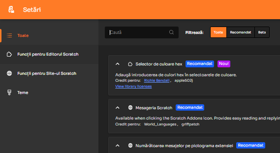
This.
The font is somewhat unreadable (for me) because of the lines and it simply looks ugly.
Secret-chest
on 5 Jan 2021
Yes especially at small sizes like the Filtreaza
samuraininja360
on 5 Jan 2021
This.
The font is somewhat unreadable (for me) because of the lines and it simply looks ugly.
Which lines?
GrahamSH-LLK
on 6 Jan 2021
This.
The font is somewhat unreadable (for me) because of the lines and it simply looks ugly.Which lines?
- "Credit pentru: Richie Bendall, apple502j"
- "Mesageria Scratch"
- "Filtrează Toate Recomandat Beta"
Secret-chest
on 6 Jan 2021
I think it would be a good decision to add a second usable font. Sora is apparently hard to read in some languages.
GrahamSH-LLK
on 6 Jan 2021
Related issues
WorldLanguages
·
10Comments
GrahamSH-LLK
·
3Comments
WorldLanguages
·
11Comments
 scratchusernamemrtbts
·
9Comments
scratchusernamemrtbts
·
9Comments
 Touchcreator
·
3Comments
Touchcreator
·
3Comments