Sanity: Unsuccessfully validating fields in the Studio should only yell at you *after* they lose focus
Is your feature request related to a problem? Please describe.
Currently when any field in the Studio has validation set up, a warning/error is flagged continuously until the field validates. This is generally a bit too aggressive, as often you have just not finished typing yet (for example when a field expecting an email address gets all flouncey and offended because you have only got as far as foo@bar and haven't yet typed the .com part of the address)
Describe the solution you'd like
It would be nice if validating fields only yelled at you after the field has lost focus (i.e. you're presumably done typing). So to recap, field gets focus: validation not yet active. Field loses focus: validation happens, and yells at you when appropriate.
Describe alternatives you've considered
It's possible there are cases when a field in the Studio should continually validate, though I can't immediately think of any. But it would be worth asking other users.
Additional context
Screenshot with example 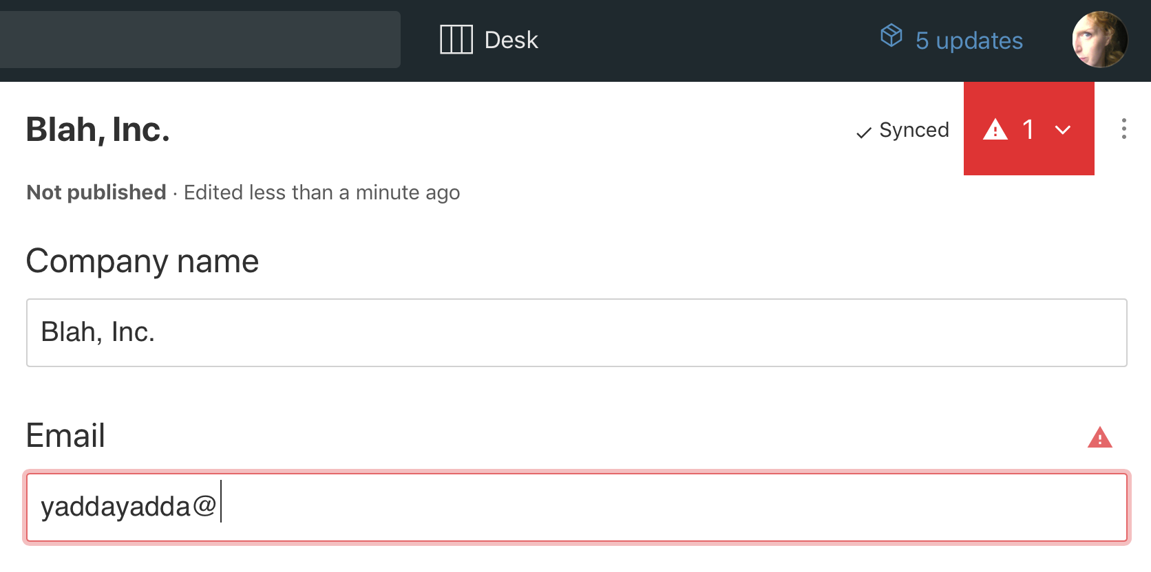
 finiteattention
>All comments
I support this. This also goes for validation of arrays of objects within document types if validation is used. In this case, when you click "Add" to create a new inlined object, ALL the fields in the object start out red, which doesn't feel very friendly.
Another scenario I face is creating empty documents for others to edit, where we need to create the document up front to assign access rights to it. As we leave the fields themselves empty, the poor editor assigned to fill out the document starts off with ALL the fields in the entire document being red.
Reversing the UI pattern somehow by for example showing green tick marks on validated fields might feel more friendly.
 bjornwang
on 9 Jun 2019
bjornwang
on 9 Jun 2019
Related issues
 camjc
·
4Comments
camjc
·
4Comments
 maxmoeschinger
·
5Comments
maxmoeschinger
·
5Comments
 evenwestvang
·
3Comments
evenwestvang
·
3Comments
 readeral
·
4Comments
readeral
·
4Comments
 hmngwy
·
3Comments
hmngwy
·
3Comments
Most helpful comment
I support this. This also goes for validation of arrays of objects within document types if validation is used. In this case, when you click "Add" to create a new inlined object, ALL the fields in the object start out red, which doesn't feel very friendly.
Another scenario I face is creating empty documents for others to edit, where we need to create the document up front to assign access rights to it. As we leave the fields themselves empty, the poor editor assigned to fill out the document starts off with ALL the fields in the entire document being red.
Reversing the UI pattern somehow by for example showing green tick marks on validated fields might feel more friendly.