
Search Bar should be aligned relatively to the right side of the window, not from the Toolbar
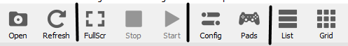
Add separators between elements of the Toolbar that arent related to eachother (makes it clearer what is related and what isnt)
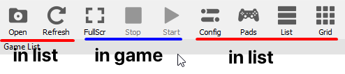
Hide relatively useless button based on context (playing/idle)
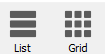
Make List and Grid a toggle instead of two separate button, they display the exact same content, not specific contents, therefore it is pointless to separate them when all they do is change the point of view

Remove the Slider altogether, it isnt very useful in my opinion

if we keep it then move it inside the window like steam does, i think this is a good place to put the grid/list toggle as well
I have some other stuff but its ui related, this post is only for ux, please give some feedback
 kymkdd
All 6 comments
Slider isn't useful in your opinion only because you don't have a mix of normal and hidpi displays, and do not use grid view that often.
 13xforever
on 3 Dec 2018
13xforever
on 3 Dec 2018
true that but imo it should be moved elsewhere, the steam way seems better than the current one
kymkdd
on 3 Dec 2018
I do agree that the steam's way looks better visually, but I'm not sure how to implement that in Qt. But it's better to have it at current position than removing it alltogether.
Other suggestions seem fine, and I might consider implementing some myself. We'll see.
 MSuih
on 3 Dec 2018
MSuih
on 3 Dec 2018
Adding the separators is easy, just requires a couple of lines to .ui file
diff --git a/rpcs3/rpcs3qt/main_window.ui b/rpcs3/rpcs3qt/main_window.ui
index 18767da..ecf9568 100644
--- a/rpcs3/rpcs3qt/main_window.ui
+++ b/rpcs3/rpcs3qt/main_window.ui
@@ -332,11 +332,14 @@
    </attribute>
    <addaction name="toolbar_open"/>
    <addaction name="toolbar_refresh"/>
+   <addaction name="separator"/>
    <addaction name="toolbar_fullscreen"/>
    <addaction name="toolbar_stop"/>
    <addaction name="toolbar_start"/>
+   <addaction name="separator"/>
    <addaction name="toolbar_config"/>
    <addaction name="toolbar_controls"/>
+   <addaction name="separator"/>
    <addaction name="toolbar_list"/>
    <addaction name="toolbar_grid"/>
   </widget>
However, the issue is that Qt doesn't seem to have any way of styling them. I tried adding all of the color properties and the only ones which had any impact were border and background colors, both of which affected the whole "bounding box" of the element instead of just the line in it. So the separators work fine in lighter themes but appear as inconsistent spacing in darker themes:
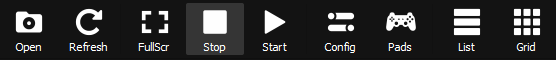
Also I'm not sure what you mean with the hiding stuff. Fullscreen button does not affect the game window but rather the main window, and play button doubles as "start last played game" button when no games are being emulated. So the only button which has no purpose outside of a game is Stop, and I think it can stay there for now.
MSuih
on 3 Dec 2018
Every change you suggest was deliberately not chosen in the last ui change
 Megamouse
on 3 Dec 2018
Megamouse
on 3 Dec 2018
Care to elaborate? Also on the why?
 JohnHolmesII
on 3 Dec 2018
JohnHolmesII
on 3 Dec 2018
Related issues
 kurosh10000
·
3Comments
kurosh10000
·
3Comments
 elad335
·
3Comments
elad335
·
3Comments
 legend800
·
3Comments
legend800
·
3Comments
 Nezarn
·
3Comments
Nezarn
·
3Comments
 Asinin3
·
3Comments
Asinin3
·
3Comments
Most helpful comment
Every change you suggest was deliberately not chosen in the last ui change