Revolution: Add icons to all elements (chunks, snippets, TV, etc.) instead of an empty icon
Why is it needed?
The icon of the element will make it easier to navigate in the element tree, especially if it is large.
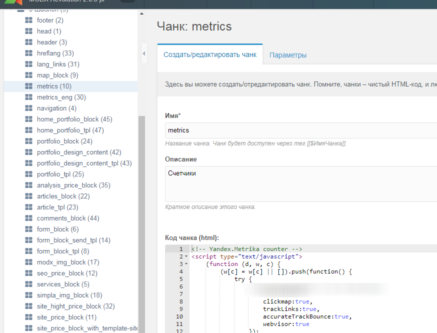
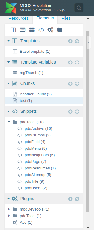
On the example of chunks (picture below): I immediately see that I am correcting the chunk, and I will not be confused when switching tabs of the browser, that to the left is the tree of chunks. Or i will not search for TV in this list of chunks, but with empty icons I have to look for the parent category of elements to understand that this is not TV list.
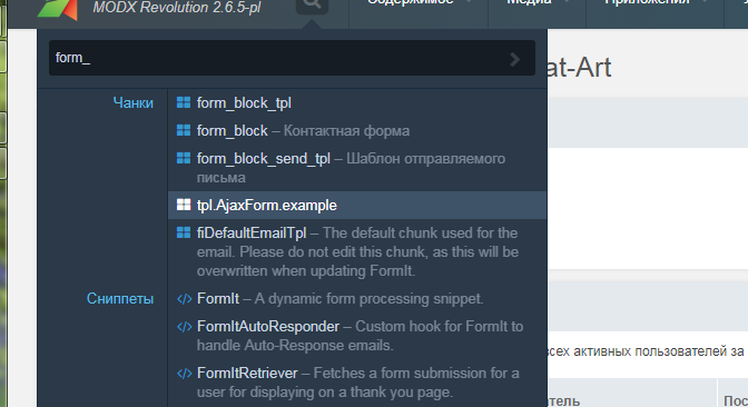
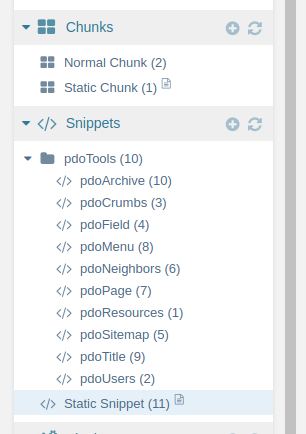
Icons are already used for elements, for example, in the search (picture below).
And also will be used to filter elements in categories - https://github.com/modxcms/revolution/pull/13997
As a result, this will give an additional visual logic to the manager panel (and the empty icon is not particularly useful).
 Ruslan-Aleev
All 10 comments
@Ruslan-Aleev - I like the principle idea behind this. However, I would have to see a visual / mockup of child Templates, Template Variables, Chunks, Snippets and Plugins with the new icons before making a call.
Some icons are quite wide and some don't look fantastic, specifically the Templates & TV icon.
 jonleverrier
on 19 Jul 2018
jonleverrier
on 19 Jul 2018
@jonleverrier I do not quite understand your comment. The goal is NOT to change the icons to new ones, but to take the icons of the parent category, so that only by looking at the tree of elements you can understand what kind of elements it is (especially if the tree is large).
"don't look fantastic" - is subjective, I like these icons, if change them, it's worth changing in MODX3 and with the new version of the Font Awesome. And need a separate discussion (in my opinion, to change the icons to completely different ones - it is not necessary).
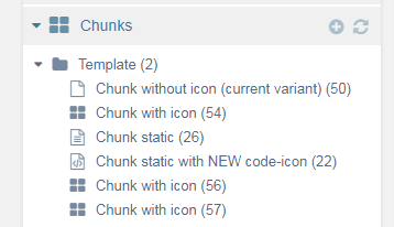
This is how I see it:
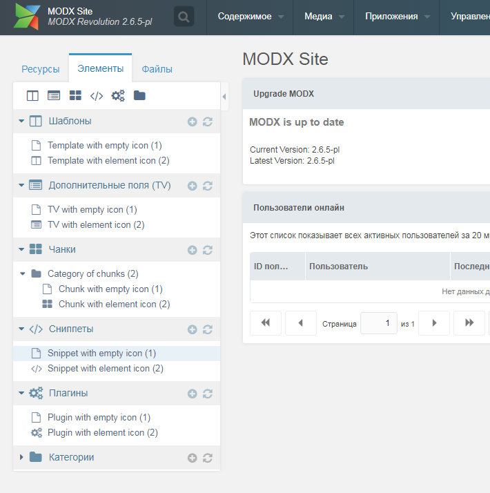
Ruslan-Aleev
on 19 Jul 2018
@Ruslan-Aleev Much clearer with a visual, thanks for that. I like this idea! Are you going to submit a PR, if so, let me know and i'll test it.
jonleverrier
on 19 Jul 2018
@jonleverrier I thought that there would be more discussion. If this is enough, please test and create PR, I will be grateful to you. Thank you :)
Ruslan-Aleev
on 19 Jul 2018
I'm all for this idea!
It seems rather unrefined now that I look at it, for all the different elements to share the same generic icon.
I would just make sure the icons are understated. Obviously every single item listed under the chunks tab is going to be a chunk, so they will all have the same icons. And everything listed in the snippet tab will have the same icon. So it isn't really about distinguishing each element type as if they were all jumbled together, because they never are, they are always listed together and grouped.
For this reason, the icon should be understated and not really stand out all that much because it's not necessary to grab attention. It's only there for a very quick visual to know that the tree is currently showing chunks or snippets or TVs etc.
I have this issue too, going from browser tab to browser tab and then coming back and having to scroll up the tree view to see if I'm in the chunk list or snippet list.
Icons in the tree would be helpful visual for sure, as long as they are distracting or draw too much attention. Thus understated.
 guyinpv
on 19 Jul 2018
guyinpv
on 19 Jul 2018
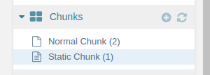
Doing this is fairly easy, but it is removing a possibly important feature. Right now you can see if an element is static (file based) or not.
If we want to have both information, we would have to agree on how static elements should look like.
Apart from this, it is very easy to implement this feature:
// core/model/modx/processors/element/getnodes.class.php, line 398
 'iconCls' => ($element->get('icon') ? $element->get('icon') : ($element->get('static') ? 'icon-file-text-o' : $this->getNodeIcon($elementIdentifier) ) ),

// core/model/modx/processors/element/getnodes.class.php, line 531
'iconCls' => ($element->get('icon') ? $element->get('icon') : ($element->get('static') ? 'icon-file-text-o' : $this->getNodeIcon($map[1]) ) ),
 pepebe
on 13 Oct 2018
pepebe
on 13 Oct 2018
How about a little file icon after the element title?
pepebe
on 13 Oct 2018
@pepebe I think just need to change the icon to the static icon, as it is now. The icon will stand out from the rest, but it will be noticeable.
And the icon with the code can be applied to static elements, it is not clear why the icon with the text is used now.
And for other elements to do the same.
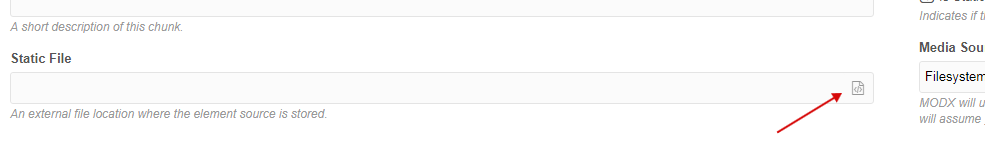
By the way, in the choice of a file for a static element, the icon is correctly.
Ruslan-Aleev
on 13 Oct 2018
Regarding a default icon for each category, I'm totally on your side. Even though I'm breaking down my elements into more categories, I'm sometimes confused by what I see in the tree.
I'm not a regular user of static elements, but from experience, I know that it is absolutely important to know whether something is static or not. For example, you can break a lot of things by duplicating a static element (it keeps the file connection).
For this reason, I'm in favour to let them stand out as MUCH as possible.
As we don't have icons for db as well as file-based elements, I think an additional icon will do the thing pretty well.
pepebe
on 13 Oct 2018
Fixed per #14217.
 Mark-H
on 2 Jan 2019
Mark-H
on 2 Jan 2019
Related issues
Ruslan-Aleev
·
3Comments
 muzzwood
·
4Comments
muzzwood
·
4Comments
 akimsullec
·
4Comments
akimsullec
·
4Comments
 freelancewebdev
·
3Comments
pepebe
·
3Comments
freelancewebdev
·
3Comments
pepebe
·
3Comments
Most helpful comment
I'm all for this idea!
It seems rather unrefined now that I look at it, for all the different elements to share the same generic icon.
I would just make sure the icons are understated. Obviously every single item listed under the chunks tab is going to be a chunk, so they will all have the same icons. And everything listed in the snippet tab will have the same icon. So it isn't really about distinguishing each element type as if they were all jumbled together, because they never are, they are always listed together and grouped.
For this reason, the icon should be understated and not really stand out all that much because it's not necessary to grab attention. It's only there for a very quick visual to know that the tree is currently showing chunks or snippets or TVs etc.
I have this issue too, going from browser tab to browser tab and then coming back and having to scroll up the tree view to see if I'm in the chunk list or snippet list.
Icons in the tree would be helpful visual for sure, as long as they are distracting or draw too much attention. Thus understated.