Hi everybody!
My name is Nicolas, I am a Graphic Designer from Argentina and I was invited by @bryphe and @lpalmes to look out proposals for Revery, as a brand.
First of all, I started to go deep on the concepts of the project. _(I'm not really a programmer, so all the perspective I can have about the features of the project its all processed by my knowledge as a communicator haha)_
Chatting with the guys about the origin of the name "revery" and getting deep on the content of the revery general entry. I have found some interesting ideas.
Bryphe told me that the "revery" name comes from the notion of daydream, a condition where the human gets lost in his own thoughts. And bryphe told me too, that the sort of things that could be represented, could be the fast, the light, the platform and the modern
So I picked too, the main description of the project.

so then, I started to work first on those concepts, drawing forms and combining them to look forward to a "generatrix", a general scheme that could help me to build a proposal
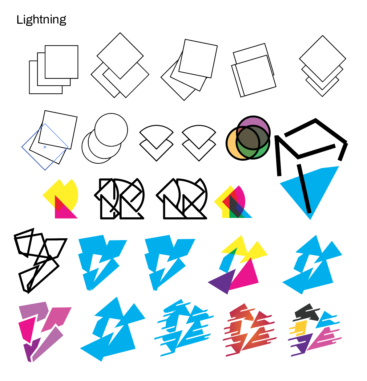
I started to find some particular forms in the negative space, with the "bolt", and a maybe overused image but an image that can serve in the building of a "fast building, multiplatform tool"
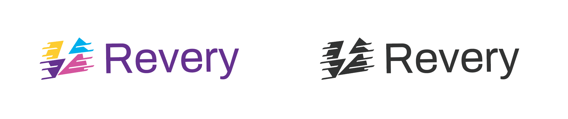
so, there the first proposal
next, I started to build another idea, one based on the old concept of the cloud like a reference of the daydreaming

So I started to work in with some other formal references like the cinetic experiments of the cinetic art, that some artists like Julio le parc done in Argentina. Just to keep and reinforce the "Fast building" idea
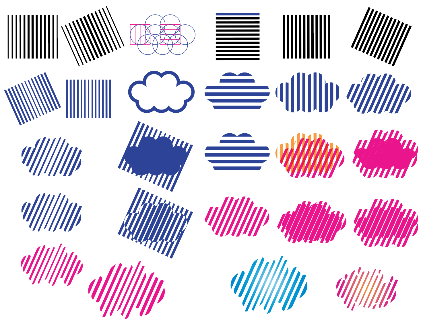
So there, i encountered this option
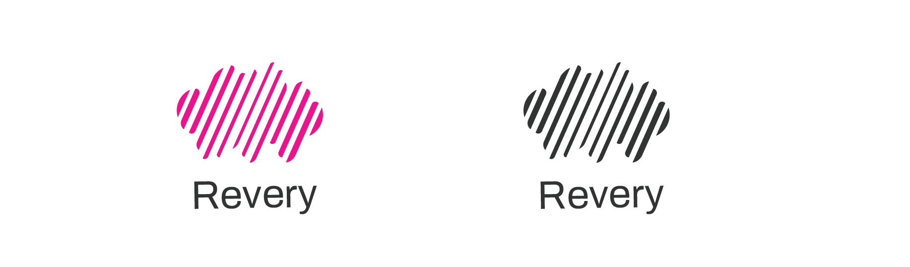
And there were the second proposal _(not my favorite, looks like a bit like a cloud service logo, but I could work too)_
and finally, with a @lpalmes joke about being trending on Twitter, I developed a third option,
that interestingly can be useful to communicate a "fast building, multiplatform library"
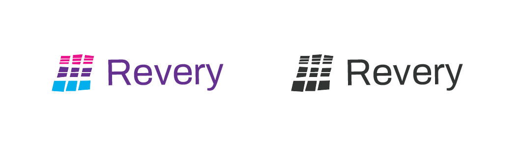
and there, the third proposal ta da!
So the final stage looked like this
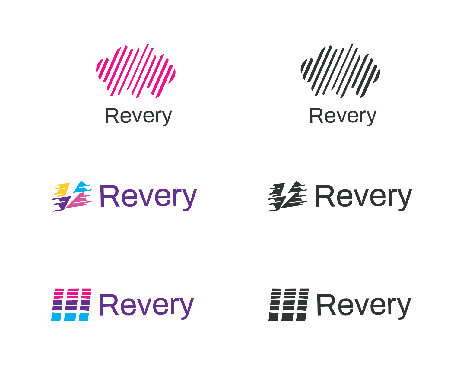
Anyway, it's important to clarify these are just, advanced sketches of the proposal. I mean, these options yet need to be re-grided, geometrically and optically adjusted. The options, just "represent" the final form of the logos.
The guys agreed that the third option was the best one so, with some corrections I started to do that boring part of the gride and I got this.
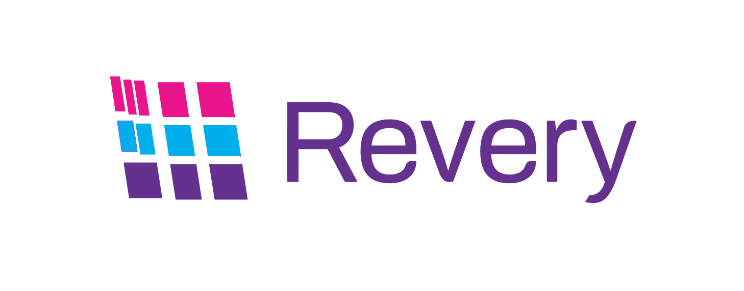
_(windows 98 music playing in the background)_
Here is a design chart where you can see how I did the boring part.
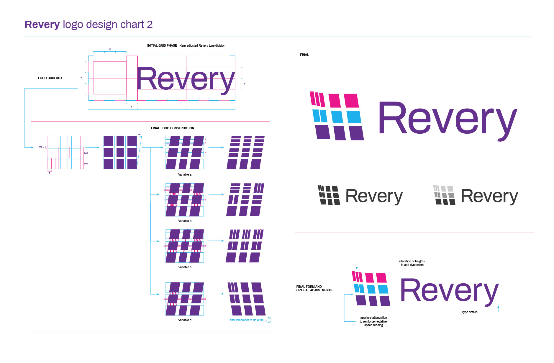
You should know, that this is on current developing and that the third proposal its the favorite one (the windows98 one) is the most defined proposal, does not mean that it is the final logo of the project, in fact, I am developing the fourth one so this is not over.
_pd: this is my first post on GitHub and I really don't know what I'm doing_
 nic0lino
All 6 comments
Wow, this is amazing.
 wokalski
on 30 Jan 2019
wokalski
on 30 Jan 2019
haha thanks! this is just a normal way to do sketches for branding
and i almost forget it. I did some previously research before picking the type.
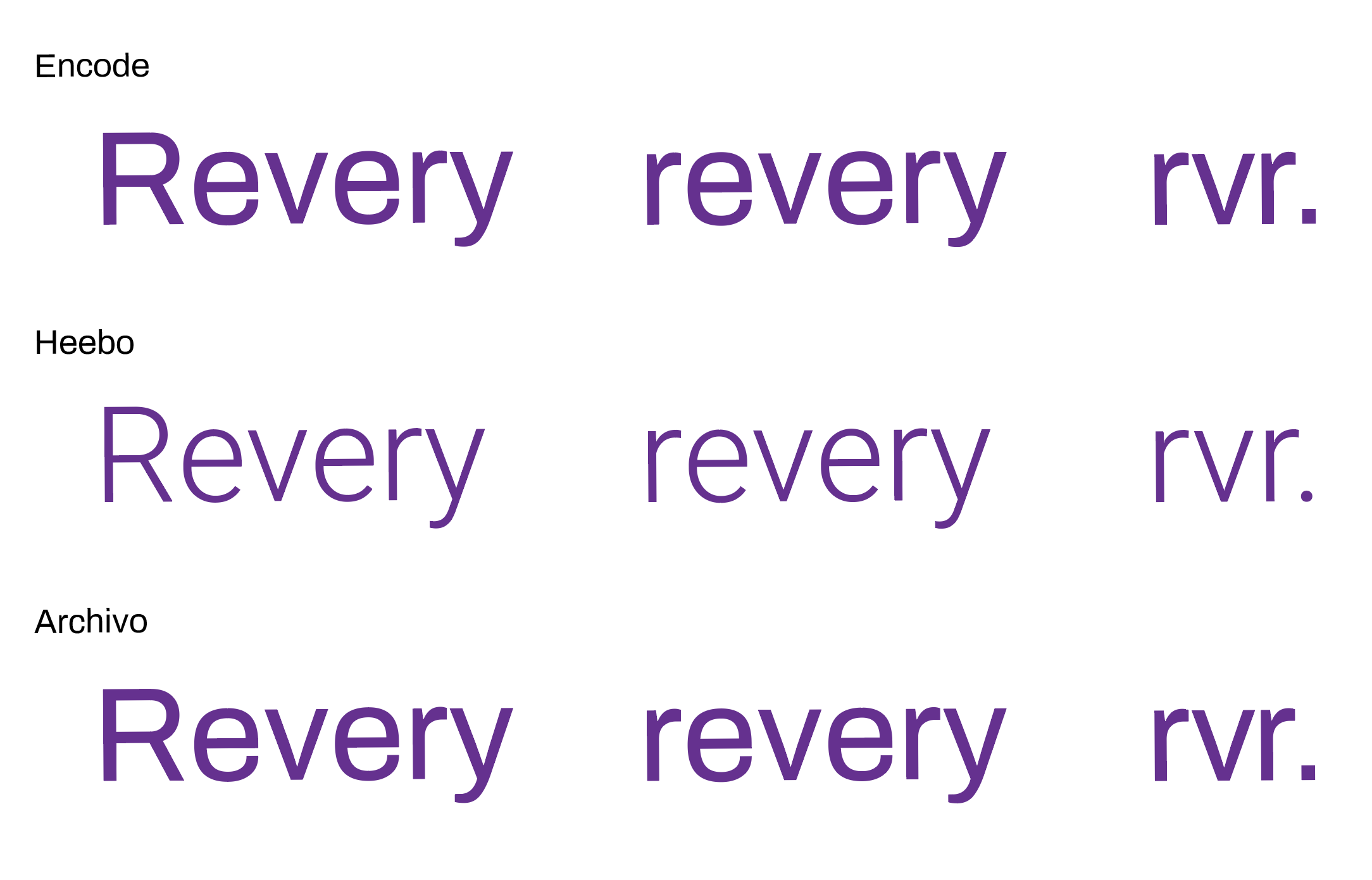
we agreed that Archivo its the best option
nic0lino
on 30 Jan 2019
Just to give a little input -- I really like how the lightning bolt logo stands out even without color. The color scheme also rocks. Thanks for this Nicolas!
 OhadRau
on 30 Jan 2019
OhadRau
on 30 Jan 2019
I like the Cloud and Lightning Bolt designs. With or without color.
 Mou-Ikkai
on 31 Jan 2019
Mou-Ikkai
on 31 Jan 2019
I like the color scheme and font. But the tiny parts in all logo versions seems _chaotic_
In the last design all the squares being out of proportions and two being split makes it somewhat difficult for the eye, I guess. Humans love symmetry and order.
 pubudu-ranasinghe
on 2 Feb 2019
pubudu-ranasinghe
on 2 Feb 2019
Thanks all for the ideas, feedback, and proposals! We have a set of logos now - and I opened #362 to track additional iterations / ideas 👍 Will close this out now but feel free to continue discussion over on #362
 bryphe
on 23 Feb 2019
bryphe
on 23 Feb 2019
Related issues
bryphe
·
6Comments
bryphe
·
3Comments
 SamuelTrew
·
4Comments
bryphe
·
5Comments
bryphe
·
3Comments
SamuelTrew
·
4Comments
bryphe
·
5Comments
bryphe
·
3Comments
Most helpful comment
Just to give a little input -- I really like how the lightning bolt logo stands out even without color. The color scheme also rocks. Thanks for this Nicolas!