Respec: Unclear if "can I use" when printing
Important info
- URL to affected spec: https://w3c.github.io/payment-request/
- ReSpec version: 24.2.3.
- [x] I did a "hard refresh", but it's still busted.
Description of problem
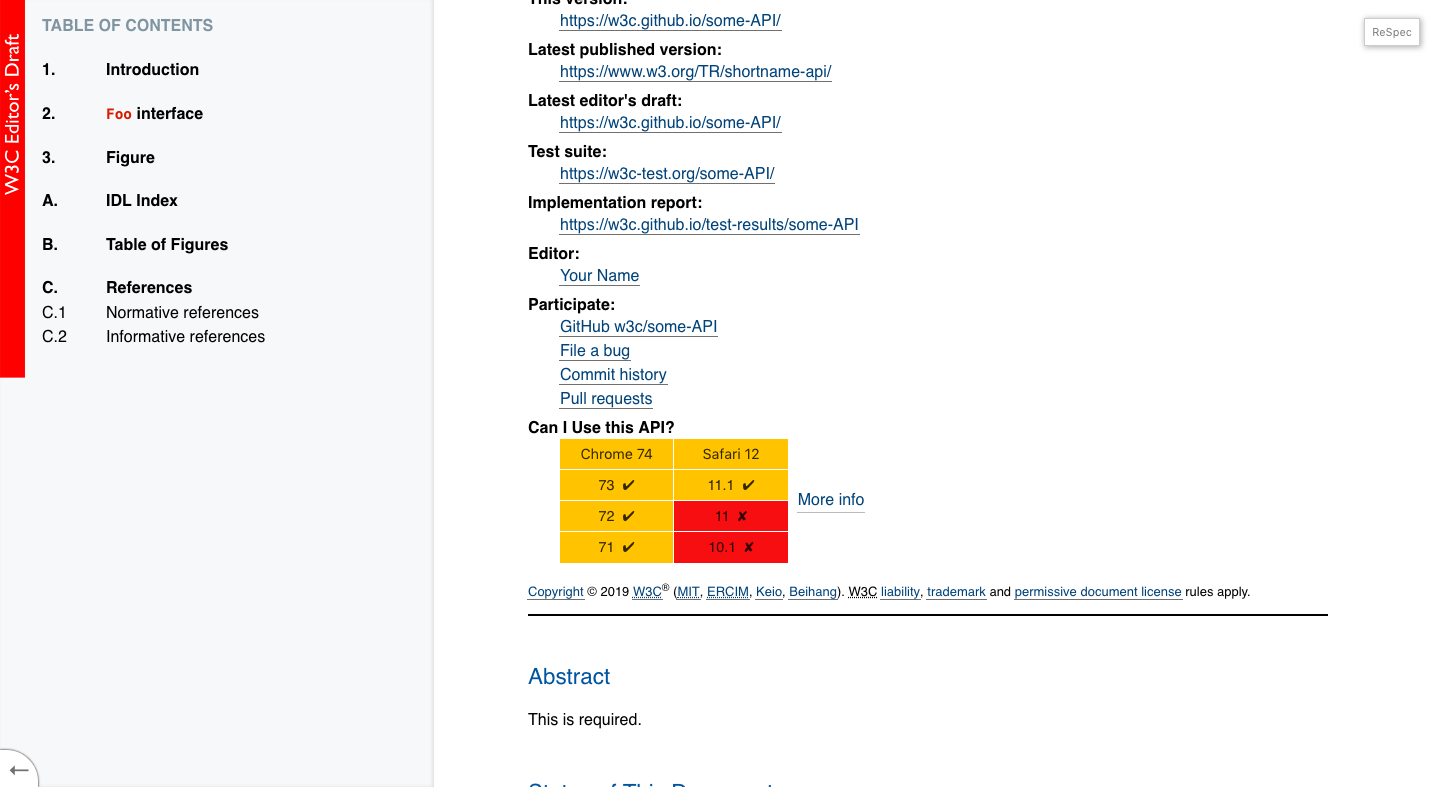
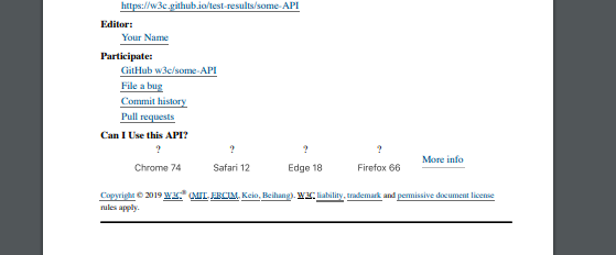
When a spec is printed (on paper/PDF), the "can I use" section in the header of doc doesn't actually show if something is supported or not:

But what I was expecting?:
To be able to distinguish them, maybe with ✅ and ❌ and ? (or similar).
Optional, steps to reproduce:
- Print first page of the spec.
 marcoscaceres
All 25 comments
This one just needs to print media rule in:
https://github.com/w3c/respec/blob/develop/assets/caniuse.css
marcoscaceres
on 22 Jan 2019
@marcoscaceres can I work on this issue ?
 CodHeK
on 22 Jan 2019
CodHeK
on 22 Jan 2019
@CodHeK, sure! Go for it.
marcoscaceres
on 22 Jan 2019
@CodHeK let me know if you need a hand or further details. Please see the Developer Guide linked from the README for instructions to get started.
marcoscaceres
on 22 Jan 2019
@marcoscaceres Yes, sure! Also, is the issue about adding "ticks" and "crosses" to the ones that are supported ?
CodHeK
on 22 Jan 2019
Yes, we need to distinguish between them in a meaningful way. If you think there is a better way of doing it, I'm all ears. You might like to take a look at the caniuse.com site for inspiration.
My feeling is that this can all be done in CSS (in the file linked above) - but I'm open to suggestions.
marcoscaceres
on 22 Jan 2019
Ok, great!
CodHeK
on 22 Jan 2019
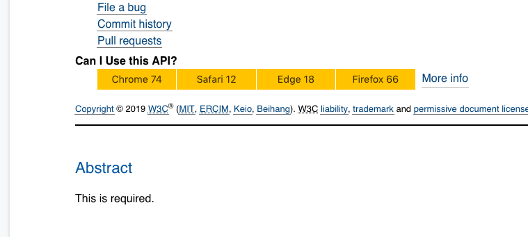
This is how we currently display them on Desktop browsers:
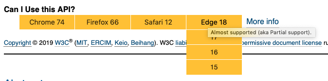
Note the title attribute there... it's also an option to display that generated content.
marcoscaceres
on 22 Jan 2019
This might help too: https://css-tricks.com/css-content/
marcoscaceres
on 22 Jan 2019
Sure!
On Tuesday, January 22, 2019, 2:52 PM, Marcos Cáceres notifications@github.com wrote:
This might help too: https://css-tricks.com/css-content/
—
You are receiving this because you were mentioned.
Reply to this email directly, view it on GitHub, or mute the thread.
CodHeK
on 22 Jan 2019
@marcoscaceres or if we could only display the ones it supports ?
CodHeK
on 22 Jan 2019
No, I think it's important to display all of them. The ones that are supported are equally as important as the ones that are not.
marcoscaceres
on 22 Jan 2019
@marcoscaceres any specific version of node required, my npm install always freezes at this extract:rxjs: sill extract @webassemblyjs/[email protected]
I am using node v11.1.0 and npm v6.4.1
CodHeK
on 22 Jan 2019
Hmm... no. That node version should be is fine? Worst case, quickly try Node LTS to see if you get the same error.
marcoscaceres
on 22 Jan 2019
@marcoscaceres What I am planning to do is, display all drop downs always (no toggling) with the "tick" or the "cross" and the respective version, that way we can see which ones are supported when its printed on paper/PDF. (will look more like a list below each browser type)
Also, when I am making changes in the css, where do I see the changes ? I mean how can I test the changes made by me ?
CodHeK
on 22 Jan 2019
@CodHeK wrote:
What I am planning to do is, display all drop downs always (no toggling) with the "tick" or the "cross" and the respective version... that way we can see which ones are supported when its printed on paper/PDF.
Ok, but to be clear: the Desktop/Mobile versions are fine and don't need to change. It's only the printed version.
Also, when I am making changes in the css, where do I see the changes ? I mean how can I test the changes made by me ?
What I do is I run two terminal windows (Bash or whatever). In one I run:
npm run babel:watch
Which will track the changes:
And in another:
npm start
That will spin up the web server and go to: http://localhost:5000/examples/basic.html. That will load up the bable compiled code and hopefully the CSS changes.
However, if you find the CSS is not being updated, manually run:
npm run babel:build
That should force the CSS in ReSpec to be updated.
marcoscaceres
on 22 Jan 2019
@marcoscaceres This is what I thought ...
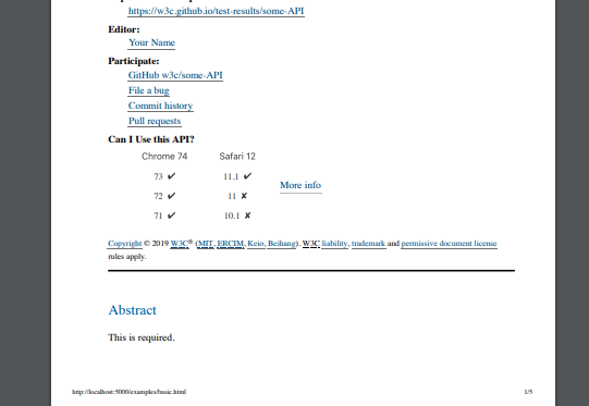
The print preview
CodHeK
on 23 Jan 2019
Glad to see you got it going!
For print view, it's probably not necessary to expand the columns. Just showing the current one is fine.
The desktop version, it's fine for it to remain as is (i.e., no ticks or crosses).
marcoscaceres
on 23 Jan 2019
Okay so, how do you want it to be when it’s printed ? The issue was specifically about adding the ticks and crosses for the case when it was printed ...
CodHeK
on 23 Jan 2019
Okay so, how do you want it to be when it’s printed ? The issue was specifically about adding the ticks and crosses for the case when it was printed ..
Two options I was thinking about:

Alternatively, using CSS generated content, if you use the title attribute's value, you can show, for example:
"Almost supported (aka Partial support) in Chrome 67. Supported in Firefox 66. Not supported or disabled by default in Safari."
That would also be nice, as it would make it super clear.
marcoscaceres
on 23 Jan 2019
If you go the emoji route: the "✓" emoji is better than the one pictured above.
marcoscaceres
on 23 Jan 2019
fixed typo above.
marcoscaceres
on 23 Jan 2019
@marcoscaceres Great, got it! Also, if you could confirm out the cases mentioned below when should I print the tick , cross, question mark.
  ["y", "Supported."],
  ["a", "Almost supported (aka Partial support)."],
  ["n", "No support, or disabled by default."],
  ["p", "No support, but has Polyfill."],
  ["u", "Support unknown."],
  ["x", "Requires prefix to work."],
  ["d", "Disabled by default (needs to enabled)."],
Because there are cases when there are combination of these in the title.
CodHeK
on 23 Jan 2019
You should be able to check the above in the current style sheet (i.e., which ones are shown as yellow, which are red, and which is green). For example:
https://github.com/w3c/respec/blob/develop/assets/caniuse.css#L74
marcoscaceres
on 23 Jan 2019
Sent a PR!
- Browser :
- When Printing :
CodHeK
on 23 Jan 2019
Related issues
 andrea-perego
·
3Comments
andrea-perego
·
3Comments
 deniak
·
5Comments
deniak
·
5Comments
 saschanaz
·
5Comments
saschanaz
·
5Comments
 sidvishnoi
·
4Comments
sidvishnoi
·
4Comments
 noamr
·
3Comments
noamr
·
3Comments