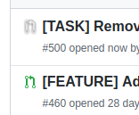
Refined-github: Draft PR icon looks weird
The Draft PR icon (changed in #2742) looks really strange and doesn't resemble anything.

I'm using Brave Version 1.2.43 Chromium: 79.0.3945.130 (Official Build) (64-bit) on Ubuntu 18.04 LTS
 Jamesking56
All 13 comments
I think you should report that to Brave, it's a plain filter: drop-shadow()
 fregante
on 4 Feb 2020
fregante
on 4 Feb 2020
If you want a quick fix to undo this change, use this CSS:
:root .js-issue-row [aria-label="Open draft pull request"] svg {
color: #6a737d !important;
filter: none !important;
}
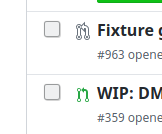
It looks strange in Firefox, too:
I'm using Firefox 72.0.2 (64-Bit) on Ubuntu 18.04 LTS
 jdreesen
on 4 Feb 2020
jdreesen
on 4 Feb 2020
Would it not be better (and more supported) to use box-shadow?
Jamesking56
on 4 Feb 2020
box-shadow only works on a square, not on the "visible pixels" like filter
fregante
on 4 Feb 2020
Reopening to discuss alternatives and ask for help to create this SVG:
[A solid] outline would be best, but there's no way to do that in CSS. I'd have to recreate the icon with the outline and embed the whole new SVG. Anyone wants to take a crack at creating the style in Illustrator/Sketch/etc?
Perhaps I should just apply this style as @tooomm also mentioned (but it'd become a JS feature): https://github.com/sindresorhus/refined-github/issues/2450#issuecomment-560247181
fregante
on 4 Feb 2020
Makes more sense to do a solid outline directly in the SVG :+1:
Jamesking56
on 4 Feb 2020
What about this CSS?
.js-issue-row [aria-label='Open draft pull request'] svg {
  stroke: #6a737d; /* GitHub's default draft PR color */
  stroke-width: 2px;
  color: #fff !important;
  paint-order: stroke;
  overflow: visible !important;
}
 FloEdelmann
on 4 Feb 2020
FloEdelmann
on 4 Feb 2020
That's really interesting. If lighter, but there's a small artifact near the arrow that kinds ruins it.

fregante
on 10 Feb 2020
Actually it's not an artifact, it's just the stroke of the arrow's head touching the arrow's body, but it looks ugly 😰
fregante
on 10 Feb 2020
We can also make the stroke thinner and use an even darker color instead:
.js-issue-row [aria-label="Open draft pull request"] svg {
  stroke: #24292e; /* ← $gray-900 from https://primer.style/css/utilities/colors */
  stroke-width: 1.2px; /* ← */
  color: #fff !important;
  paint-order: stroke;
  overflow: visible !important;
}

FloEdelmann
on 13 Feb 2020
^ Just tried this myself and it does look a lot better for me.
The only thing I would do is change the colour to be a lighter grey as it looks almost black which to me doesn't signify a draft PR.
Jamesking56
on 13 Feb 2020
Please send a PR with that CSS. I just used that style in for a different feature and it looks great!
fregante
on 28 Feb 2020
Related issues
 hkdobrev
·
3Comments
hkdobrev
·
3Comments
 durka
·
3Comments
durka
·
3Comments
 Celthi
·
3Comments
Celthi
·
3Comments
 supremebeing7
·
3Comments
supremebeing7
·
3Comments
 mischah
·
3Comments
mischah
·
3Comments
Most helpful comment
What about this CSS?