Refined-github: Add shortcut for hiding a comment as "Resolved"
GitHub introduced support for hiding comments, but it requires many clicks to hide a comment as "Resolved". Since that's the most common use-case for hiding comments, it would be nice to make it faster.
Maybe a keyboard shortcut, so you hold a certain key down while clicking the comment?
// @jamiebuilds
 sindresorhus
All 12 comments
Comments can’t be navigated via keyboard so the keyboard shortcut would feel weird. If GitHub’s menus support sub-menus we can just move the actions directly in the sub-menu of “hide” so they’d be one-click.
 fregante
on 19 Apr 2018
fregante
on 19 Apr 2018
@bfred-it That's why I suggested holding a key down while mouse clicking the comment. But your suggestion would work too. Maybe even both?
sindresorhus
on 19 Apr 2018
holding a key down while mouse clicking the comment
Clicking where? That's an unusual interaction
fregante
on 19 Apr 2018
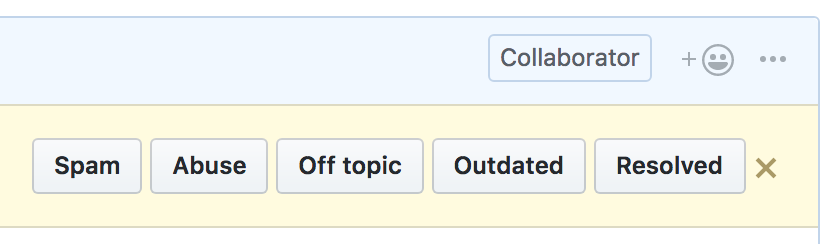
The dropdown doesn't seem to support sub-menus. Maybe we can give this the same treatment we gave to the review box:

Drop the drop-down, show 5 buttons (aligned top right), sort of like:
fregante
on 19 Apr 2018
Clicking where? That's an unusual interaction
Anywhere inside the comment box.
Drop the drop-down, show 5 buttons (aligned top right), sort of like:
Yes, looks great!
sindresorhus
on 19 Apr 2018
You could go even further by expanding the dropdown:

Maybe could be improved with some styling
 jamiebuilds
on 20 Apr 2018
jamiebuilds
on 20 Apr 2018
Comments can’t be navigated via keyboard so the keyboard shortcut would feel weird.
btw that sounds like it'd be a great feature to add
jamiebuilds
on 20 Apr 2018
You could go even further by expanding the dropdown:
I thought about that, but it makes the menu very large. Better to optimize for the common use-case instead.
sindresorhus
on 20 Apr 2018
Perhaps the dropdown code can be abused to link "hide" to a new dropdown that would replace that. I'm not a fan of my own mockup's style 😄
fregante
on 20 Apr 2018
I would love to see this be done, so I'd like to re-ignite this conversation. I kind of opened a duplicate issue with an alternate proposal. I think doing something (anything) to improve this would have huge value, even if it's not perfect.
What about expanding the first dropdown to have all the hide options in it, and then have that dropdown menu display on hover (which removes one extra click)?
Even just expanding the first dropdown would be a great place to start, and we can iterate on it past that.
 tgolen
on 3 Jul 2018
tgolen
on 3 Jul 2018
@bfred-it was there a reason you did not implement this?
Drop the drop-down, show 5 buttons (aligned top right), sort of like:

 yakov116
on 10 Jul 2018
yakov116
on 10 Jul 2018
@bfred-it was there a reason you did not implement this?
Time. Interest. Feel free to
fregante
on 10 Jul 2018
Related issues
 Celthi
·
3Comments
Celthi
·
3Comments
 Arcanemagus
·
3Comments
Arcanemagus
·
3Comments
 supremebeing7
·
3Comments
supremebeing7
·
3Comments
 hkdobrev
·
3Comments
hkdobrev
·
3Comments
hkdobrev
·
3Comments
hkdobrev
·
3Comments
Most helpful comment
The dropdown doesn't seem to support sub-menus. Maybe we can give this the same treatment we gave to the review box:
Drop the drop-down, show 5 buttons (aligned top right), sort of like: