Redash: Bubble size should scale area, not radius
Issue Summary
The size of bubbles seems to be applied directly as the diameter of the bubble. This means that doubling the size makes the bubble area quadruple, which is visually misleading if you are plotting a quantity, which I expect is the common case.
Steps to Reproduce
Select some data with a simple query like SELECT 1, 2, 50 UNION ALL SELECT 3, 4, 100, and plot it as a bubble chart. The bubble with size 100 will be four times the size of the bubble with size 50.
I would expect the radius to be set as the square root of the size, which would make the area and perceived size scale linearly with size. For example, this is how matplotlib does it.
Technical details:
- Redash Version: 8.0.0-beta+b27489
- Browser/OS:
- How did you install Redash: Helm chart
 zhaakhi
All 8 comments
This looks like a pretty simple change. Plotly supports the sizemode attribute for Bubble charts. The options are diameter and area.
Plotly doc: https://plot.ly/python/reference/#scatter-marker-sizemode
I changed it on a local build...
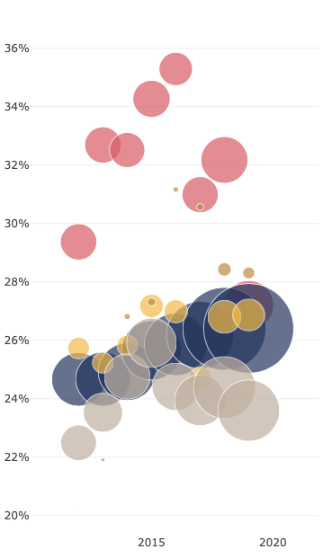
Diameter
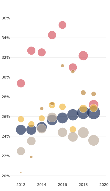
Area
 susodapop
on 12 Dec 2019
susodapop
on 12 Dec 2019
Hi @susodapop, thanks for testing out and finding a way to handle this.
Is the difference between the two screenshots sizemode value only? For me, in some cases changing this value drastically shrunk the size of the circles. Yours look okay, and need no other measures to "look normal".
 deecay
on 14 Dec 2019
deecay
on 14 Dec 2019
@deecay Thanks for mentioning that. I did change my query.
diameter accepts bubble size values from 1 - 100 and applies a floor and a ceiling so that values outside these thresholds are normalized back to the edges (105 -> 100. -5 -> 0). The diameter sizemode is effectively a _percentage of a derived max bubble size_ which Plotly calculates dynamically based on the x and y size of the chart.
area is an absolute pixel value: _the number of pixels that should appear in this bubble_. There is no ceiling on this value. So a bubble size of 40 under the diameter sizemode might have an area 350 pixels. Switching to area will of course shrink the bubble.
I changed my query to multiple my calculated values by 1000 instead of 100.
susodapop
on 15 Dec 2019
@susodapop, thanks again for the investigation.
So we need three things.
- Bubble size to sizemode.
- Let the user define coefficient as in #3928.
- Think about if we need some kind of migration for the existing bubble charts, for the look will drastically change. However, I don't believe we can come up with a robust equation to determine decent default coefficients for all existing Bubble charts. Any thoughts anybody?
deecay
on 15 Dec 2019
Migration shouldn't be an issue. We can default the bubble chart to use diameter, the same as today.
susodapop
on 23 Dec 2019
I believe the default should be area, because most of the time area is what we want?
deecay
on 23 Dec 2019
@deecay It could be default for new charts, but migration should keep old behavior for all existing ones.
 kravets-levko
on 23 Dec 2019
kravets-levko
on 23 Dec 2019
I've updated my PR #3928 with 'diameter' as a default for sizemode. This does not require migration, so if this is acceptable, I would like to go with this.
deecay
on 25 Dec 2019
Related issues
 koooge
·
3Comments
koooge
·
3Comments
 yalisassoon
·
4Comments
yalisassoon
·
4Comments
 stephane-klein
·
3Comments
stephane-klein
·
3Comments
 tomaytotomato
·
4Comments
tomaytotomato
·
4Comments
 arikfr
·
3Comments
arikfr
·
3Comments
Most helpful comment
This looks like a pretty simple change. Plotly supports the
sizemodeattribute for Bubble charts. The options arediameterandarea.Plotly doc: https://plot.ly/python/reference/#scatter-marker-sizemode
I changed it on a local build...
Diameter
Area