Redash: Query description field location is less discoverable
I'm not sure if this was on purpose, but it seems that the field for adding a description for a query has moved to the bottom left corner of the query editor which is slightly less discoverable in my opinion than right next to the query title.
 emtwo
emtwo
All 7 comments
It moved to make room for the new tags feature while making sure we don't push down the main content (query/visualization) too much down.
We're open to suggestions though and even more so happy to learn how you use query descriptions.
cc: @kocsmy
 arikfr
on 5 Aug 2018
arikfr
on 5 Aug 2018
@emtwo can you please share some examples of how you use this field at Mozilla? Thanks!
arikfr
on 27 Aug 2018
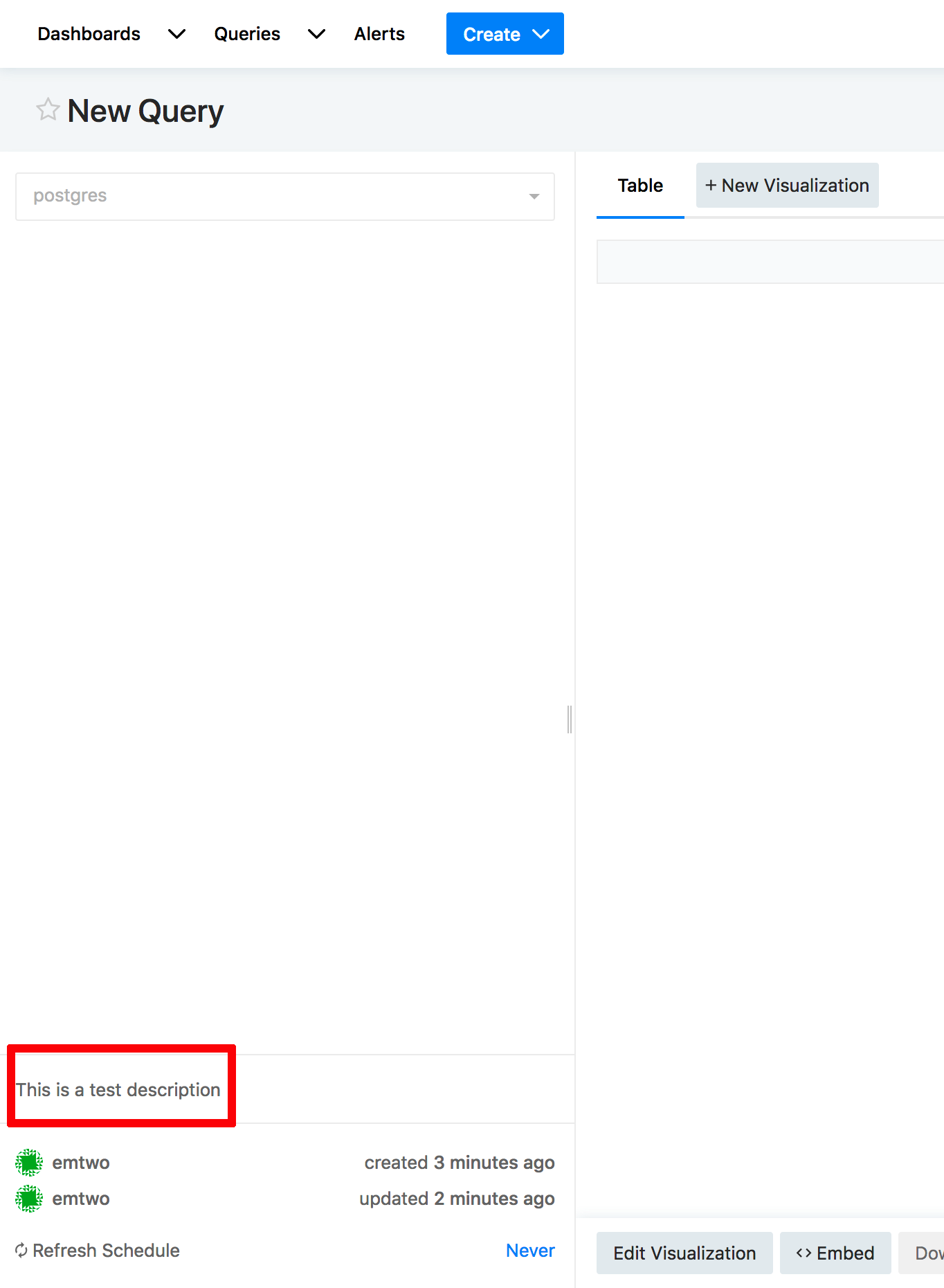
@arikfr Different people may be using that field differently at Mozilla. However, the most common use-case I've seen is simply to provide a description of a visualization to help a user understand it.
Here is one example:

emtwo
on 29 Aug 2018
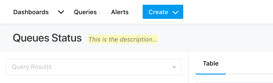
@arikfr where did we move this, in 5.0? I can't specifically remember and on 4.0 it's still next to the header (and it's not really pushing down the content if the query header isn't super long):
 kocsmy
on 29 Aug 2018
kocsmy
on 29 Aug 2018
To add another use case: in addition to explaining the results of a query, we also use descriptions to explain parameters and sometimes even the query itself when multiple people are editing a query. So ideally the description would be placed before all of that.
 sreynen
on 22 Jan 2019
sreynen
on 22 Jan 2019
@sreynen thank you for the additional use case! We tried to keep the top section minimal so it won't push down the query editor and results.
What if we kept the description where it is now or even behind some button in the edit mode of the query, but moved it up in the results mode? (see #3087 for new layout of results only view)
Calling @ranbena to join the discussion :)
arikfr
on 23 Jan 2019
Let's continue discussion in Discussion #3099
 ranbena
on 26 Jan 2019
ranbena
on 26 Jan 2019
Related issues
 tomaytotomato
·
4Comments
tomaytotomato
·
4Comments
 WesleyBatista
·
4Comments
WesleyBatista
·
4Comments
 stephane-klein
·
3Comments
arikfr
·
4Comments
stephane-klein
·
3Comments
arikfr
·
4Comments
 alison985
·
3Comments
alison985
·
3Comments
Most helpful comment
@arikfr Different people may be using that field differently at Mozilla. However, the most common use-case I've seen is simply to provide a description of a visualization to help a user understand it.
Here is one example: