React: React DevTools tutorial instructions are hard to read
What is the current behavior?
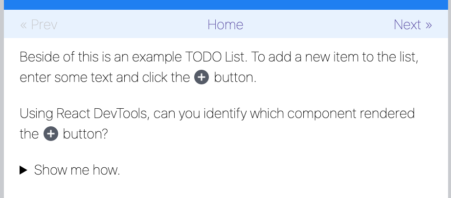
https://react-devtools-tutorial.now.sh/
The text on the left is difficult to read because of thin font styling

What is the expected behavior?
Increase the contrast on the top row buttons and increase the font-weight for the text
font-weight: 300 or 400 makes it easier to read
(300 pictured)
Running Catalina latest, macOS.
 brotzky
All 5 comments
I liked the lighter font weight 😄 but I don't feel strongly enough to argue about it. I've removed the "lighter" weight attribute and re-deployed the tutorial site.
 bvaughn
on 16 Aug 2019
bvaughn
on 16 Aug 2019
I only brought it up because I genuinely had a hard time reading it. I don't want to fuss about any visual styles but in this case it was so light I thought maybe it was a bug.
Or maybe I'm just getting old... 😂😂
Anyway, really appreciate the tutorial and all your work on React DevTools and the bump in font-weight!
brotzky
on 16 Aug 2019
No worries! I'm glad you brought it up :) If you had trouble reading it I'm sure others did as well.
bvaughn
on 16 Aug 2019
Luckily it didn’t look as light on my screen as on that screenshot — the screenshot looks barely readable to me too. I’m glad this is fixed, thank you!
 gaearon
on 17 Aug 2019
gaearon
on 17 Aug 2019
Yeah, didn't look nearly so light on my screen either. I assume it was using a different font.
bvaughn
on 17 Aug 2019
Related issues
 zpao
·
3Comments
zpao
·
3Comments
 Prinzhorn
·
3Comments
Prinzhorn
·
3Comments
 UnbearableBear
·
3Comments
UnbearableBear
·
3Comments
 huxiaoqi567
·
3Comments
huxiaoqi567
·
3Comments
 krave1986
·
3Comments
krave1986
·
3Comments
Most helpful comment
I liked the lighter font weight 😄 but I don't feel strongly enough to argue about it. I've removed the "lighter" weight attribute and re-deployed the tutorial site.