React-styleguidist: Page per section suggestions
Hi @aaronjense and @sapegin,
Again thanks for your awesome project,
I would like to show the implementation of page per section of vue-styleguidist. I worked on this feature.
https://github.com/vue-styleguidist/vue-styleguidist/issues/26
When I thought in how developed the section split, thought that it should be as the last section's father who has children should show all the children without separating them.
├── Documentation     // Alone section
├── Files             // Show section and their childrens
|   ├── First File
|   └── Second File
└── Components        // Alone section
    ├── Buttons       // Show section and their childrens
    |   ├── Button
    |   ├── RandomButton
    |   └── WrappedButton
    └── Fields        // Show section and their childrens
        ├── Label
        └── Placeholder
This is it because components usually are part of a category like https://docsify.js.org/
And by default when you enter on the website, it already is separated.
You can see an example here
http://rafaelescala.com/vue-styleguide-navigation/
I would like if we can standard it and know your opinion.
Another detail, when I was adding this feature, I had that change the path manipulator, because it caused problems when I clicked in different section when it is separated.
In vue-stylaguidist:

In react-styleguidist:
You can see this error, here:
http://localhost:6060/#!/First%20File
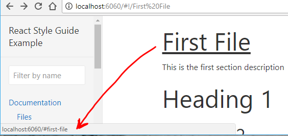
And when I have a section with the same name of a child, only show the children and ignore the father section.
{
    name: 'Button',
    content: 'docs/One.md',
    components: () => [
        './src/components/Button/Button.js',
        './src/components/RandomButton/RandomButton.js',
        './src/components/WrappedButton/WrappedButton.js',
    ],
},
Regards!
 rafaesc
All 25 comments
I think the main idea was to never show lots of components at the same page, which isn't the case in your implementation.
But I'd like to hear more opinions ;-)
 sapegin
on 26 Mar 2018
sapegin
on 26 Mar 2018
Hi @sapegin,
Already updated vue-styleguidist with your 7.0.0 version, in addition, fixed problems with the navigation and the components are separated.
You can see the demo here:
http://rafaelescala.com/vue-styleguide-navigation/
There are some differences with pagePerSection but if you agree I can create a PR
Regards
rafaesc
on 31 Mar 2018
This looks good! Do you see an easy way to return isolated mode? Should be possible because you use different URLs for sections. A PR would be super cool!
sapegin
on 1 Apr 2018
@sapegin See related discussion and a question for you here: https://github.com/vue-styleguidist/vue-styleguidist/issues/113
 viljamis
on 5 Apr 2018
viljamis
on 5 Apr 2018
I think this could be super useful. Any plans on PR?
 okonet
on 6 Apr 2018
okonet
on 6 Apr 2018
I think @rafaesc maybe had ;-)
viljamis
on 6 Apr 2018
haha maybe @viljamis, but how you said it would be better to receive more feedback to develop this feature. Actually, I think that this feature would start in react-styleguidist and then with vue
rafaesc
on 6 Apr 2018
@rafaesc Definitely makes sense to do it first here if you’re anyway bringing most of the features from React Styleguidist to Vue Styleguidist. Makes sense to try to keep these two projects as aligned as possible.
A few thoughts:
- Would it be possible to do this in a way which doesn’t remove the isolated mode?
- I personally find the current
pagePerSectionsetting name a little confusing in React Styleguidist, but if we want to stay backwards compatible we probably don’t want to change it. - So… if we keep that as is, could we then in addition to this existing
pagePerSectionsetting have another setting that controls the depth of a section whenpagePerSectionis enabled? F.ex.sectionDepthwhich by default has a value of1(show only one level), but if changed to for example2, it would then show the section + it’s direct children on the same page?
viljamis
on 10 Apr 2018
I personally find the current pagePerSectionsetting name a little confusing in React Styleguidist, but if we want to stay backwards compatible we probably don’t want to change it.
I hear you. I don't like it either so I'd say we should make a breaking change.
What I was thinking lately is to move all global settings related to sections to sections themselves and make them apply per section.
I think this would make styleguidist even more flexible. Would this solve the problem?
module.exports = {
  // This would be required one
  sections: [
  {
    name: 'Design tokens',
    content: '...',
    showCode: false,
    showUsage: false,
    isolated: true // Still not sure about the name
  },
  {
    name: 'UI Components',
    components: '...',
    showCode: true,
    showUsage: true,
    isolated: false // Still not sure about the name
  }
  ]
}
cc @sapegin
okonet
on 11 Apr 2018
@okonet That sounds like a great idea! 👍
The ability to turn of code and usage would be great as well as now I (and a few of my clients too) have been hiding things awkwardly in SCSS case-by-case. I think all in all this would make styleguidist much more flexible for larger documentation needs.
viljamis
on 11 Apr 2018
@okonet so that I understand correctly… would turning isolated : true show everything under that section on separate pages? and giving it value false would do the opposite and show everything on the same page? If yes, sounds perfect.
viljamis
on 11 Apr 2018
If you can agree on The Perfect API and send a PR I'm fine with a breaking change ;-)
Honestly I don't have a strong opinion on how it should look, but ability to toggle things per section looks like a good idea.
sapegin
on 11 Apr 2018
@sapegin great!
It's a good idea abstract the setting per sections
@viljamis but when you disable showCode or showUsage, it only collapse the table, but the table still visible if you click on the title. I think that you want that in that situation it is hidden. So adding @okonet suggestion, could be this:
module.exports = {
  sections: [
    {
      name: "Design tokens",
      components: () => [
        "./src/components/Button/Button.js",
        "./src/components/RandomButton/RandomButton.js",
        "./src/components/WrappedButton/WrappedButton.js"
      ],
      collapseCode: true, // Before `showCode:false`
      collapseUsage: true, // Before `showUsage:false`
      isolated: true // Show the isolate button
    },
    {
      name: "UI Components",
      components: () => [
        "./src/components/Label/Label.js",
        "./src/components/Placeholder/Placeholder.js"
      ],
      hideCode: true, // Completely hidden `display:none`
      hideUsage: true, // Completely hidden `display:none`
      isolated: false // Hide the isolate button
    },
    {
      name: "Deep",
      sections: [
        {
          name: "Files",
          sections: [
            {
              name: "First File",
              components: () => [
                "./src/components/Label/Label.js"
              ]
            },
            {
              name: "Second File",
              components: () => [
                "./src/components/Label/Placeholder.js"
              ]
            }
          ]
        }
      ],
      collapseCode: true, // ??? What happens here? Do it affects their children?
      isolated: true
    }
  ]
};
But it needs to add the pagePerSection and the split for depth (sectionDepth by @viljamis), I think that it should be global because maybe it would be strange that in some sections are separated and other sections not, so it shouldn't provide this possibility per sections, I think.
Regards
rafaesc
on 11 Apr 2018
@rafaesc @okonet I feel like it would be really useful to be able to do this per section (of course there needs to be a global default too). That way you could easily combine these kind of “overview” sections with guidance with sections that have separate views for each component.
viljamis
on 13 Apr 2018
@rafaesc Instead of introducing more options, I'd suggest to use variance instead:
{
  codeSamples: 'hide' | 'collapse' | 'expand', // completely hides (display: none), collapses (default) or expands code samples
  propsMethods: 'hide' | 'collapse' | 'expand',  // completely hides (display: none), collapses (default) or expands props & methods section
  separatePage: 'none' | 'sections' | 'components'
}
Apart from the face it's less options, this won't allow you to create impossible state like in case with hideCode: true and collapseCode: true.
I'd say, children sections inherit settings from parent.
module.exports = {
  // This would be required one
  sections: [
  {
    name: 'Design tokens',
    content: '...',
    components: [],
    codeSamples: 'hide',
    propsMethods: 'hide',
    separatePage: 'section' // This means this page has a separate "route" which
  },
  {
    name: 'UI Components',
    components: '...',
    codeSamples: 'expand',
    propsMethods: 'expand',
  },
  {
    name: 'UI Patterns',
    components: '...',
    codeSamples: 'collapse',
    propsMethods: 'collapse',
    separatePage: 'components' // This means each component get's a separate page
  }
  ]
}
@okonet that's better.
if everybody agree it, so I can create the PR.
rafaesc
on 16 Apr 2018
@rafaesc I think @okonet’s suggestion makes a lot of sense 👍
viljamis
on 17 Apr 2018
@rafaesc would be great if you could work on it!
okonet
on 17 Apr 2018
@rafaesc and everybody - awesome work.
If I can help with the separatePage implementation let me know - our styleguide is starting to creak and I was about to write a routing patch :)
 marcdavi-es
on 25 Apr 2018
marcdavi-es
on 25 Apr 2018
@marcdavi-es yes, this feature is developing and it could be discussed.
Ok, I would like to share some advances, when I tried to implement separatePage: 'section' || 'components', I saw that there are sections that have as children, sections and components, so I thought that there should is another alternative to manage it.
So, took the sectionDepth option, by @viljamis, because the routes are navigated by deep and at the same time was very easy to implement.
{
+  pagePerSection: true,
  sections: [
    {
      name: 'Documentation',
      content: 'docs/Documentation.md',
      sections: [
        {
          name: 'Files',
          content: 'docs/Files.md',
          components: () => ['./src/components/WrappedButton/WrappedButton.js'],
          sections: [...],
        },
      ],
+      sectionDepth: 2,
    },
    {
      name: 'Components',
      content: 'docs/Components.md',
      sections: [
        {
          name: 'Button',
          content: 'docs/Files.md',
          components: () => ['./src/components/Button/Button.js']
        },
        {
          name: 'Fields',
          components: () => ['./src/components/Placeholder/Placeholder.js']
        },
        {
          name: 'Others',
          components: () => ['./src/components/RandomButton/RandomButton.js']
        },
      ],
+      sectionDepth: 0,
    },
  ],
};
Other feature that I am adding, it is the pathname to navigate, only available if active the pagePerSection

And this way when you want isolated a section or component
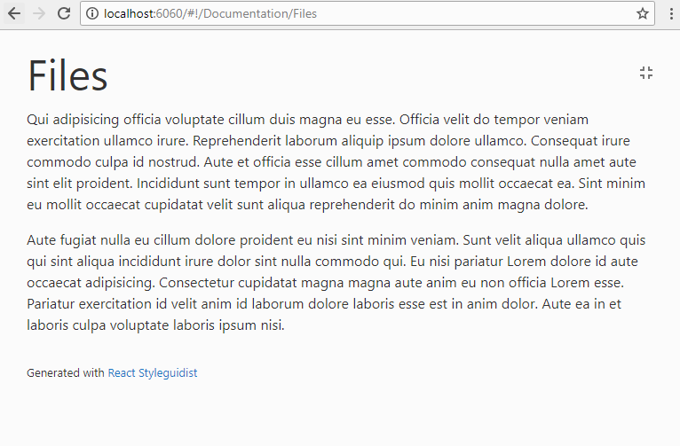
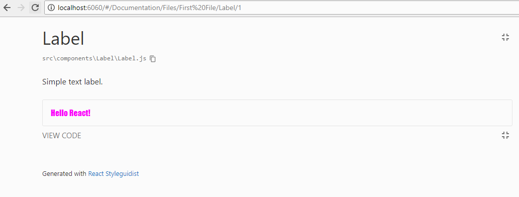
You can see the url change from #/Documentation to #!/Documentation, and when you navigate a deep route, the route change to #/Documentation/Files, that it is useful when you have parents with the same name of the their children
Example isolated
Only I have a problem that maybe I am not sure about the solution, when you navigate in a page that shows all his children (sectionDepth: 0), and you want to go a section's child, what url should be appear. Like this example
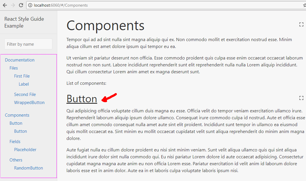
I can't use /#/Components/Button, because it will filter his parent, and that isn't the idea.
I was thinking to add a param like this /#/Components?id=button (/#/Components?id=slug)
Maybe in a couple of days I can already generate a PR.
Regards!
rafaesc
on 9 May 2018
Regarding linking to sections on a page, it should probably actually be something like #/Components#Button.
 Alxandr
on 9 May 2018
Alxandr
on 9 May 2018
Regarding the list displayed, how about having expand and collapse defined in the UI. It really helps to quickly navigate through when the list increases.
 dinukadesilva
on 4 Aug 2018
dinukadesilva
on 4 Aug 2018
@dinukadesilva you can modify the styles of UI to create that feature.
rafaesc
on 7 Aug 2018
@rafaesc Should we close this issue?
sapegin
on 7 Aug 2018
@sapegin, its true
rafaesc
on 7 Aug 2018
Related issues
 benoitgrasset
·
3Comments
sapegin
·
3Comments
benoitgrasset
·
3Comments
sapegin
·
3Comments
 gargroh
·
3Comments
gargroh
·
3Comments
 magicmark
·
3Comments
magicmark
·
3Comments
 lyz810
·
3Comments
lyz810
·
3Comments
Most helpful comment
@okonet that's better.
if everybody agree it, so I can create the PR.