React-styleguidist: [Feature Request] Color Swatch Documentation
First off, wanted to say that I love the library and have been working on getting it fully implemented within my company to create a usable living style-guide, so thank you 👍
Secondly, I was curious if there are any plans of implementing color swatches? You can see what I mean under the "Specimens" section here in the Catalog documentation. I don't really care for Catalog as much, so was hoping this might be something coming down the pipeline in react-styleguidist.
I'd like to be able to fully encapsulate my team's design system and that includes having clean documentation of elements such as brand colors. I saw PR #756 was open, but that was more for including color swatches in the "props" documentation it seemed.
 jrjacobs24
All 4 comments
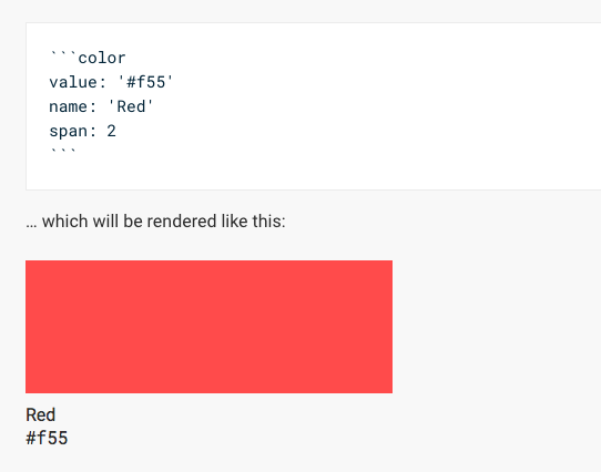
I realise this is not exactly what you asked for but this may be of use to you.
If you grab the two attached files and remove the ".txt" from the end of the file name.
so they are named
ColorSwatch.md.txttoColorSwatch.mdColorSwatch.jsx.txttoColorSwatch.jsx
Then put them in your components folder where styleguide is run and start styleguide.
Please note the Component ColorSwatch has 4 properties as demonstrated in the ColorSwatch.md file.
- name
- value
- width
- height
The width and height properties are optional and default to 320 and 180 respectively.
ColorSwatch.md.txt
ColorSwatch.jsx.txt
2017/Jan/17 Updated ColorSwatch.md.txt with suggestion from @sagepin below to add 'noeditor' to the examples in ColorSwatch.md.txt.
 rluiten
on 17 Jan 2018
rluiten
on 17 Jan 2018
The simplest way to do this would be to create a Markdown file with colors and include it in RSG.
 n1313
on 17 Jan 2018
n1313
on 17 Jan 2018
I think @rluiten solution is the best for now, but you should use noeditor modifier to render components without the editor.
 sapegin
on 17 Jan 2018
sapegin
on 17 Jan 2018
@rluiten @sapegin This is perfect. I don't why I didn't think to just do this in the first place. It'd be cool to one day see this functionality built into the core react-styleguidist library styleguideComponents, but this accomplishes exactly what I needed it to so I'm not worried about it. Thanks for the tip!
jrjacobs24
on 17 Jan 2018
Related issues
sapegin
·
3Comments
 mealeyst
·
3Comments
mealeyst
·
3Comments
 davidjb
·
3Comments
davidjb
·
3Comments
 dzimmerman902
·
3Comments
dzimmerman902
·
3Comments
 benoitgrasset
·
3Comments
benoitgrasset
·
3Comments
Most helpful comment
I realise this is not exactly what you asked for but this may be of use to you.
If you grab the two attached files and remove the ".txt" from the end of the file name.
so they are named
ColorSwatch.md.txttoColorSwatch.mdColorSwatch.jsx.txttoColorSwatch.jsxThen put them in your components folder where styleguide is run and start styleguide.
Please note the Component
ColorSwatchhas 4 properties as demonstrated in the ColorSwatch.md file.The
widthandheightproperties are optional and default to 320 and 180 respectively.ColorSwatch.md.txt
ColorSwatch.jsx.txt
2017/Jan/17 Updated ColorSwatch.md.txt with suggestion from @sagepin below to add 'noeditor' to the examples in ColorSwatch.md.txt.