React-stripe-elements: Input for Card Element squished
Trying to implement this into my react app the input from the cardElement is all squished together, is that how it comes out of the box? Do I need to apply extra styling from the get go to get it to appear correctly? Thanks.

 chadwtkns
All 9 comments
Hi @chadwtkns, thanks for filing this issue. The input elements always stretch to 100% of the width of their parent container. So you would control this behavior by adjusting the width of the parent element. Let me know if that worked for you.
 cweiss-stripe
on 18 Aug 2017
cweiss-stripe
on 18 Aug 2017
Closing for now, please let us know if things are still unclear.
cweiss-stripe
on 21 Aug 2017
Yeah sorry for the late response but it was how I was styling the label. Thanks for the advice. It probably wouldn't have been found/thought of for while.
chadwtkns
on 24 Aug 2017
Is there a way to have the card elements vertically rather than on the same line?
 KudMath
on 13 Sep 2017
KudMath
on 13 Sep 2017
@KudMath There's no way to do this with CardElement. If you want to lay it out a different way, you can use the individual CardNumberElement, CardExpiryElement, CardCVCElement, and PostalCodeElement components, and position them however you want on the page.
If you also want the card brand icon, you'll have to show this yourself (but the CardNumberElement includes the brand information in the change event it gives to your onChange callback).
It's a good idea though! We're considering whether we want to support an option like that in the future.
 jez-stripe
on 13 Sep 2017
jez-stripe
on 13 Sep 2017
@chadwtkns could you share your styling? I'm having the same issue and it's totally not obvious to me how I'm supposed to style the label.
 RP-3
on 10 Sep 2018
RP-3
on 10 Sep 2018
Update: I had the base: { font-size } fixed at 22px. _If you remove this, it will work correctly._
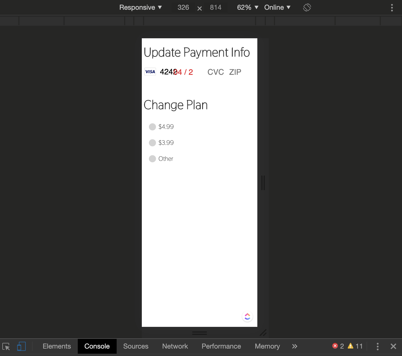
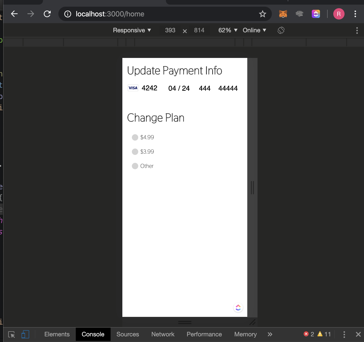
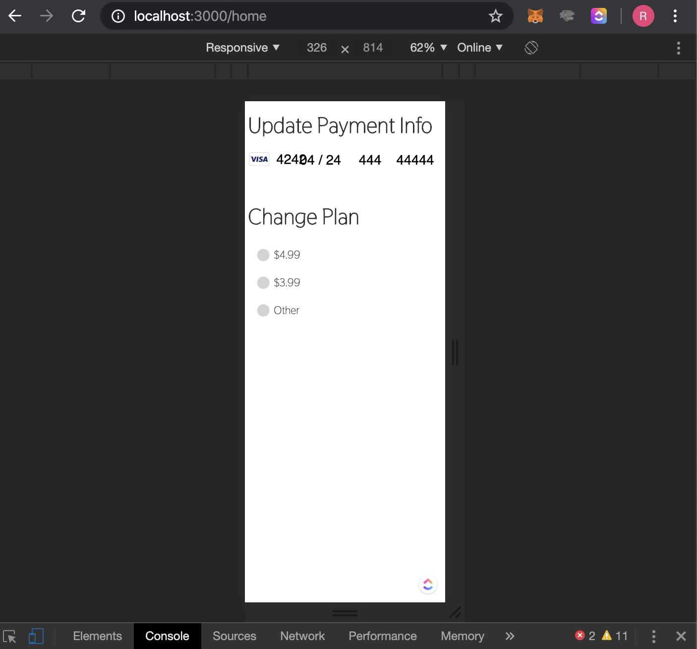
Hi, this is definitely still an issue, under 340px. if you create a CardElement, with no other context, the UI falls apart under 340px width.
I understand 340 px seems small, but consider this example:
- iPhone X Width (via Chrome): 417px
- App has 20px padding on either side (- 40px combined)
- View has 10px padding (- 20px combined)
- All Non-header elements have 10px left/right margins (- 20px combined)
= 417px - 80x = 337px
Pictures of the issue:
 Rcuz8
on 14 Apr 2020
Rcuz8
on 14 Apr 2020
As @cweiss-stripe pointed out, the width is based on the parent element, and if you don't set the width of the parent element it will sit near invisible. Thanks for the solution.
 IliaMaz
on 1 May 2020
IliaMaz
on 1 May 2020
Also concur with Rcuz8 above. The elements are not mobile responsive on fairly common screen sizes (iPhone SE), at around 320px. Making the container larger does not fix this.
We should either reopen this issue or create a new one.
 blainemuri
on 5 Jan 2021
blainemuri
on 5 Jan 2021
Related issues
 shortcircuit3
·
5Comments
shortcircuit3
·
5Comments
 Dasyel
·
4Comments
Dasyel
·
4Comments
 DennisdeBest
·
4Comments
DennisdeBest
·
4Comments
 max-favilli
·
5Comments
max-favilli
·
5Comments
 mmmikeal
·
4Comments
mmmikeal
·
4Comments
Most helpful comment
Closing for now, please let us know if things are still unclear.