react-spring needs a logo, help wanted
If anyone with some design skills would like to help out making the react-spring brand look good we would love to credit/link you on the GH front for it.
 drcmda
All 32 comments
Hi @drcmda! I'm interested to help to design the react-spring brand.
Can you please tell me brief of the logo?
 afnizarnur
on 15 Dec 2018
afnizarnur
on 15 Dec 2018
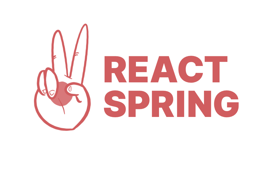
Here's my first attempt:

Let me know if you'd like the SVG/Affinity-Designer files.
 will-stone
on 15 Dec 2018
will-stone
on 15 Dec 2018
@afnizarnur It would be totally up to your creativity. I've tried lots of variations in Sketch but couldn't find a single one. I guess if it's a cool looking, simplistic icon, maybe has some meaning, and looks good next to the react-spring name, that'll be perfect.
@will-stone good start! Maybe a little more iconic/simplistic would be good.
drcmda
on 15 Dec 2018

Some quick sketches that play off the React logo. Although it seems like a missed opportunity to design a logo that can't be animated in this case. Will think about it some more.
 mcernusca
on 16 Dec 2018
mcernusca
on 16 Dec 2018
I also thought it might be cute to keep the current emoji in spirit somehow but not sure how to tie it to the name or function yet. Posting in case it inspires someone else.
mcernusca
on 16 Dec 2018
@drcmda Great! Will do some exploration for the logo, and I'll get back to you ASAP.
afnizarnur
on 16 Dec 2018
@mcernusca i really dig the second (grey one). This might actually work ... really cool idea merging the slinky with the react atom 😄
drcmda
on 16 Dec 2018
Hi @drcmda, this is what I have until now.
Option 1
What I first thought about react-spring, is that an animation that so smooth and fluid like water, and come up with this one.
Option 2
Another iteration that come up in my mind is, keyword "spring", zig-zag, and the letter "S". Font is Overpass, which is used by Red Hat and open source.
Let me know what you think! Hope you like it especially the color 😅
afnizarnur
on 16 Dec 2018
@afnizarnur i do! the colors are nice, too!
drcmda
on 18 Dec 2018
Let me know what option you want to go ahead,
then I'll provide the logo assets for you :)
afnizarnur
on 18 Dec 2018
@mcernusca i think your logos are awesome. And don't worry about animating them, it's possible to animate SVG 😄
 haikyuu
on 19 Dec 2018
haikyuu
on 19 Dec 2018
take a look at https://codesandbox.io/embed/4zppn84yj4 for example
haikyuu
on 19 Dec 2018
that's a cool idea! @mcernusca could i get the svg for this?
drcmda
on 19 Dec 2018
@haikyuu good thought!
@drcmda sure thing:
react-spring-logo.zip
contains: react-spring-logo.sketch and react-spring-logo-icon.svg
Font for sketch file is InterUI https://rsms.me/inter
As mentioned earlier this was just a conceptual sketch. Happy to play around with treatment, colors etc if we move in this direction. Others can feel free to take these files and play around too!
mcernusca
on 19 Dec 2018
@mcernusca I must say i dig the direction. I love @afnizarnur 's, too - but the idea of crossing a slinky with Reacts atom dot rings a bell. Not sure how @ruggedy feels about this, but i'd love to explore this with some drafts/colors. Or maybe even merge these ideas, like the typographic that @afnizarnur did (the slanted text looks nice)
drcmda
on 19 Dec 2018
I thought I'd have another go. I hope you don't mind, @afnizarnur, but I took your designs for inspiration and incorporated them with my first idea.

will-stone
on 19 Dec 2018
I also wanted to give it a go 🙂. It's based on the idea of @mcernusca that positions the nucleus of React in the middle of an actual spring.

Here's another color variation:
The font is Ubuntu.
 amannn
on 20 Dec 2018
amannn
on 20 Dec 2018
Below a quick b/w draft. COLORS NEED STILL TO BE DONE!. Setting the right colors + finalizing would take quite some time. Further missing: motion lines, a dark-background version, perfecting/balancing all shapes and proportion, versions with other text-alignments/-positions (e.g. for a centered layout, a banner layout, etc.) and versions without a text-logo. If you could imagine to go this direction let me know and I would work on the missing stuff...

NOTE: COLORS NEED STILL TO BE DONE
 desmap
on 21 Dec 2018
desmap
on 21 Dec 2018
Played around with some colors, it's super hard, I haven't found the palette where I am happy. Tested following color pair with a contrast of 3 (I think it's still too flat). But I'd tend to opt for a dark-background theme. IDK, maybe it's because it's about animation/motion (anime.js chose also a dark-background theme and it looks damn slick).
However, whatever logo/design/key colors you guys choose, you need think about a new/consistent CI/CD which reflect this and covers the entire website, So, just changing the logo won't work.

desmap
on 21 Dec 2018
Make sure it will still be recognisable even at very small sizes (favicon, avatar). Basic geometric shapes with a hook usually work best. Vue has nailed the logo game in the JS ecoverse.
 eoghanmccarthy
on 23 Dec 2018
eoghanmccarthy
on 23 Dec 2018
Hey everyone! Here’s my take on a logo for react-spring. I felt it was important to make the logo as simple and playful as possible, as I think it would help with approachability of the project. Hope you like it!

 picnich
on 24 Dec 2018
picnich
on 24 Dec 2018
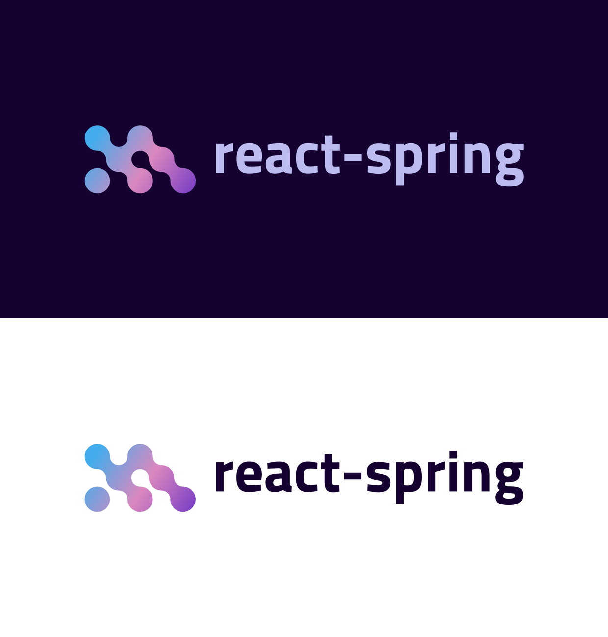
@drcmda Sorry this took so long. I finally had some time today to revisit the logo and try to merge some of the ideas and feedback presented so far. Here is where I landed:
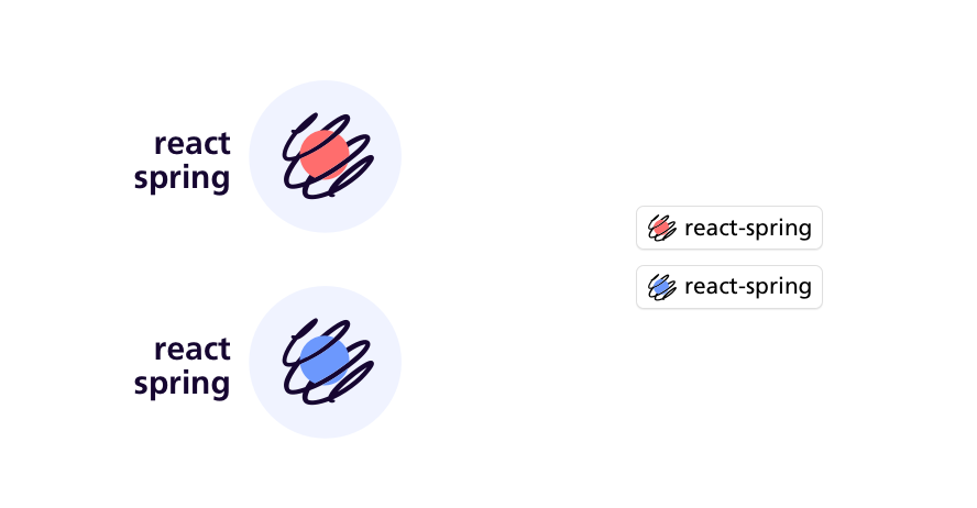
I beefed up the strokes and the size of the nucleus so it can scale down comfortably and still be recognizable. If we prefer the smaller nucleus I think it should be fine to have different variations for different sizes too.
Some potential rendering and colors:

I couldn't find any way to invert the spring and still have it look good so we need some sort of container shape. I kind of dig keeping the existing vivid red brand color but if you're going to use that as a primary color on the website then maybe we should use a complementary color in the logo itself.
mcernusca
on 14 Jan 2019
@mcernusca i like it, simple and clean, has the react atom dot and a spring - let's go with it!
drcmda
on 15 Jan 2019
Awesome work @mcernusca !! Love the coloured two on the right-hand side.
 jameesy
on 16 Jan 2019
jameesy
on 16 Jan 2019
Here's my attempt
Concept #1

Concept #2

Concept #3

Concept #4
Hope you like it.
 aprather51
on 17 Jan 2019
aprather51
on 17 Jan 2019
Hi all, I had a go at making this logo interactive. Feel free to fork and have a play:
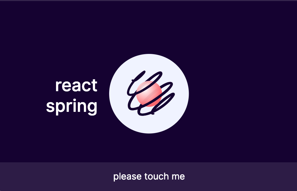
Sketch file: react-spring-logo-2.zip
PS: the hooks api is so good ♥‿♥
mcernusca
on 22 Jan 2019
@mcernusca thats a cool idea! where can i reach you, do you twitter?
drcmda
on 22 Jan 2019
@mcernusca looks super cool man, great work!
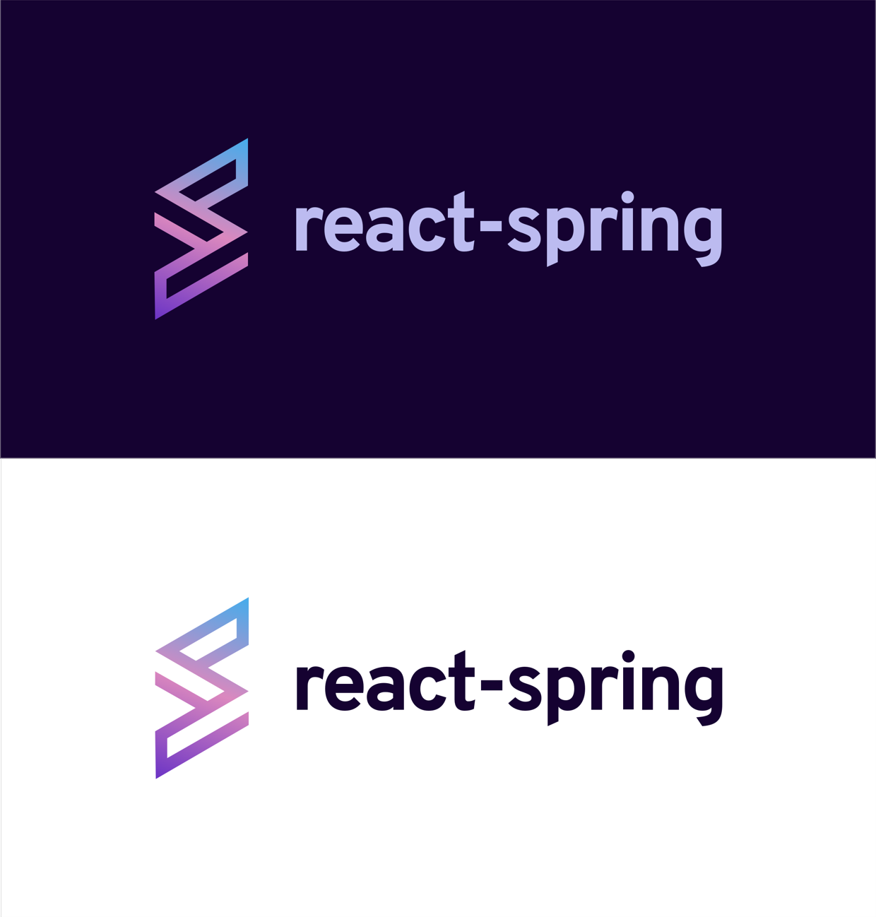
I'm not sure if I prefer the text at the left or the bottom:

 brunolemos
on 23 Jan 2019
brunolemos
on 23 Jan 2019
@brunolemos thanks! I agree, especially in this context. Updated link! Also included some feedback from Paul about limiting by radius instead of boxing the nucleus in which feels much better. That gave us a few extra pixels to move in so I made it bouncier to take advantage :)
mcernusca
on 23 Jan 2019
I love the fact we have a logo now. It does seem like a great idea to also animate it. It looks so nice on the gitHub page as well. I was thinking it would be cool if we can create something like:
https://github.com/juliangarnier/anime/
That globe is such a huge WOW factor 🕺
 ahmedu007
on 31 Jan 2019
ahmedu007
on 31 Jan 2019
Good idea @ahmedu007 I'll play around with that and see what I can come up with!
mcernusca
on 1 Feb 2019
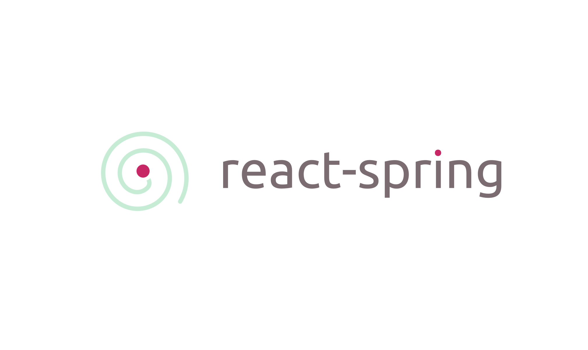
@afnizarnur 1st option for the win
 eballeste
on 6 Feb 2019
eballeste
on 6 Feb 2019
Related issues
 BertCh
·
3Comments
BertCh
·
3Comments
 MaximeDenuit
·
4Comments
MaximeDenuit
·
4Comments
 localjo
·
3Comments
localjo
·
3Comments
 flsilva
·
3Comments
flsilva
·
3Comments
 n1ru4l
·
3Comments
n1ru4l
·
3Comments
Most helpful comment
Some quick sketches that play off the React logo. Although it seems like a missed opportunity to design a logo that can't be animated in this case. Will think about it some more.