React-select: Text cursor location
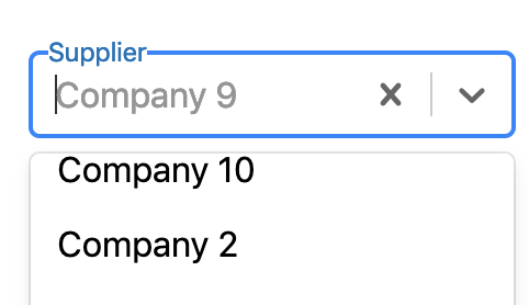
It may be nitpicking, but after choosing an item in the dropdown the text cursor blinks in front of the displayed text. Wouldn't it make more sense to move it after the text?
 dlong500
All 29 comments
+1
 sureshvarman
on 18 Nov 2015
sureshvarman
on 18 Nov 2015
+1
 vinutha-singtel
on 10 Dec 2015
vinutha-singtel
on 10 Dec 2015
+1
 mepheser
on 17 Dec 2015
mepheser
on 17 Dec 2015
+1
 j-clark
on 9 Jan 2016
j-clark
on 9 Jan 2016
+1
As a side note, anyone have any suggestions as to a quick and dirty way to get it appearing at the end? @dlong500
 burritofanatic
on 23 Feb 2016
burritofanatic
on 23 Feb 2016
+1
 gjritter
on 25 Feb 2016
gjritter
on 25 Feb 2016
- 1 Hi Folks, anyone have any suggestions/ideas/hack as to quick or long way to get it ?
 jerrytom1986
on 5 Aug 2016
jerrytom1986
on 5 Aug 2016
+1
 korotindev
on 23 Sep 2016
korotindev
on 23 Sep 2016
+1
 petrgazarov
on 20 Oct 2016
petrgazarov
on 20 Oct 2016
I haven't had much time to look into this myself. I believe the root of the problem is that the actual value is stored in a span element and not the input control. The input is only used for typing, and once a value is chosen it appears that the input is cleared and the span overlay shows the value (thus leaving a blinking cursor in an empty input control).
Perhaps there is a way to have the input's value set to the selected value instead of being empty? Given the structure of this component I don't see an easy way to hack around it without modifying the actual react-select code.
One other possibility that might at least make it not look so odd is to hide the blinking cursor with styling when the input is not active, but this would obscure the fact that a value could be typed in.
The only true fix is going to be having code updated in react-select. Either having the input control value set to the selected value (probably the easiest option) or changing the whole structure of how the component works so that the input control is the primary value holder.
dlong500
on 20 Oct 2016
If you don't allow user to enter values, you don't need to display the contents of the input, so you could use:
.Select-input {
  color: transparent;
}
FYI @jerrytom1986 @burritofanatic @dlong500
 AndersDJohnson
on 13 Feb 2017
AndersDJohnson
on 13 Feb 2017
@adjohnson916 I think most people using this component (at least the ones in this issue) are certainly wanting people to be able to enter values for the typeahead feature that is a large part of what this component provides, so unfortunately that doesn't really solve the issue.
That being said, I think it would actually need to be the following to hide the cursor (and the text someone might type):
.Select-input > input {
  color: transparent;
}
@dlong500 Agreed, a general solution is needed that works with typeahead. Just thought I'd mention as that fix suited my use case.
AndersDJohnson
on 14 Feb 2017
@JedWatson any updates would be appreciated. Thanks.
 Anshul-HL
on 21 Mar 2017
Anshul-HL
on 21 Mar 2017
+1
 mahesh1996
on 8 Jan 2018
mahesh1996
on 8 Jan 2018
+1
 walifaizy
on 28 Jan 2018
walifaizy
on 28 Jan 2018
Throwing in another 2¢: The main issue here is that the behavior of react-select breaks implicit UX contracts users are bringing with them from standard form elements.
The select box here looks like a text input, with cursor flashing, but then you can't select or delete any of the text that appears to be inside it. You quickly learn that if you start typing it will replace the existing text. But it creates a feeling of being artificially hemmed in.
You're also out of luck if you want to perform a new query by deleting some characters from the end of the existing value. You have to start over.
If #2176 works could someone please merge?
 glortho
on 16 Feb 2018
glortho
on 16 Feb 2018
@glortho I replaced official react-native with that one from PR, added proper typings for TS and I had couple of errors while selecting elements from search. I'm not sure if it works - I don't test it properly.
 pawlowskim
on 16 Feb 2018
pawlowskim
on 16 Feb 2018
+1, I agree with @glortho, this breaks the expected convention
 Keltin42
on 21 Feb 2018
Keltin42
on 21 Feb 2018
+1
 martinlistiak
on 25 Feb 2018
martinlistiak
on 25 Feb 2018
The following CSS solved the issue for me -
  .is-focused.has-value.Select--single {
    .Select-control {
      .Select-value {
        position: relative;
        display: inline-block;
      }

      .Select-input {
        display: inline-block;
        vertical-align: top;
        padding-left: 0px;
      }
    }
  }
 shreyass
on 30 Mar 2018
shreyass
on 30 Mar 2018
@dlong500
I just made the text inside gray while menu is open which makes it look a lot better.
here is a sample that will get you the result
const styles = {
  singleValue: (base, state) => ({
    ...base,
    color: state.selectProps.menuIsOpen ? '#some-shade-of-gray' : base.color,
  }),
}

... <Select {...otherRequiredProps} styles={styles} />
 omerman
on 21 Mar 2019
omerman
on 21 Mar 2019
I'm facing this problem too. My case is actually worse since it is a rich react node with an avatar + text.
The cursor blinks below the avatar and users don't know they can actually search.
Inline search is very tricky. It is not that terrible for text-based select, but for anything else it does not work really.
Is there an easy to way to move the search to be inside the drop contents?
 alansouzati
on 28 Mar 2019
alansouzati
on 28 Mar 2019
I had a same issue, and I found that Material-UI's demo (https://material-ui.com/demos/autocomplete/) didn't have this issue.
In there, I found out passing in SingleValue component would solve this issue.
Here's a codesandbox example that material-ui's demo uses.
https://codesandbox.io/s/34k6v4vr6
 jhrinoa
on 23 May 2019
jhrinoa
on 23 May 2019
const styles = {
singleValue: (base, state) => ({
...base,
color: state.selectProps.menuIsOpen ? 'transparent' : base.color,
}),
}
...
gives a much better experience
 JoElAbRaHam-cW
on 26 Sep 2019
JoElAbRaHam-cW
on 26 Sep 2019
React-select adds a div for the placeholder. It's not a real placeholder, and the cursor will rest after that div.
I solved this by positioning that div as absolute:
placeholder: styles => ({
        ...styles,
        position: 'absolute'
    })
You might want to tweak the padding a bit so it would align better with the text.
 alvamanu
on 13 May 2020
alvamanu
on 13 May 2020
Hi, I solved it by simply fixing the margin and padding:
const selectStyles = {
        singleValue: (styles) => ({
             ...styles,
            marginLeft: "4px",
        }),
        placeholder: (styles) => ({
            ...styles,
            paddingLeft: "4px",
        }),
        input: (styles) => ({
            ...styles,
            marginLeft: "-4px",
        }),
};
return <Select  styles={selectStyles} />
Maybe it helps someone.
 Juancard
on 20 Oct 2020
Juancard
on 20 Oct 2020
I've started a fork of react-select. Feel free to resubmit this issue on the fork and/or submit a PR to resolve this issue on the fork and we can get it merged and released.
 Methuselah96
on 14 Nov 2020
Methuselah96
on 14 Nov 2020
I have added this as a conversation here. I think it merits discussion based on naming and side effects and would love to hear input especially given that a solution is possible without the need to add a prop.
Would love to include Jed in this conversation as this appears as one of the few opinionated decisions that were made with a level of context that might not be immediately apparent.
 ebonow
on 28 Nov 2020
ebonow
on 28 Nov 2020
Related issues
 geraldfullam
·
3Comments
geraldfullam
·
3Comments
 juliensnz
·
3Comments
juliensnz
·
3Comments
 pgoldweic
·
3Comments
pgoldweic
·
3Comments
 mjuopperi
·
3Comments
mjuopperi
·
3Comments
 yrabinov
·
3Comments
yrabinov
·
3Comments
Most helpful comment
Throwing in another 2¢: The main issue here is that the behavior of react-select breaks implicit UX contracts users are bringing with them from standard form elements.
The select box here looks like a text input, with cursor flashing, but then you can't select or delete any of the text that appears to be inside it. You quickly learn that if you start typing it will replace the existing text. But it creates a feeling of being artificially hemmed in.
You're also out of luck if you want to perform a new query by deleting some characters from the end of the existing value. You have to start over.
If #2176 works could someone please merge?